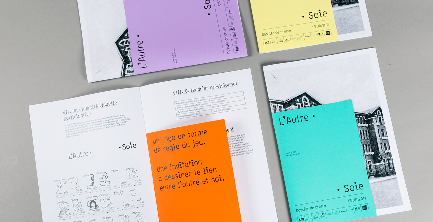
L’Autre Soie, a participative branding!
We present you a visual identity project that goes off the beaten track. An adventure of collective design that was an opportunity to question the role of visual identity outside the traditional institutional and commercial fields.
hat would a horizontal, participative and inclusive visual identity look like?
hat would a horizontal, participative and inclusive visual identity look like?
L'autre Soie, a third-place
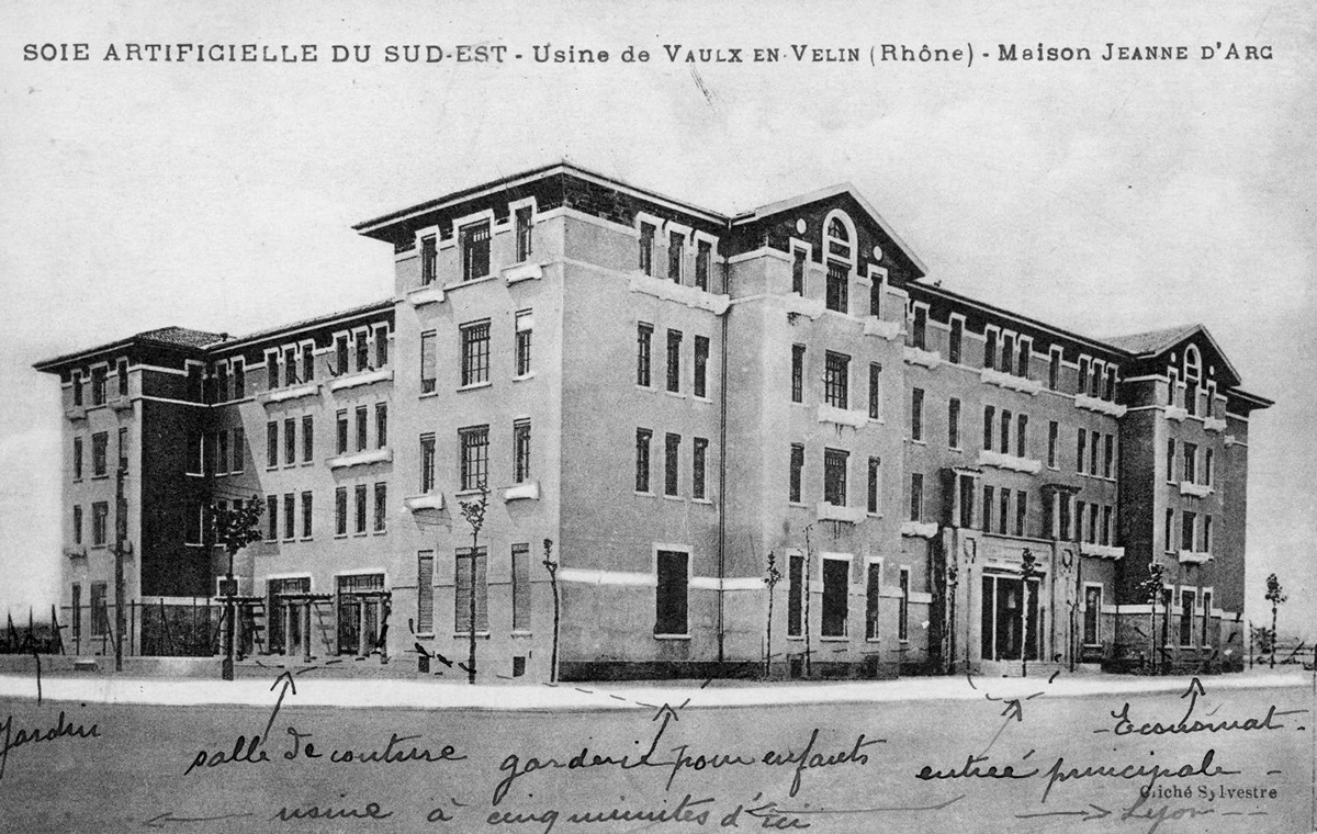
L'Autre Soie is a project that combines housing, social and solidarity economy and culture in Villeurbanne, near Lyon, France. Located on the site of a former IUFM (training institution for public education professionals), in the perimeter of the "Carré de Soie" ("Silk district"), it will combine housing reserved for people in difficulty as well as places dedicated to culture and the social and solidarity economy.
Behind this utopian project, halfway between social housing and third-place, there is an economic interest group composed of 4 members: Alynea, Aralis, Est Métropole Habitat (EMH) and Rhône Saône Habitat (RSH). They are also accompanied by the CCO, the Villeurbanne Cultural Centre.
The ambition is to make the Autre Soie a creative and attractive place in the agglomeration with a strong citizen involvement in the design and implementation of the project. It will be a district where the inhabitants will be the carriers of resources for the territory. Everyone, in their diversity, will be able to find their place and have a social, cultural and economic environment that contributes to the development of their capacity to act.
An untranslatable name!
The name of the project can not be translated in English.
It refers to the history of the district where silk ("soie" in French) was produced, and it is also a play on words between "the Other" ("l'Autre" in French) and oneself ("Soi" in French). In short, it is a new way to imagine the Silk district!
It refers to the history of the district where silk ("soie" in French) was produced, and it is also a play on words between "the Other" ("l'Autre" in French) and oneself ("Soi" in French). In short, it is a new way to imagine the Silk district!
Step 01, the call for tenders
When we left the presentation meeting, we immediately went to the site of the Autre Soie. We took advantage of this impromptu visit to meet its current inhabitants. Indeed, the building welcomed 150 migrants, mainly from the Calais jungle. After some exchanges, and despite the language barrier, we asked them to write "L'Autre Soie" in their native language.


At this stage of the project, we had no idea what we were going to do with these words. In fact, we will not do anything about it in the end. Finally, not totally... this meeting had the merit of immersing us very quickly in the subject, and consolidating our motivation to propose a project as utopian and humanistic as their third-place!


Questioning otherness
Otherness is the recognition of the other in his difference, whether ethnic, social, cultural or religious. Questioning about otherness leads us to wonder about what is other (alter) than us (ego), about our relations with it, about the means of knowing it, about the possibility of existing without it, if it constitutes a threat to our identity. Otherness is different from tolerance, because it implies an understanding of the particularities of each individual, the ability to be open to different cultures and their interbreeding.
Territory, places and links
The territory can be defined as a real and dreamed space made up of places that are linked together. It includes paths, networks made up of strengths and weaknesses. This space is in interaction with its actors.
A territory is also signs, symbols, words, images inscribed in time. Links or places, what is more visible? Does the multiplication of links make places more visible?
Sharing humanity
Third-places, by facilitating encounters, sharing, innovation, pooling resources, and taking greater account of people and the environmental context, offer relevant spaces for solidarity, value creation and local development.
Space of possibilities
Third-places are spaces of freedom, places of invention and workshops of singular shaping of collective organizations. These are spaces of possibilities. How can we make visible the links that unite us to others? To try to answer this question, we had fun in the square next to the office.
Step 02:
A participative visual identity
A participative visual identity
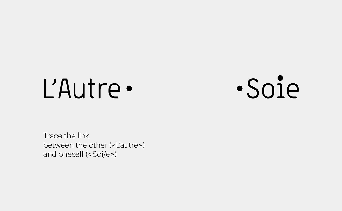
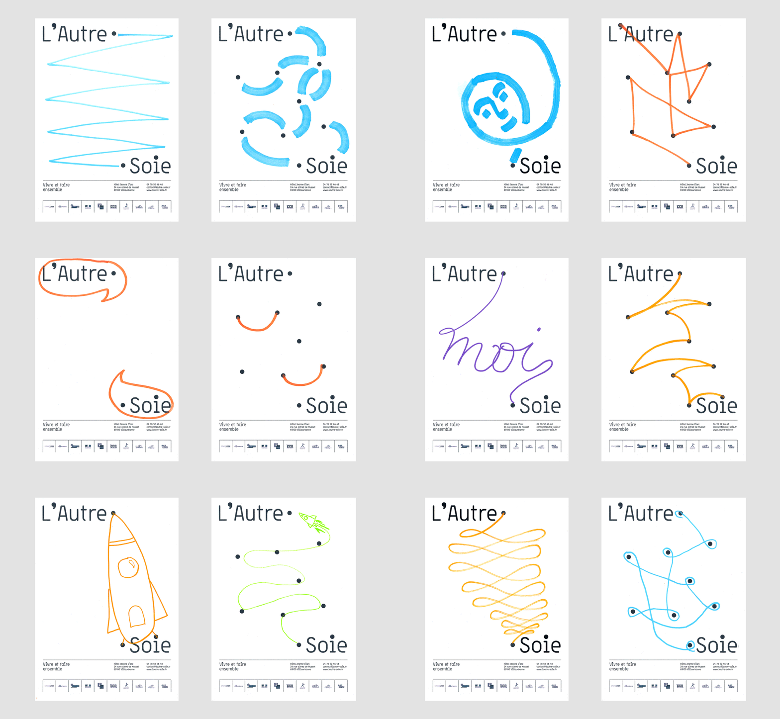
The idea emerged in one of these long collective brainstorming sessions. At the beginning, there is this idea of the points to connect to draw something. Like in those kids' coloring books. Then by purifying the idea to its maximum, we came up with the idea that the logo would be an invitation to connect the Other ("l'Autre") to Oneself ("Soi(e)"). In the end, the logo only exists once the points are connected.
And no matter if the dots are physically or mentally connected, it is in this action that the words become signs, and the logo appears. From then on, the person looking at the logo becomes co-author of the logo!
Finally, it should be noted that the rule of the game is not binary, since a third point has slipped into the name. As an invitation to hijack the rule.
Finally, it should be noted that the rule of the game is not binary, since a third point has slipped into the name. As an invitation to hijack the rule.
A visual identity as a manifesto
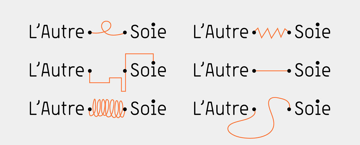
A manifesto that makes the link between us and the other tangible and concrete.
A rule of the game that invites us to do together.
As a collective and participatory work that allows us to question the principle of otherness.
A space of free expression, open and in the making.

Long live participative branding!
The challenges related to the design of a visual identity are numerous. Public image, made up of a set of signs that give it its coherence, the visual identity must simultaneously identify and make a difference, be recognized and set a limit.
This notion also raises the question of visibility, the blurring of identities, the competition between signs in the public space, and conversely, anonymity.
The notion of identity was invariably associated with the logo, with the brand as a unique, versatile sign, because it could be used on any medium. However, this graphic solution has found its limits in the repetition and uniformity it generates.
The logo is obviously essential. However, we may wonder how to extend and develop this word, how to adapt it to the specificity of the multiple supports that are called upon to carry it in the public space. Today, we are witnessing a transformation, both in terms of content and form, of the monolithic archetype of the logo that we all know.
Times and needs have therefore changed. No more unique discourse repeated over and over again, and long live the evolution that allows us to take into account the singularity of individuals, projects, periods and events.
The logo of the Autre Soie is continuously reinvented, while maintaining the coherence and recognition necessary for a brand. This participatory identity can therefore be seen as a response in line with its time (cf: more horizontality) where authority is shared!
A participative audition
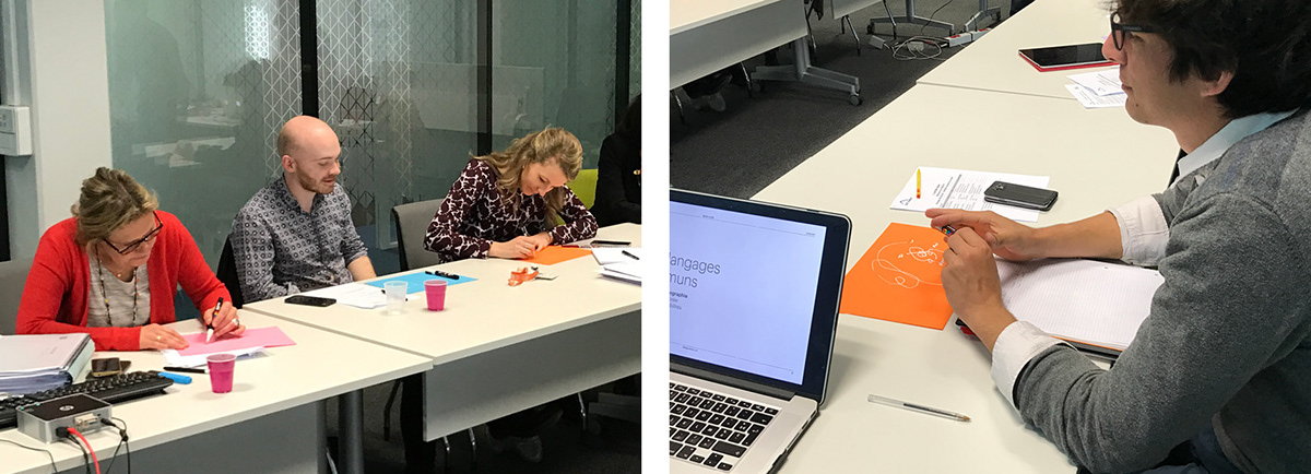
At this stage of the project, we were still mere candidates for this call for tenders. We had to defend this iconoclastic project before an assembly of a dozen people. And a simple PowerPoint presentation would have been counterproductive. So we considered testing our concept directly with them. The objective was that at the end of the presentation, everyone could participate in the production of a brochure on the Autre Soie.
So we landed with our reams of paper, our Posca markers and the office printer, and in 45 minutes we had made about ten unique copies. The small A5 brochures are presented below.


A unique typography
The identity is based on the Storno, a typography designed by Lineto. Its very "standard" design contrasts with the joviality of its large dots on the "i's", thus allowing many graphic games. It is a typography that exists in only one style. A form of minimalism that limits unnecessary effects within the layout. Therefore, only the word scale will allow to establish reading levels.

We had also imagined a name architecture for the different entities of the project. Probably more of a poetic game than a functional proposal. But at this stage, wasn't it necessary to open up the field of possibilities?
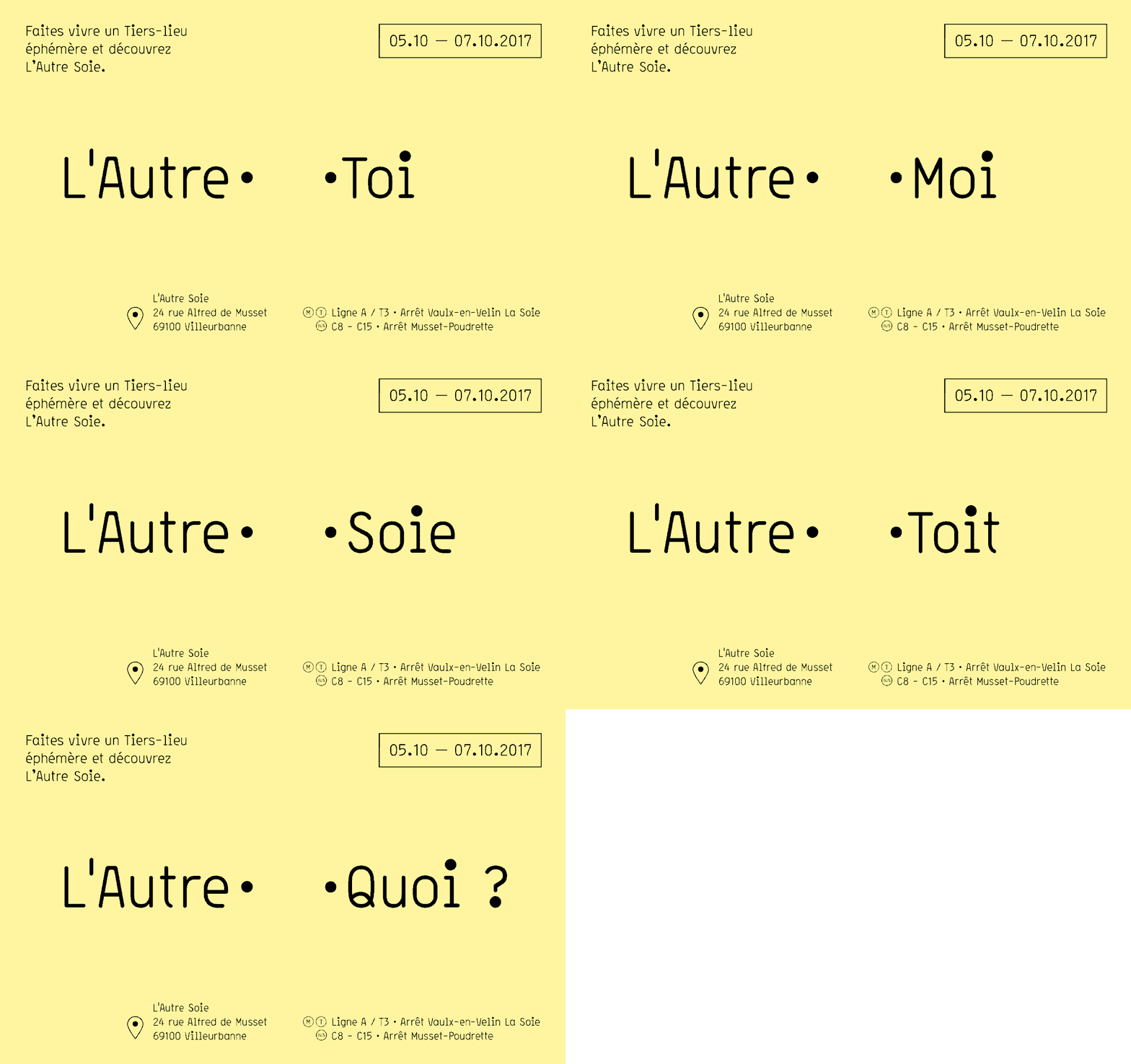
This principle inspired the invitation card for the inauguration....."L'autre quoi ? moi ? toi ? toit ? Soie ?"...
(The other what? Me? You? You? Roof? Silk? Self?"...)

Communication media
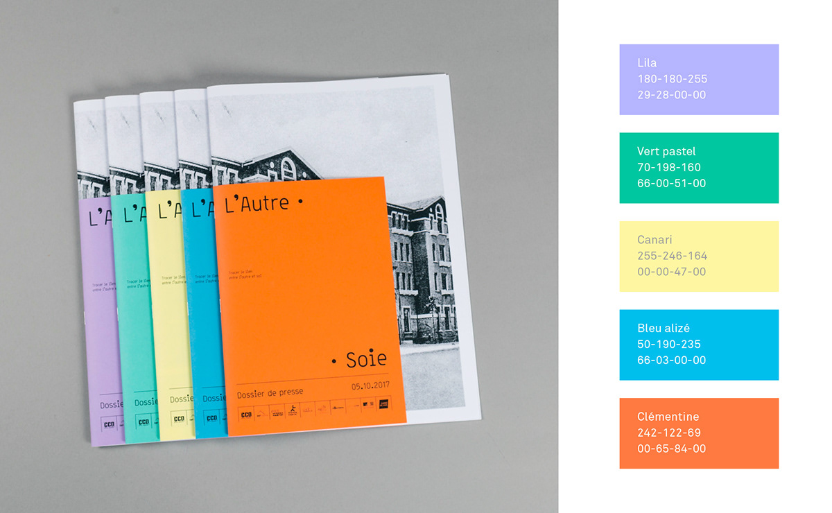
Once the project was selected, we had to implement this identity. So we started by designing the press kit and the invitation.
A black and white print on papers of different sizes and colors.
A black and white print on papers of different sizes and colors.


Step 03:
The ordinary adventure!
The ordinary adventure!
The first deadline was the day entitled "The Ordinary Adventure" organized by the CCO. The aim was to invite about a hundred volunteers over a weekend to reflect in "creative marathon" mode on the future orientations of the project.
On Sunday, the general public was invited to discover the exhibition presenting their thoughts. We were in charge of setting up the exhibition during the night!
An inaugural gesture was also planned. Since there is no first stone to lay yet, we had suggested that they collectively trace the first link. A joyful graphic cacophony as shown in the video below.
There is obviously in this inaugural happening a form of assumed " mess ". By choosing to entrust the pencil to the Other ("L'Autre"), the one who is not a graphic designer for example, you have to accept that the drawing is not as well mastered as if it were made by a professional. That's also what horizontality is all about!
The exhibition
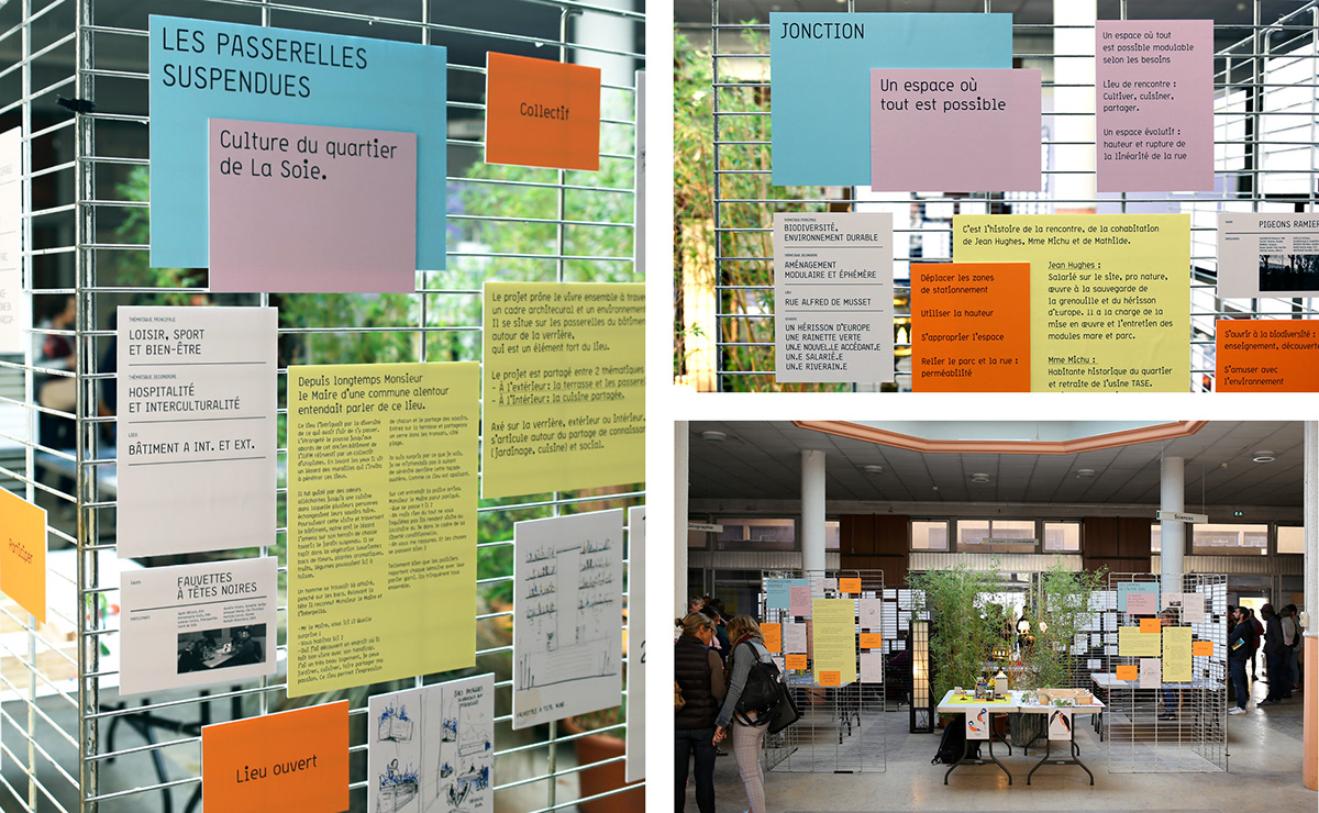
At the end of the collective reflection day, we had to recover all the teams' productions, then set up the exhibition during the night. Given the time available, and by economic logic, we recycled large grids on the abandoned IUFM site. And then we manufactured and installed the printed panels on the colored papers.

Participative workshops
During the day open to the public, we also facilitated a participatory workshop. Visitors were invited to freely draw a link between the Other ("L'Autre") and Oneself ("Soi(e)"). The objective is to create a "bank of links" to be used to enrich the future communication of the place.
Another exercise consisted in composing a drawing from a key word (ex: sharing, friendship, living...) on the basis of points, a priori randomly placed on the page. Once the interpretation of the word was finished, we would pass the drawing through the printer, and a quotation would be printed in superposition. The initial points merging with the points of the typography.
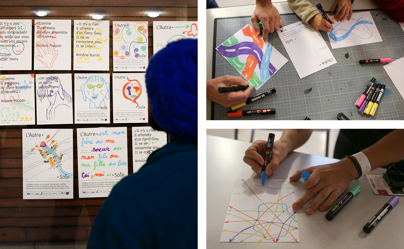

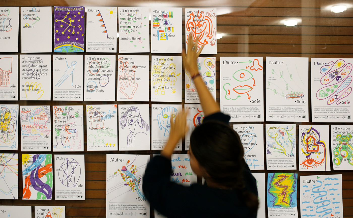
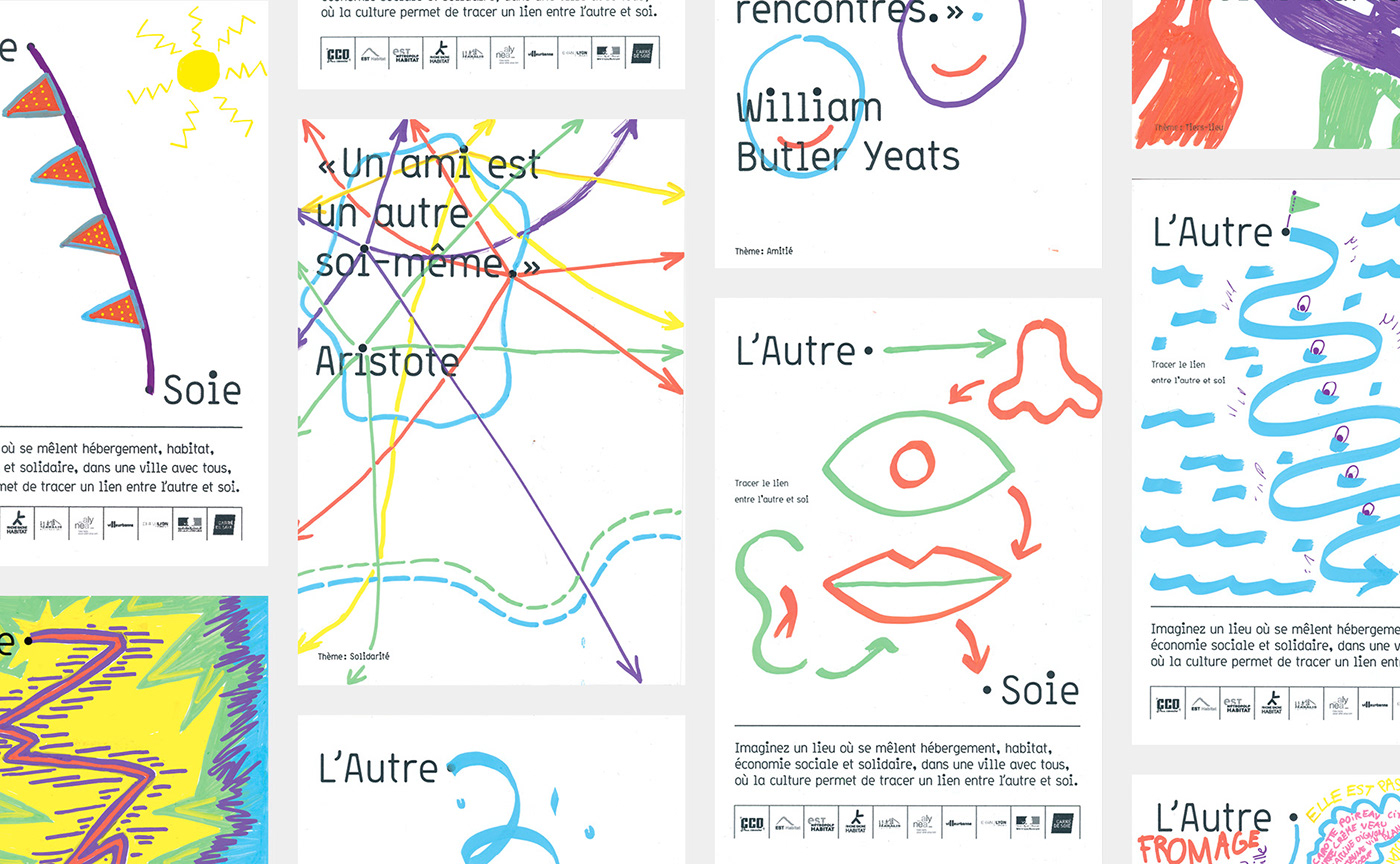
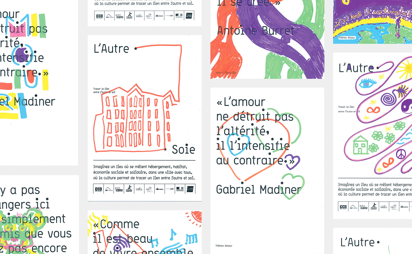
About a hundred drawings were made during the workshop.
Thanks to Uniball for supporting this workshop by providing several boxes of their famous Posca markers free of charge!
The system was extended online on the website of the Autre-Soie. Indeed, to access the site, the Internet user was invited to connect the "Autre" to the "Soie" and therefore to draw freely. Here are some examples of illustrations made online!

Step 04: Participate!
The homepage of the Autre Soie site is composed of a drawing module (not available in mobile version). To enter the site, you must connect the "Autre" to the "Soie". The website was designed and created by the Lyon-based agency Kolle-Bolle.

Even if your drawings are digital... we can print them with the same markers used during the workshop. To do so, we use the small "Axidraw" printer which allows to print with any pen, felt pen, brush... A great tool to get an "natural" render!
—
Thank you!
The project was not always easy to design. Thanks to Fernanda Leite and Tanguy Guézo of the CCO, and Françoise Lagarde and Célia Germain of Est Métropole Habitat.
Thanks to Jean-Baptiste Joaton for his help in developing the participative drawing module.
Thanks also to Klervi, Gaspard and Céline from the Graphéine team who were involved with passion and commitment in this adventure. And thanks again to Posca for their kind "material" support!
—
More details on the project:


