A branding project for the City of Paris
A few months ago, we participated in the call for tenders launched by the City of Paris to redesign its visual identity. This is the unsuccessful project we presented. A project far from perfect, conceived on a very simple intuition in a limited time, but which deserved to be presented here on Behance.
To give some background information, the specifications were very clear on the fact that it was necessary to preserve the "Nave", the historical symbol of the city. So our work focused first on this symbol.
Fluctuat “Nave” Mergitur
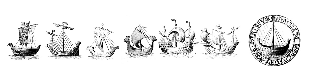
The nave is originally the symbol of the corporation of water merchants, which gave birth to the municipality of Paris. This symbol could be traced back to the Lutetia nautes of the Gallo-Roman era. The nautes were the basis of trade and exchanges between the city of Lutetia and the rest of the ancient world. They were therefore at the origin of the city's wealth. The motto of the city since 1358 was "Fluctuat Nec Mergitur" a Latin phrase, roughly meaning "(It) is tossed by the waves but doesn't sink".
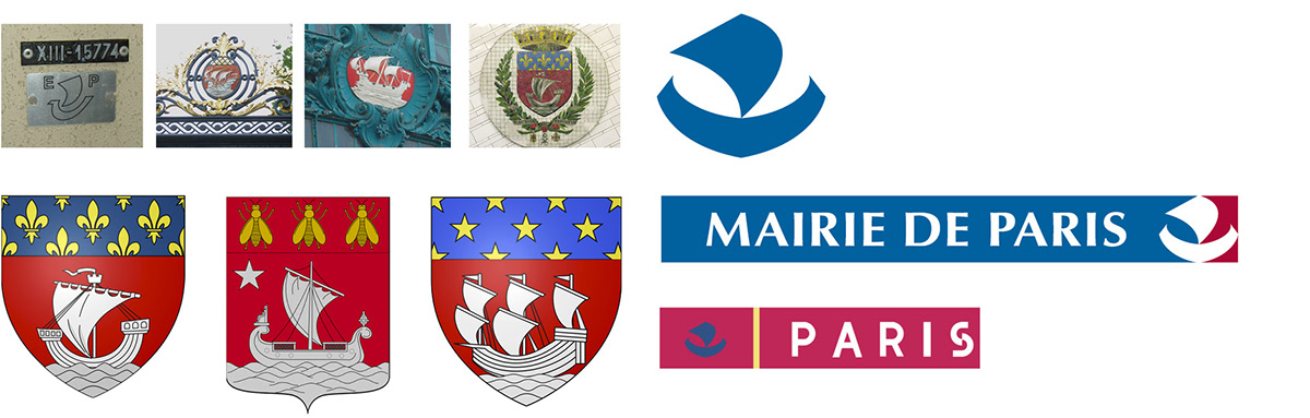
Today, countless representations of this coat of arms co-exist throughout the city. Whether on electrical cabinets, on the pediment of railway stations or at the entrance to parks....
A "nave", a "drakar" or an "arch"?
The graphic translation of this "nave" may have varied considerably over time. If we were to take a critical look at the current drawing, we could note an "aggressive" and "spicy" spirit that brings this nave closer to a Drakar Viking than to a Gallo-Roman nave.
It therefore seemed important to us to restore "softness" and "roundness" to this "nave" in order to make it more of a "welcoming arch" than a warship.
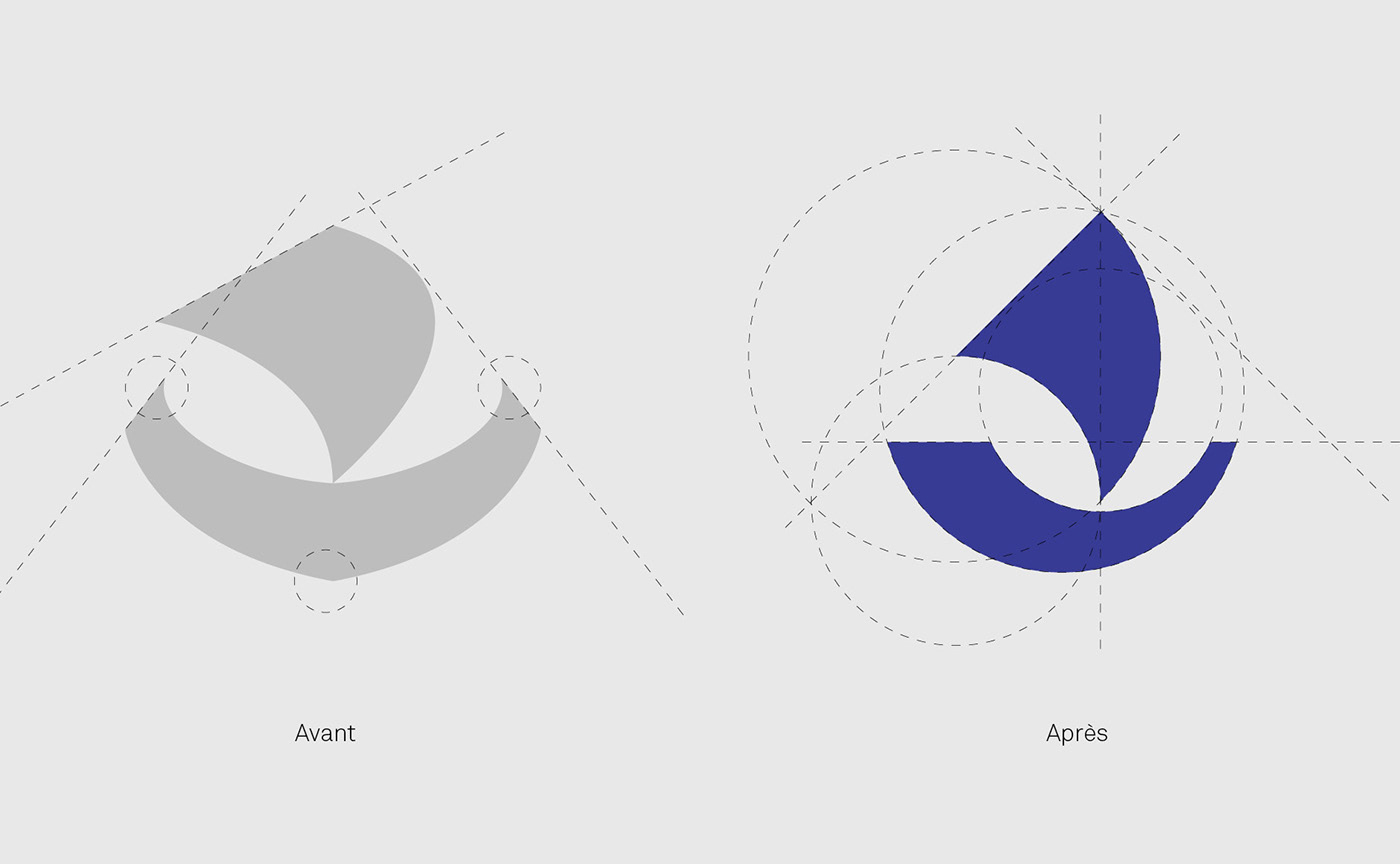
A brand new "nave"...
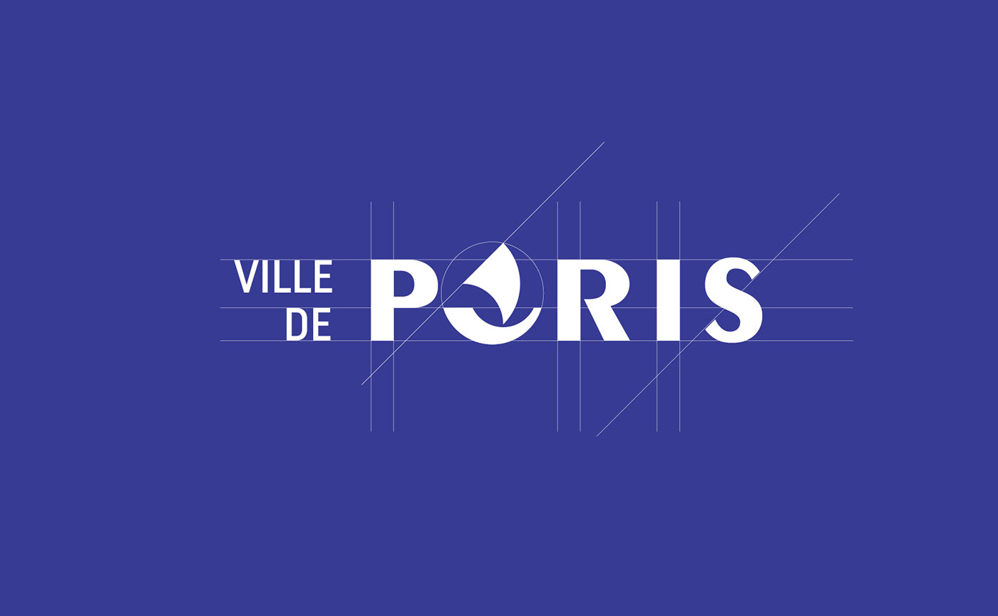
The drawing of the nave is simplified. Its geometric structure is articulated between the dynamics of the 45° angle of the sail and the asymmetrical flexibility of the hull. The sign obtained will have the necessary visual qualities for its use in both very small and very large formats.
The concept of the logo
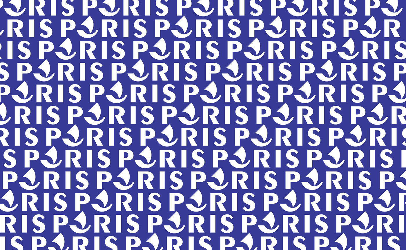
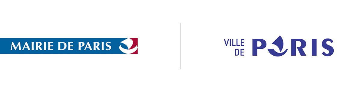
The trick is to mix the word and the image. The silhouette of the nave being close to the shape of the A, we proposed the audacious choice of replacing this letter with the image. The semantic conjunction of the nave of the coat of arms and the silhouette of the word "PARIS" ensuring the reading of the word. The reading accident becoming the main ingredient of the logo.
It was probably at that very moment that we had to lose the jury for the tender. This combination of word and image, possibly surprising at first sight, was in our opinion a happy encounter. Give as much to see as to read. Let the eye get lost a little to better catch its gaze. There was play and boldness in that logo. Maybe a little too much?
We are already hearing that the reading accident would be too strong and readability would not be guaranteed. However, all the people with whom we tested this logo read the name the first time. It's just that the trap isn't that complicated. We can tell skeptics that you have to be able to trust people :-)

It was also a logo designed in a responsive way. We all know that words and typography are responsive by nature. This is why typographic logos are naturally more practical to use than complex logos.
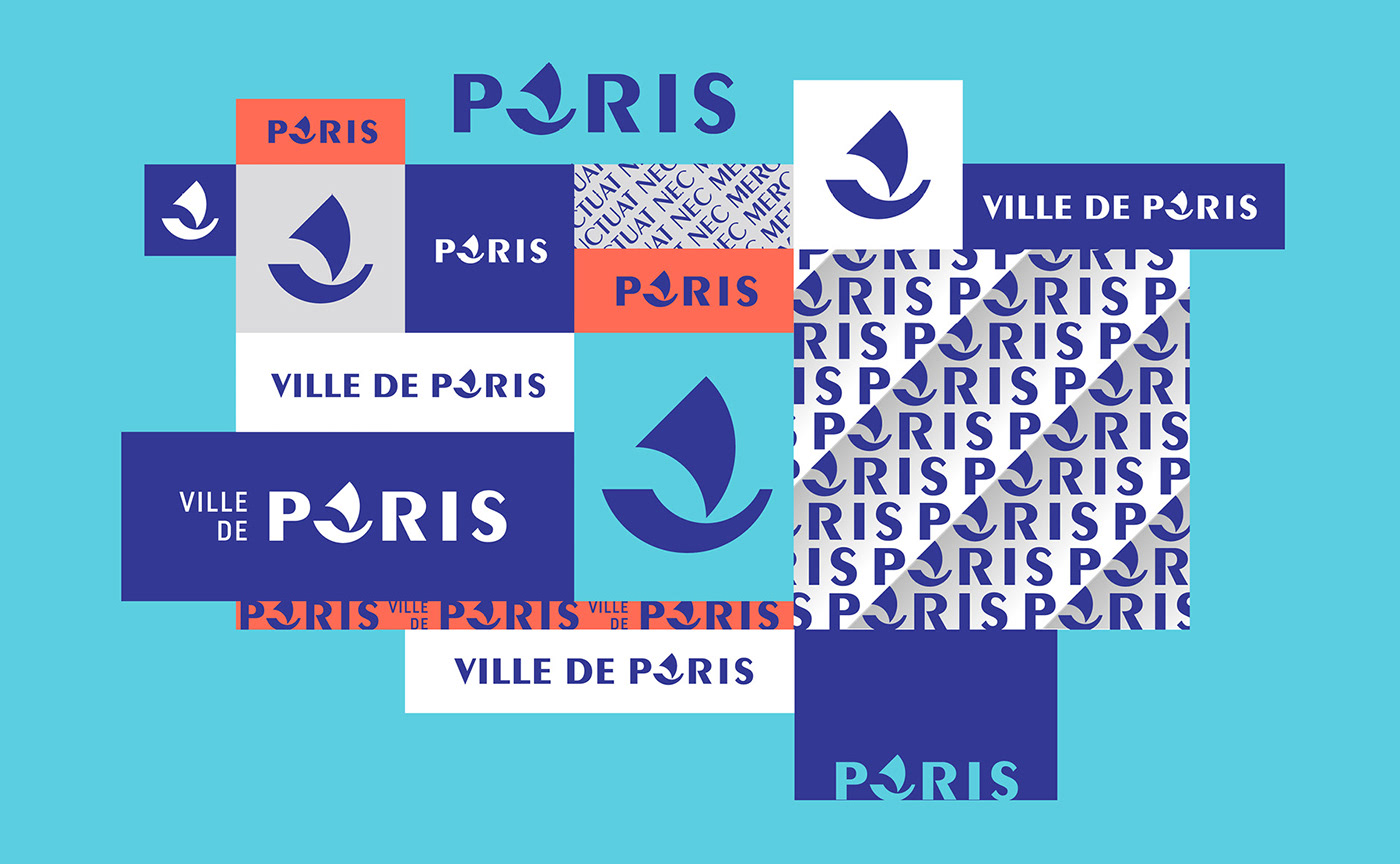
The repetition of the sign reveals the 45° angle. The result is a particularly dynamic composition.
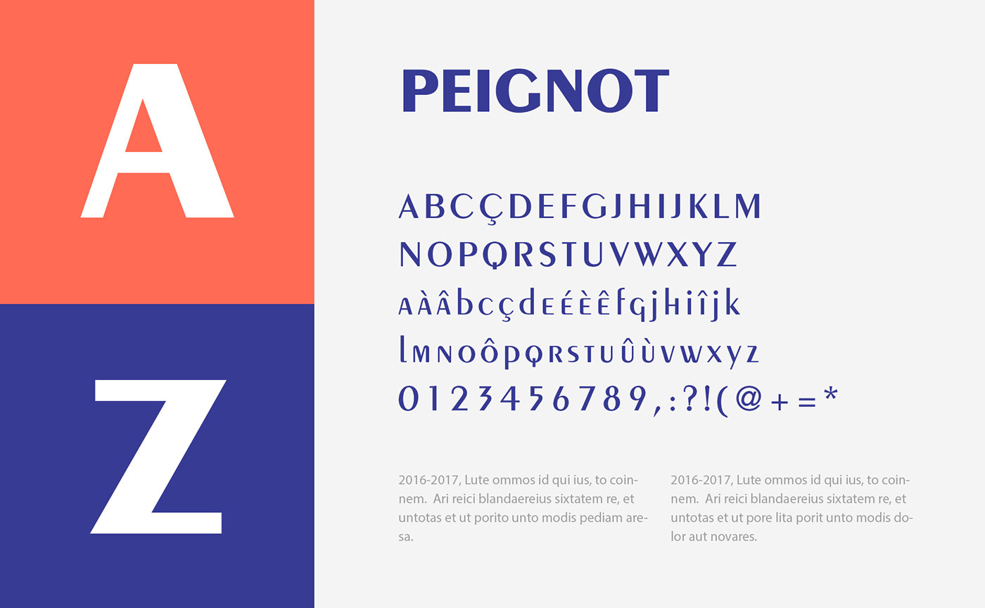
The timeless Peignot
This is the Peignot designed by Cassandre. An emblematic character of the spirit of Paris, since it was designed for the 1937 Universal Exhibition in Paris, and commissioned by Paul Valéry himself, for the inscriptions he wrote for the façade of the Palais de Chaillot, opposite the Eiffel Tower.
In this character, in our opinion, there is all the refinement of Paris expressed in a simple and modest way. Like a typographic oxymoron, combining the Louvre Palace with the Place de la République. And if its institutional character is undeniable, we would have liked to add a more relaxed low-case character to this choice, because as you can see, the Peignot does not have any tiny letters. It is certainly one of the most beautiful designs of capital letters in existence. That's good, since it was a question of working on the visual identity of a capital!
Let us recognize that this typographical choice might seem to go against the current of the frantic use of geometric linear typographies that can be found in almost all visual identities of the last 10 years. On this subject, we are not throwing stones at anyone. But a few grams of full and loose in a world of bullies... it was worth a try!
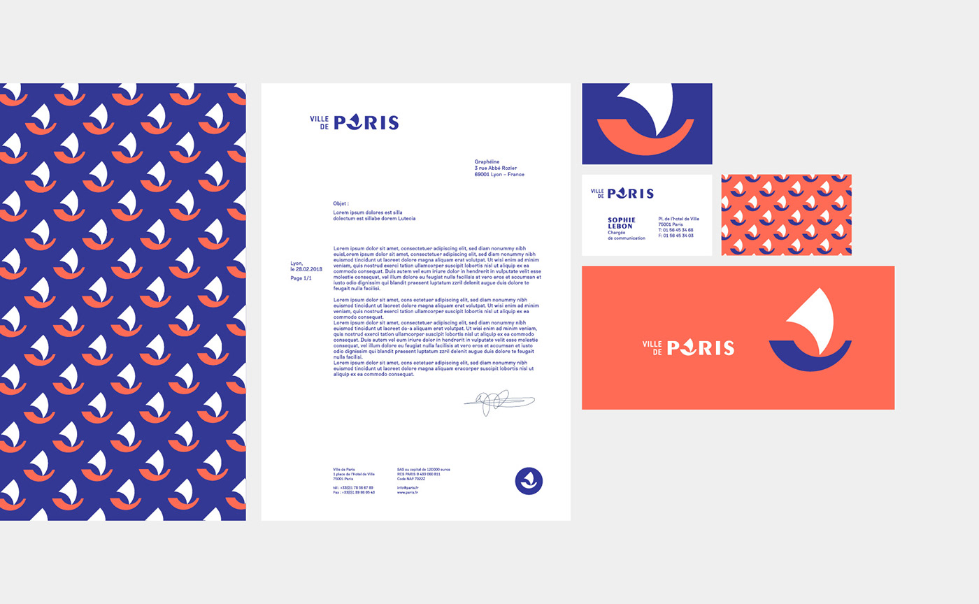
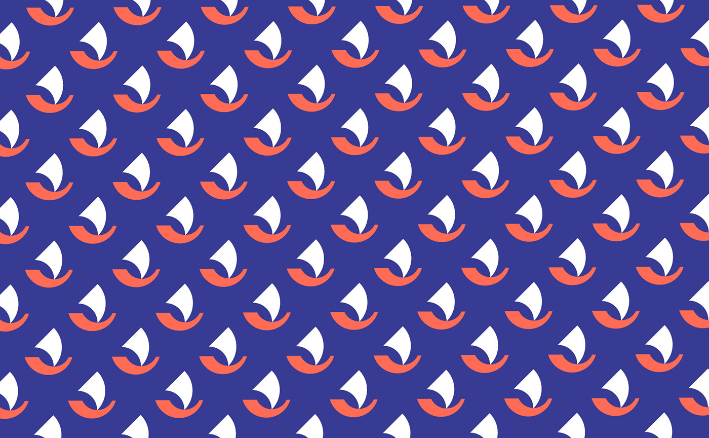
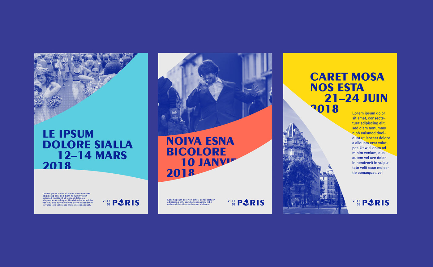
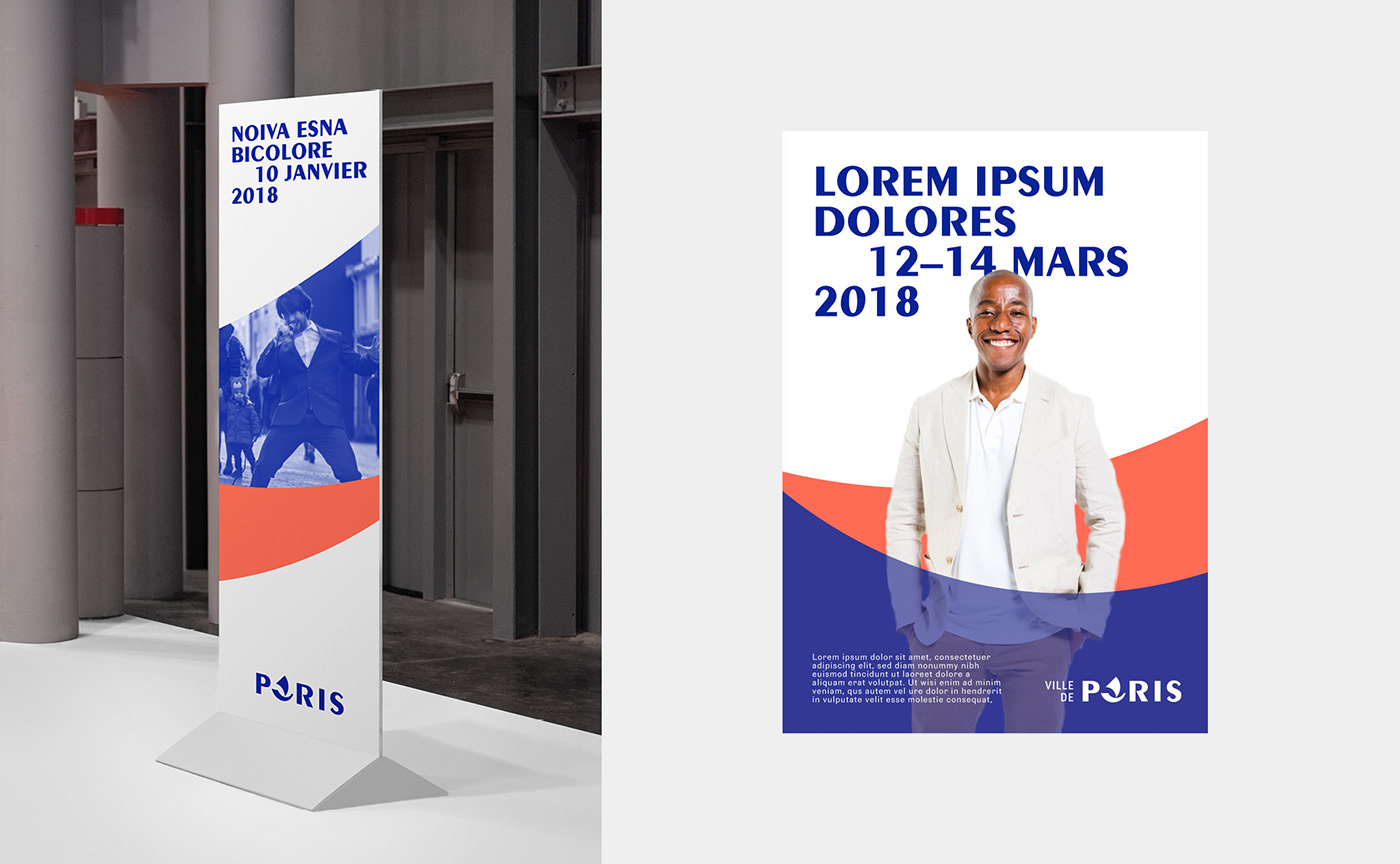
The graphic universe
At this stage of the project, and always in a limited time, it was a question of developing the graphic universe that could accompany this logo. Intuitively, we played with colours and patterns. A game of rhythm, colour inversions, framing... in short, classic and effective recipes.
But we would have appreciated the opportunity to continue our research. Especially by looking for a less orthogonal, less rigid visual universe.... around these curves and waves from the Nave's design. As if Paris was on the waves... on the move... fluctuating nec mergitur!
There you go. This project will remain in our boxes.
In any case, thank you to the City of Paris for giving us the opportunity to work on this subject.

