


Évolution de l’identité visuelle d’Anacours
Une nouvelle image qui souligne les valeurs de la marque
Une nouvelle image qui souligne les valeurs de la marque
Pour la rentrée 2018, Graphéine a accompagné le groupe Anacours, spécialiste du soutien scolaire depuis 1999, dans la refonte de son identité de marque. Cette évolution renforce la visibilité et la lisibilité de la franchise Anacours pour lui permettre de se singulariser dans l’univers très concurrentiel du soutien scolaire.
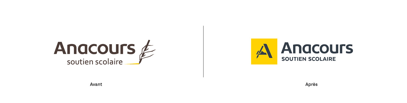
La précédente identité visuelle d’Anacours manquait de cohérence et faisait coexister plusieurs variantes du même logotype. Graphéine les a accompagnés dans la refonte de leur emblème et la création d’une nouvelle charte graphique. L’ensemble de leurs supports de communication a été entièrement repensé.
Anacours rebranding
A new visual identity to underlines the brand's values
For the start of the 2018 school year, Graphéine supported the Anacours group, a specialist in tutoring since 1999, in the redesign of its brand identity. This evolution strengthens the visibility and readability of the Anacours franchise to enable it to stand out in the highly competitive world of tutoring.
Anacours' previous visual identity lacked coherence and made several variants of the same logo coexist. Graphéine supported them in the redesign of their emblem and the creation of a new graphic guidelines. All their communication media have been completely redesigned.

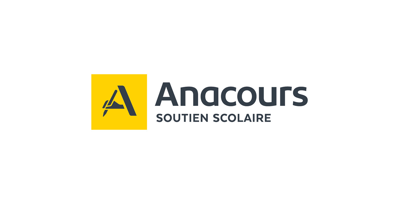
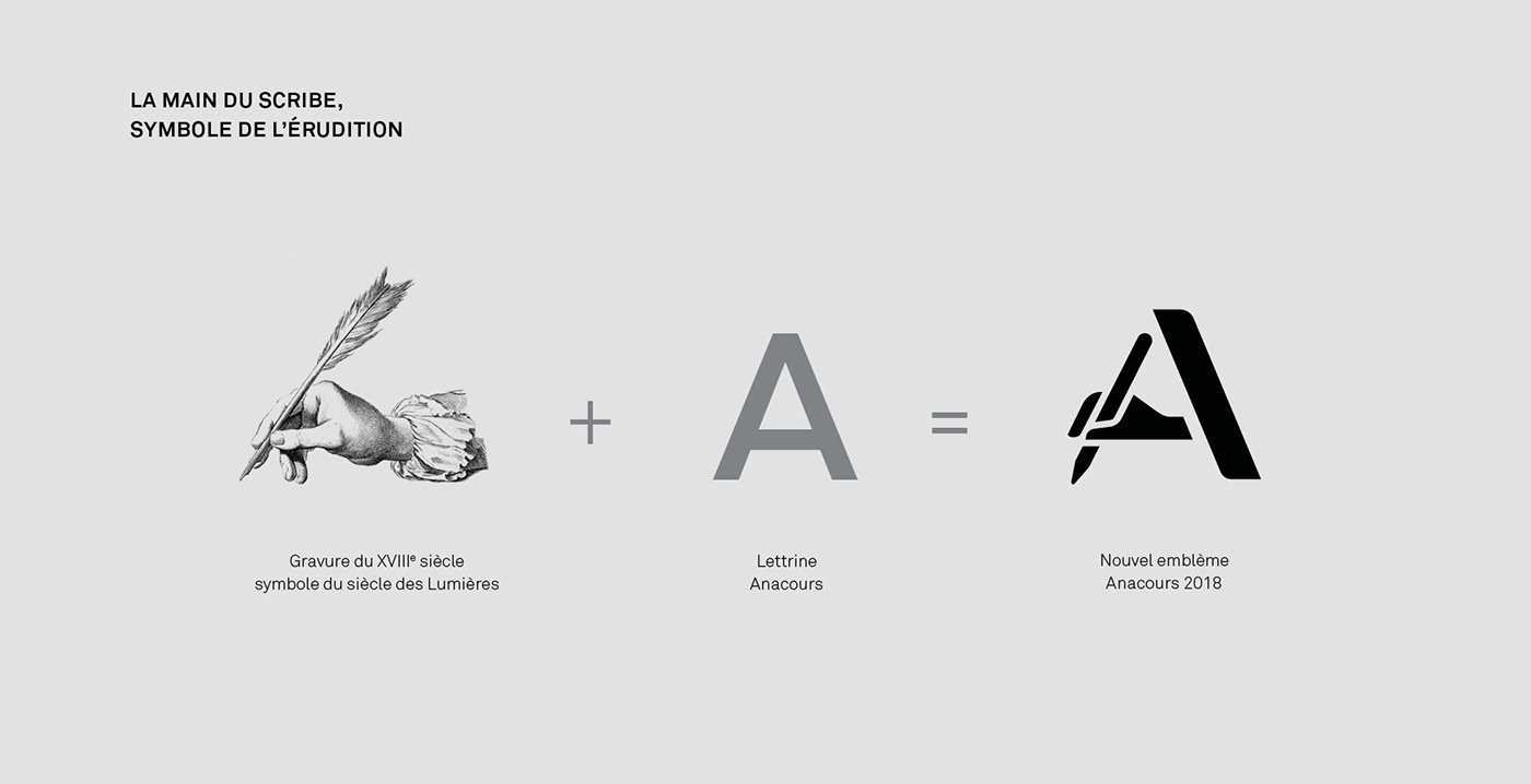
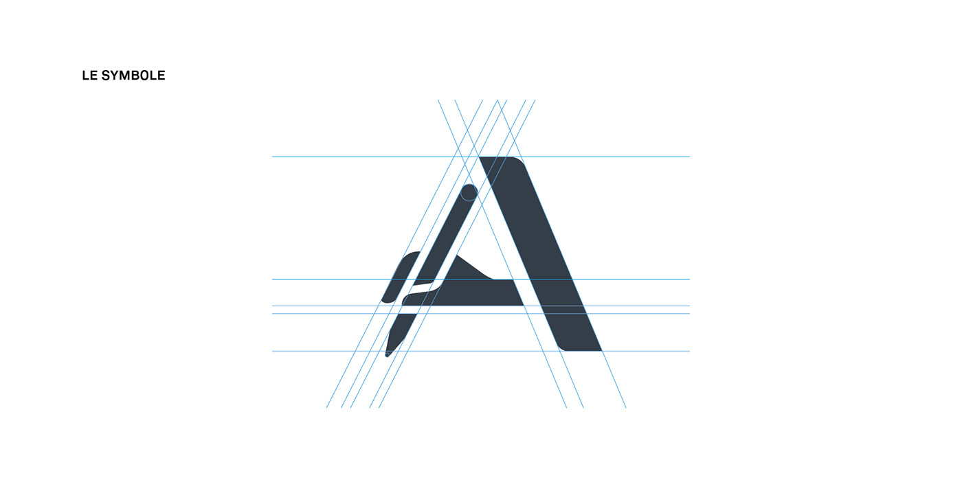
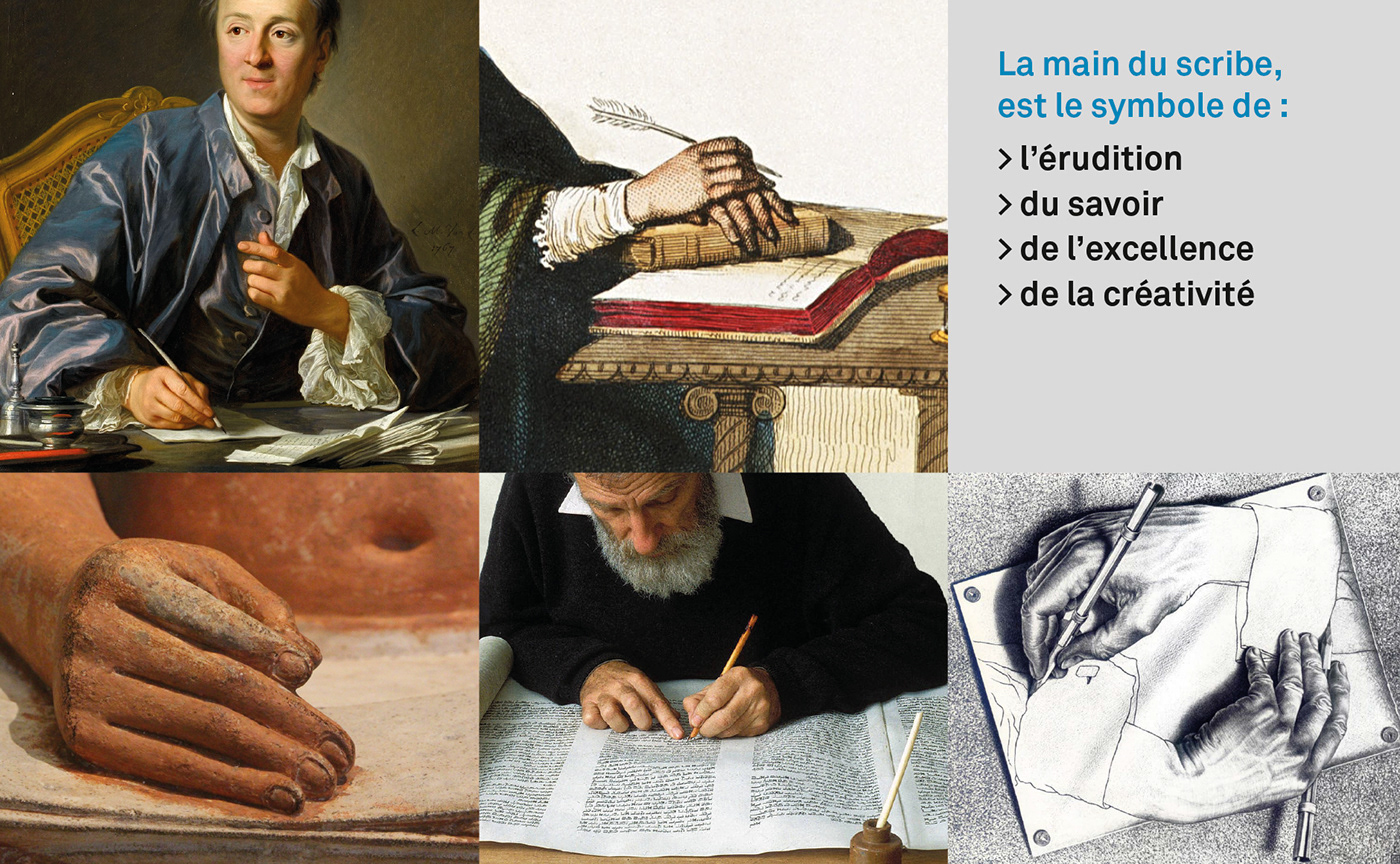

Le nouvel emblème « A scribe » reprend la lettrine du nom de marque autour du symbole de l’écriture. Ce choix permet de revaloriser l’histoire de l’enseigne et fait naître un label Anacours plus fort et plus identifiable. Son dessin était jusqu’alors trop complexe et peu lisible. Nous avons fait le choix de la simplicité et de la modernité pour mettre en place un graphisme plus adapté au digital. Ce nouveau logotype met en exergue les valeurs adoptées par la marque depuis son lancement : confiance, proximité et qualité.
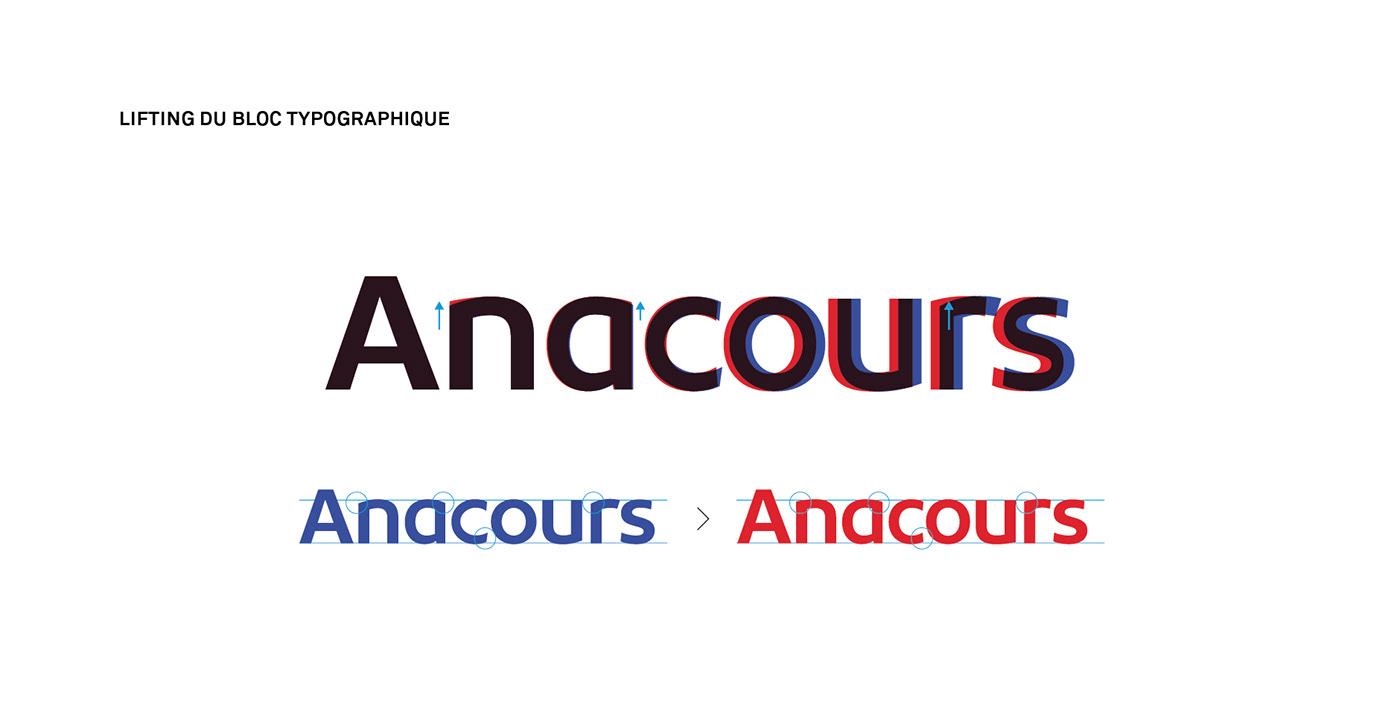
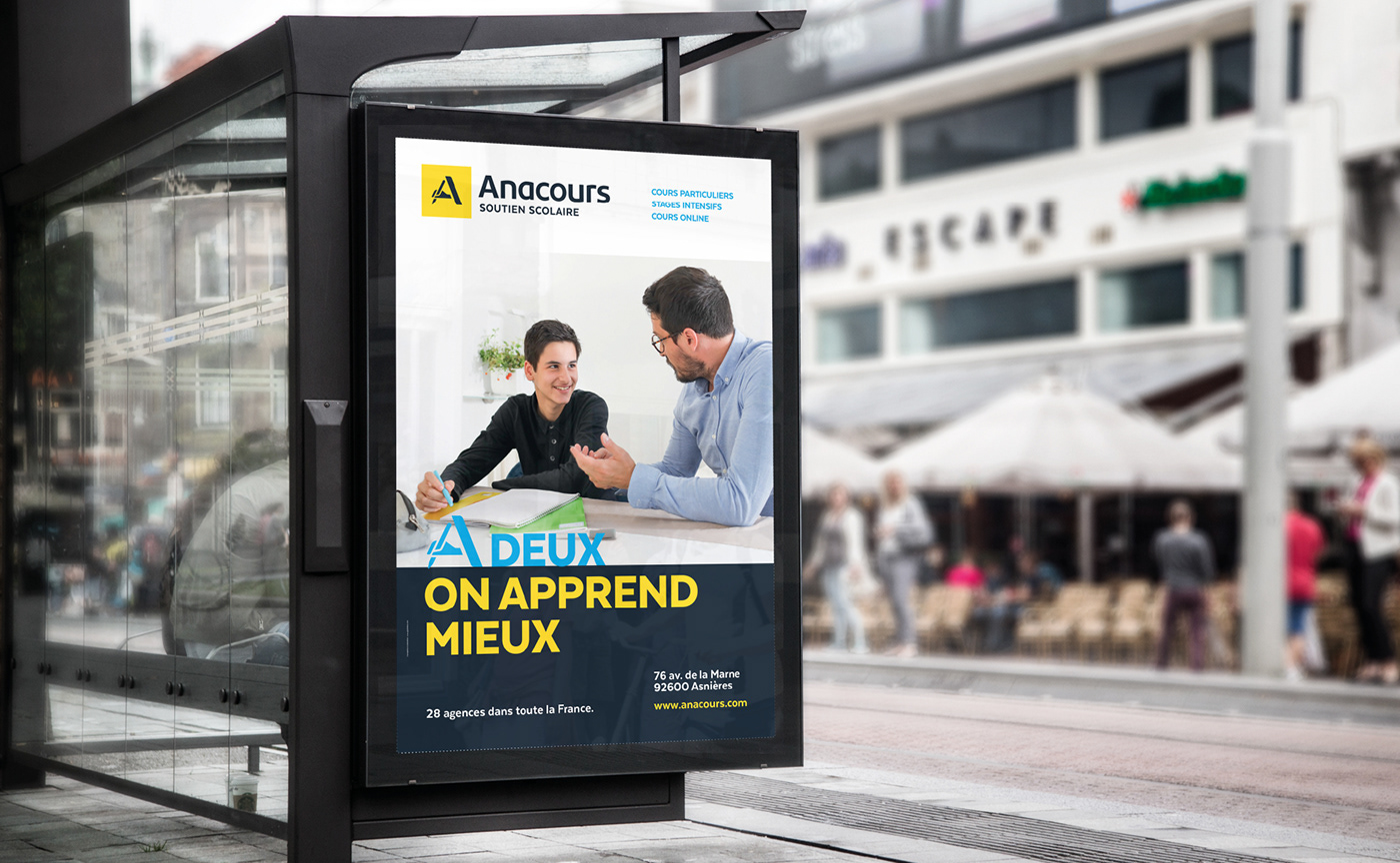
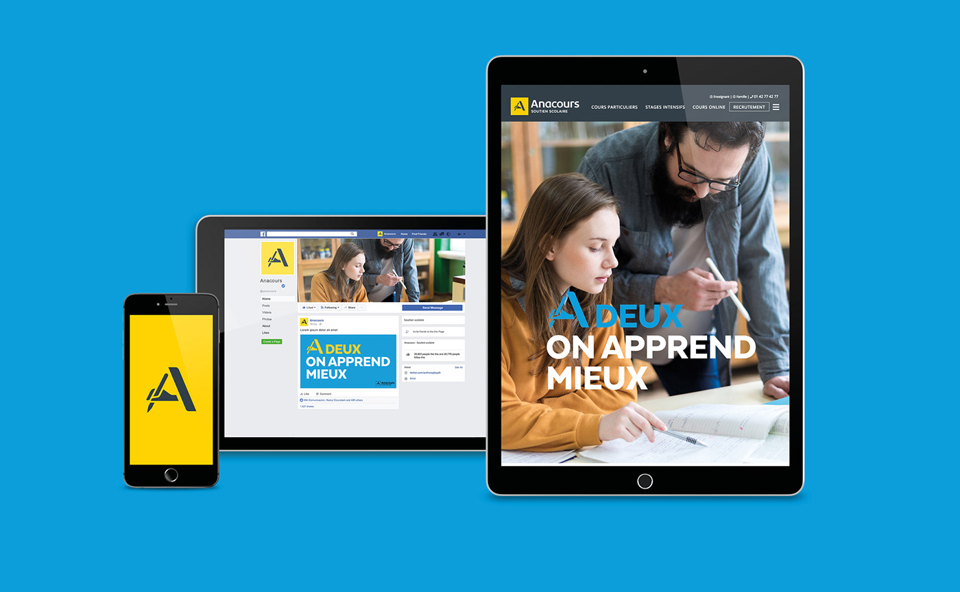
Le bloc typographique a aussi été retravaillé afin d’accorder plus de stabilité et d’horizontalité au logotype. L’identité visuelle se décline en versions verticale et horizontale. Cette flexibilité permet à l’identité visuelle de s’adapter aussi bien au supports imprimés que numériques.
_
The new emblem "A scribe" uses the first letter of the brand name mixed with the symbol of handwriting. This choice makes it possible to enhance the brand's history and creates a stronger and more identifiable Anacours icon. Until then, its design had been too complex and difficult to read. We have chosen simplicity and modernity to set up a graphic design more adapted to digital. This new logo highlights the values adopted by the brand since its launch: trust, proximity and quality.
The wordmark has also been redesigned to give more stability and horizontality to the logo.
The visual identity is available in vertical and horizontal versions. This flexibility allows the visual identity to be adapted to both printed and digital media.


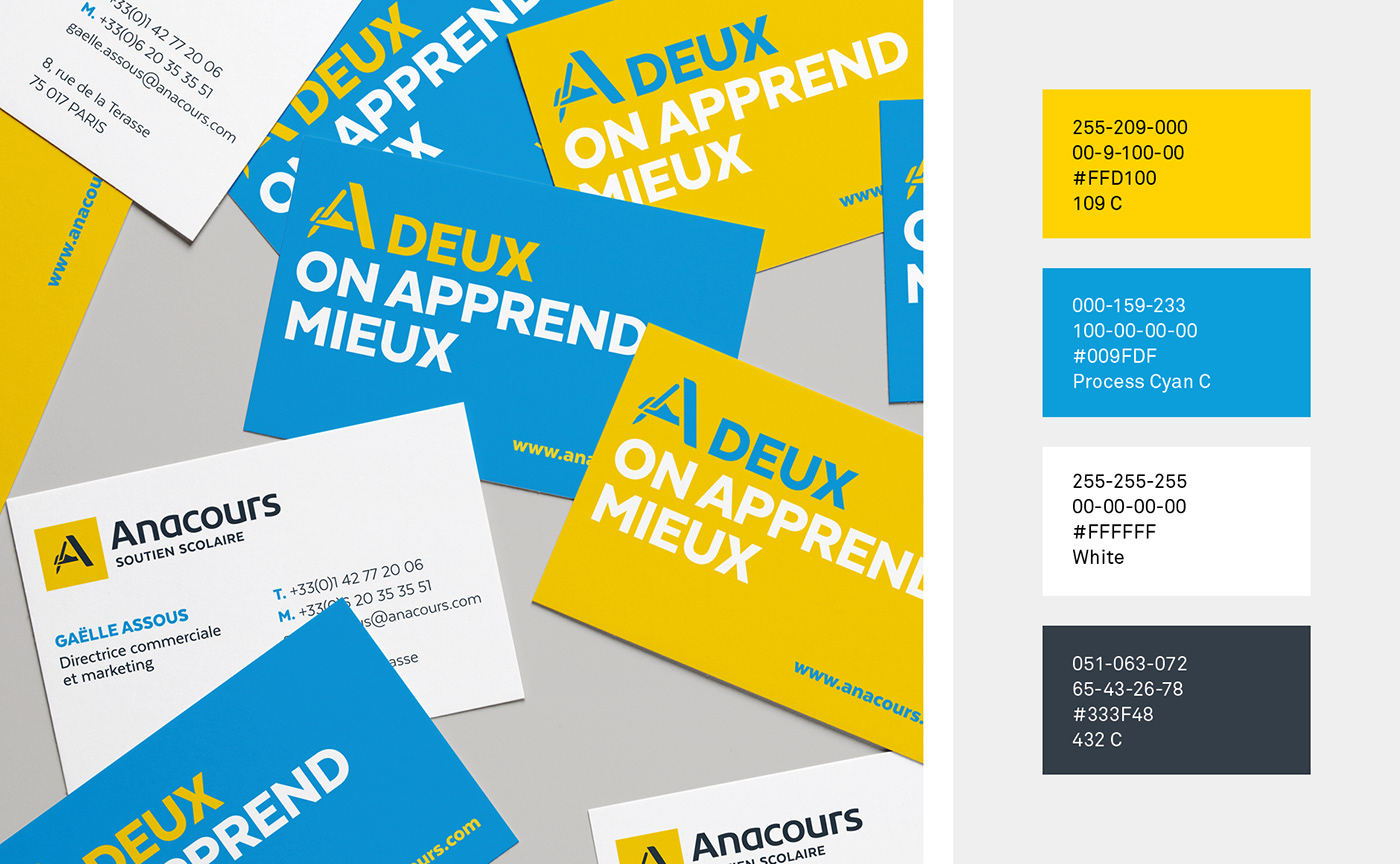
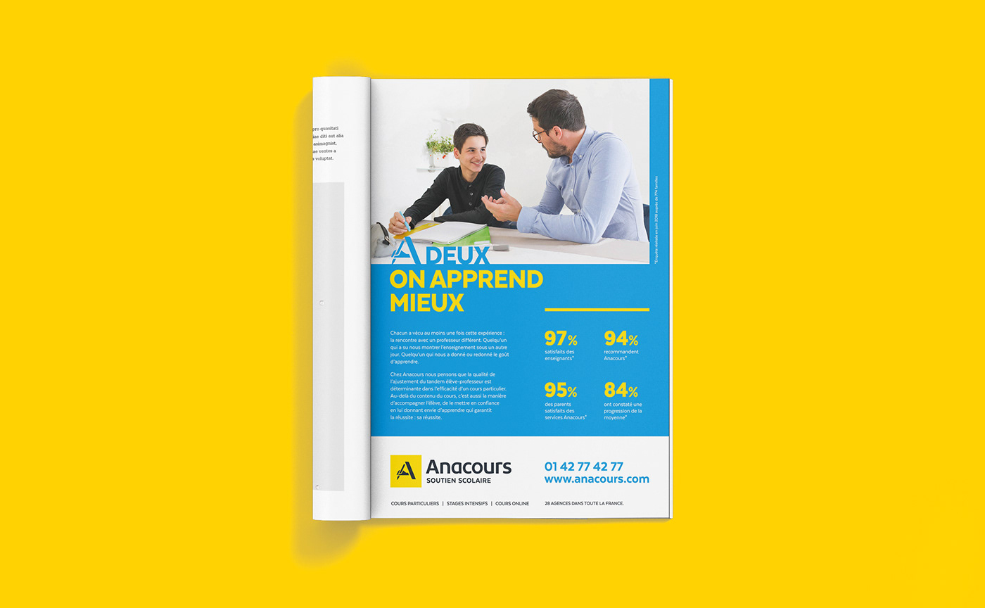
La signature « À deux on apprend mieux » complète le storytelling de marque autour d’un soutien scolaire sur mesure qui privilégie la relation élève/enseignant. La composition typographique du slogan intègre le nouvel emblème. Cette astuce visuelle renforce la cohérence de marque et permettra d’accroître la notoriété du logo. Un nouveau principe iconographie vient illustrer l’idée de « tandem gagnant » et se focalise sur l’échange entre élève et professeur comme clef du succès.
Le jaune emblématique de la marque a été conservé afin de maintenir une cohérence à l’ensemble des franchises du territoire. Nous avons enrichit la palette chromatique Anacours d’un bleu cyan qui affirme une identité plus « pop » et visuellement moins institutionnel.
_
The signature "À deux on apprend mieux" (Two people learn better) completes the brand storytelling with tailor-made tutoring that emphasizes the student/teacher relationship. The typographical composition of the slogan incorporates the new emblem. This visual trick enhances brand consistency and will increase the awareness of the logo. A new iconography principle illustrates the idea of a "winning tandem" and focuses on the exchange between student and teacher as the key to success.
The emblematic yellow of the brand has been retained in order to maintain consistency across all franchises in the territory. We have enriched the Anacours color palette with a cyan blue that asserts a more "pop" and visually less institutional identity.


Credits:
Creative & Art direction: Jérémie Fesson
Graphic design: Maxime Saint Etienne, Ajitesh Lohkande
Project manager: Leslie Darné
Project manager: Leslie Darné


