

[EN] In 2015, we came up with the visual identity for the Saint-Étienne Opera. The logotype was really simple with its shape mirroring the building’s architecture. Smiles were part of the story too…
[FR] En 2015, nous concevions l'identité visuelle de l'Opéra de Saint-Étienne. Un logotype, extrêmement simple, dont la forme est directement issue de l'architecture du bâtiment. C'était également une histoire de sourires...
> If you’d like to take a look at the presentation of this visual identity:
https://www.behance.net/gallery/26146543/Saint-Etienne-Opera-House-Brand-design
https://www.behance.net/gallery/26146543/Saint-Etienne-Opera-House-Brand-design
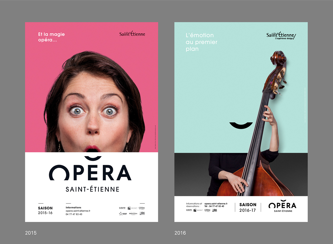
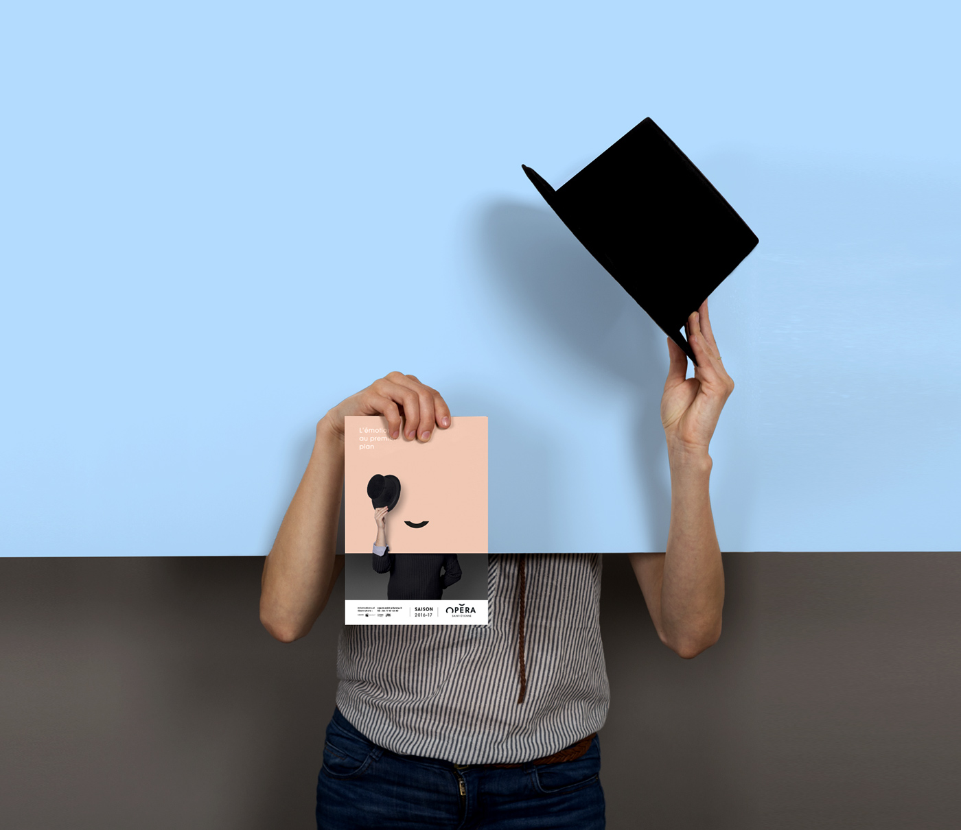
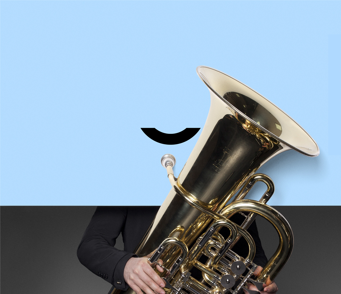
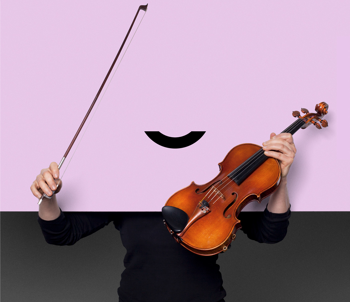
[EN] In 2015, we decided to present a collection of portraits in which people were ‘wowed’. These portraits were of the technical and administrative staff from the Opera itself who were willing to play ball. For the 2016 season, we’ve chosen to put the orchestra’s musicians slap bang in the foreground.
In-keeping with the minimalist vision, the smile continues to play a central role in the visual identity. This time, however, faces make way for instruments to perform a symphony of colour. Emotion then steps into the foreground…
In-keeping with the minimalist vision, the smile continues to play a central role in the visual identity. This time, however, faces make way for instruments to perform a symphony of colour. Emotion then steps into the foreground…
[FR] En 2015, nous avions choisi de présenter une collection de portraits émerveillés. C'était les personnels technique et administratif qui s'étaient prêtés au jeu. Pour la saison 2016, nous avons choisi de mettre en avant les musiciens de l'orchestre.
Toujours dans une optique minimaliste, le sourire reste au centre de l'identité visuelle. Cette fois-ci les visages laissent place aux instruments dans une symphonie de couleurs. L'émotion passe au premier plan...
Toujours dans une optique minimaliste, le sourire reste au centre de l'identité visuelle. Cette fois-ci les visages laissent place aux instruments dans une symphonie de couleurs. L'émotion passe au premier plan...


[EN] Some pictures of the photo shoot session. We’re working once again with Lyon-based photographer Ghislain Mirat, and we asked willing musicians to come by and have their photo taken.
[FR] Quelques images de la séance photo. C'est toujours avec Ghislain Mirat, photographe lyonnais, que nous avons travaillé. Sur la base du volontariat, les musiciens étaient invités à venir se faire prendre en photo.
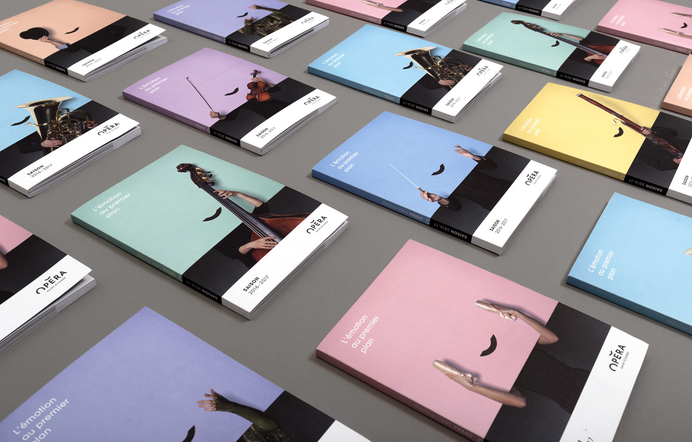
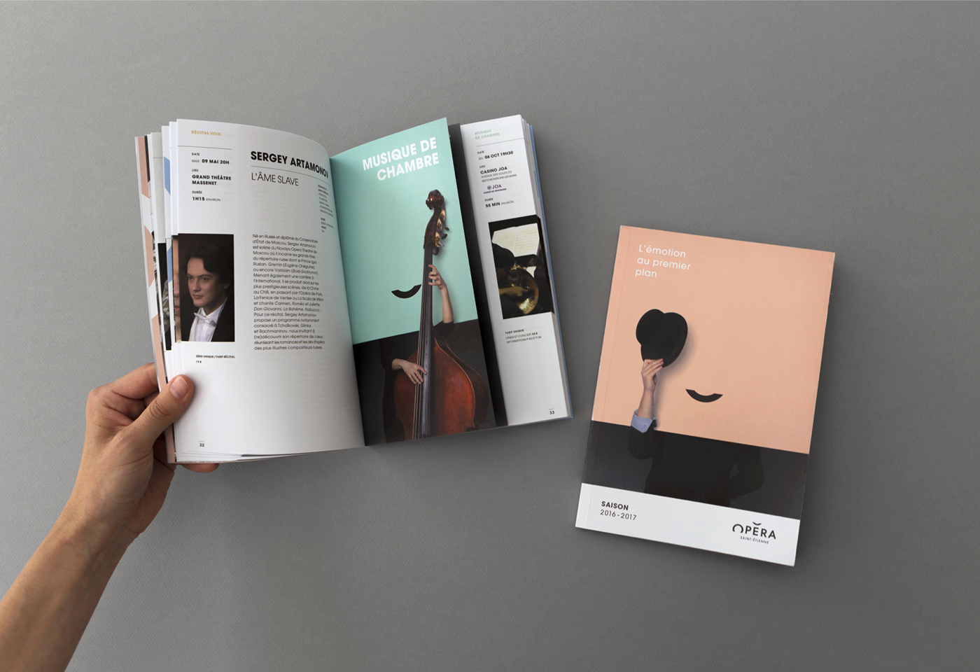
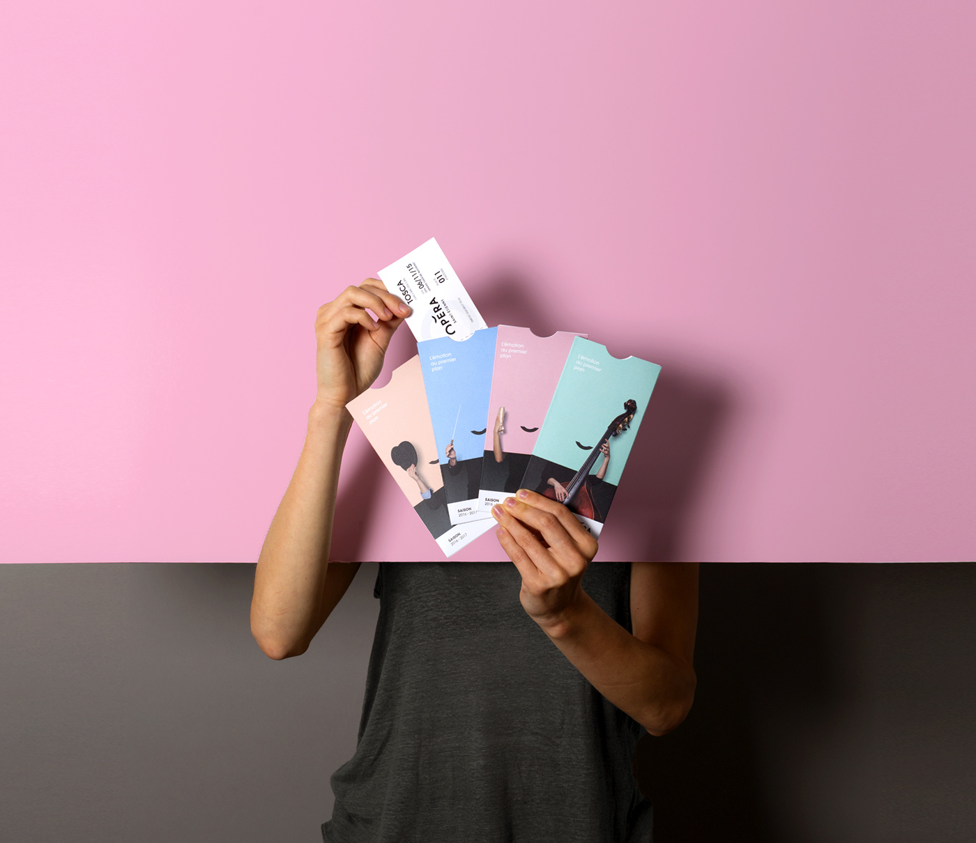
[EN] Seasonal brochure edited with 8 different covers.
[FR] Brochure de saison éditée avec 8 couvertures différentes.

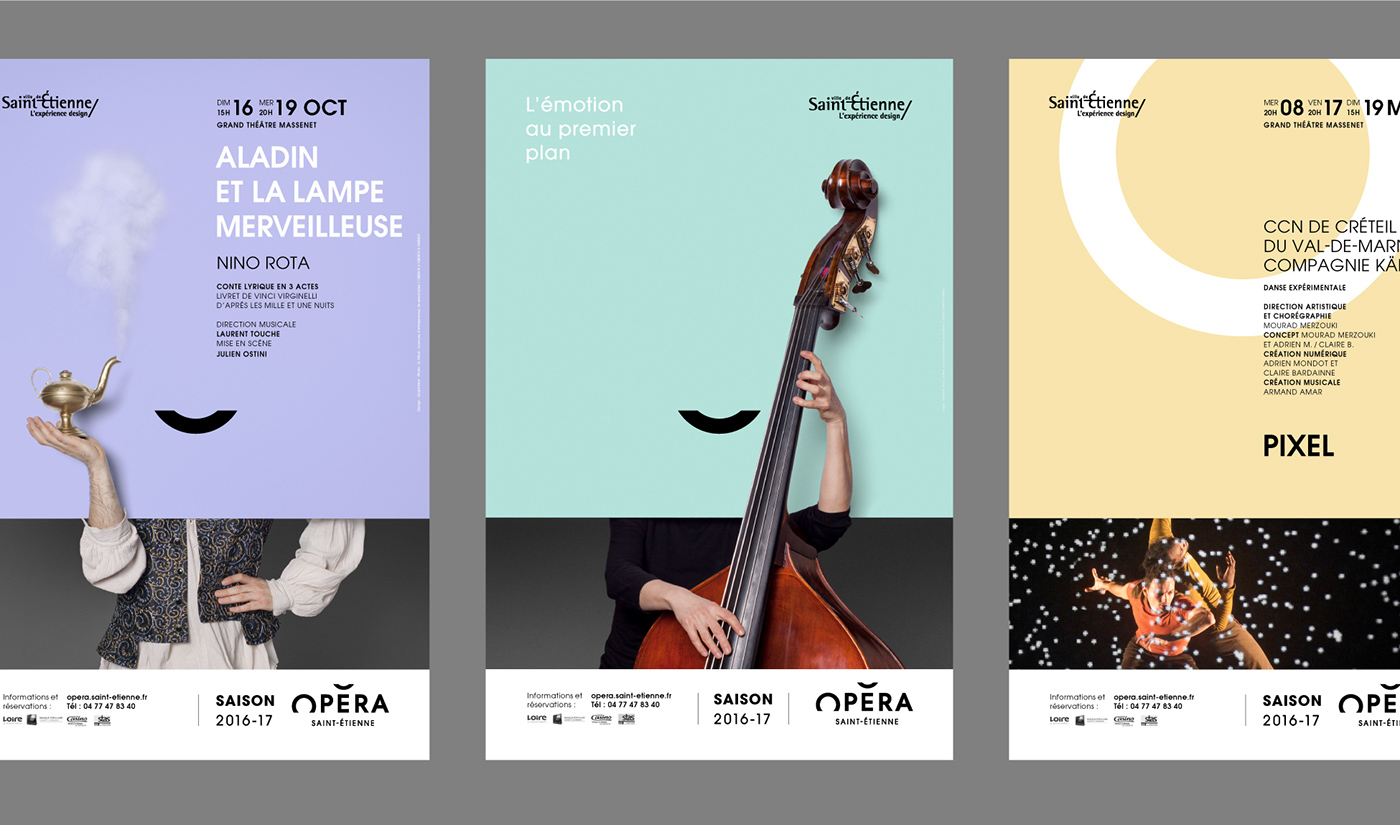
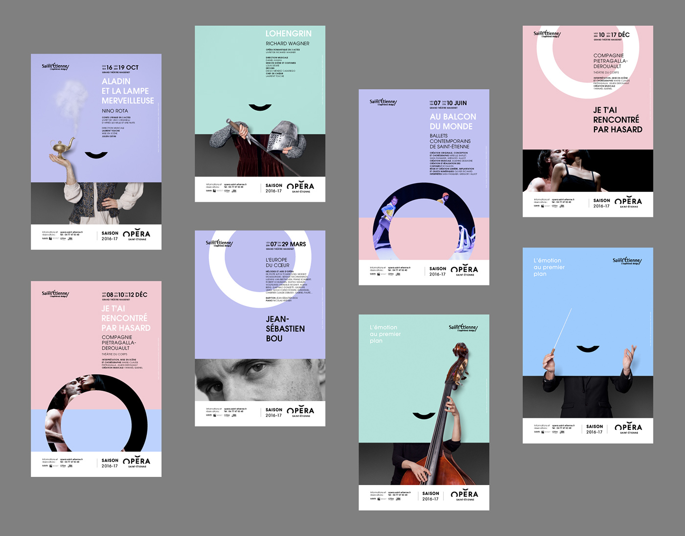

[EN] To stretch the visual concept even further, we created a series of posters for the Opera’s main performances. What we wanted to do was connect the performance to a costume.
[FR] Pour prolonger le concept visuel, nous avons conçu une série d'affiches pour les principales créations de l'Opéra. L'enjeu était de contextualiser l'œuvre par un costume.


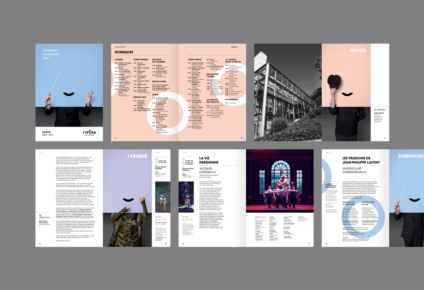
[EN] The seasonal brochure layout.
In the same vein as last season, the yearly brochure is printed with 8 different covers, the idea being to continue to create a lively and diverse identity. Like the previous edition, the brochure is made up of chapter openings which serve as a bookmark. They are in the form of small booklets, 4cm narrower, with a series of portraits. Because of their shortened width, you can read the programme and access each chapter more easily.
In the same vein as last season, the yearly brochure is printed with 8 different covers, the idea being to continue to create a lively and diverse identity. Like the previous edition, the brochure is made up of chapter openings which serve as a bookmark. They are in the form of small booklets, 4cm narrower, with a series of portraits. Because of their shortened width, you can read the programme and access each chapter more easily.
[FR] La maquette de la brochure de saison.
Toujours dans la continuité de l'édition précédente, la brochure s'organise autour d'entrées de chapitres faisant office d'intercalaire. Il s'agit simplement de petits livrets moins larges de 4 cm, comprenant une série de portraits. Du fait de leur largeur raccourcie, ils facilitent la lecture du programme en permettant d'accéder plus facilement au chapitre souhaité.


Credits:
Creative direction: Mathias Rabiot
Art direction: Adrienn Nagy
Photography: Ghislain Mirat
Graphic design: Jonas Barry
Project management: Céline Boursin


