Sanctuary
A time capsule on the moon
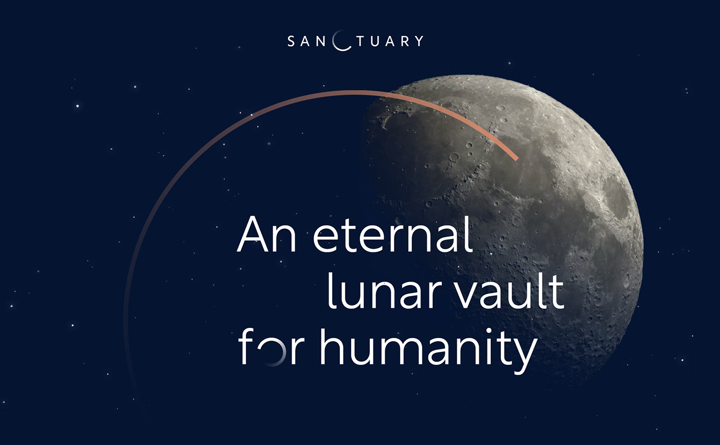
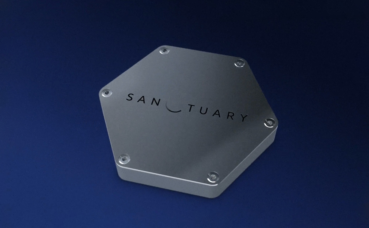
Sanctuary is a time capsule that will contain and preserve a collection of ultra-hard sapphire disks engraved with billions of pixels. Together, they will carry through time a precious cargo of human knowledge from the arts and sciences. Sanctuary's mission is to describe who we are, what we know and what we do.
This time capsule will be placed on the lunar surface as part of Nasa's Artemis program. It will remain there for millions of years to come. A unique philosophical and anthropological journey into eternity, an unprecedented opportunity to protect and pass on our intangible heritage to future generations.
"Sanctuary" is the realization of the dream of Benoit Faiveley, creator of the project, who took on board an entire team of experts for this extraordinary mission, going so far as to convince NASA to transport the capsule to the moon.
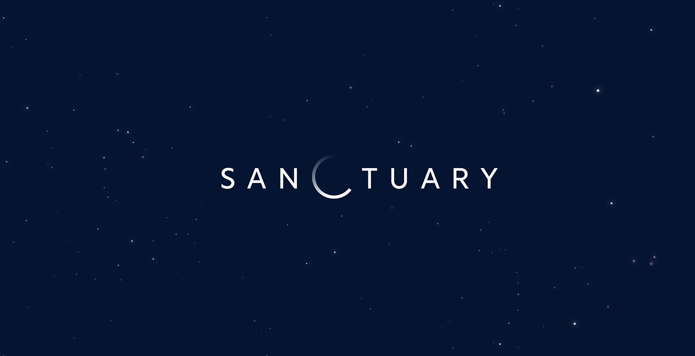
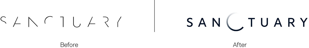
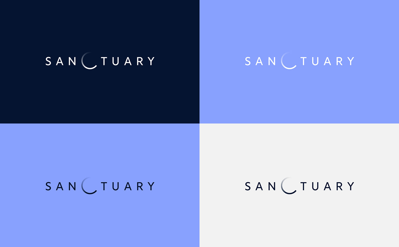
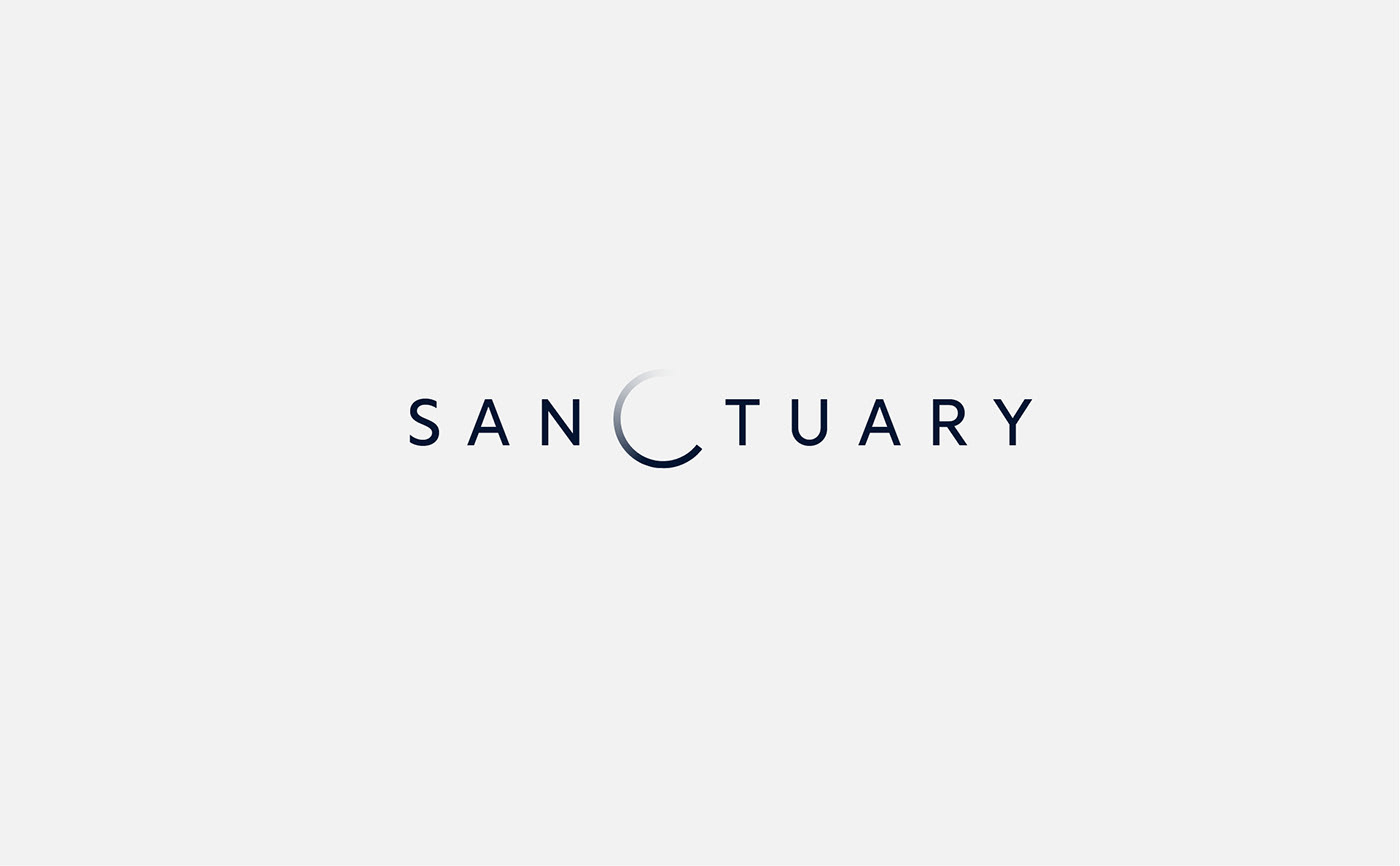
Graphéine was called in to develop the project's logo. The previous, very futuristic version was not sufficiently legible. We opted for a minimalist logo, taking advantage of the central position of the letter C, which becomes a lunar eclipse. The circular shape also evokes the passing of time, reflecting the project's philosophical and memorial dimensions.
The logo will be engraved on the time capsule that is due to be placed on the moon as part of NASA's Artemis space program, whose aim is to bring the Earth's past to life.

Concept
"Sanctuary" will take with it the traces and memories of our era, entrusting them to the eternal silence of the Moon. On the face of it, this is an act of preservation, a reflection of our deep desire to preserve a legacy for future generations. "Sanctuary" also raises the question of the fragility of life on earth and the transience of human life. It is a mirror that reflects back to us our own reflections on the nature of time, memory and the meaning of our existence.
By choosing this circular shape, in perpetual motion, we have materialized the idea of infinity and perpetual motion. The symbol can be seen as a form of "vanity", an allegory of the passage of time and the fragility of life. It is also reminiscent of "Memento mori" (Remember that you will die), a reminder of the ephemeral condition of existence.

Typography
The typeface chosen was Rustica from the TipoType foundry. This typeface is based on a humanist design, with the added precision of geometric linéales. It's a typeface halfway between yesterday and tomorrow. We simply programmed the typeface using the possibilities of Open type to create a sequence of alternative characters for the letters "O" and "o". A simple script is used to scroll through these alternative characters, creating this effect of movement.