L'échoppe de Gustave
Visual identity for a motorway restaurant
L'Échoppe de Gustave has taken up residence in an old farmhouse converted into a service area on the 79 motorway near Moulins (France). This imposing building, which has been completely renovated, houses a shop selling regional products, a snack bar and a restaurant serving regional specialities. Among other things, you can try the Piquenchâgne, a typical Bourbonnais pear tart.
Aliaé (APRR Group) commissioned us to help create the name, alongside Sylvain Perillat Architecte, Citti (interior architecture), BrandValue (positioning) and Eres (catering expertise). We then designed the visual identity and directional signage for the service area.
The overall challenge was to come up with a non-standardised motorway restaurant offering that was rooted in its local area (the Bourbonnais region), with a contemporary local feel and a generous sense of welcome (aimed at the trucking public).
Here is a summary of the work done on this project.


Naming
The name "Échoppe de Gustave", the result of a collective creation, is particularly relevant to the strategic challenges of the project. The word "échoppe" evokes a traditional, artisanal image, suggesting a restaurant on a human scale that showcases quality products and an authentic culinary experience. It aims to attract customers looking for a gourmet break in a more convivial and traditional setting than traditional motorway restaurants.
The use of the first name 'Gustave' gives the brand a warm, personal touch. On the one hand, the root 'Gusta' evokes the french world "gustatory", while on the other, the first name conjures up images of yesteryear, the land and old stoves. The use of a first name creates an emotional connection with customers by offering a unique culinary experience, associated with a real person.
The whole name evokes a family atmosphere, attentive service and a generous restaurant offering.

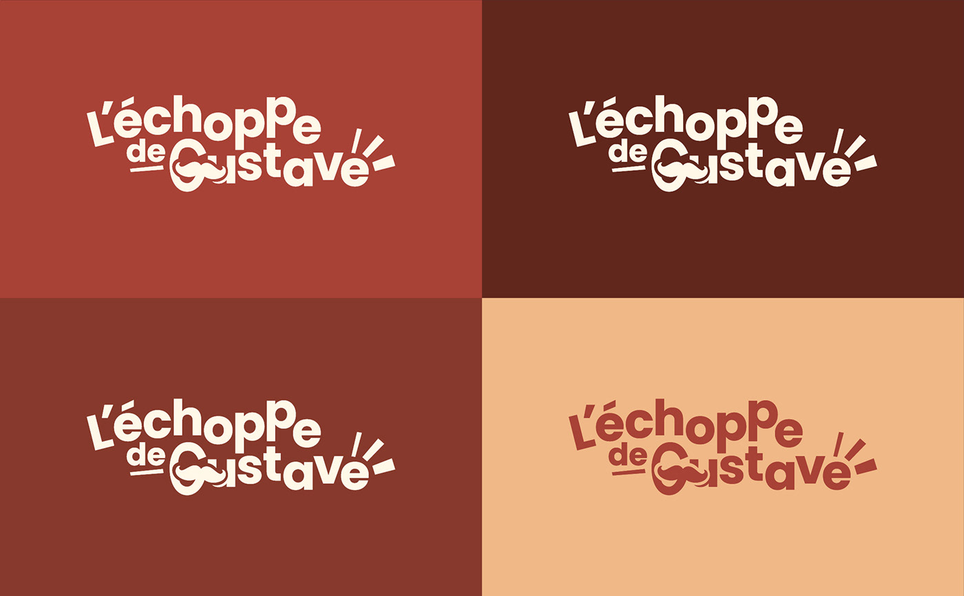


Logotype
Gustave could be the embodiment of a certain Gallic spirit. We imagine him to be strong of character, a bon vivant, with a touch of mischief and a contagious bonhomie. The logo had to reflect this energy, simplicity and generosity.
The symbolism of the moustache was chosen to convey the authenticity and non-conformity of this establishment. It expresses a certain independence and rebellious spirit, evoking the idea of an old-fashioned character, frank and direct. By cleverly slipping into the letter G, like an illustrated initials, it became the central ingredient of the brand. At the same time, the typographic composition will reflect the lively, cheerful atmosphere of the establishment.


signage


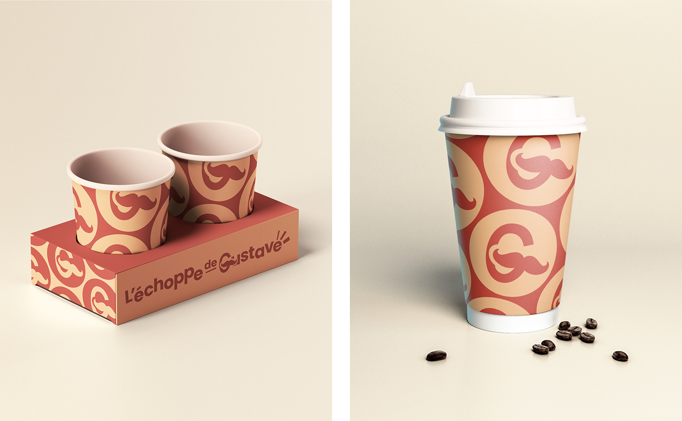
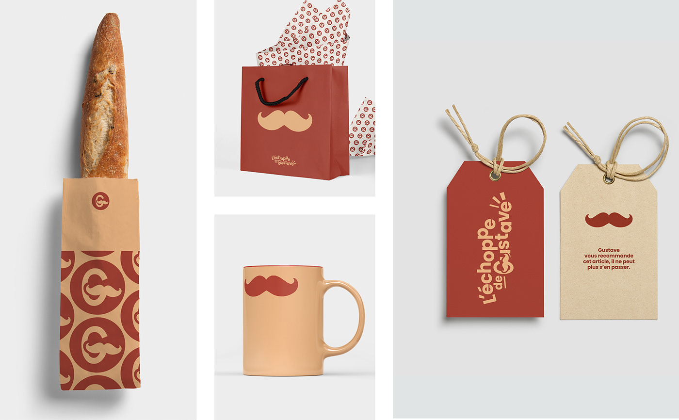
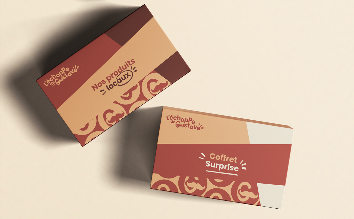
Packaging & goodies