Sonoschool
Explore the invisible
Sonoschool's objective is to train and support doctors & health professionals in the practice of ultrasound in order to extend their clinical examinations and improve their diagnoses.
Although everyone is familiar with this medical imaging technology, mainly for pregnancy examinations, ultrasound can in fact be used to examine many areas of the body. The miniaturisation and democratisation of these devices invite Sonoschool to consider the ultrasound scanner as the stethoscope of the 21st century, which should help doctors to improve the reliability of their diagnoses and the care of their patients.
By creating accessible training courses, Sonochool's ambition is to support the development of local ultrasound and respond to the shortage of ultrasound technicians in isolated areas on the one hand, while at the same time helping to relieve congestion in emergency rooms on the other.
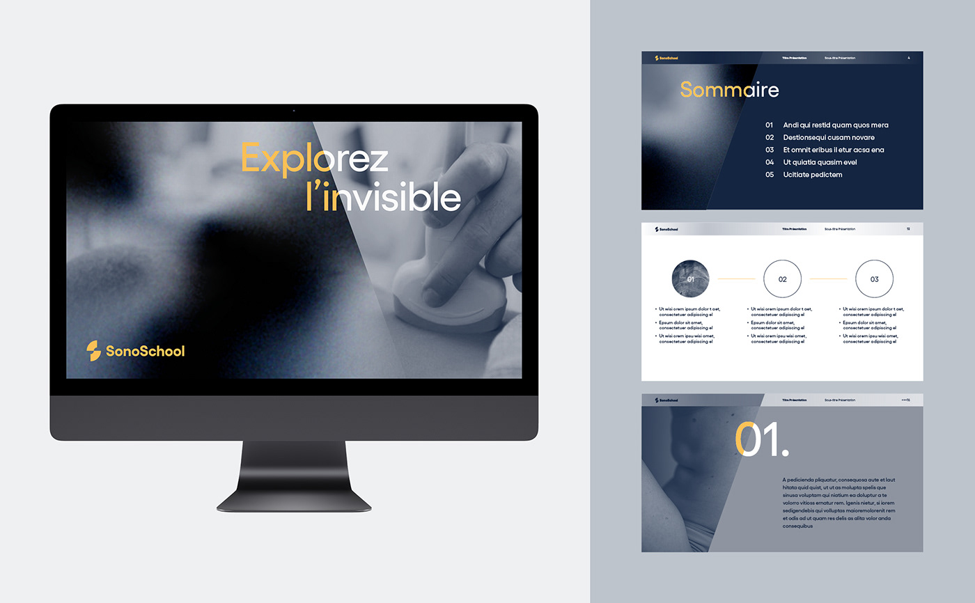
We assisted them in the strategic positioning and creation of their brand identity.


Concept
S for SonoSchool. The name SonoSchool has a remarkable sound. The two capitalized S's allow the word SonoSchool to be sequenced phonetically as well as visually. We therefore thought it would be interesting to use the initials within the logo, while avoiding bad associations (SS).
Image of the ultrasound. The typical "coffee filter" shape of the ultrasound is the reference symbol par excellence.
An abstract S. The logo is made up of two "coffee filters", directly evoking the world of ultrasound. These two shapes together also symbolise the meeting, the exchange. The two quarter circles bring movement and dynamism.


Colors
The Yellow/Blue duo stands out from the usual colour codes of the medical world, considered too cold. Yellow brings warmth and modernity, while dark blue confers elegance and seriousness.
These colours can also evoke the world of ultrasound, by their strong visual contrast: Light/Dark; Exterior/Interior.


Iconography
In order to illustrate the trainings, we imagined a series of photos to illustrate the different parts of the body. The first objective was to translate in a sensitive way this very intimate relationship with the body during the ultrasound examination.
By taking this very close-up view, the patient becomes almost "touchable". This effect of proximity also aims to diminish the feeling of physical distance present in the context of online training.