Proposal of a new logo for Franch Athletic Federation / 2018 - not retained
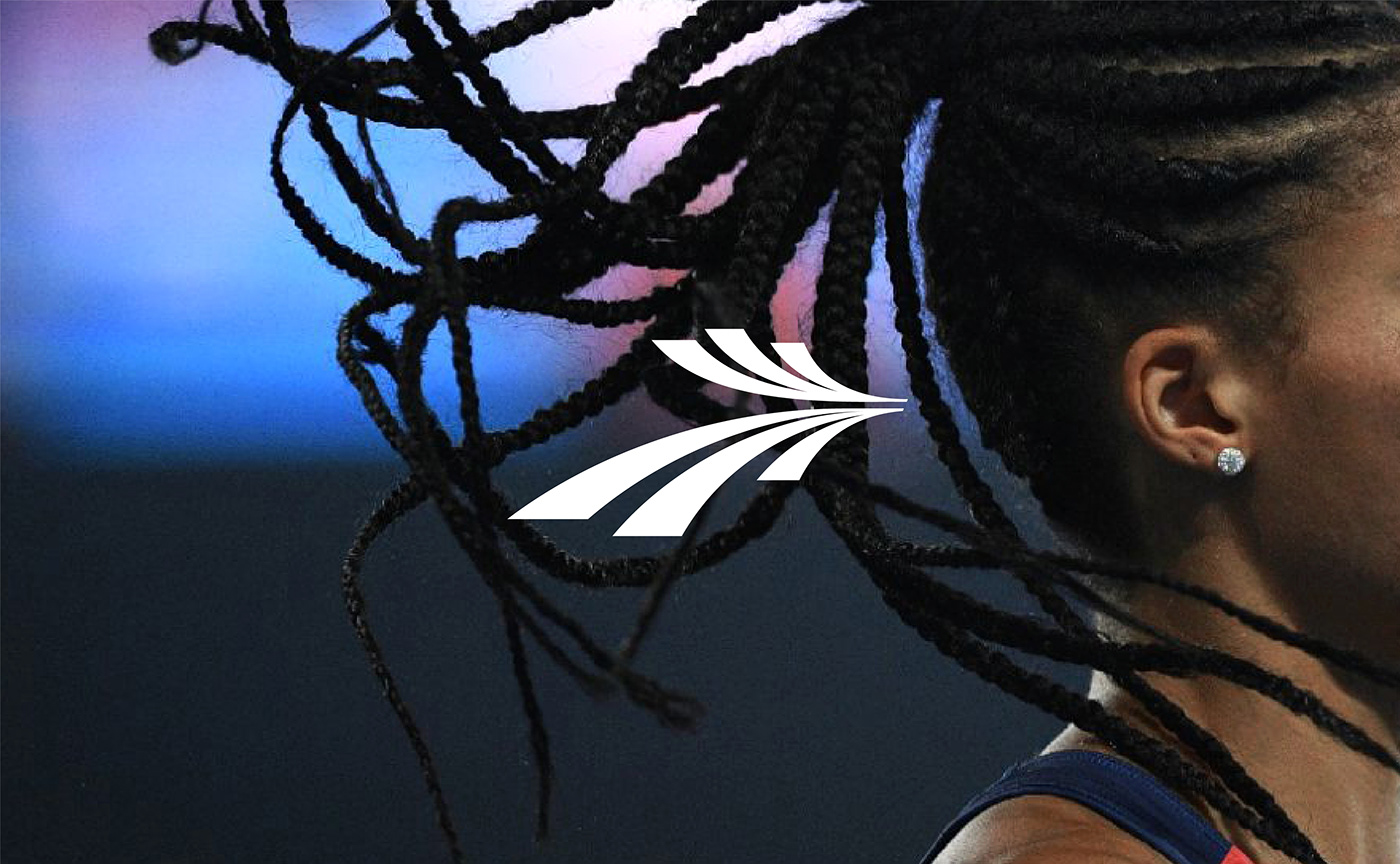
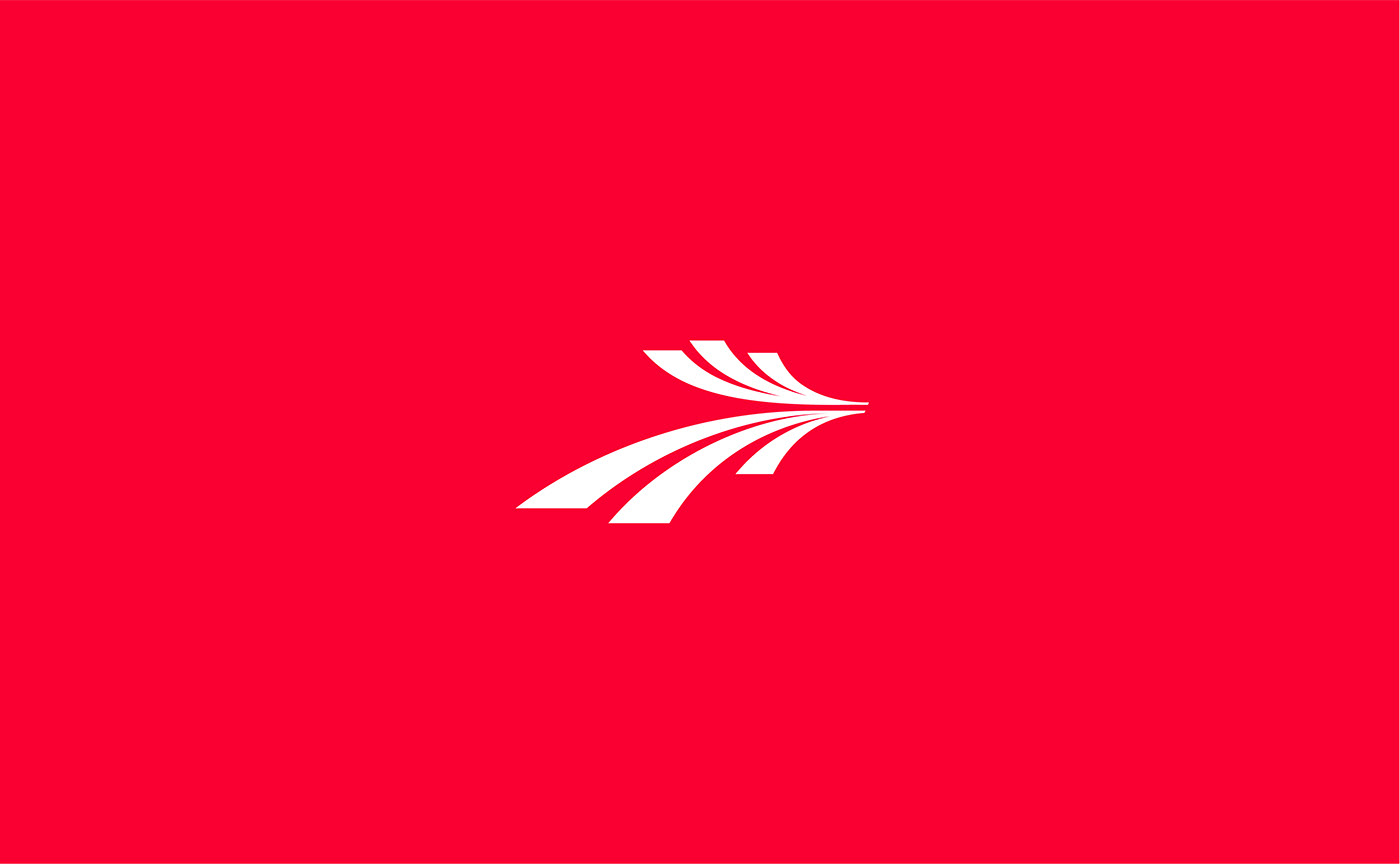
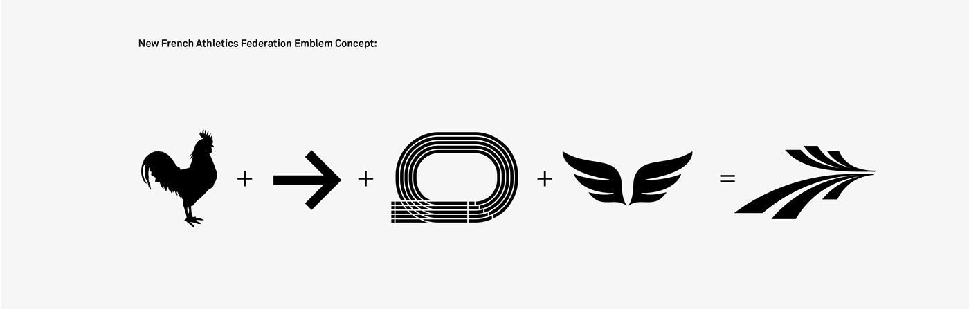
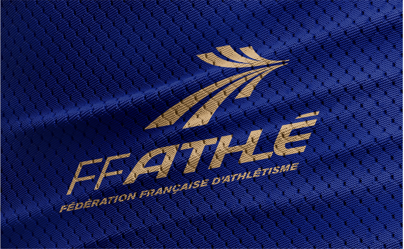
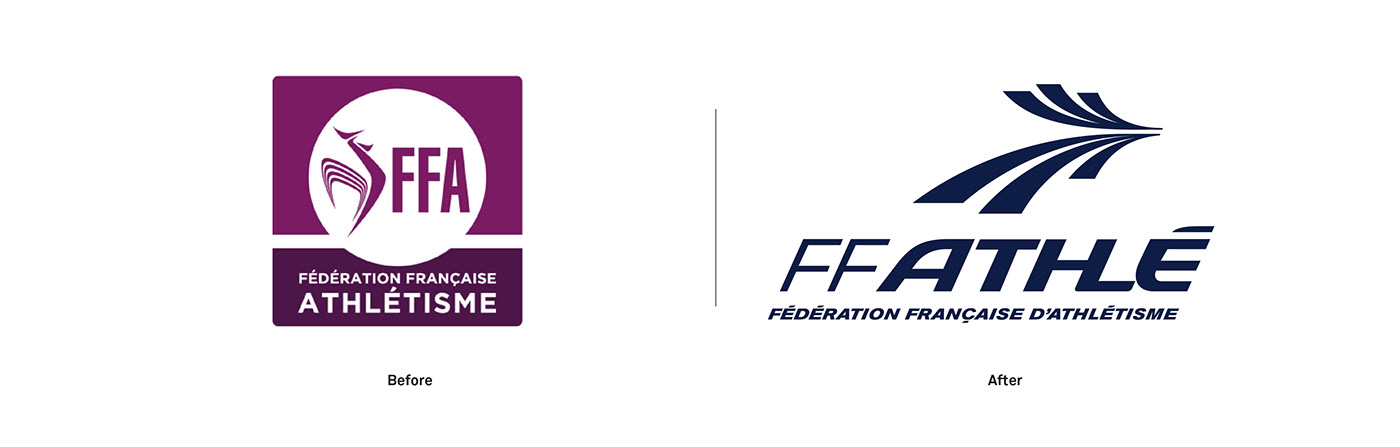
We designed a new rooster icon playing with symmetrical curved shapes to obtain the feeling of motion and physical performance. The rooster is the well known emblem of France and it's often used throughout French sports federation.
We tried to reinvent the design of the animal by giving as motion and energy that we could in the shape of this new logomark. Stylisation of the rooster's crest and feathers evokes running and jumping trajectories. The outcome is closed to the aesthetic of an arrow or a pair of wings which fit to express the dynamic of athletism.
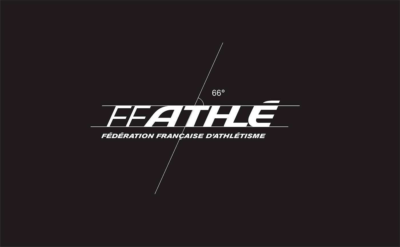
This minimalistic symbol was completed with a new custom wordmark “FF Athlé”. The custom typedesign evokes the graphics of the runway corridors. The "THL" ligature hides the silhouette of a podium. The italic aspect conveys the idea of speed and performance.
Its angular style is inspired by the vocabulary of shapes from the disciplines of disciplines: hurdles, pool, plank, etc.
We tried to reinvent the design of the animal by giving as motion and energy that we could in the shape of this new logomark. Stylisation of the rooster's crest and feathers evokes running and jumping trajectories. The outcome is closed to the aesthetic of an arrow or a pair of wings which fit to express the dynamic of athletism.
This minimalistic symbol was completed with a new custom wordmark “FF Athlé”. The custom typedesign evokes the graphics of the runway corridors. The "THL" ligature hides the silhouette of a podium. The italic aspect conveys the idea of speed and performance.
Its angular style is inspired by the vocabulary of shapes from the disciplines of disciplines: hurdles, pool, plank, etc.
FFA becomes «FF ATHLÉ»
The name is now more than an acronym, it is a new title that gives the federation a stronger and modern image. Franch Athletic Federation own a brand.
This change allows us to :
- create a more meaningful name
- remove ambiguity with other existing FFA acronyms which are not related to athletics at all (steel, aeronautics, insurance, etc)
- create maximum consistency with the language elements using "ATHLETICS" already present in your current communication
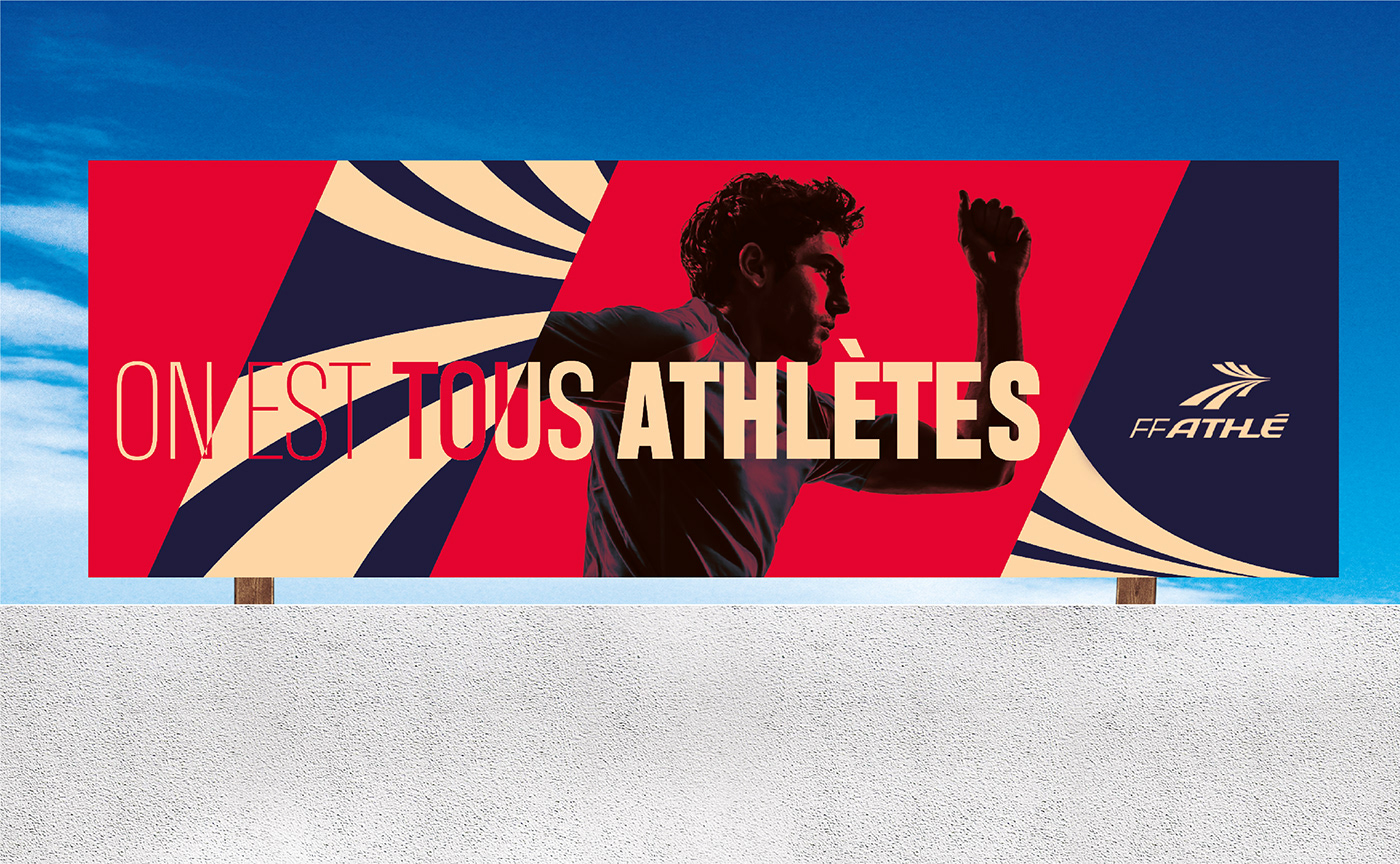
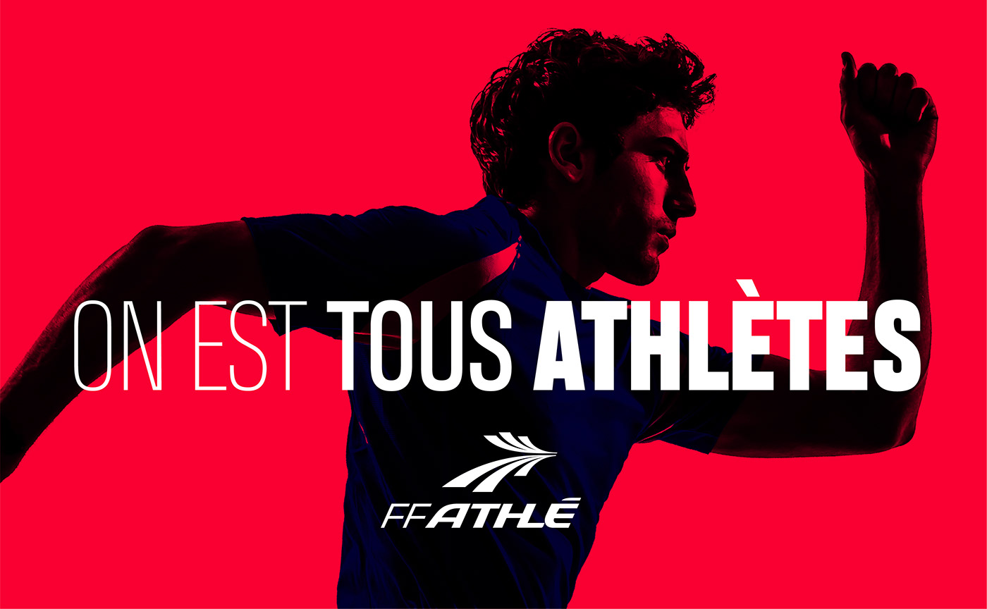
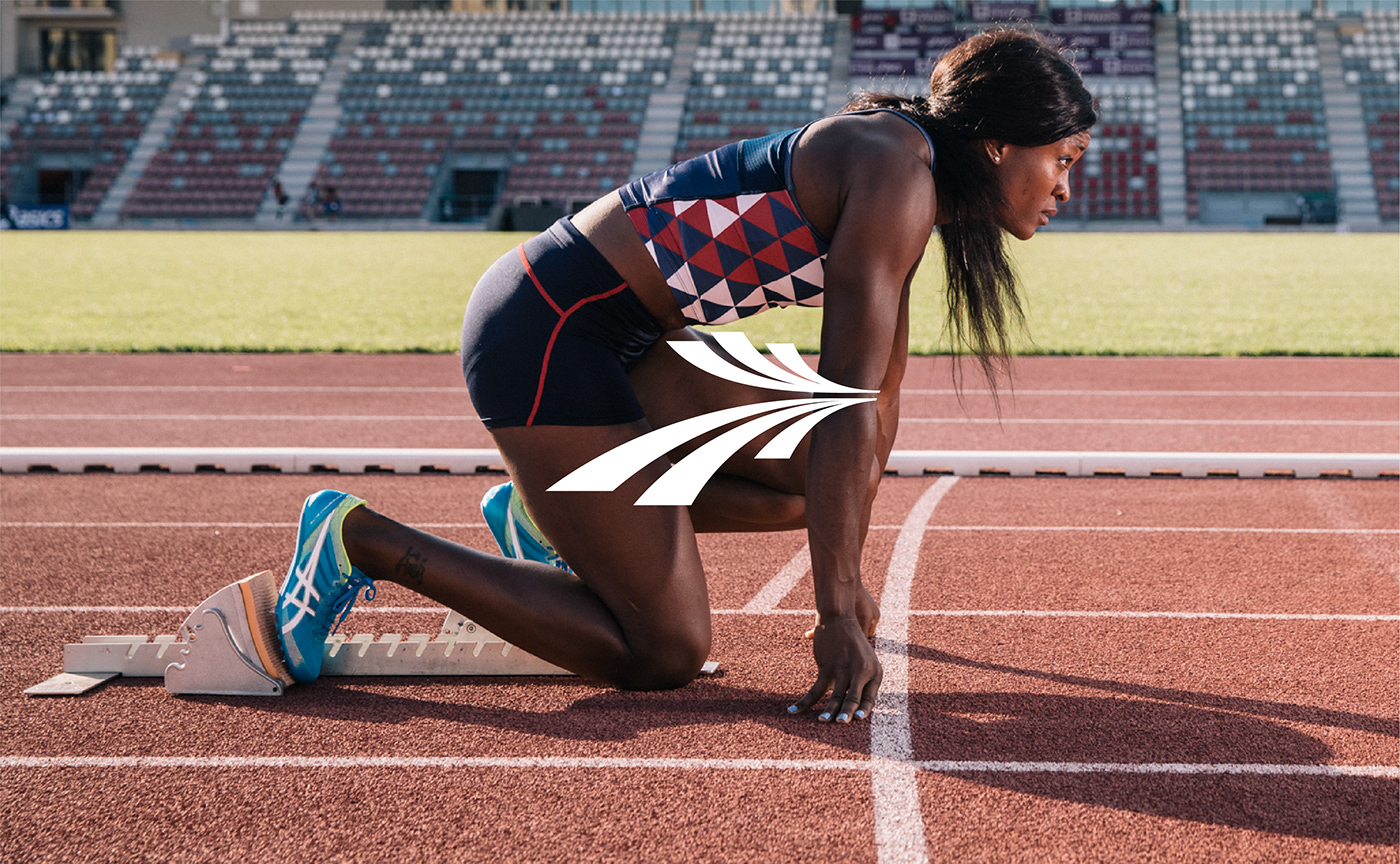
FF ATHLÉ, a new brand architecture that is legible, coherent and adaptable to enhance Franch Athletic Federation's presence and actions throughout the territory.