TOORMIX DESIGN AGENCY REBRAND
Designed by Toormix team
Developed by Program.studio
At Toormix we consider the agency as another client. We like that as we offer strategy, branding and web development projects, our identity is also a reflection of the way we work and the way we orientate our commissions. From time to time we update our identity as well as our portfolio and especially the way we present our case studies.
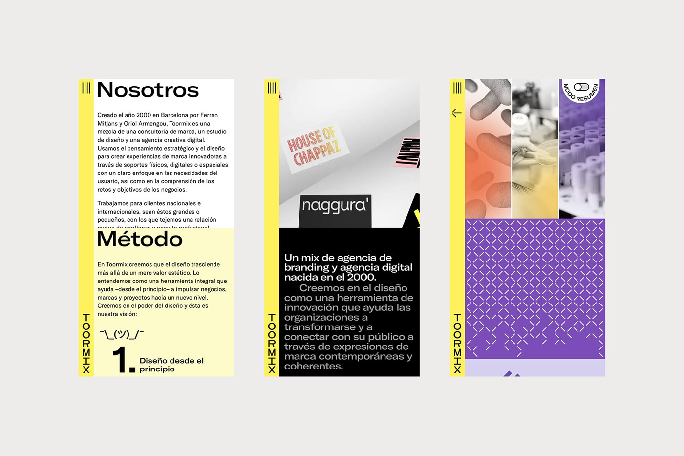
In this last redesign process we have updated our logo so that it could be built in vertical format since one of the applications was a vertical corporate band in all our applications both physical and on the web itself.
The redefinition project reinvents the symbol and gives it a new meaning. Starting with two facing arrows that symbolize the idea of collaboration with our clients. This symbol also has its dynamic animation that allows for example to use it in videos, presentations and even for the loading of the web in a 3d way.
In terms of graphic code, we expanded the palette a bit by incorporating a purple accent color and we selected a new corporate typeface, GT America by Grilli Type with its different extended versions.
In relation to the new digital experience we were looking for a different way to present the portfolio through an interesting interaction and a layout that was different from the usual portfolio websites.
Visit the website and the updated case studies at www.toormix.com