NAMING AND GRAPHIC IDENTITY FOR SEVERAL GASTRONOMIC PROJECTS IN PALAFRUGELL
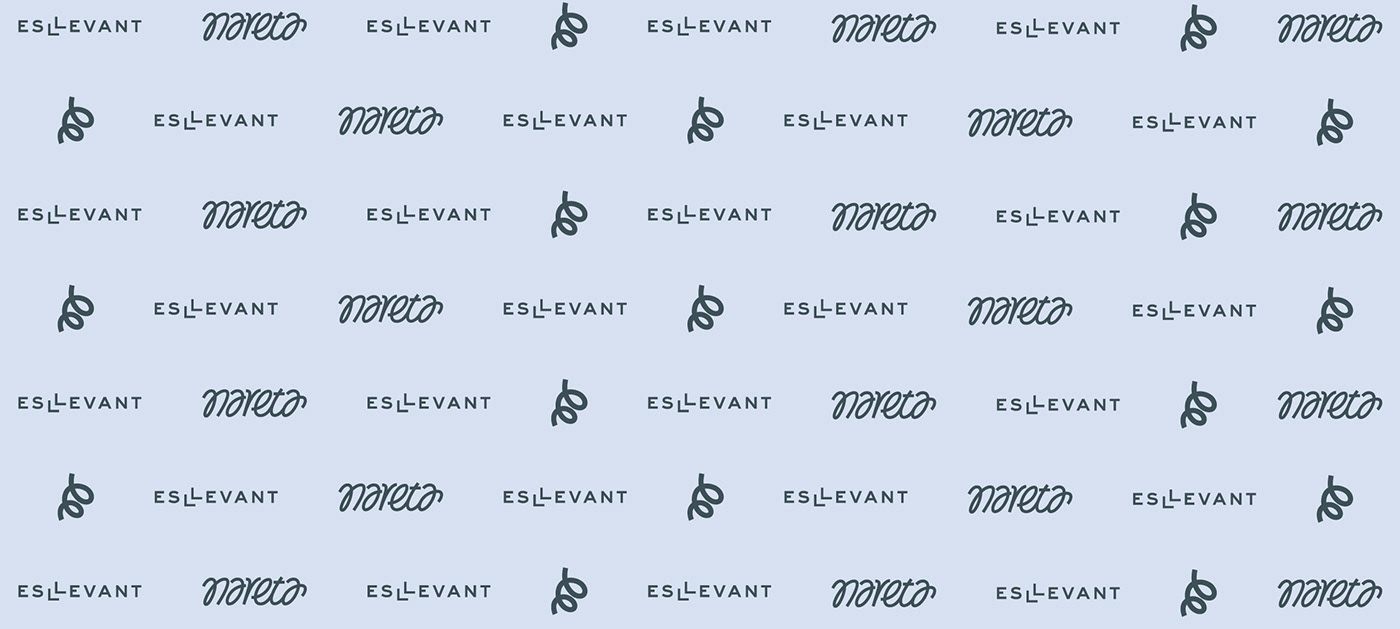
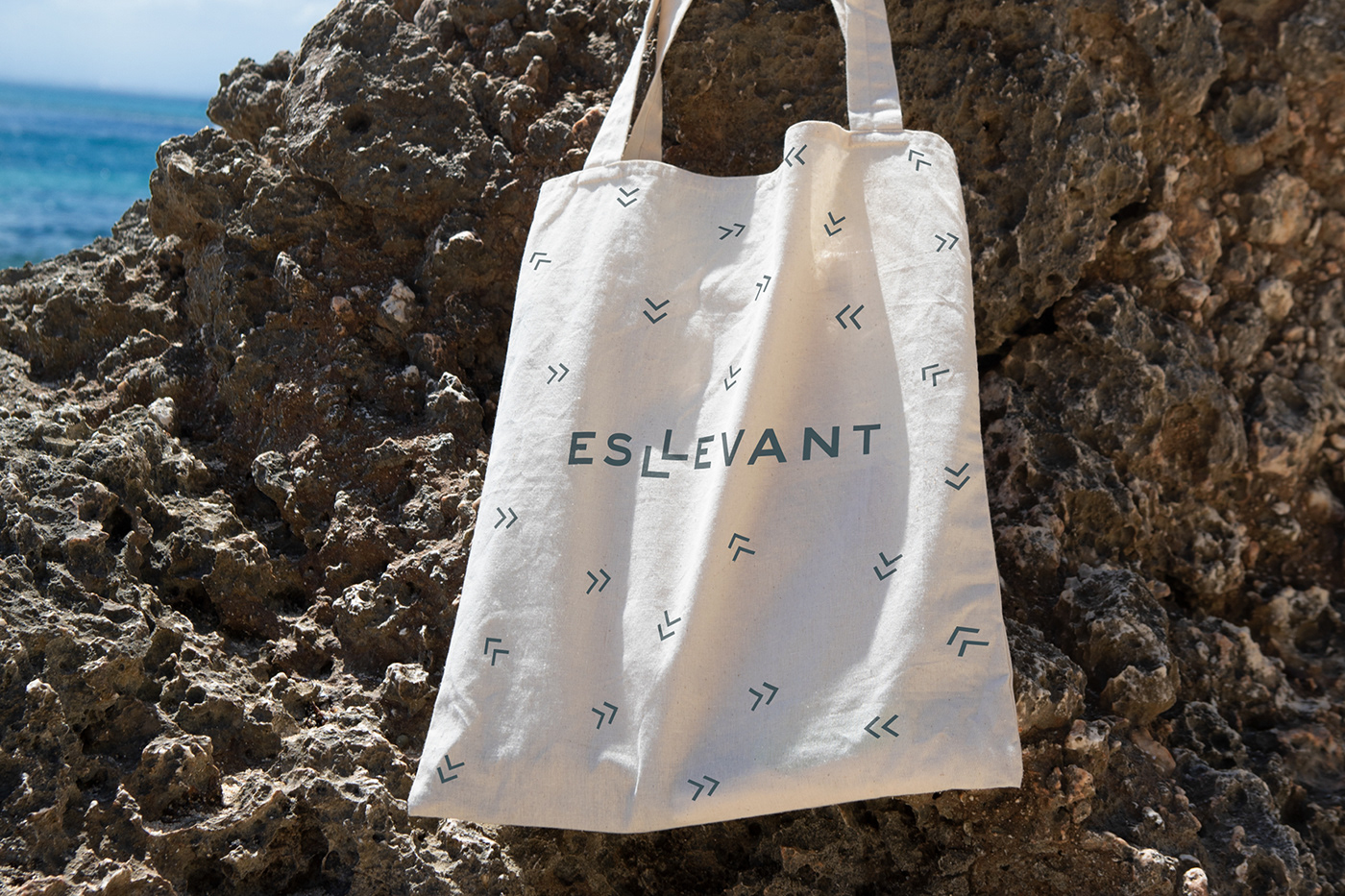
Esllevant
The Hotel Llevant de Llafranc, a small 5-star hotel facing the sea, closes its doors and begins a new stage outside the town. Leaving behind his successful experience, he undertakes new projects hand in hand with his team and his recognition. The first assignment is to work on the denomination that must somehow link with its legacy and that will open its doors to new projects.
ESLLEVANT
The new name that wants to recognize the past and at the same time serve as a generic brand that encompasses the various projects that are being generated anew. This naming structure allows any product added to “XXX ES LLEVANT” to become a phrase on its own that explains its origin. The graphic identity plays with the idea of the double LL that is particular to the name and that in the future will also be an emblem that will be repeated in the various projects with the idea of connecting them to each one of them despite having different visual expressions.
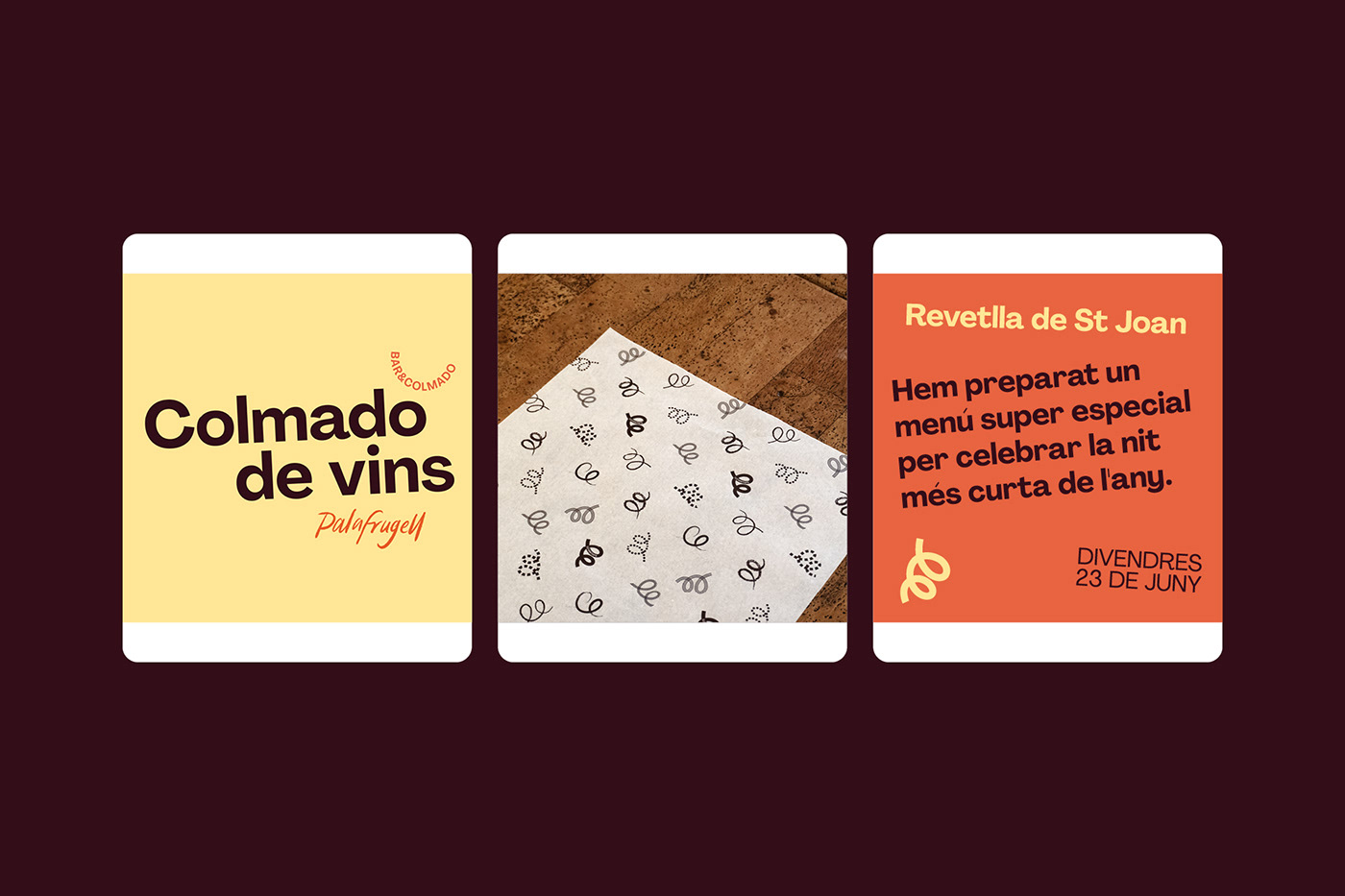
The first two projects started by this team are a wine, cheese and tasting bar, and on the other hand a gastronomic space that combines the idea of brunch with that of pastry. Both projects located in Palafrugell require their name, identity and visual language.


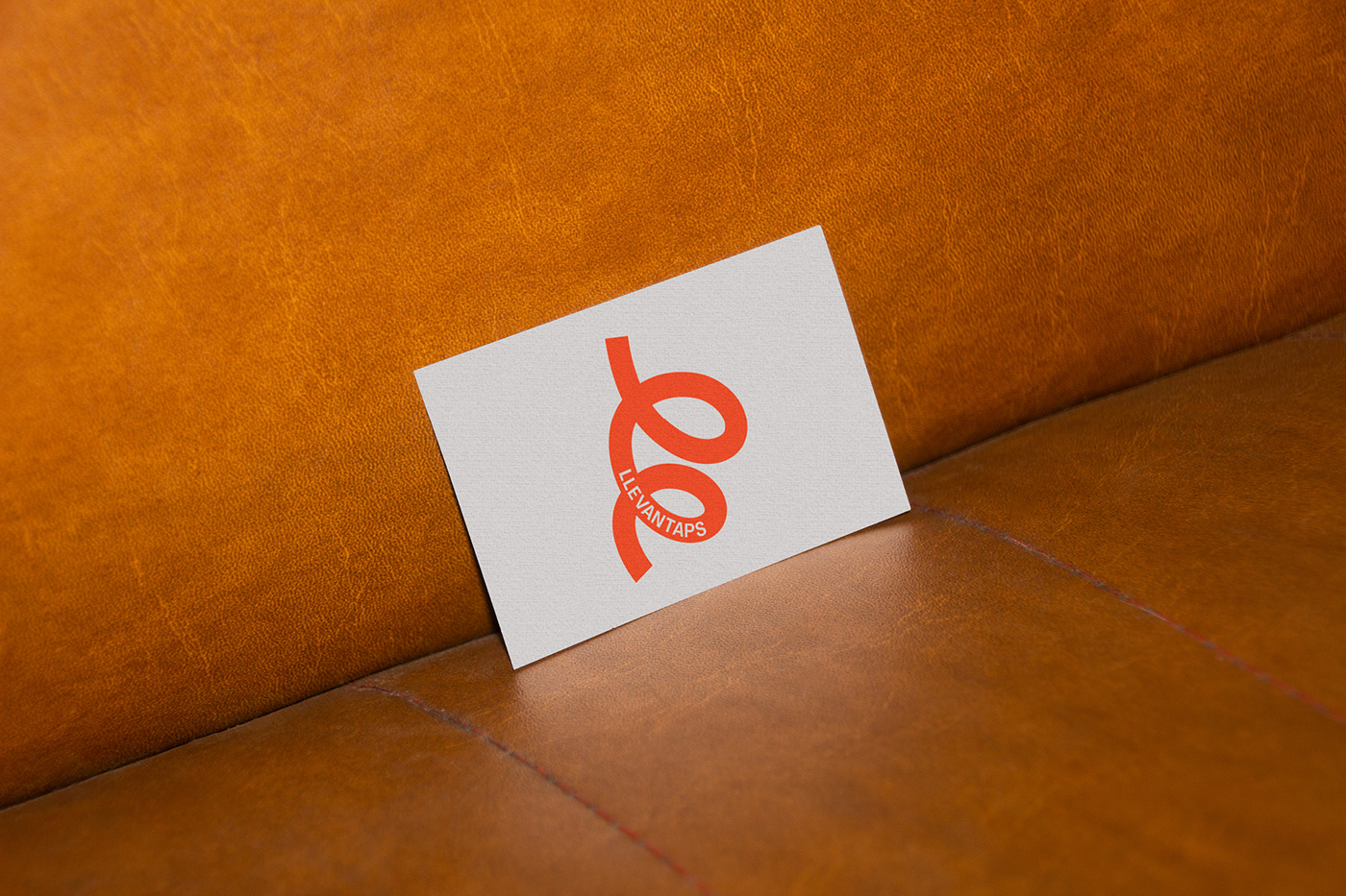
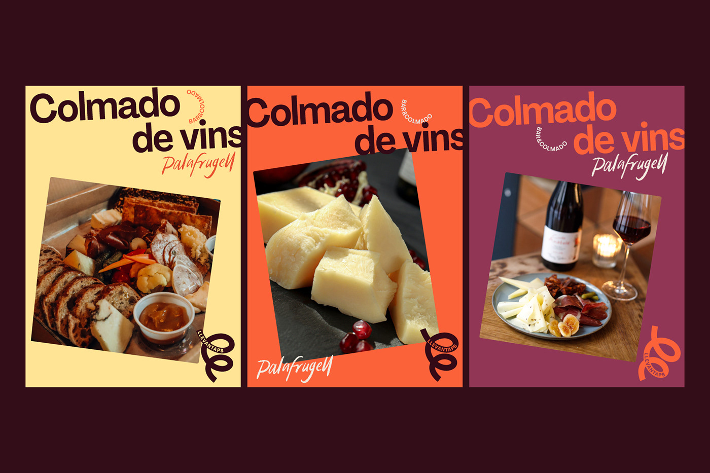
LLEVANTAPS
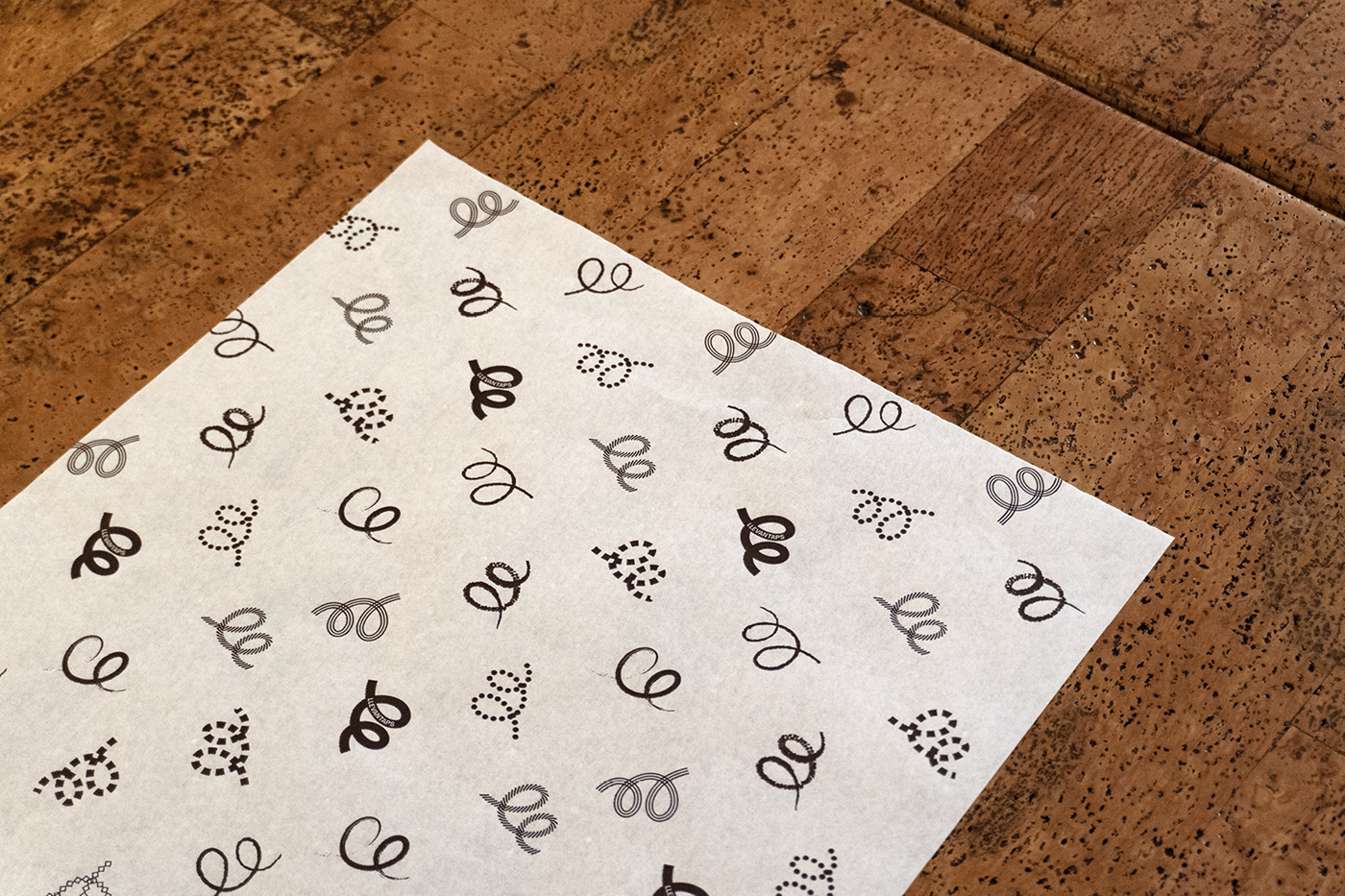
For the first project, the wine bar, the name wants to connect with the root “levante” coming from the name of the “mother” project and to link it to the world of wine the name LLEVANTAPS is created. A combination that includes LIFT and at the same time connects with the symbol of the utensil that opens the bottles. The identity is the symbol itself appropriating not only the opener but also becoming a letter “L” at the same time. This dynamism flows in the different graphic expressions that develop all his graphic and visual language that is accompanied by illustrations, gestures and other combinations of irregular composition.


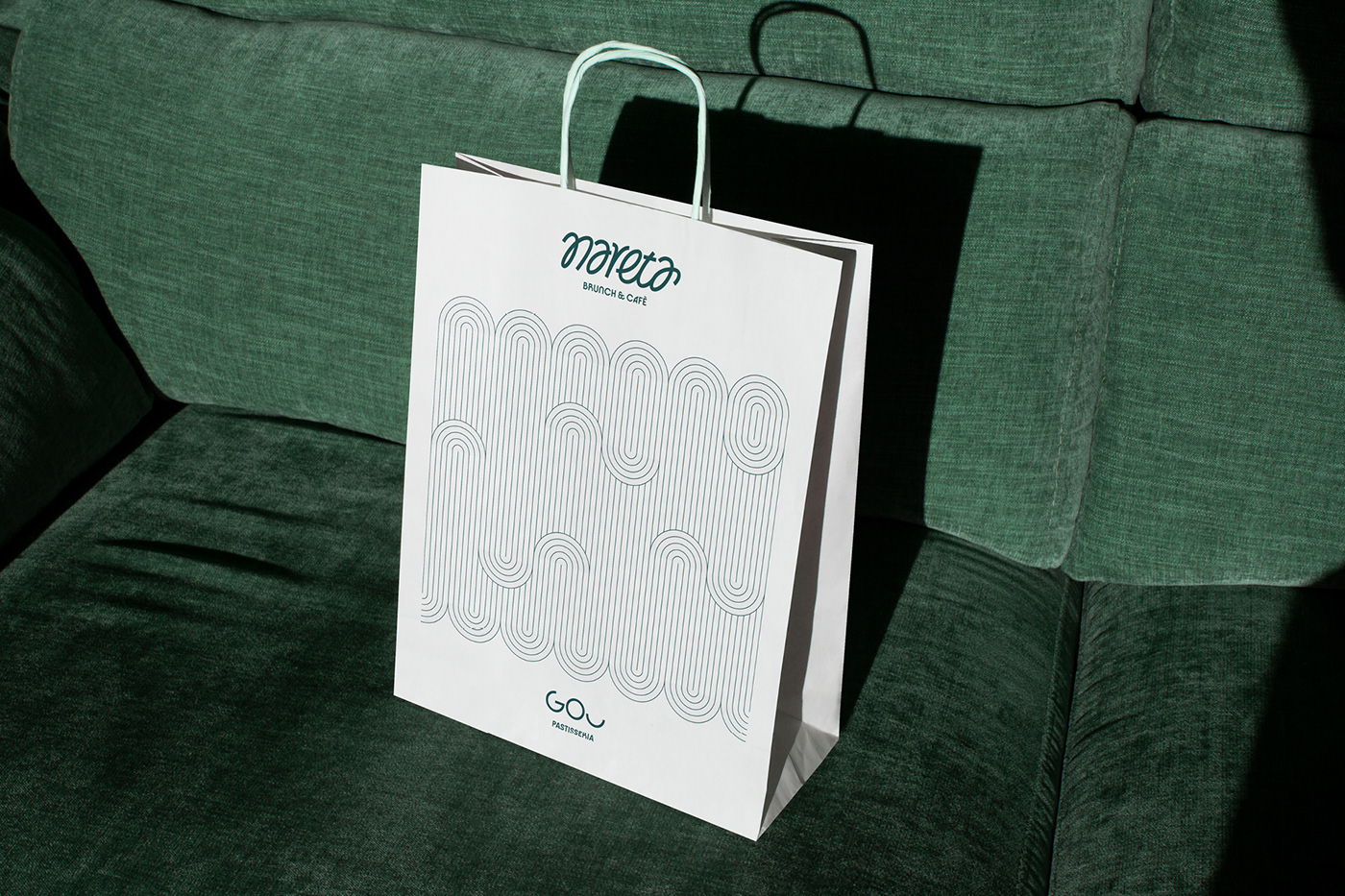
NARETA
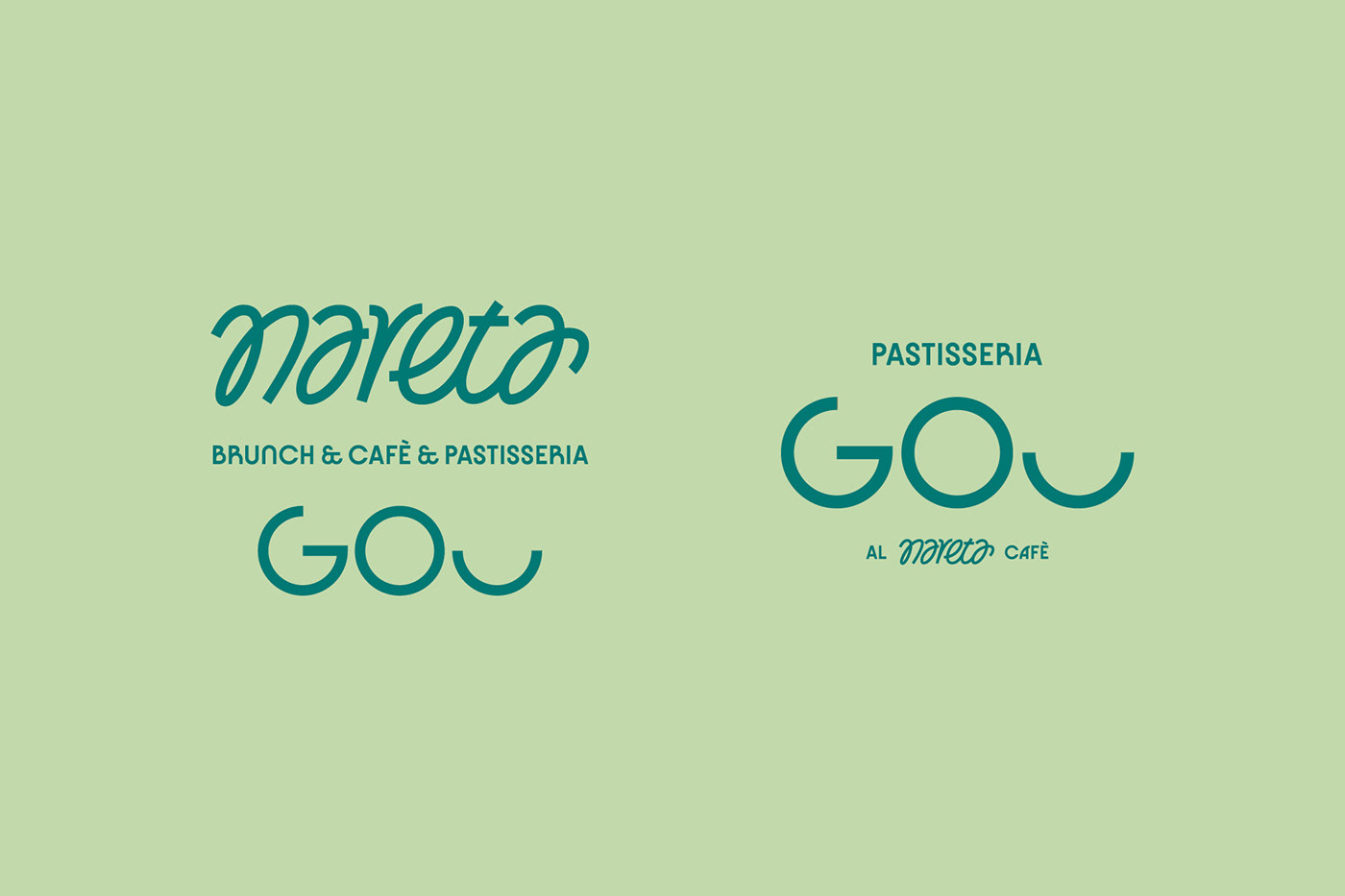
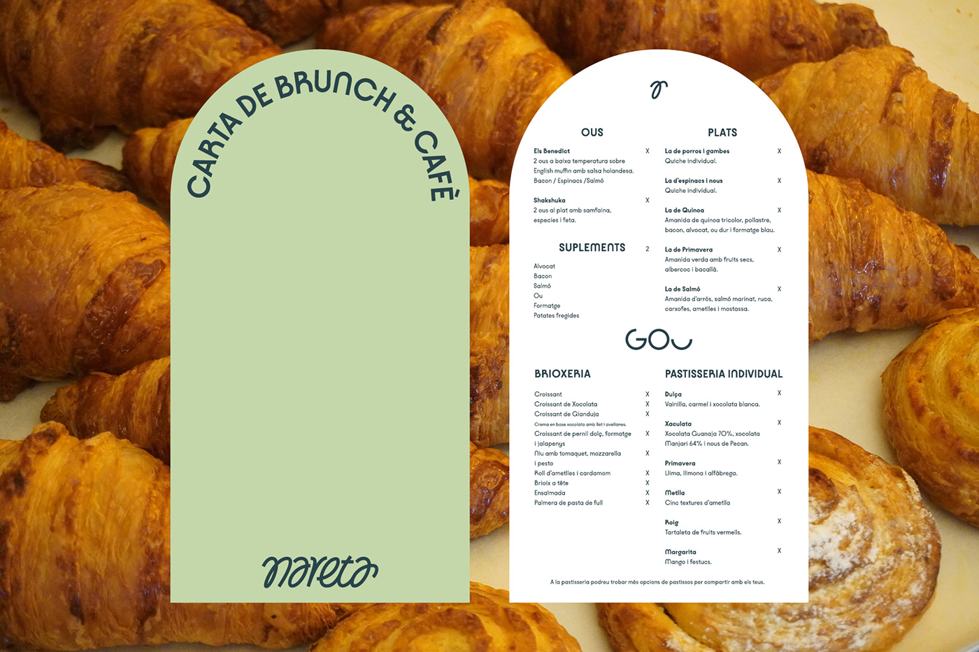
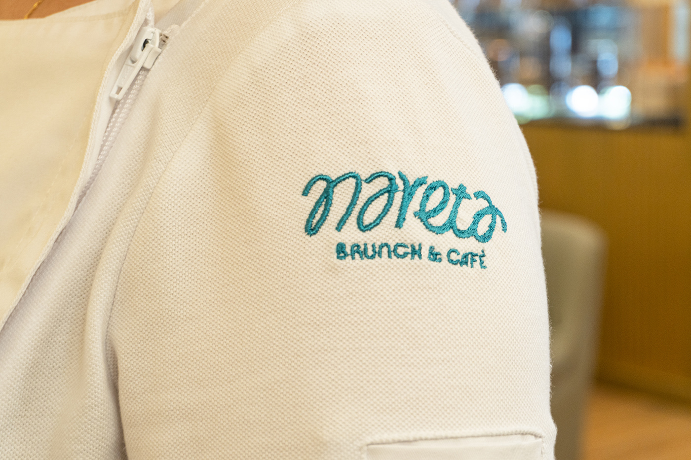
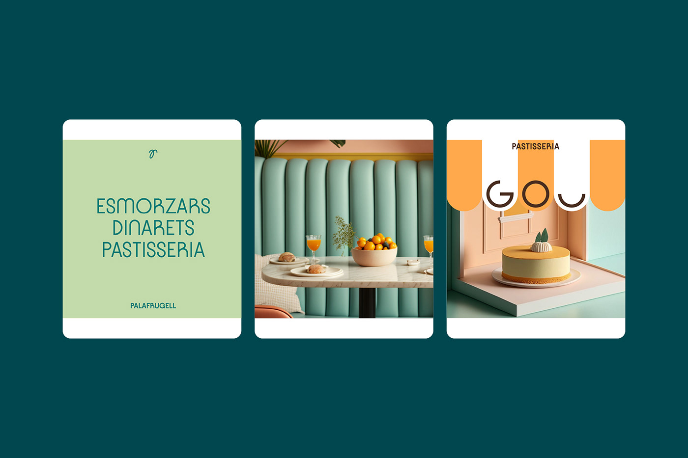
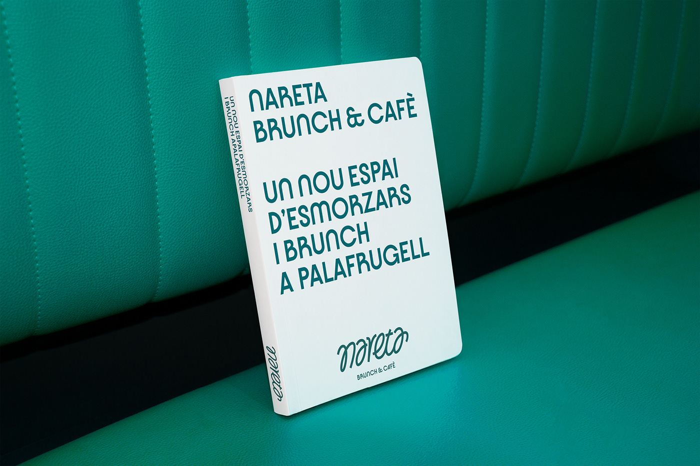
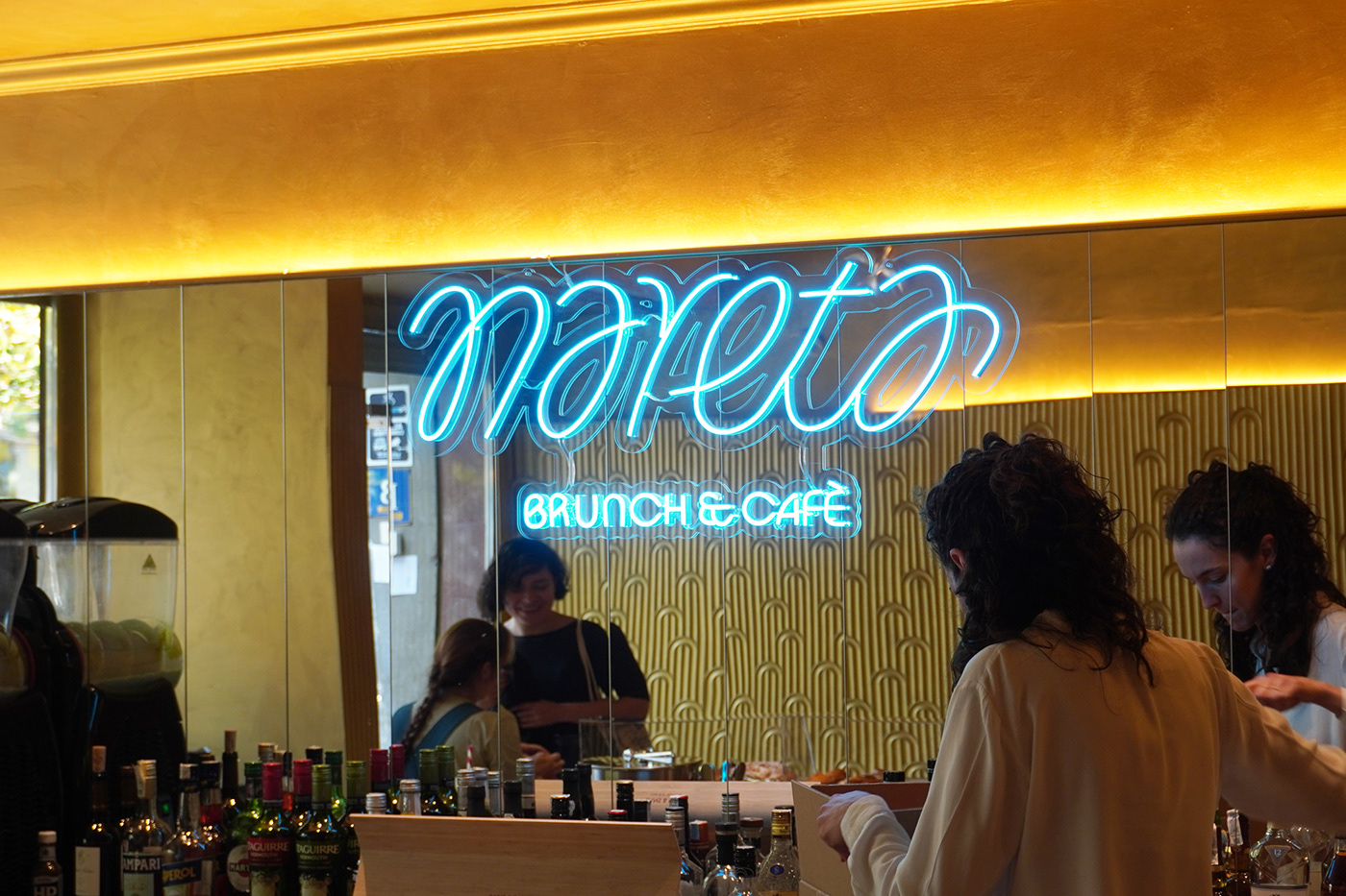
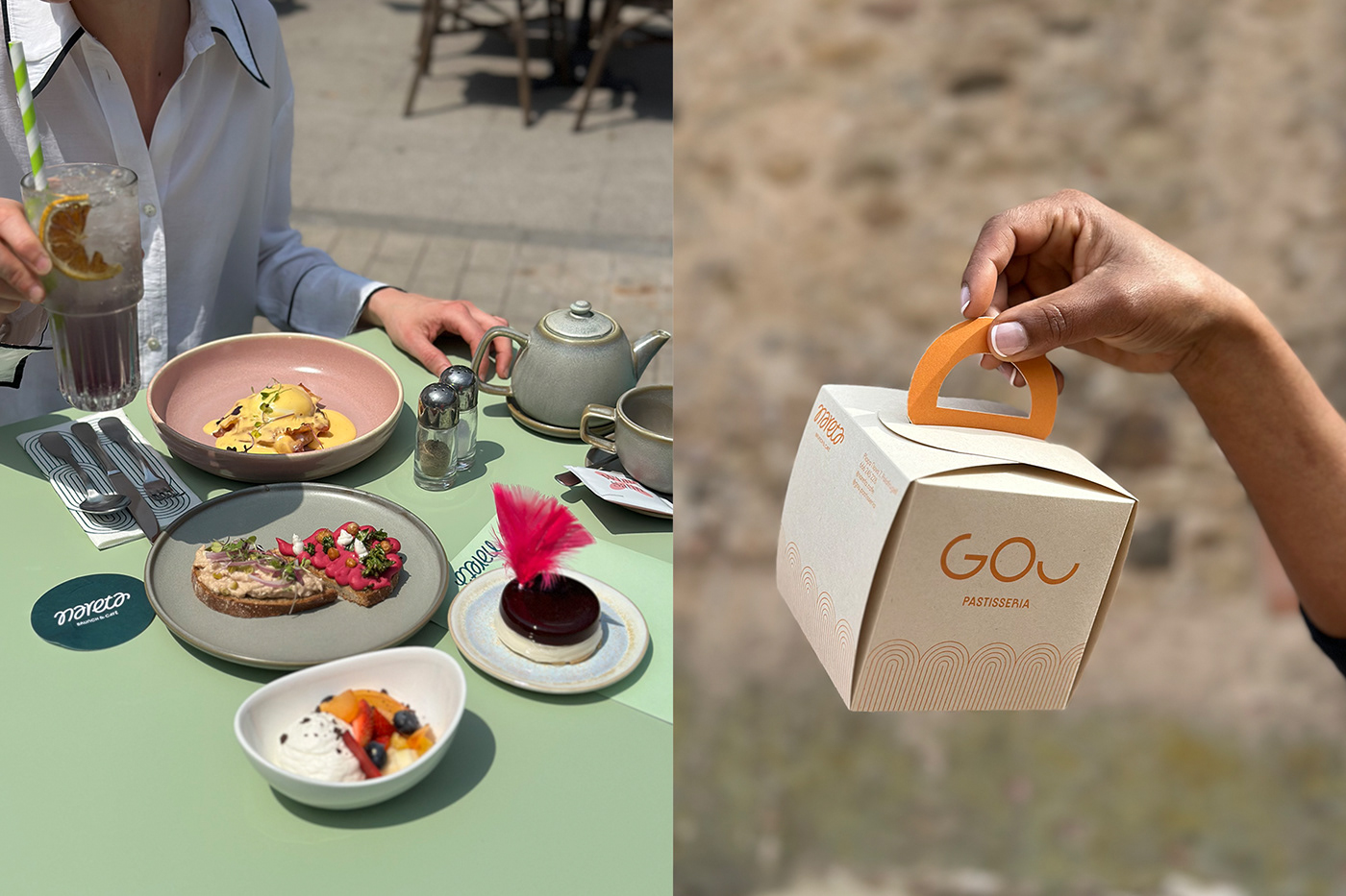
The second project, the brunch space, is called NARETA with a clear influence from the swallows but also from the way of writing it in the area. Through lettering-shaped graphics, a linked brand is created that is also reminiscent of the shape of an L that connects us with the rest of the graphic families. GOU is the name of the pastry shop that is located inside the space and is run by the famous pastry chef Ruth Gou and which complements the offer of this new space in the middle of Palafrugell.
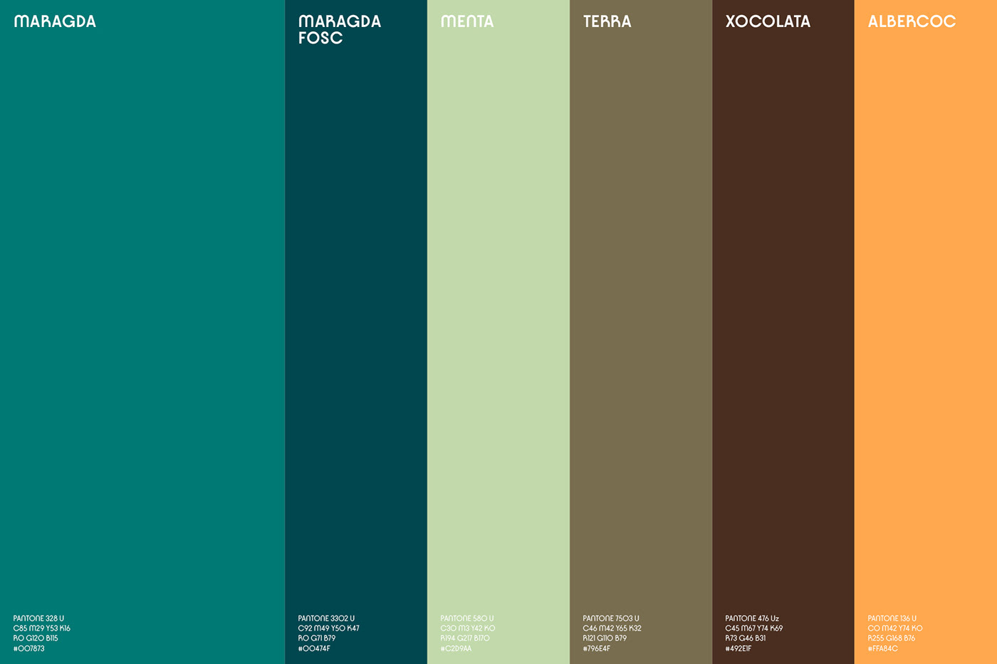
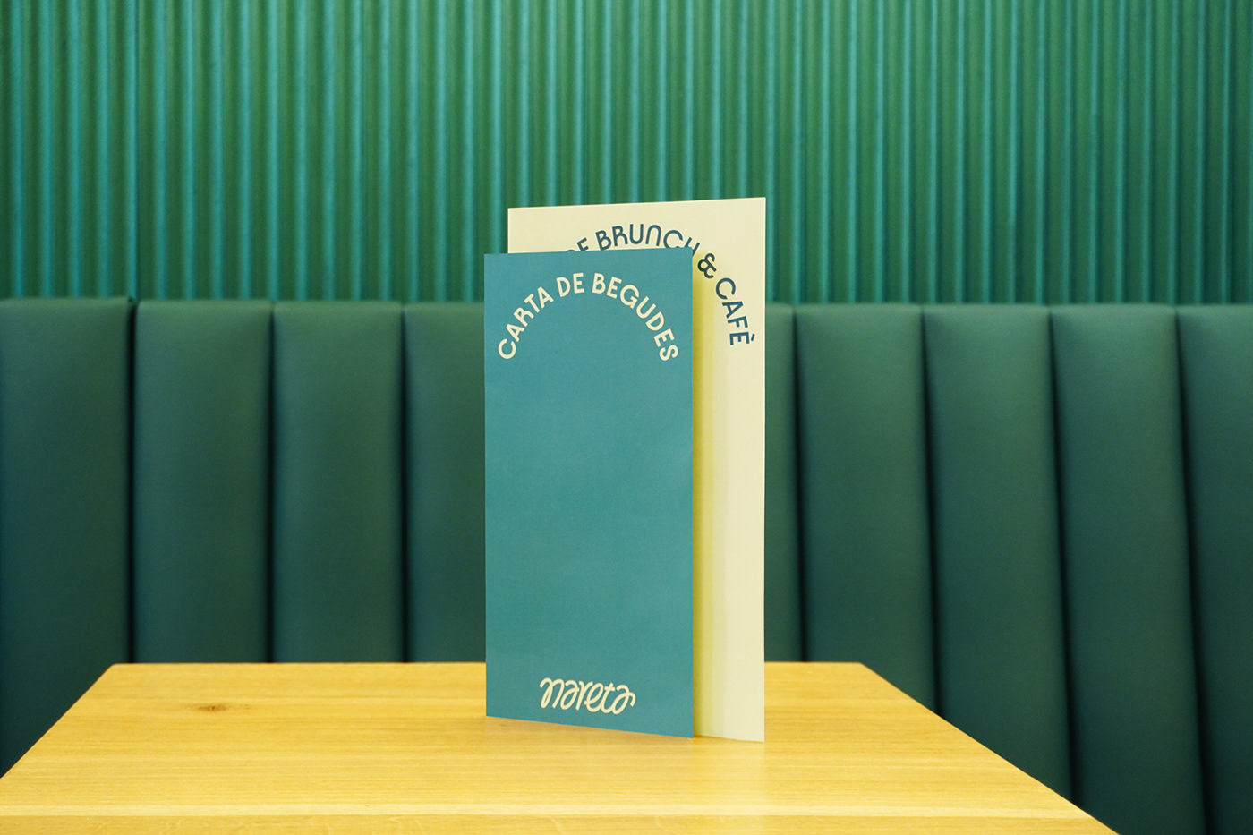
Striking colors and contemporary combinations that, through a fresh language, transmit the various communicative messages for each space and at the same time are combined with photographs of its gastronomic offer and even with suggestive images by NARETA created with artificial intelligence.