Rebranding, communication strategy and webdesign for law firm Labour & Law.
A law firm that doesn't want to look like '13 in a dozen'. Not that hammer again, that toga, nor that law book. Not as a standard law firm, but as a mental market leader. A party for us at Pröpper&Garnaat!
So, what should the brand and identity of Labor & Law convey, then, to be seen as an excellent office, as a mental market leader? How should we position and behave in communication, in order to contribute to growth? And how do we ensure that the culture
of the office is preserved and becomes even more manifest?
of the office is preserved and becomes even more manifest?
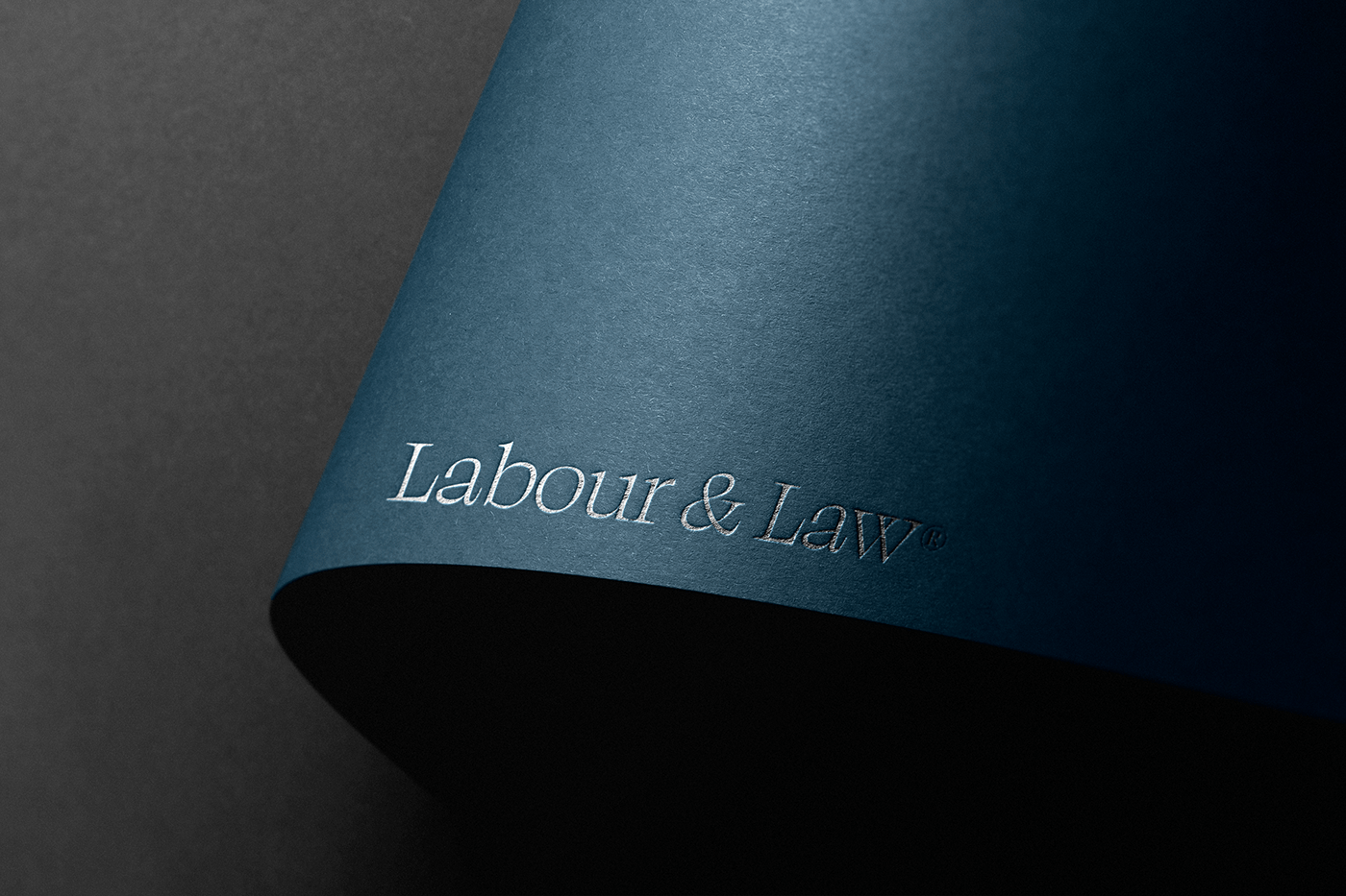
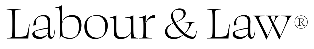
The name 'Labour & Law' deserves an upgrade, especially given the ambitions of the company. It deserves a font, a design, with which you immediately stand out. With which you are immediately seen as a high-quality office (what you are), yes a touch of corporate.
So what makes you BIG, not necessarily in a cold marble status, but big in thinking, intellectual, inclusive, human, serious in involvement, and certainly approachable.
That said, we started.


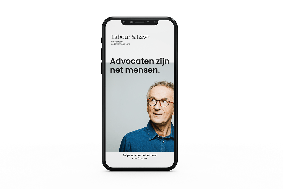
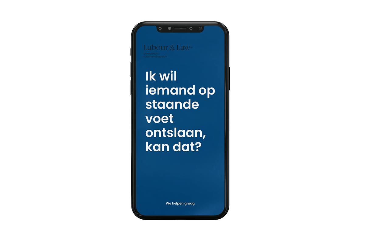
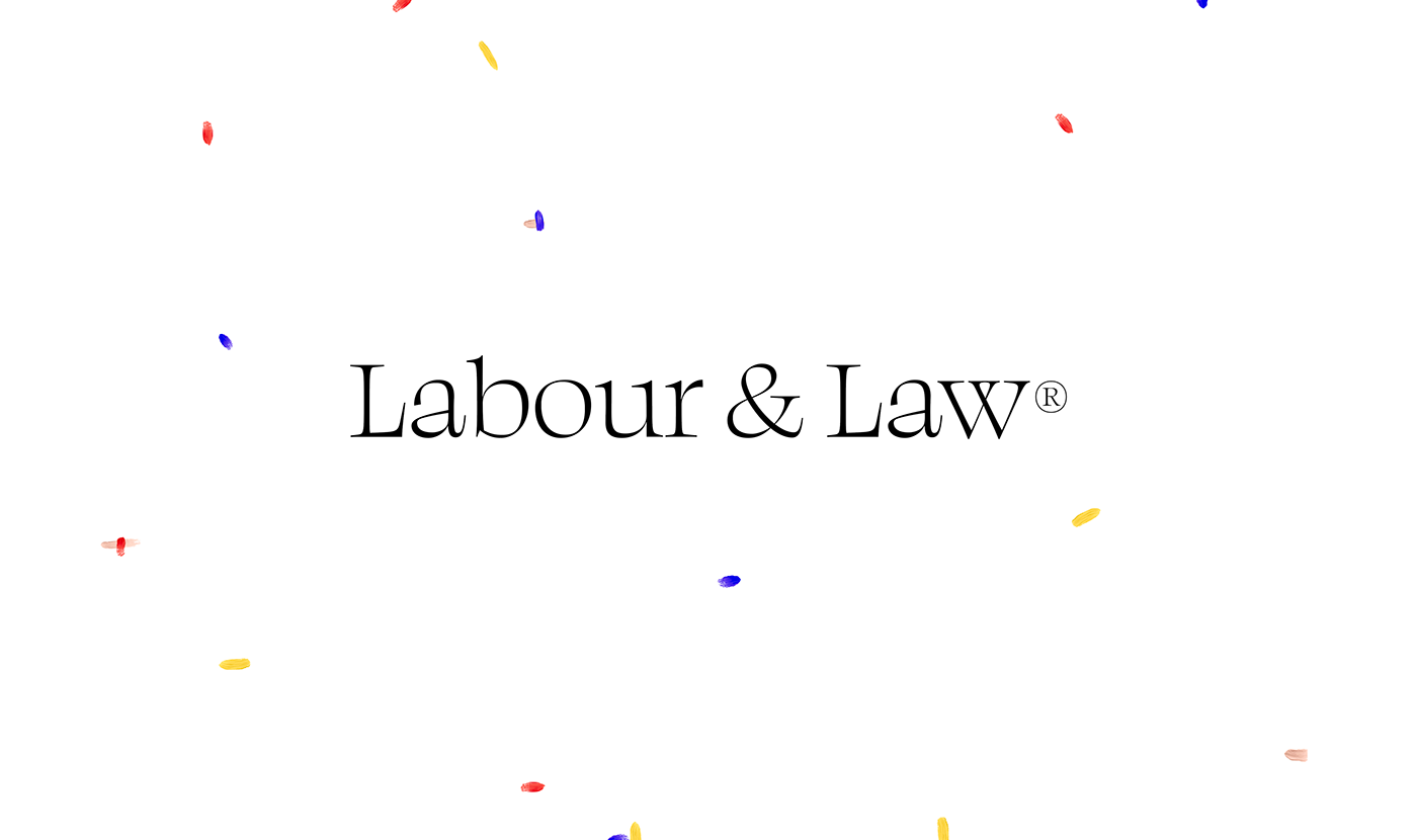
Movement gives air
Labour & Law enters a world of people and companies that are constantly in motion. And as they themselves beautifully said: “people often feel they're stuck, but we show them that they're on the move, on their way to something else. That it doesn't have to be something negative, you can also experience it as a positive thing.”
Movement gives air, light, space. It gives freedom and offers an opening. So anyone who comes into contact with Labour & Law should feel the safe feeling of movement, that personal journey, sensory, not the feeling of a bizarre rollercoaster. "We are businesslike yes, but fresh, modern, we move. And we will help you. Period."

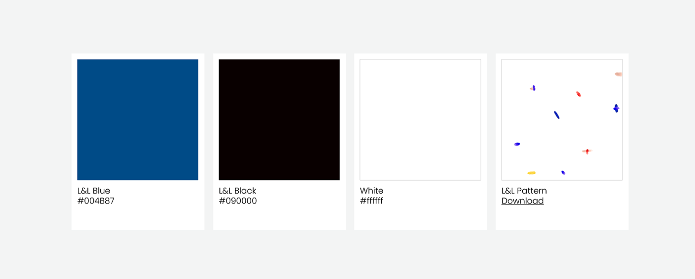
Corporate color palette
No cosmetic smoke screens
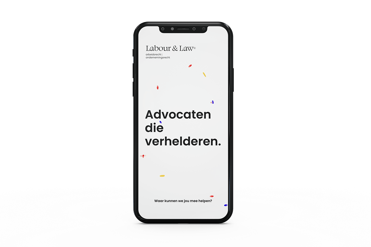
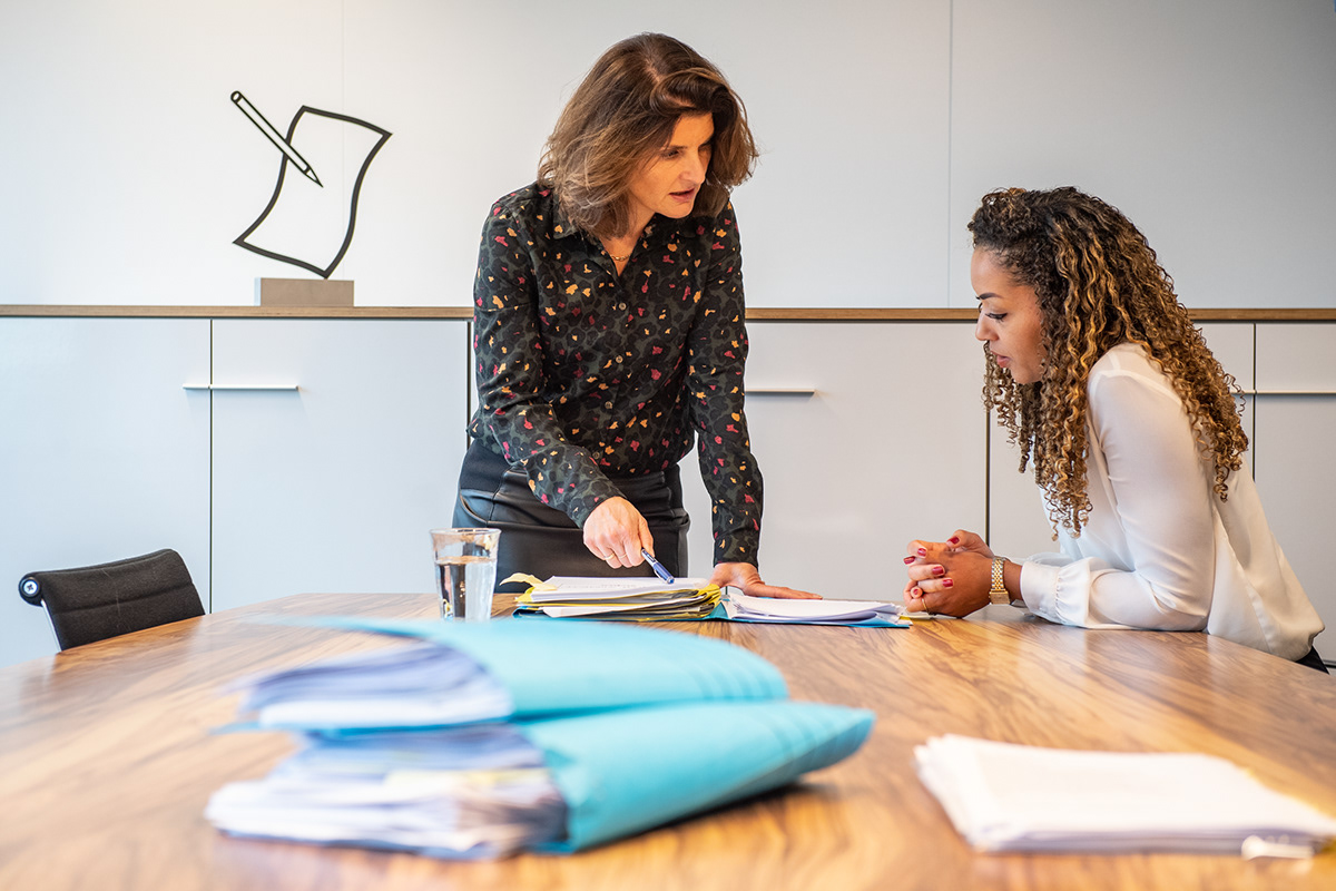
Although the office tables are cluttered with papers, Labour & Law is clean and tidy. No mess, no frills, no golden curls either, it is more almost minimalist, functional, pure.
It fits the way Labour & Law wants to work: with an approach that clarifies, not obscures.
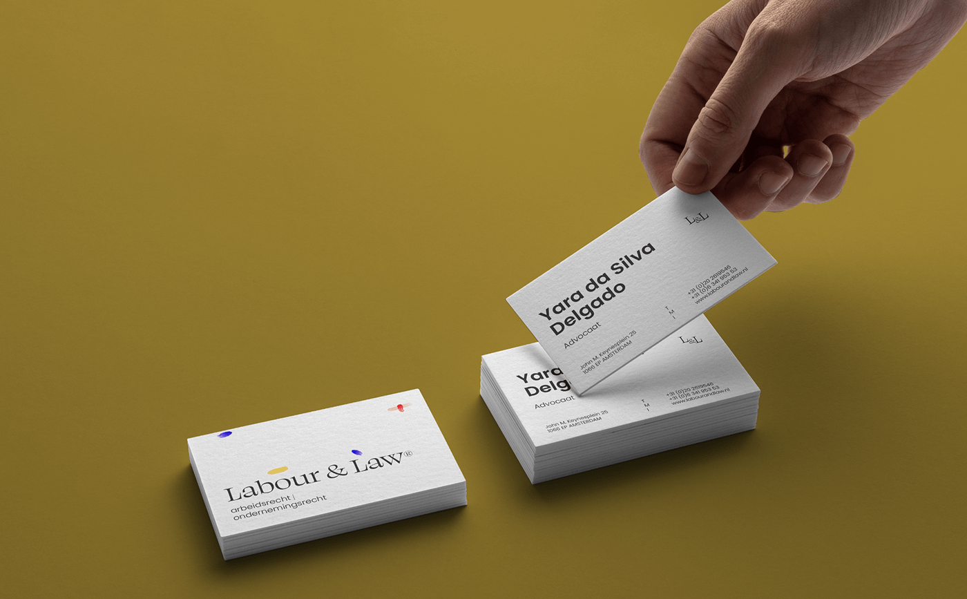
This is reflected in the brand's identity (and, for example, also in the new logo, which is much 'simpler').
The clean, clear stands for how we approach things: to the point, straight forward, without opschmuck and cosmetic smoke screens, always clear-headed.
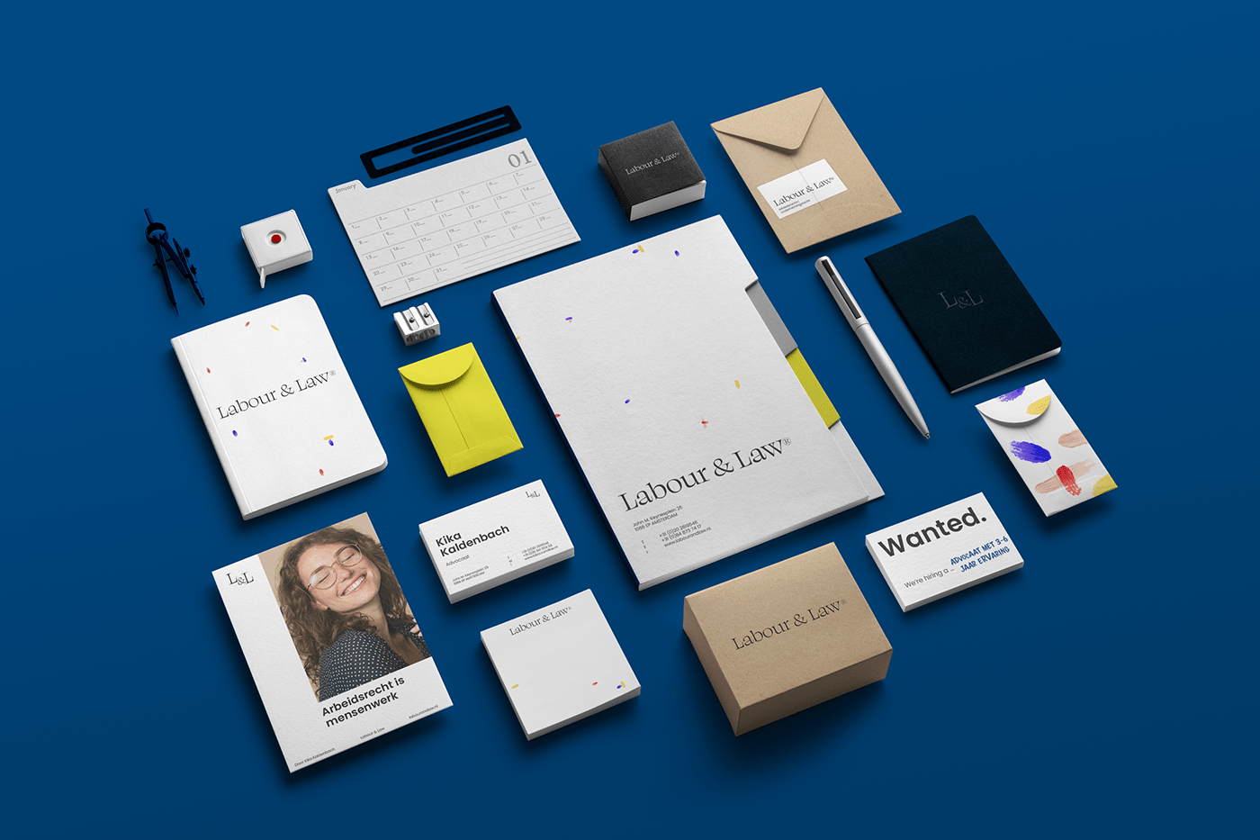
Stationary


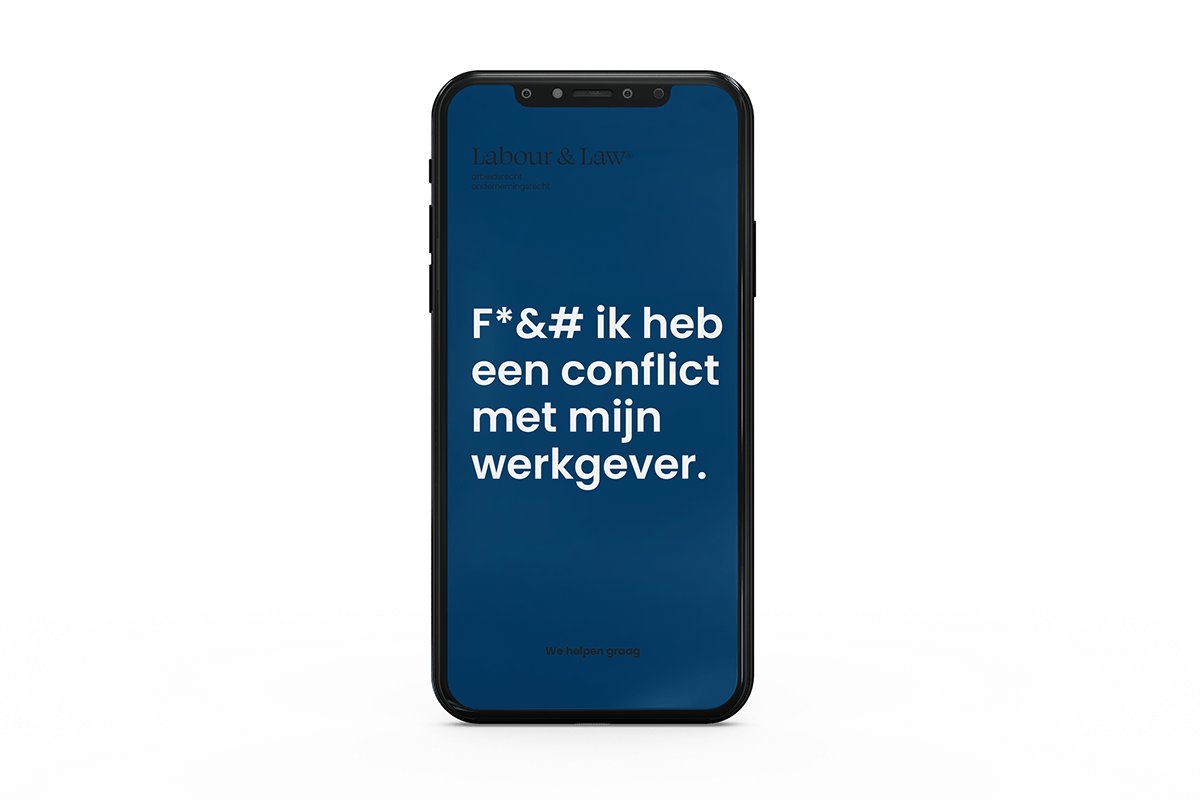
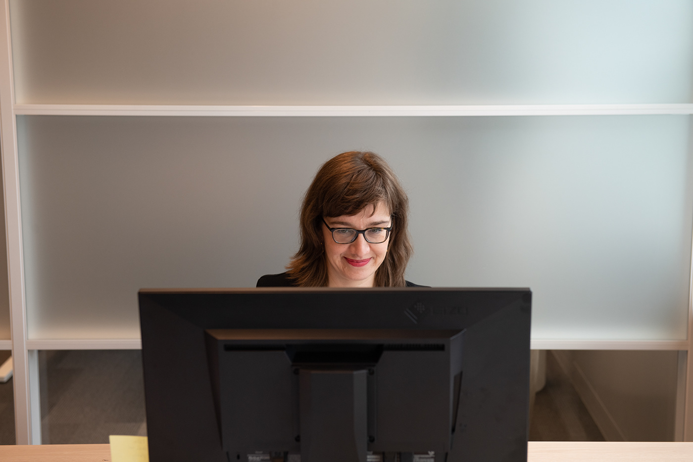
It's about people
And then of course: we are here for people. It's in the visual language we use (human, open, real); It's in the tone (not pompous, nor narrow-minded, but clear, clear, in human language). Sure we are businesslike, we should be, but we are not formal. We are substantive, customer-oriented, authentic and without nonsense. That's Labour & Law.