
Répar'acteurs,
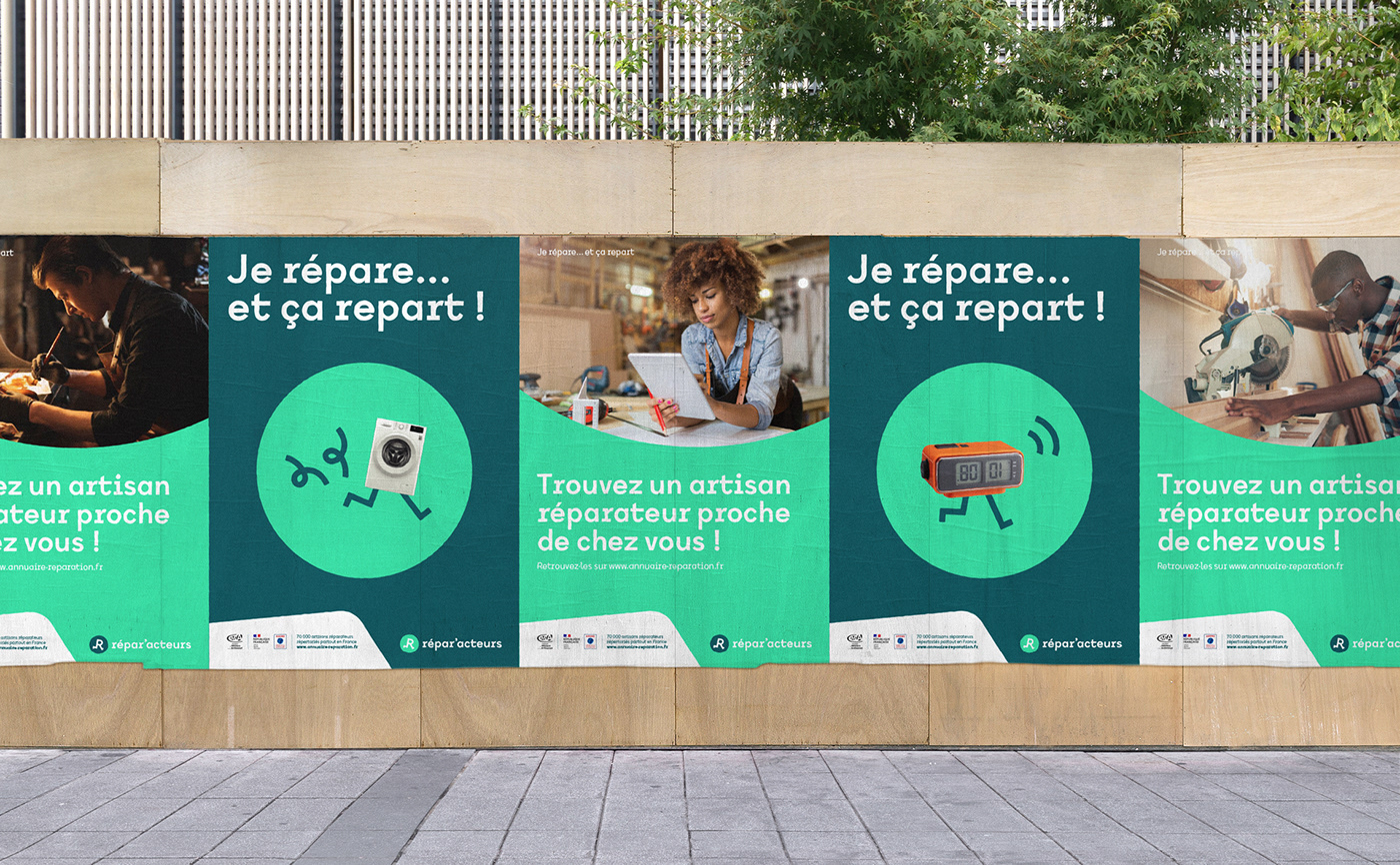
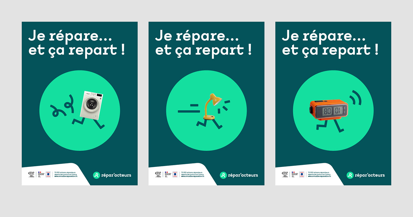
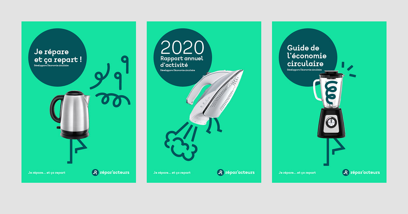
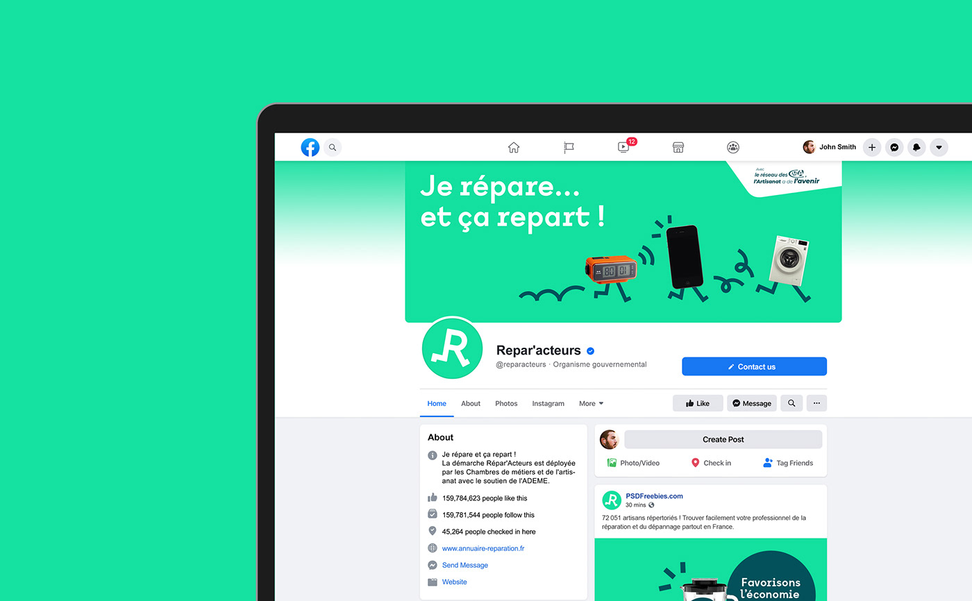
Je répare… et ça repart !*
*I repaired it, and now it's running again!
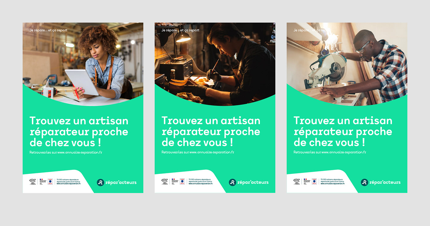
Répar'acteurs is a network of more than 100,000 craft businesses and more than 4,500 certified repairers throughout France. This initiative aims at extending the life of everyday objects by having them repaired by craftsmen, avoiding garbage and over-consumption.
Online, Répar'acteurs connects consumers and repair service professionals, contributing to the local economy by promoting social ties and local jobs. The network also raises awareness on circular economy and sustainable development. It fights against waste and for the preservation of resources, while at the same time promoting craftsmanship.
Graphéine has designed Répar'acteurs' new visual identity to help them promote a more responsible consumption model widely, and also to harmonise and federate all the regional initiatives.
A need of harmony
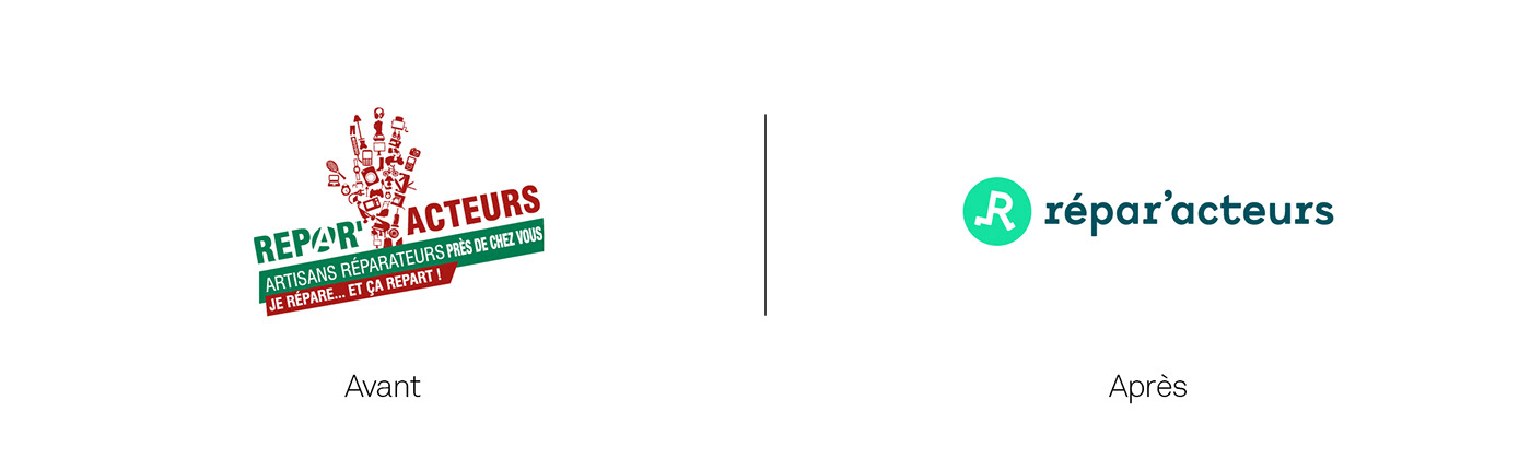
The previous logo was build around the name "Répar'acteurs" intertwined with a hand. The latter was made up of a set of pictograms representing various objects that could be handled by craftsmen. This logotype wasn't reflecting the sustainable and social scope. Besides, the ("zombie-like") hand looked more like a "STOP" rather than an invitation to consume more responsibly. Our goal was to simplify and modernise the brand while developing its sympathetic image.
The network lacked of shared graphic guidelines and visual harmony. This did not contribute to identify and assert its values, its national dimension and its place as a major player in sustainable and circular economy.


Concept
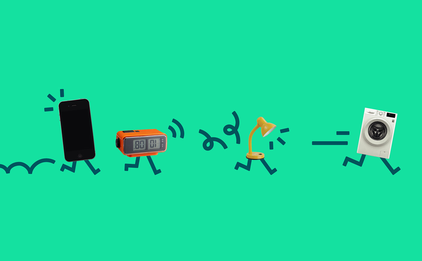
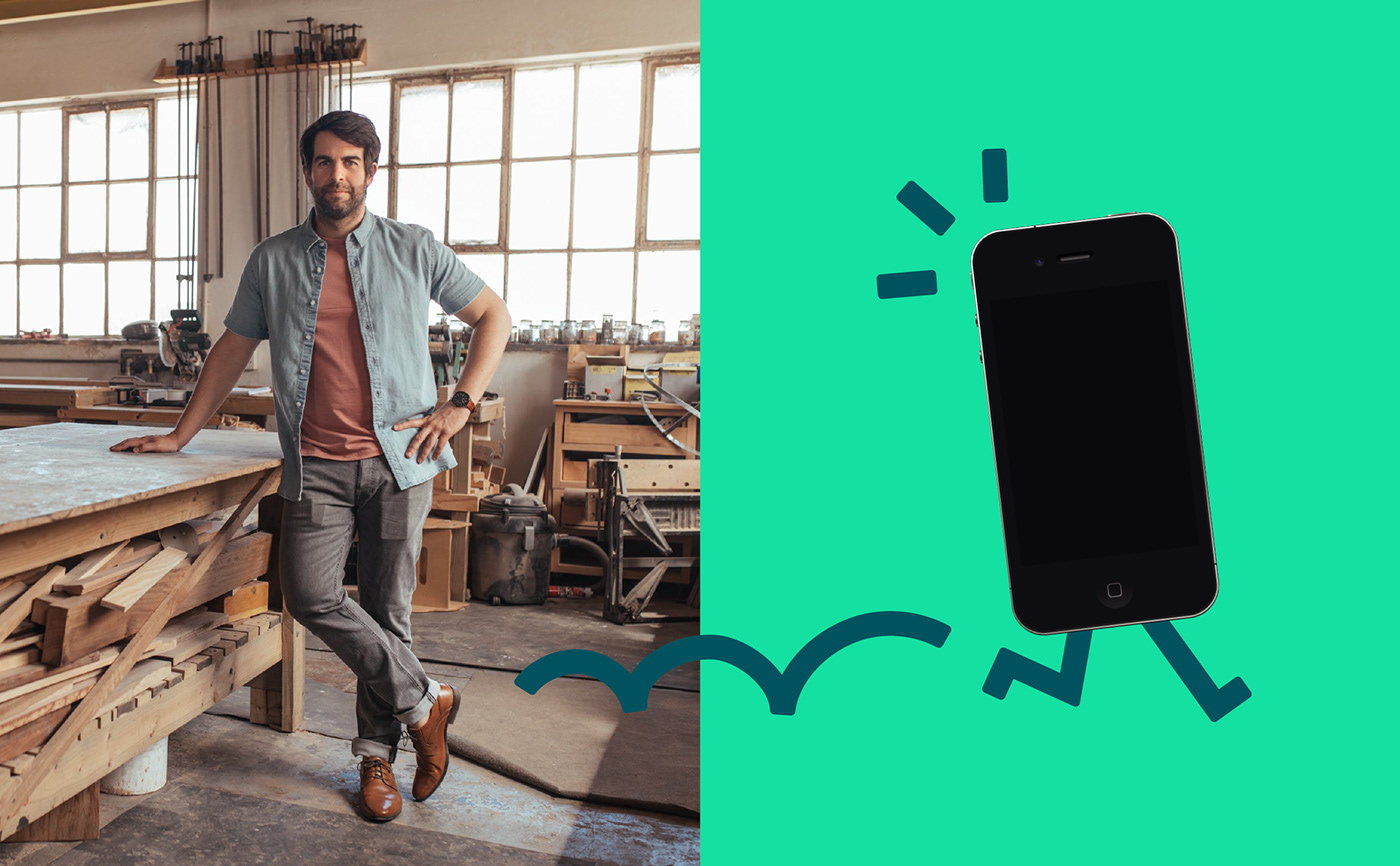
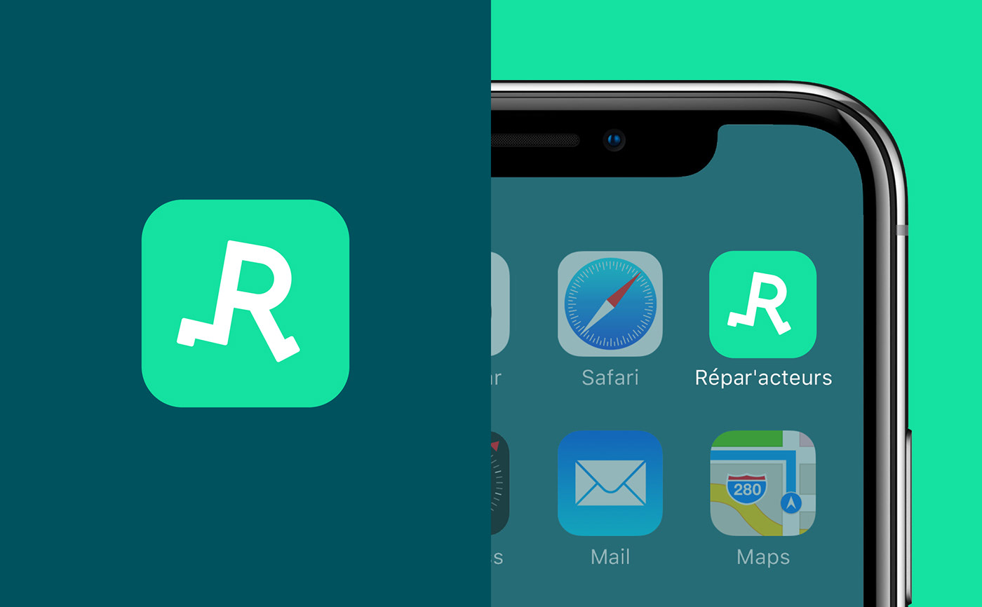
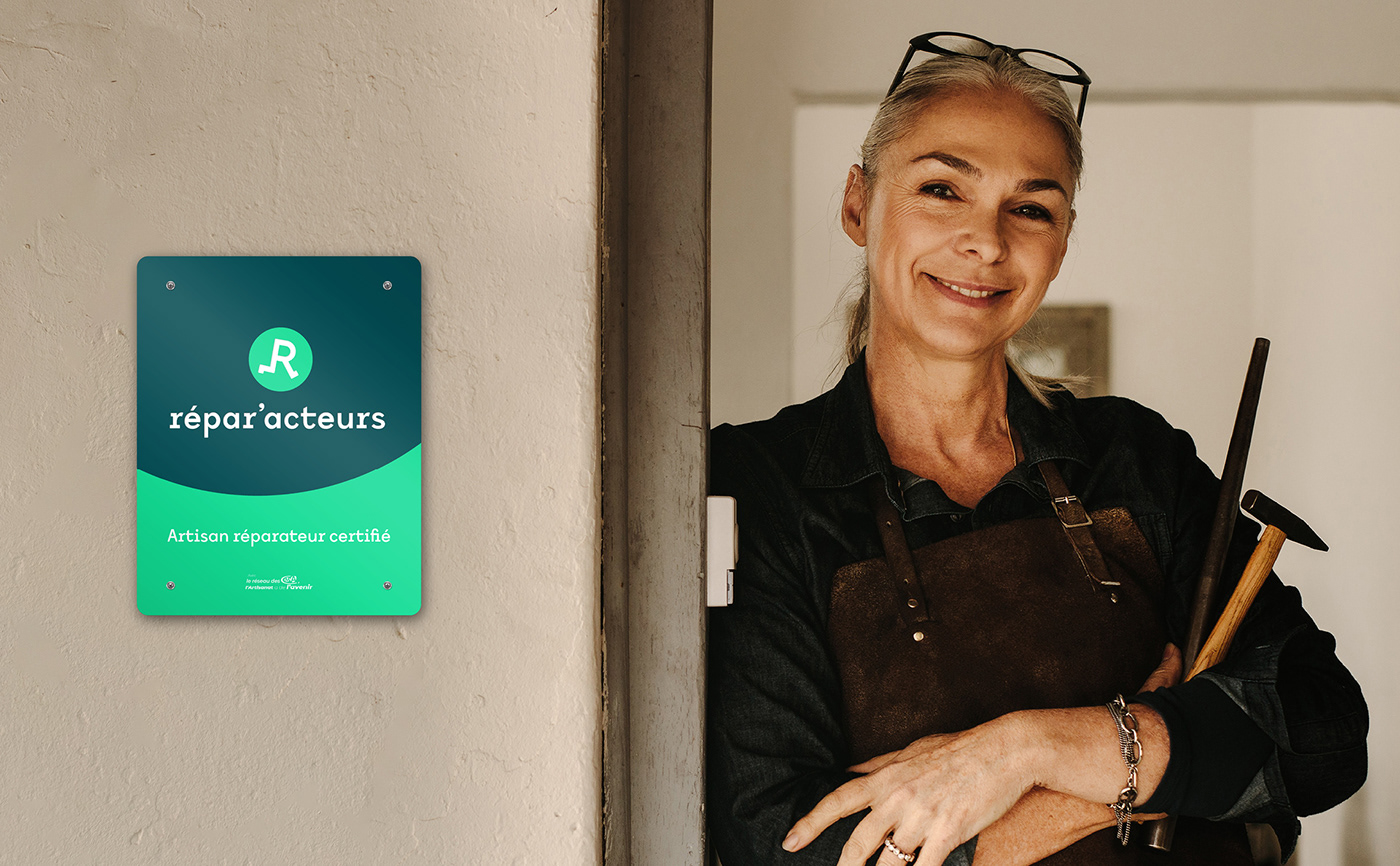
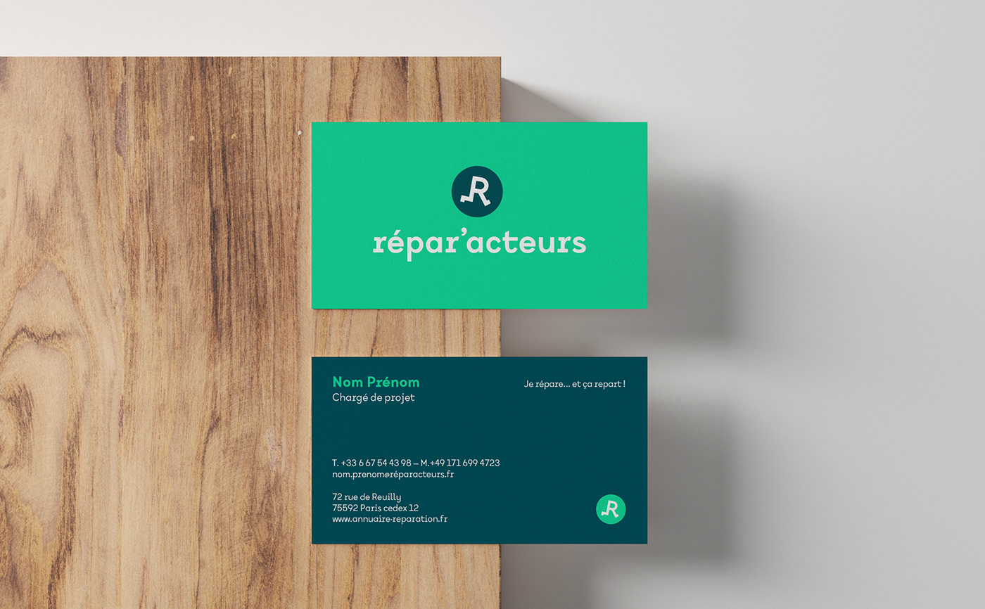
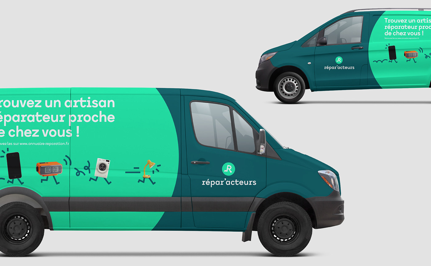
The Répar'acteurs put our objects back on their feet, which is why we decided to do the same with their logo. Indeed, the logo is a visual translation of the baseline "I repaired it, and now it's running again!" The letter "R" is used as a symbol, running along on its two legs. Simple and accessible, this logo invites us to take action!

Visual universe
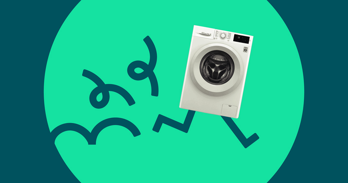
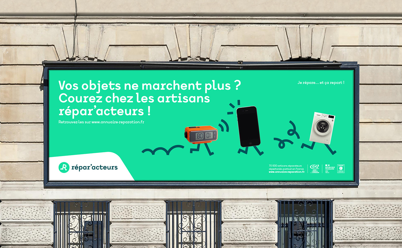
The visual universe is based on collage-type images as "lighthearted" as the logotype. The idea is to illustrate the diverse and varied goods and objects that can be handled by the Répar'acteurs craftsmen. The tone is playful and offbeat, the objects come back to life!


Thanks to Barbara Vertuaux, Marie Govciyan and the teams of the Chambre des Métiers et de l'Artisanat - France for their trust throughout the project.


