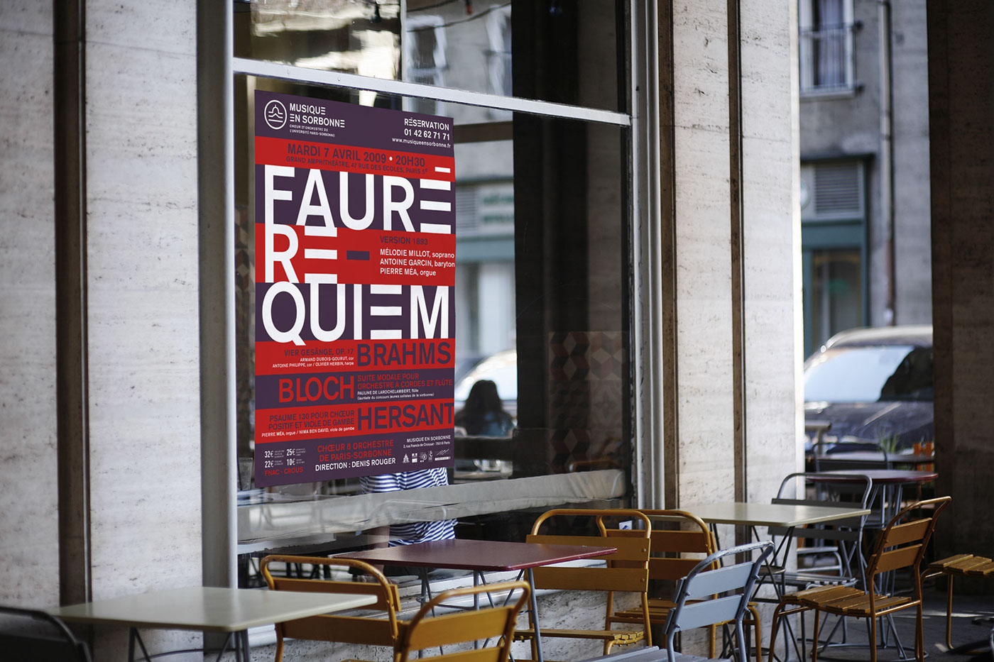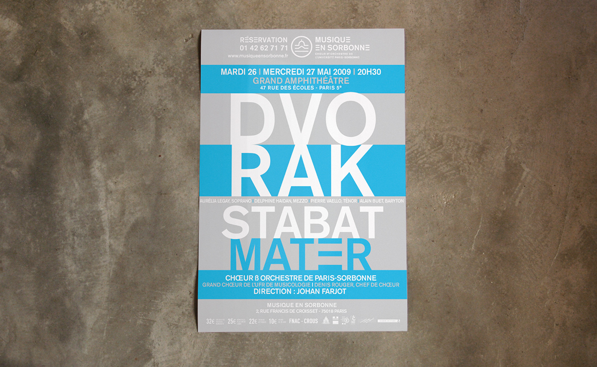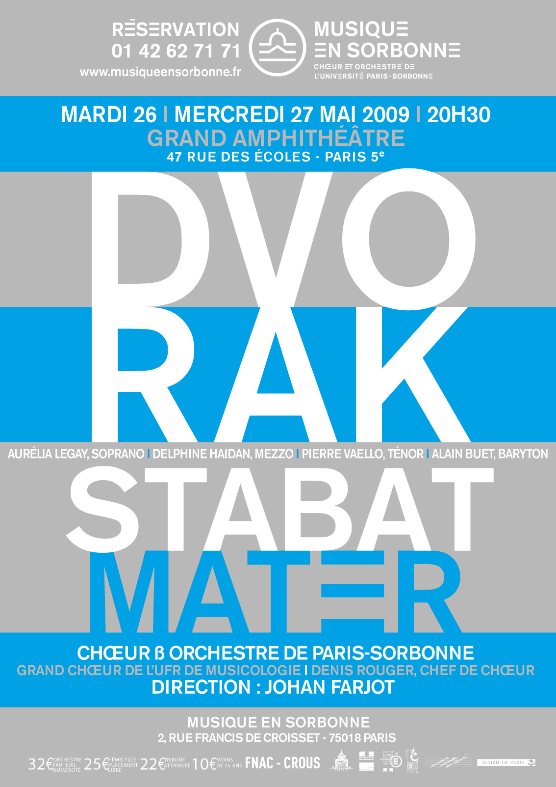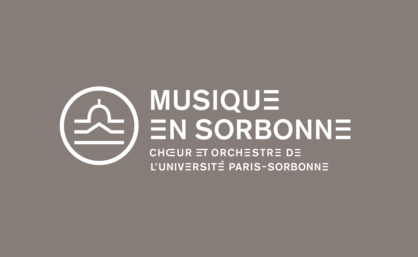
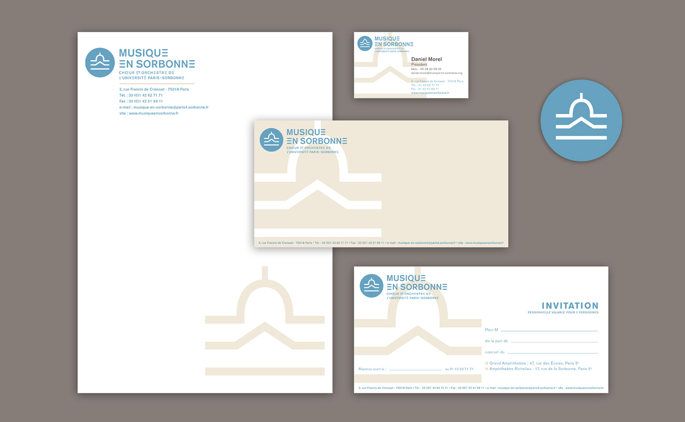


[FR] Voici l’identité visuelle du Choeur et Orchestre de l’Université de Paris-Sorbonne.
Typographie : En personnalisant la voyelle "E" ( la plus utilisée dans la langue française ), on créé un nouveau signe distinctif. Évocation du rythme, de l’intervalle, de la portée musicale, ce signe abstrait devient lettre “E” lorsqu’il est intégré au sein d’un mot.
L’utilisation d’un accent unique “horizontal” fait écho au rythme du “E”, comme une ligne supplémentaire sur une portée.
L’usage de cette typographie permet, avec une certaine économie de moyen, de mettre en place un système identitaire efficace et déclinable.
Le signe : Il représente la célèbre façade du bâtiment de la plus vieille université Parisienne.
Il symbolise le prestige et l’histoire de l’université de la Sorbonne.
Plus d'informations : http://www.grapheine.com/portfolio/musique-en-sorbonne
[EN] Here is the visual identity of Choir and Orchestra of the University of Paris-Sorbonne.
Typography: By customizing the vowel "E" (most used in the French language), we created a new emblem. Evocation of rhythm, intervals, musical scope, abstract sign becomes "E" when integrated within a word.
Using a unique "horizontal" focus echoes the rhythm of the "E" as an additional line on a staff.
The use of typography makes this with a certain economy of means, to establish an effective and déclinable identity system.
Using a unique "horizontal" focus echoes the rhythm of the "E" as an additional line on a staff.
The use of typography makes this with a certain economy of means, to establish an effective and déclinable identity system.
The sign: It is the famous facade of the building of the oldest Parisian university.
It symbolizes the prestige and history of the University of the Sorbonne.
It symbolizes the prestige and history of the University of the Sorbonne.