Global POS, retail performance - Brand identity
A modernized image to embody the evolution of a brand operating in the international market for retail software solutions
A modernized image to embody the evolution of a brand operating in the international market for retail software solutions
Global POS is a software solutions provider with 18 years of experience. Initially dedicated to cash solutions for physical points of sale, the group has expanded its service offering with an omnichannel payment platform that dematerializes the management of prepaid vouchers, a gift card program manager and alternative payment management. The digitalization of these services has aged the company's visual identity, which was no longer consistent with the expertise and modernization of its offering.
Graphéine provided support to Global POS in rethinking its visual identity. The aim was to respond to the brand's international deployment and adapt to the constant evolution of its offering.


A new brand emblem reflecting digital excellence
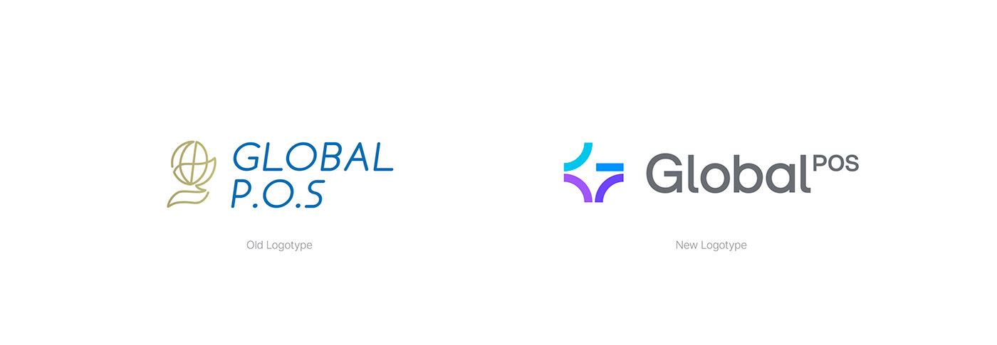
First of all, we questioned the name Global P.O.S. The use of the acronym "point of sales" seemed outdated, complex to read and pronounce. The acronym made Global P.O.S. sound too administrative, and didn't reflect the modernity of its smart services. Nevertheless, the group wanted to extend the notoriety of this name, which is highly recognized in its sector. We therefore opted for a slight evolution of the latter, erasing the acronym to establish a brand name that is legible, pronounceable and emphasizes the term "Global". Global embodies international expansion and a comprehensive service offering.
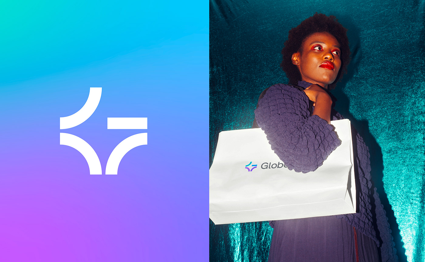
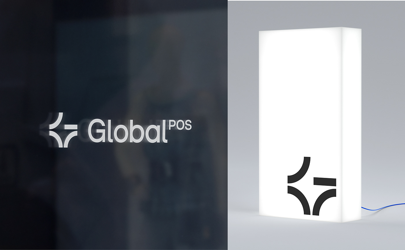
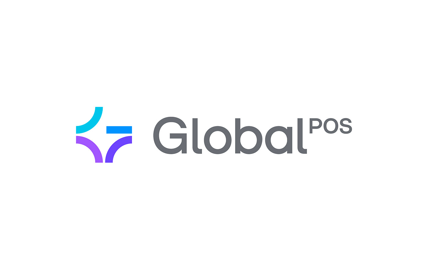
Global POS had a globe emblem adorned with a ribbon. This emblem was redundant with the "global" name and too far away from the digital aesthetic. We designed a new emblem with a G letter and a star, using customer satisfaction rating codes. With this new emblem, the brand emphasizes the premium quality of its services and its recognized excellence.


A new "smart experience" aesthetic for Global POS
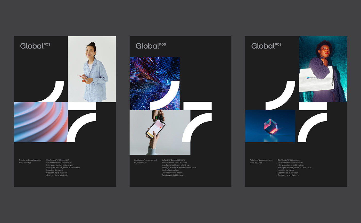
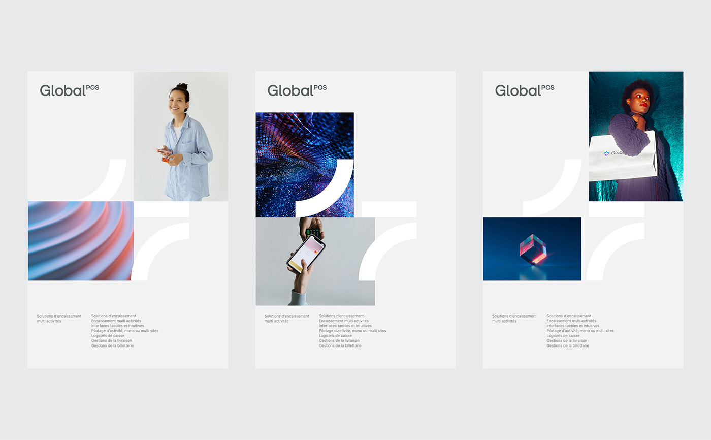
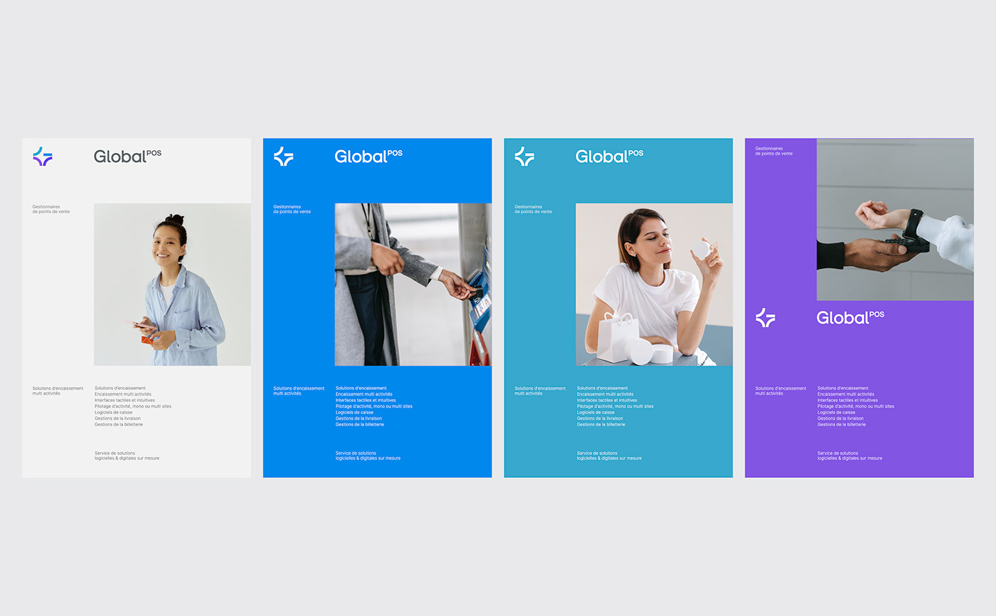
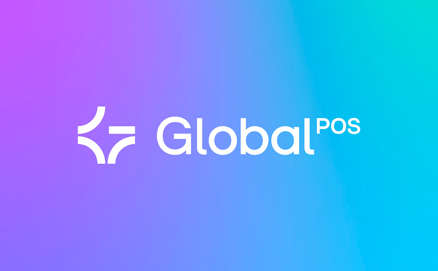
The brand wordmark is custom-made. Modernized, it is now written in lowercases to meet digital standards. The name Global POS is written as a single word, with the former acronym POS used as a superscript.
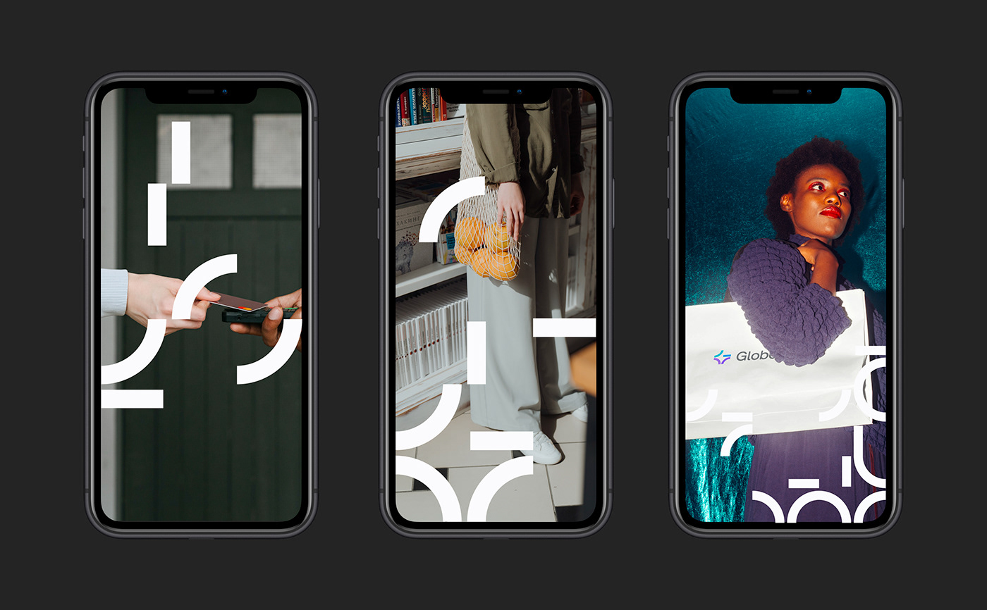
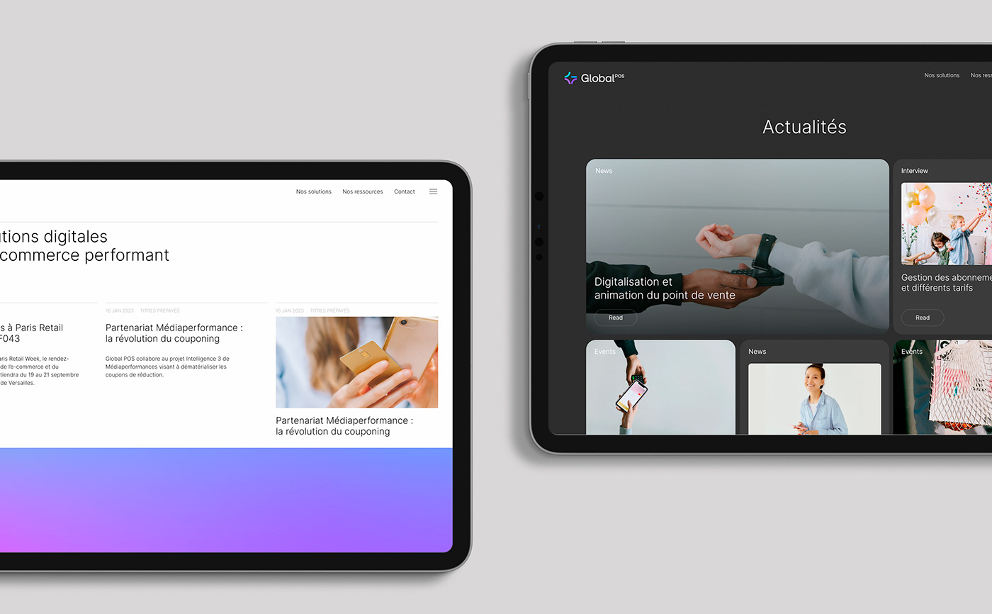
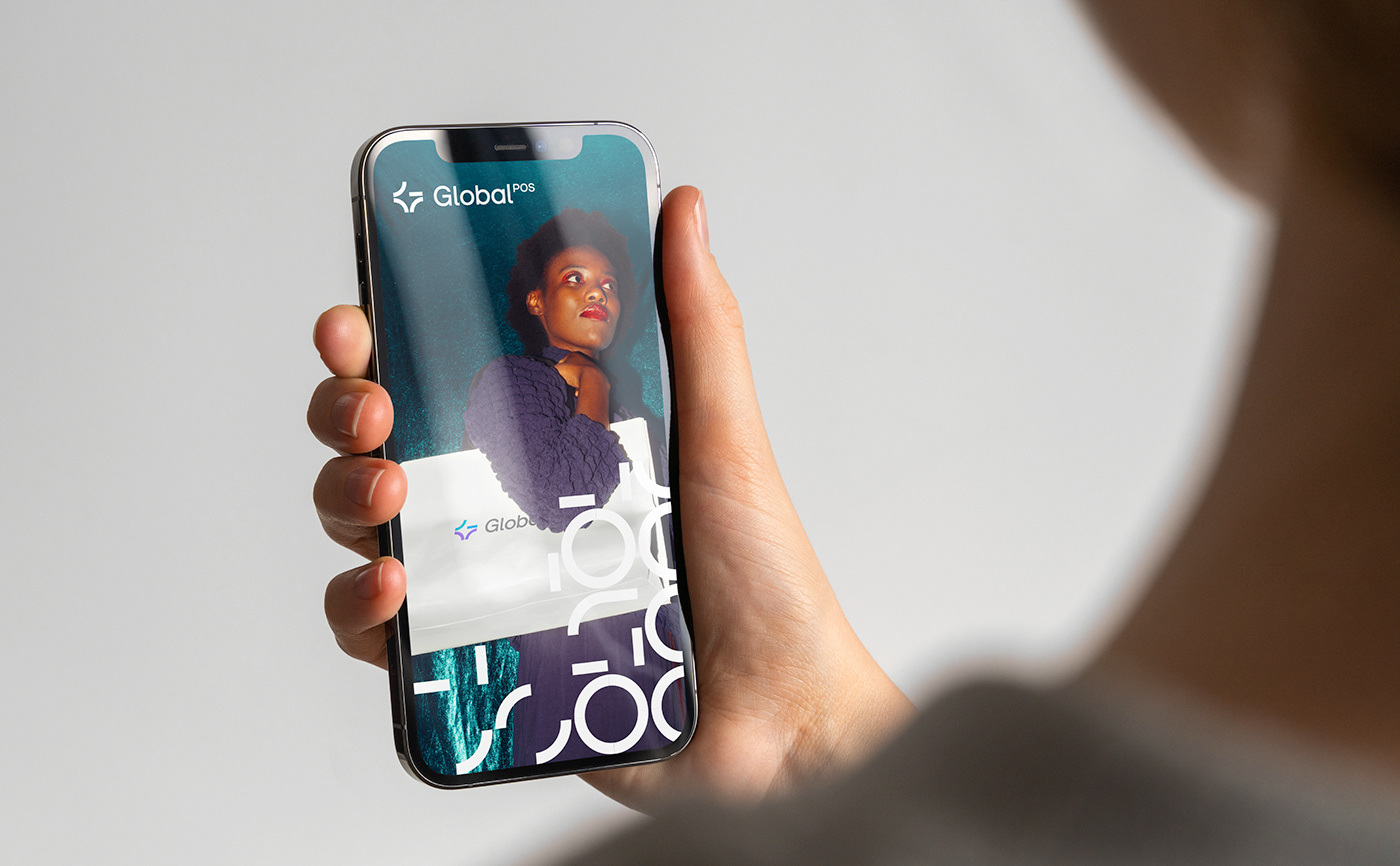
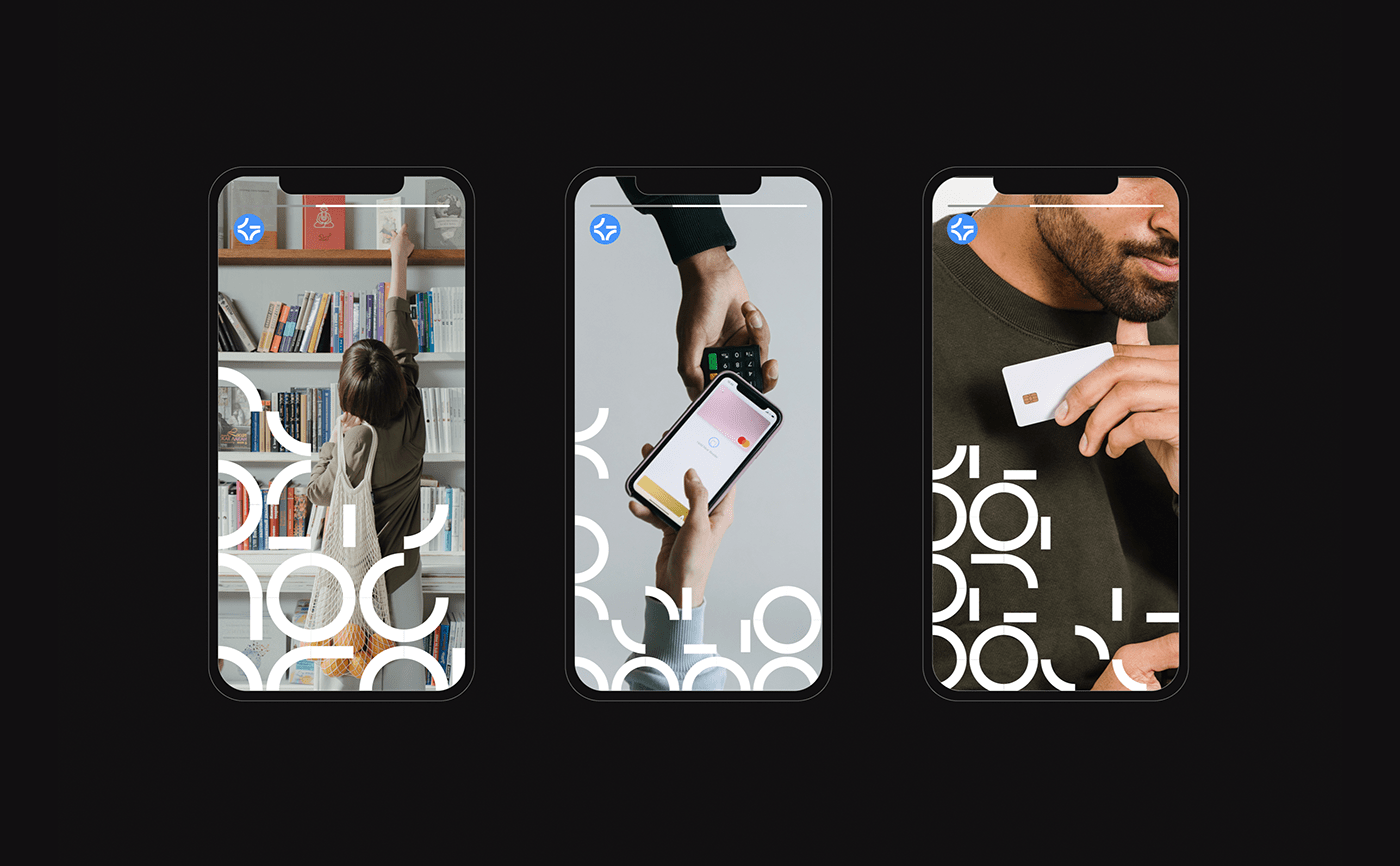
The color palette has been designed with warm gradations that work very well on screen and energize communications. The iconography has also been rethought to reflect the customer experience for retailers using Global POS. The photographs show us the satisfied consumer experience, free of any payment complexity. Global POS is there to make shopping a smart experience.
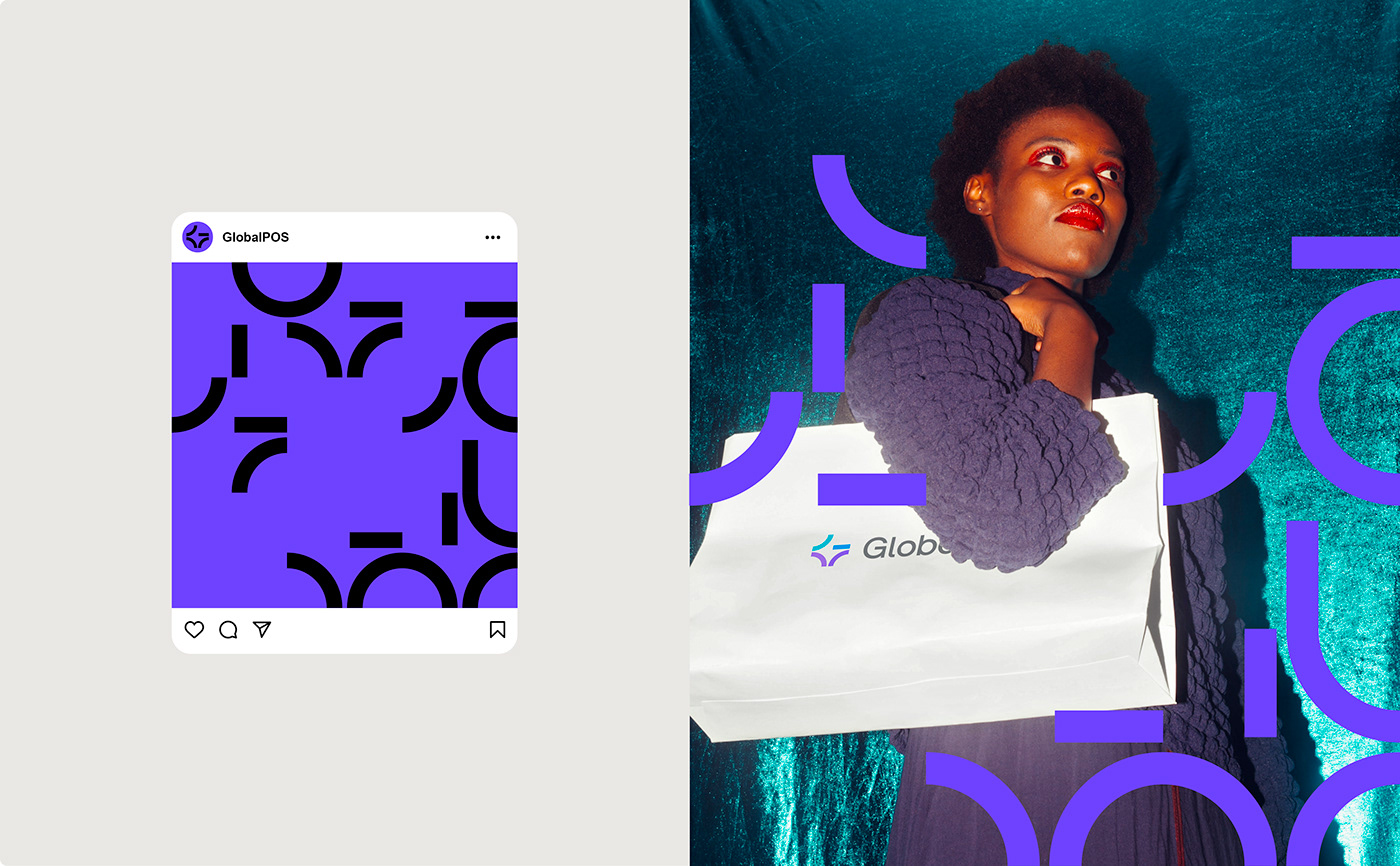
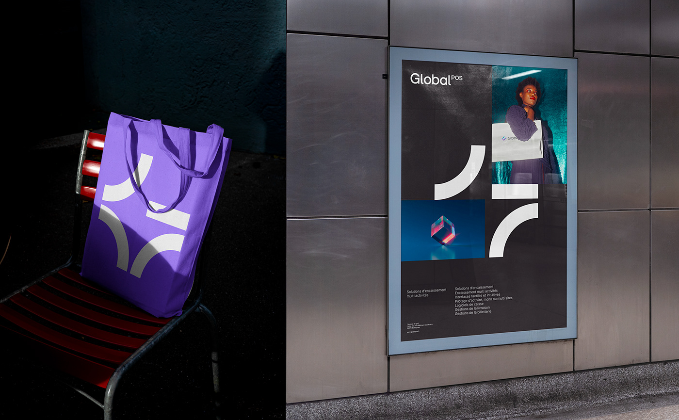
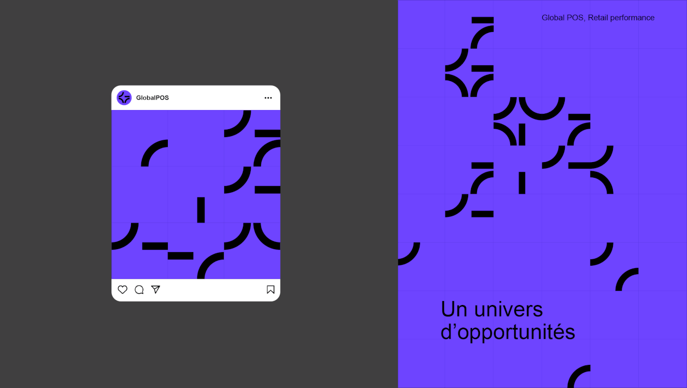
From the emblem grows a vocabulary of shapes, allowing the creation of a pattern that completes the graphic charter. These motifs can be superimposed on the photograph or replace it. With a visual identity more in keeping with its offer and the modernity of its services, Global POS is consolidating its brand image in line with its goal of international deployment.
The color palette has been designed with warm gradations that work very well on screen and energize communications. The iconography has also been rethought to reflect the customer experience for retailers using Global POS. The photographs show us the satisfied consumer experience, free of any payment complexity. Global POS is there to make shopping a smart experience.
From the emblem grows a vocabulary of shapes, allowing the creation of a pattern that completes the graphic charter. These motifs can be superimposed on the photograph or replace it. With a visual identity more in keeping with its offer and the modernity of its services, Global POS is consolidating its brand image in line with its goal of international deployment.