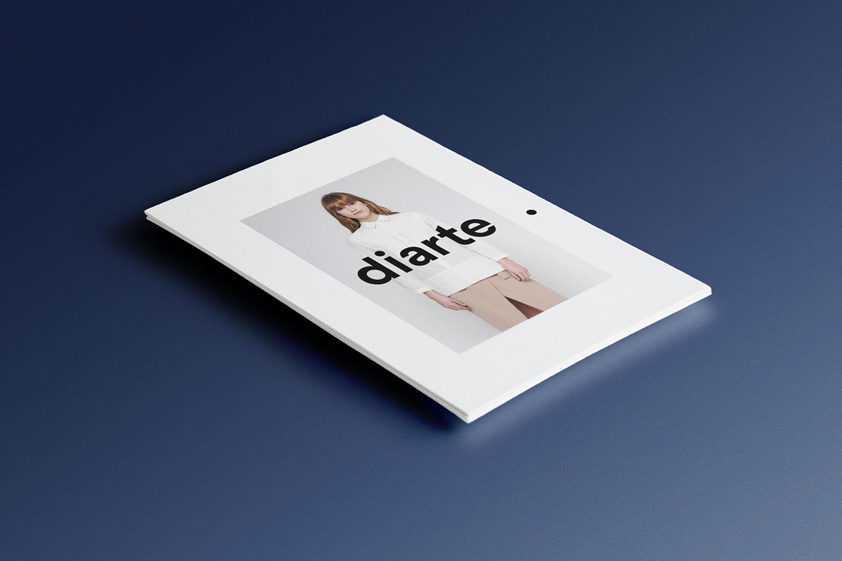
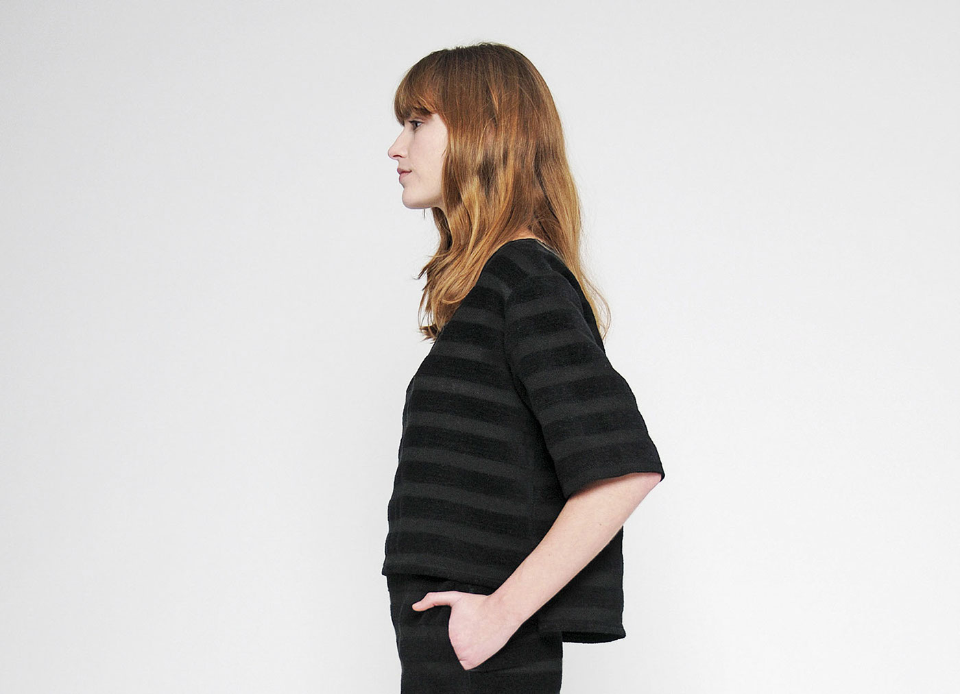
Diarte is a fashion brand of elevated knits and timeless wovens.
Built under the premisses of quality materials, clean lines and masculine flare, the brand presents absolutely wearable collections full of technical details and own design prints.
Built under the premisses of quality materials, clean lines and masculine flare, the brand presents absolutely wearable collections full of technical details and own design prints.
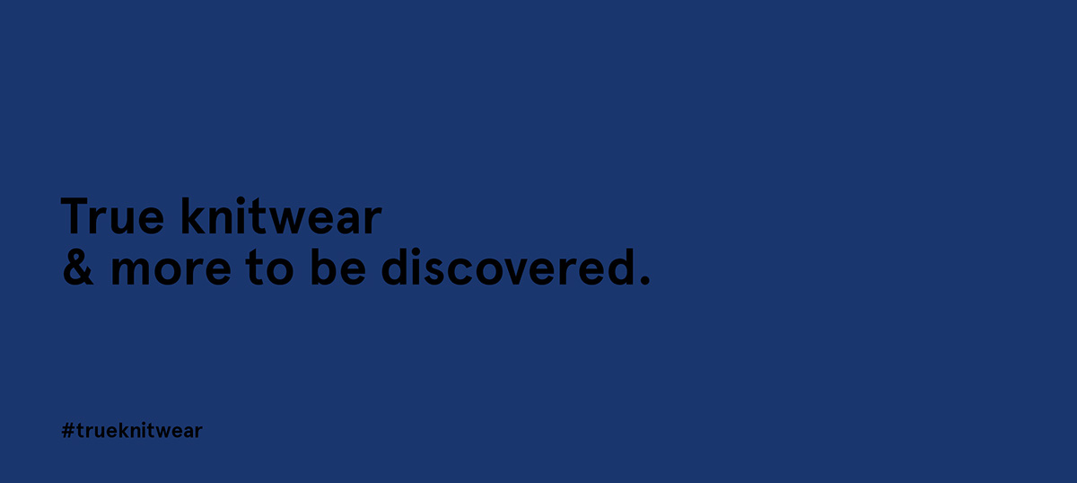
We faced the challenge of renewing the brand’s strategy through a completely new visual identity based on its claim 'True knitwear and more to be discovered'


The concept
In spanish the word 'punto' has two different meanings: knit and dot.
That´s why we created a visual identity around the graphic representation of a dot, not just to emphasize the connection between 'knit' and 'dot' in spanish, but to give strength and clearness to diarte's logotype.
That´s why we created a visual identity around the graphic representation of a dot, not just to emphasize the connection between 'knit' and 'dot' in spanish, but to give strength and clearness to diarte's logotype.

Diarte wants to keep on innovating and discovering new ways of surprise people with their collections.
The position of the dot in the logo -a bit separated from the word diarte- gives dynamism to the composition where it seems to be in movement connecting to brand's explorer archetype.
The position of the dot in the logo -a bit separated from the word diarte- gives dynamism to the composition where it seems to be in movement connecting to brand's explorer archetype.

Visual system
The corporate typography was carefully selected. Diarte needed a 'simple but nice' font to build its logotype and visual identity system.
We chose the grotesque typeface Apercu because of it´s characteristic shapes easily recognizable but still clear and simple.
We chose the grotesque typeface Apercu because of it´s characteristic shapes easily recognizable but still clear and simple.


