Getting a breath of fresh air or soaking up the art scene, trend-shopping or birdwatching, dipping your feet in the water or resting them under the table ... Knokke-Heist has it all.
This is an innovative coastal town bursting with life and offering amazing experiences. It is a place with many faces, but one that has always retained its DNA: quality and class. And it now radiates that DNA in a strong, uniform brand that can be used flexibly. Versatile yet unified. Because those words clearly reflect what Knokke-Heist is all about.
Diversity in quality.
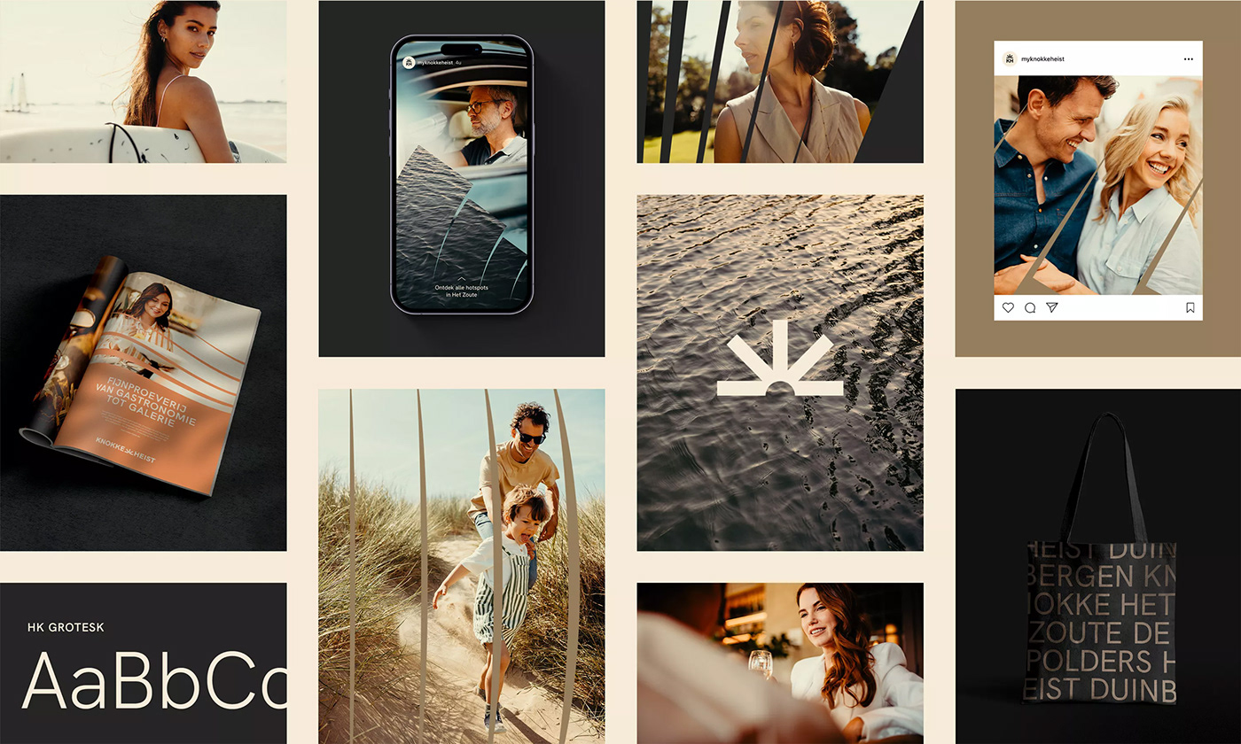
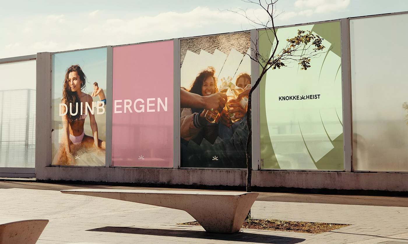
Knokke-Heist comprises five districts, each of which has its own special places and experiences. The result? There’s always something to experience - and this applies for visitors and residents alike. Diversity also formed the strategic basis. Not just for the rebranding but also, especially, for the new logo. It encompasses a range of experiences derived from the 5 districts. And winking at the setting - and then rising - sun.
The new Knokke-Heist is
colourful, casual, and lively.
colourful, casual, and lively.
Despite being an ancient icon, Knokke-Heist never stands still. And that called for a dynamic visual language featuring graphic shapes that organically wave, sway, and blow. It needed lines from the logo that move and flow into each other. And a clear, natural, and modern typeface that is immediately recognisable was a must. An identity had to be projected that brings unity yet leaves enough room for flexibility. That way, the various different city departments would all be able to use it.

Compelling colours.
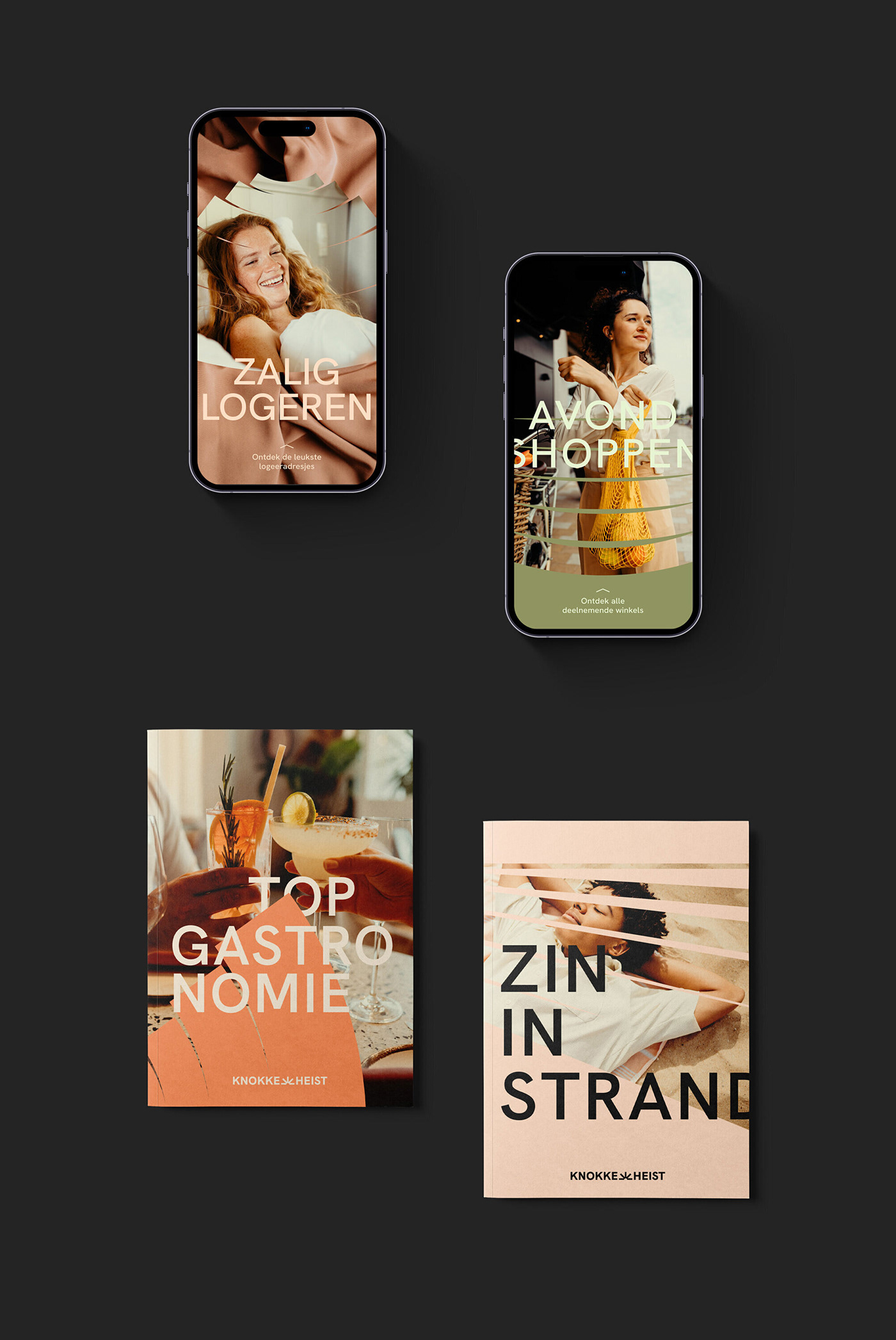
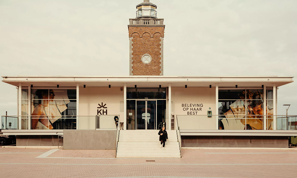
The endless, blue sky. The soft, sand-coloured dunes. The 80s-style pink offered by the Lichttorenplein. The coastal city itself provides the basis for a poetic colour palette that highlights the diversity and colourful character of Knokke-Heist.
Moving shapes.
Knokke-Heist is always on the move. And that also applies to its brand identity. With a dynamic design language that always starts from the lines of the logo. We let them move and flow into each other. From slow to fast. From tight to curved. From district to district. From experience to experience.

The focus isn’t on attractions,
but instead on the people.
but instead on the people.
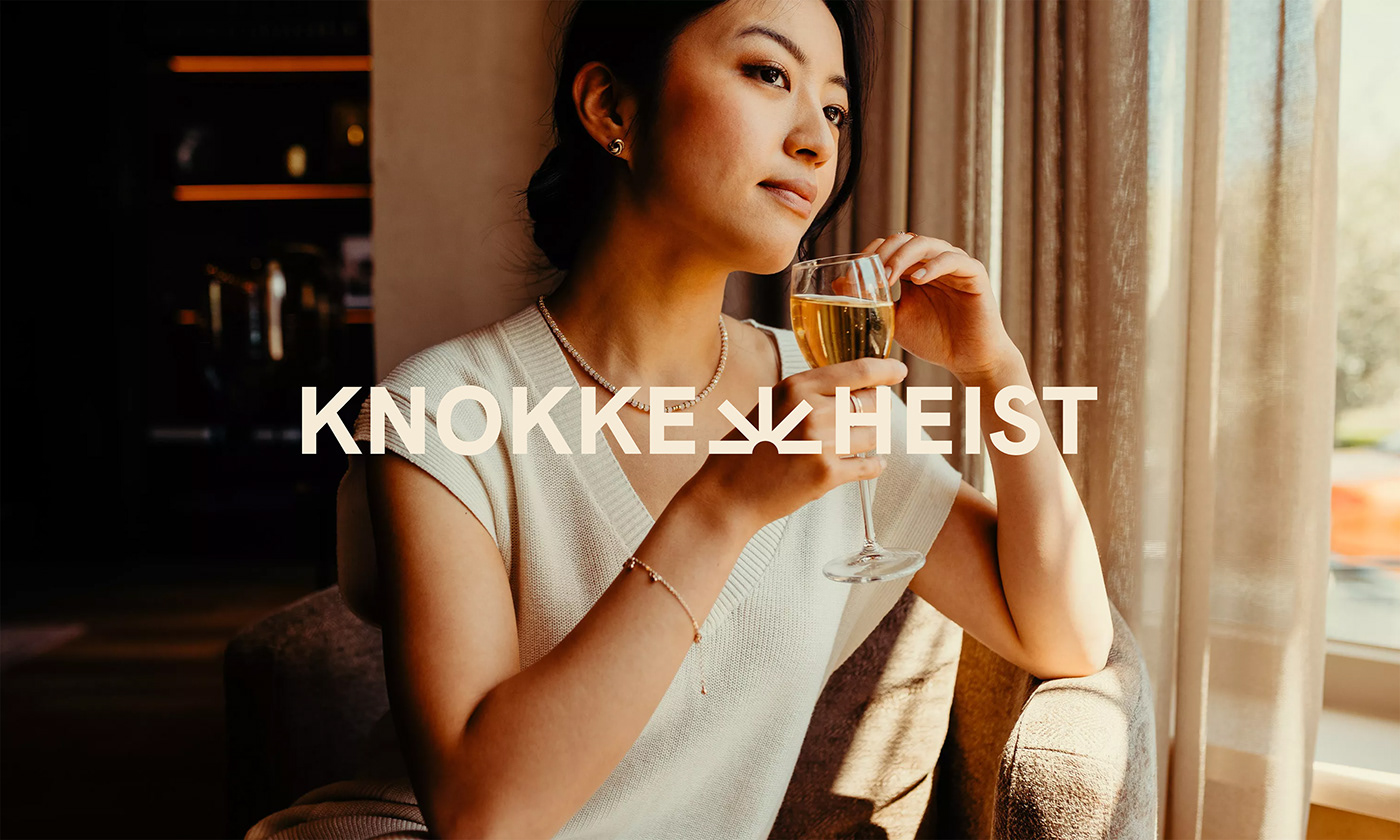
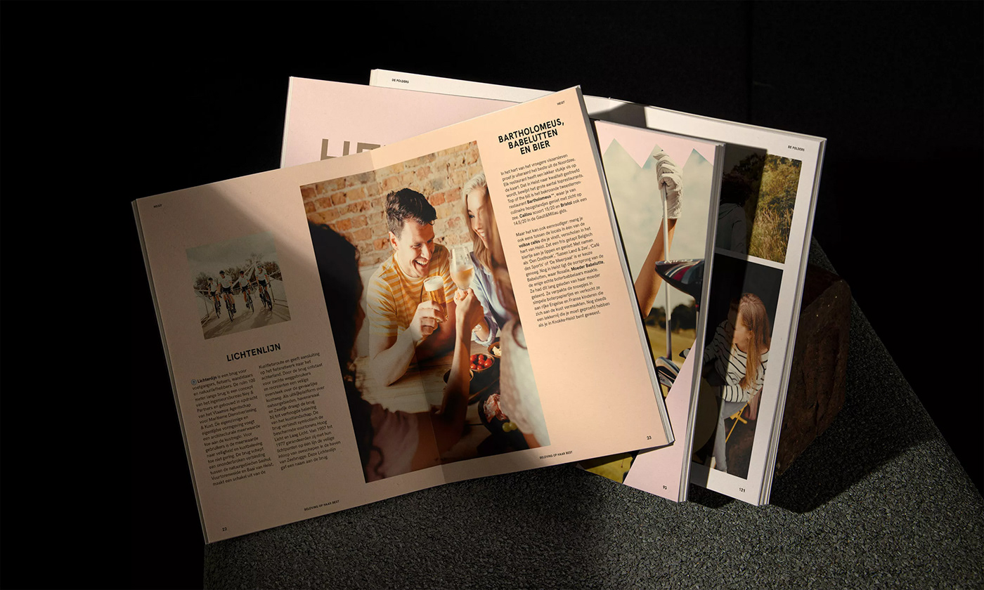
Knokke-Heist is defined by its residents and visitors - not by its attractions. The visual style is positive, dynamic, and ‘in the moment’. It is never ‘perfect’ or ‘overly posed’. On the contrary, it is always real and close. You can continuously feel the presence, even if you aren’t always explicitly seeing it.


While other municipalities focus on the attractions they offer, Knokke-Heist expresses its individuality in a more emotional way. It is proud of its diversity, its people, its different neighbourhoods, and the range of experiences it offers. And it radiates that pride. In a contemporary and stylish way.


