Belcolade
From classic player
to remarkable frontrunner.
From classic player
to remarkable frontrunner.
More than 30 years’ experience. Part of Puratos Group. And the only B2B chocolate manufacturer in the world still in Belgian hands. Is Belcolade a classic in the chocolate industry? Undoubtedly.
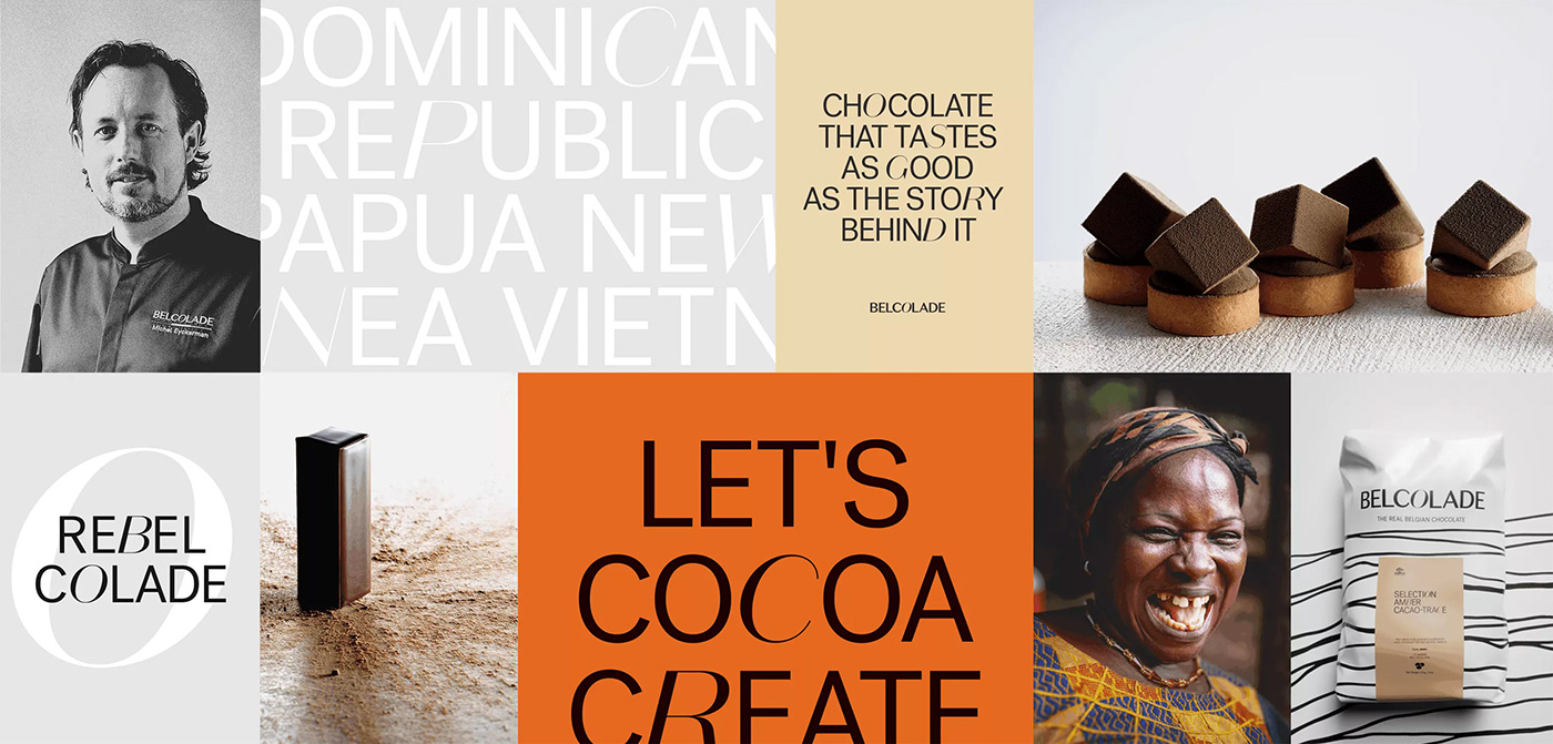
Today, however, the chocolate brand is more than that. Their new sustainability goals are progressive. Their collaborations with local cacao farmers and chocolatiers unrivaled. Belcolade is one big chunk of innovation and humanity. But their branding did not necessarily reflect that. So we created a brand that expresses what Belcolade stands for today. Positive and caring. Disruptive and Belgian through and through.

The new Belcolade is breezy, artistic, and inventive. A fresh, colourful wind in an industry where golden and dark browns usually set the tone.
A tighter wording of the purpose formed the foundations of the rebranding. You can feel it in every fibre of the brand identity. Including its manifesto, verbal identity and motion identity. And their experience and know-how? That you can taste in the visual identity.
Chocolate inspired
graphical patterns
graphical patterns
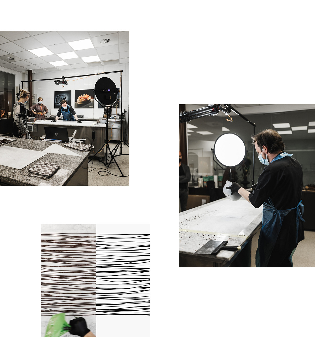
Artistic, black and white patterns constitute the playful basic layer for other brand elements such as pictures, videos and headlines. They refer to an important step in every chocolatier’s process: hot tempering of the chocolate. Designers for the day? Belcolade’s expert chocolatiers, actually. That way, the artisanal chocolatier - Belcolade’s prime target audience - plays a vital role in its identity.

In this way, the artisanal chocolatier - the target audience of Belcolade - is also given a central role in the identity.
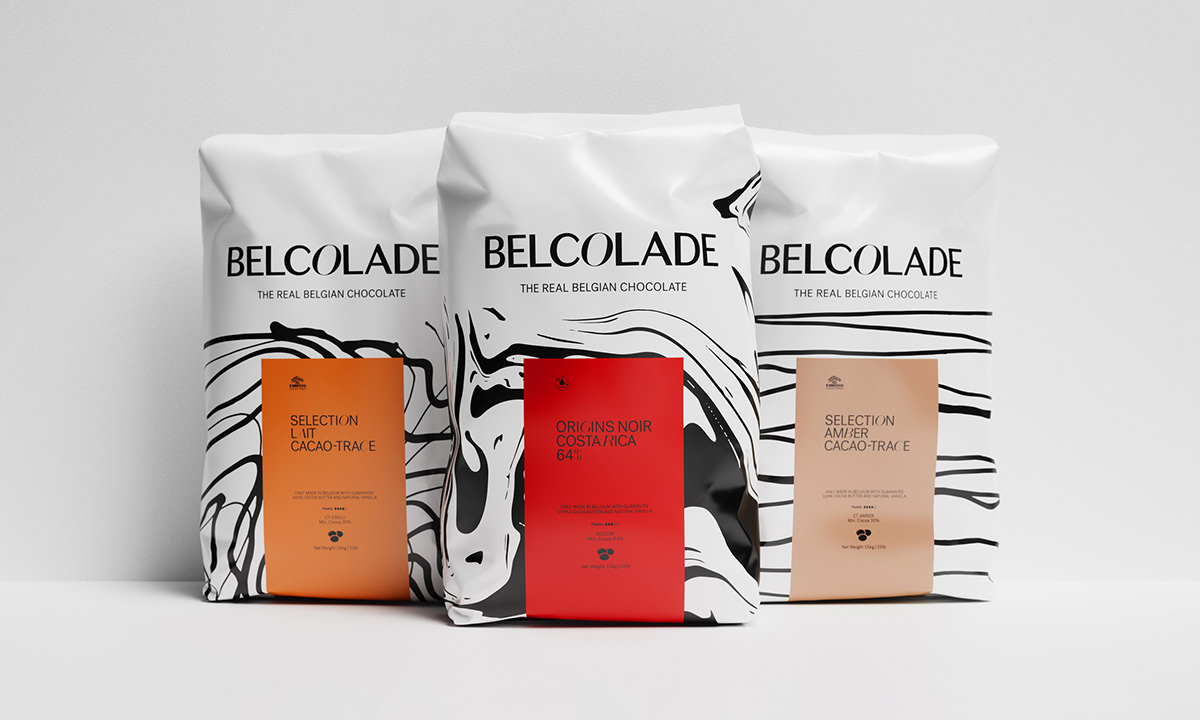
The graphical patterns also pop up in the packaging. Albeit mixed with the signature colour of each chocolate variant. The result? A packaging that really gushes with the thrilling, tasty goodness of chocolate. It jumps out in a sea of brown and golden tints.

Typography
Neutral and contemporary versus lively and delicate. There is an exciting tension between the two primary fonts. We’ve put them together intentionally to underline the disruptive attitude of Belcolade.

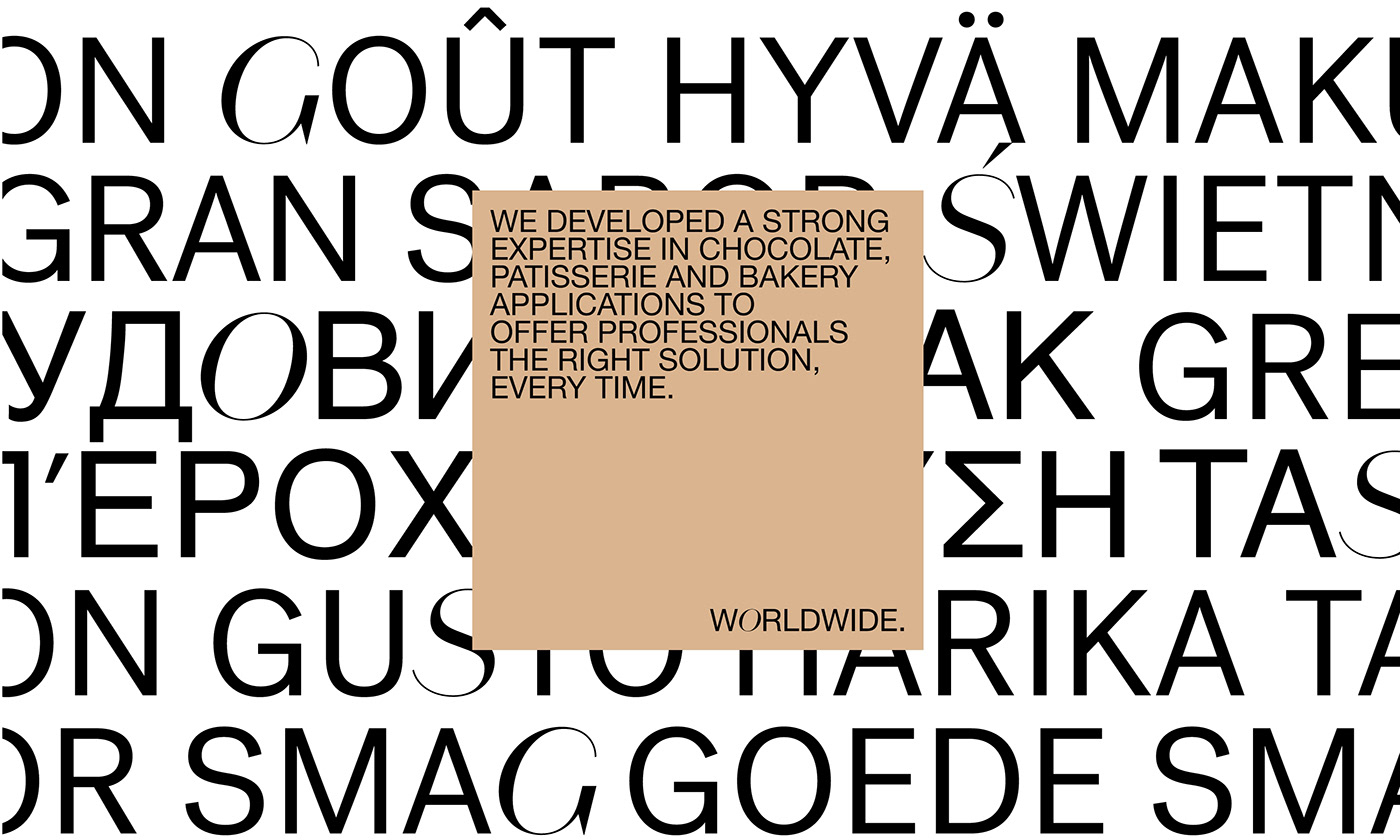
Belgian roots. Active worldwide.
That, too, is Belcolade.
That, too, is Belcolade.
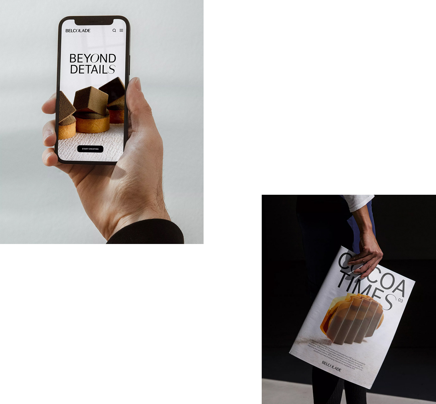
So we created we a comprehensive brand guide - including presentation and motion templates, digital guidelines, language-friendly fonts, … - and a launch video to roll out the new brand story in various markets in a consistent manner.