Beverly Møøn
2019
OVERVIEW
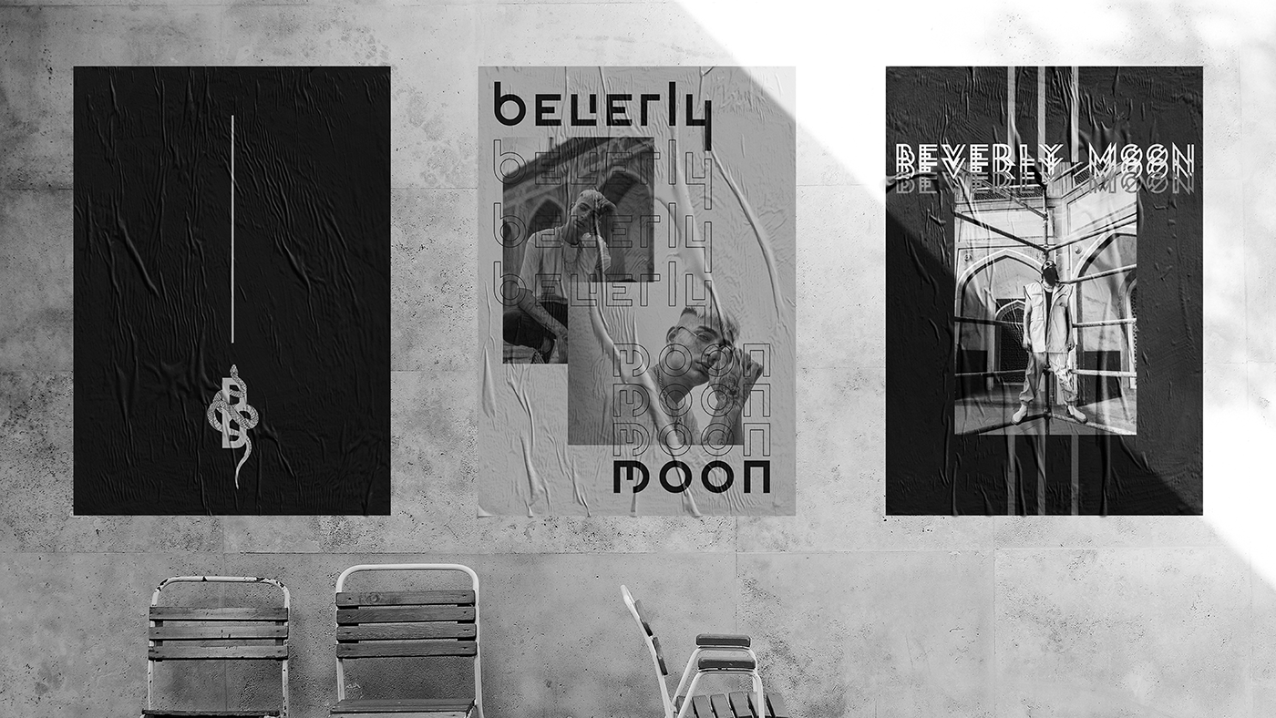
Beverly Møøn is a streetwear brand inspired by classic tailoring with a deconstructed lift, established in 2014 by Beverly Kho. Through bespoke and ready-to-wear garments, the brand aspires to create distinct lifestyle designs for any creative savant expressing themselves however they choose.
To match their cutting edge staples, we created a lasting brand design that can transcend through different collections to come, for different people who resonate with their pieces. For the color palette, we focused on minimal and neutral tones. From darker hues of Heavy Metal to Fuscous and Dusty Gray, and a splash of cement-like Swirl, the balance is reminiscent of concrete, a foundation of one’s wardrobe that proves adaptable to any day. The initial logo was a conception of an array of graphic elements, settling on the imagery of a snack, symbolizing rebirth and a life force. Partnered with edgy modern typography, the sharp lines and intertwined curves represent the balance of feminine and masculine energy. But reimagined, the logo evolved into a simpler design; one that communicates the brand name balanced on geometric shapes representing universality.
Driven by its very own creative life force, the font styles and application followed suit in their own raw yet elegant manner. Staying true to their calling in every aspect of the business, Beverly Møøn speaks of diversity through art and fashion in their work.
SERVICES
Visual Identity
Art Direction
Packaging
Packaging
Signage