2020
Peddler Days
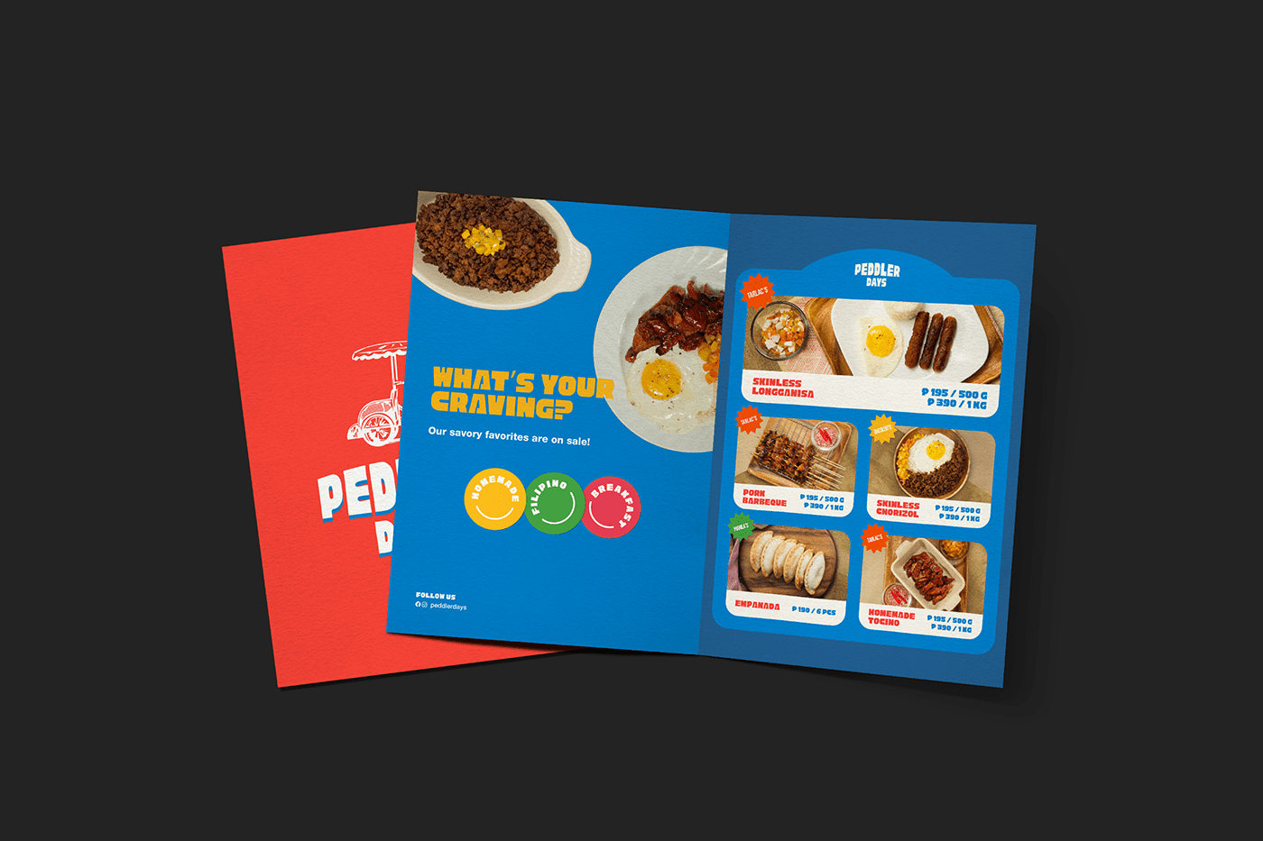
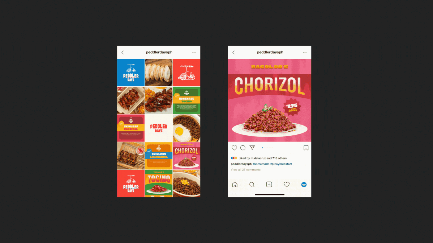
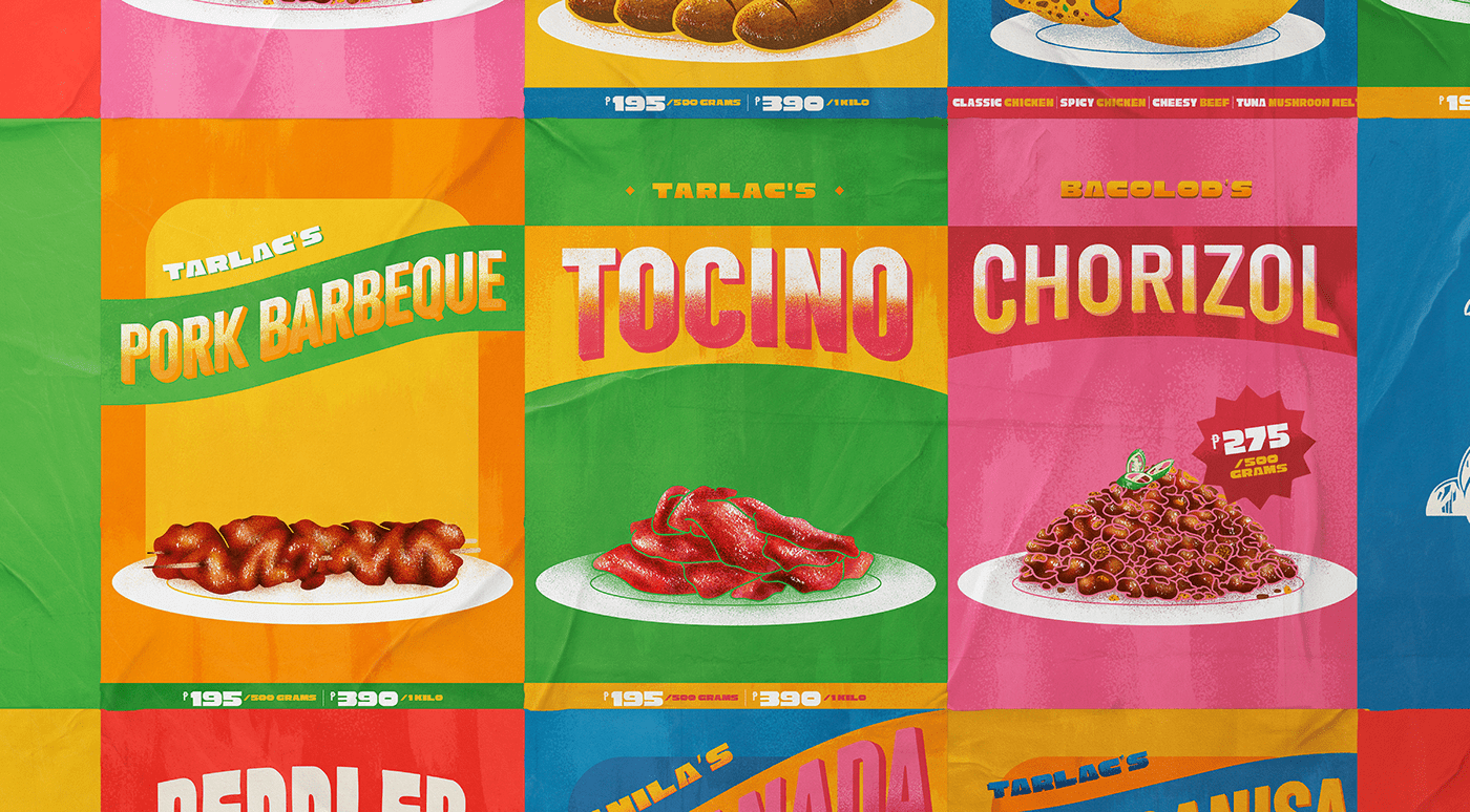
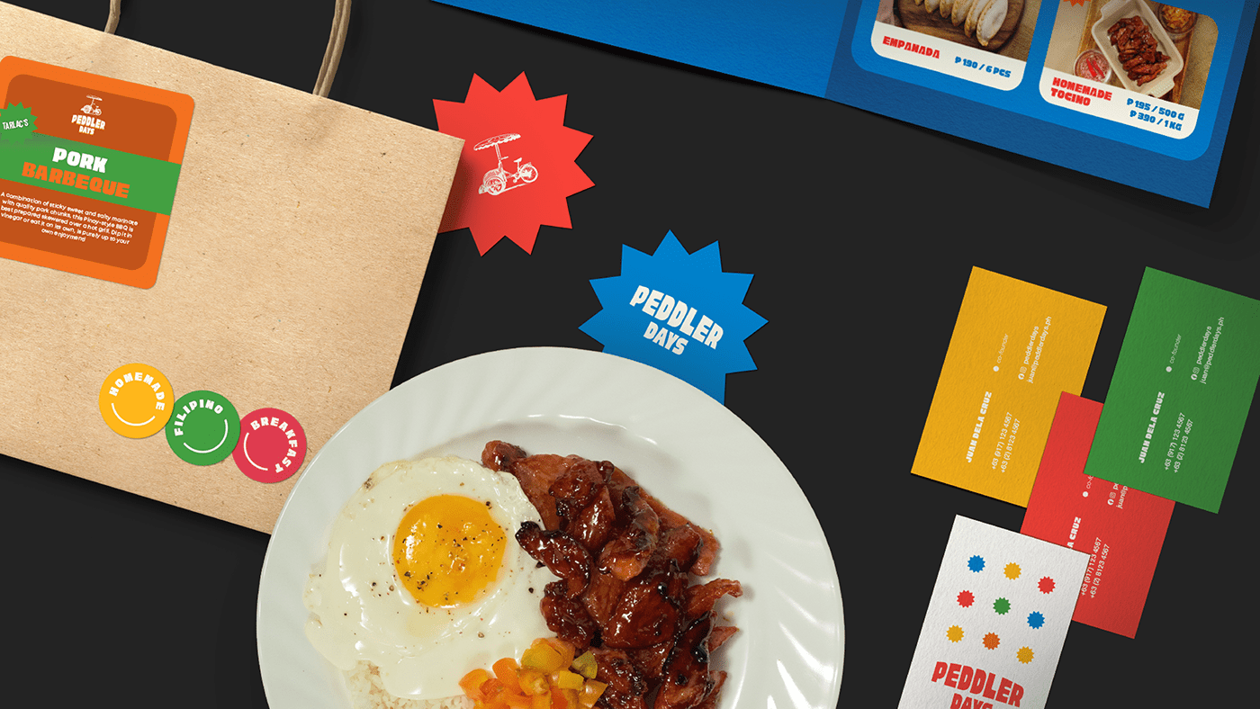
Returning to its roots, Peddler Days recalls a simpler time: the summer heat, the side of the street, and a home-cooked treat. Serving all-day Filipino breakfast favorites from different regions, customers can choose from a range of classic dishes with an authentically local twist.
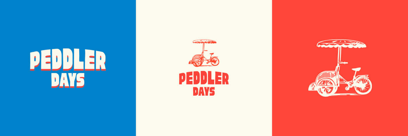
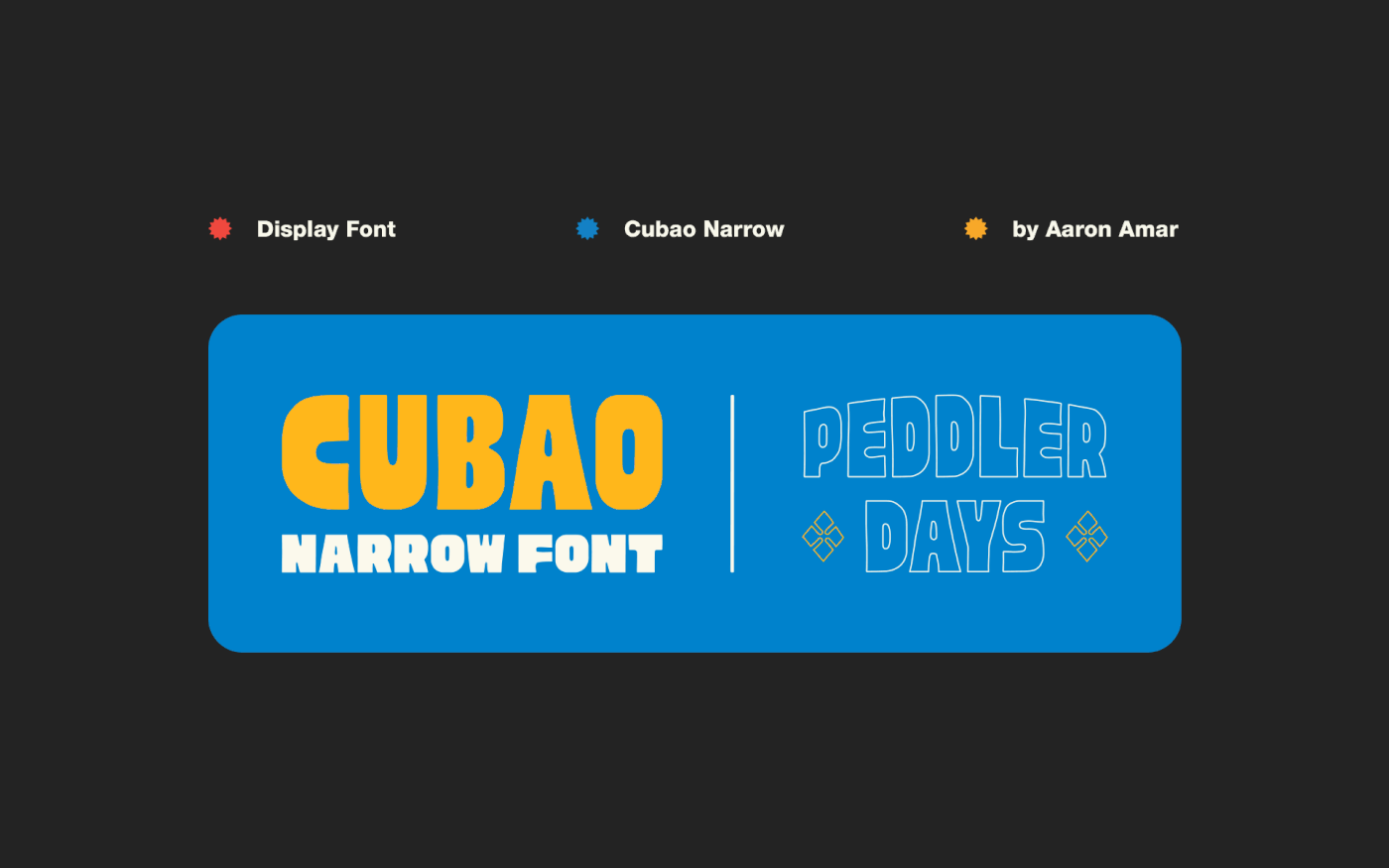
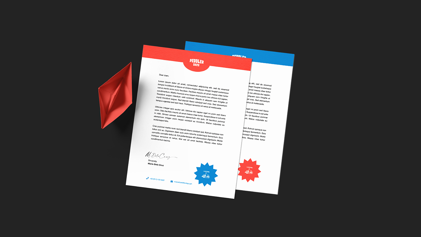
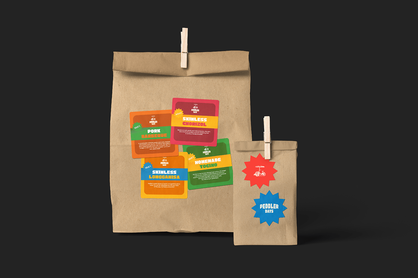
To match the Filipino spirit in every last bite, we shaped their visual identity to be as bold and striking as our flavors tend to be. Following a pop art concept, the hero colors of Mariner, Coconut Cream, and Cinnabar are chosen to resemble our flag. For the menus, our illustrations of their food feature bursts of color that depict the festive spirit with which we share our meals. For the menus, we used the same bright hues and photo-heavy blocking, while combining illustration and typography reminiscent of homemade menus at our local karinderya. To add the touch of hand-painted art, a locally made font only made sense for this local brand: see Cubao Narrow by Aaron Amar, a testament to the unique jeepney signages on our streets. As an extra treat, any true Pinoy would recognize the subtle elements of different regions, just as each dish takes you on a trip around the most loved food in the country. And lastly, the logo: a peddler, familiar to us in its pedicab frame and umbrella, a vision of a hot meal and a memory on the corner of the street.
Visual Identity, Logo Design, Sticker Design, Menu, Posters