_
EN
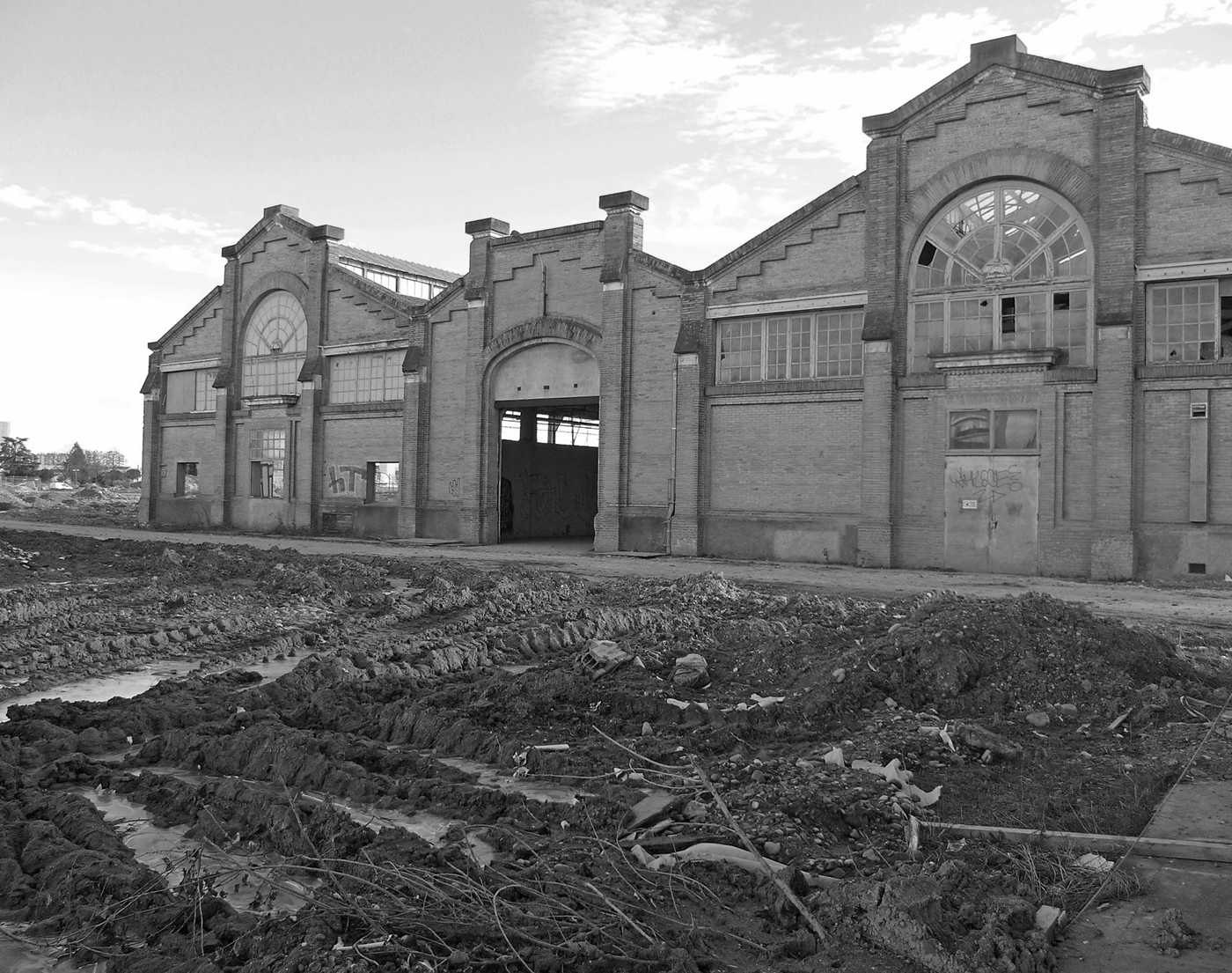
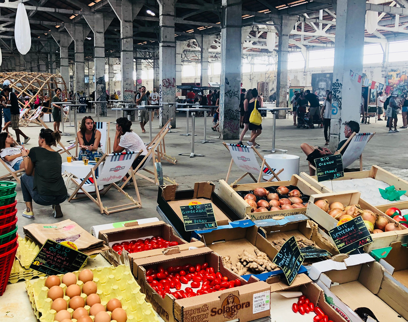
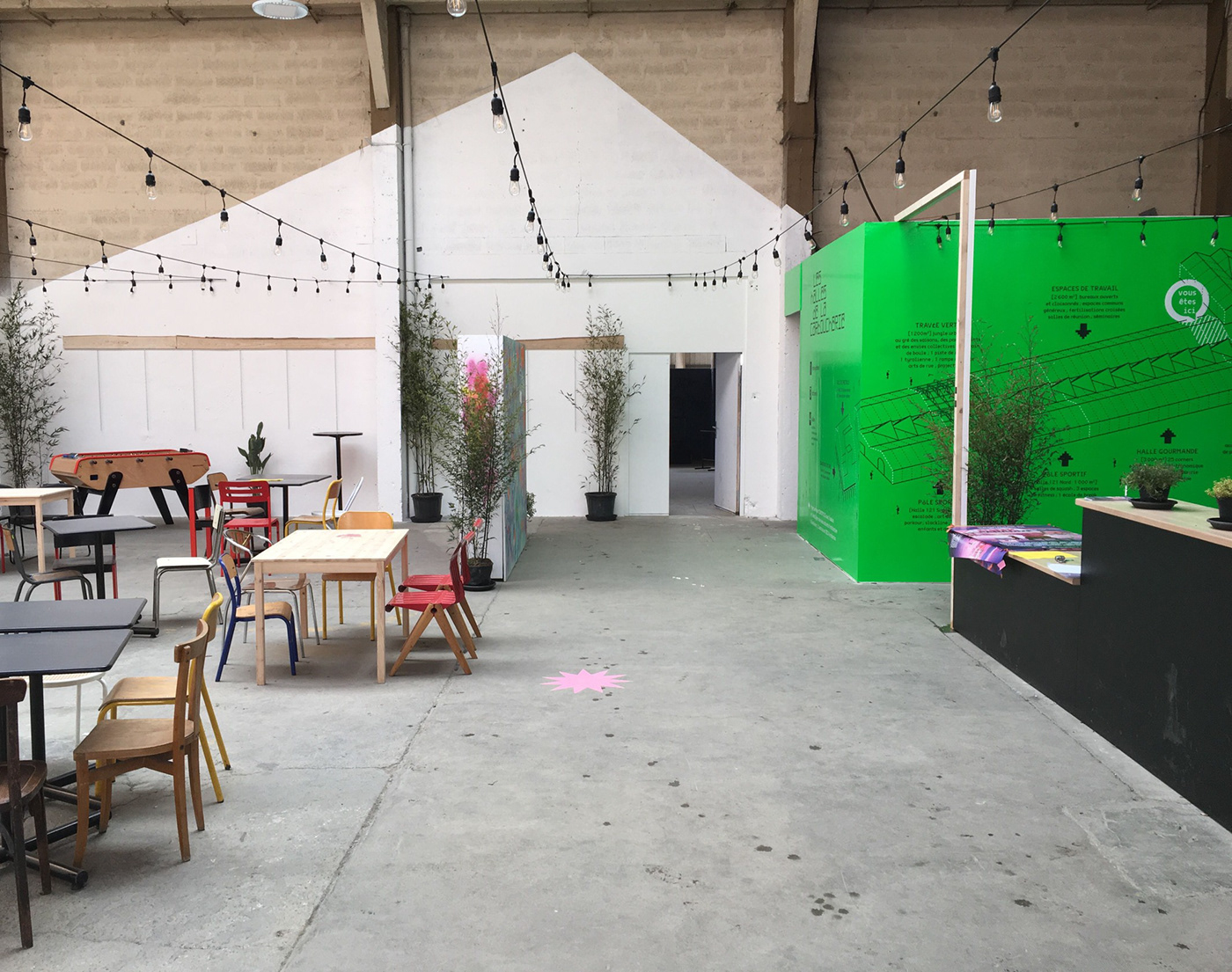
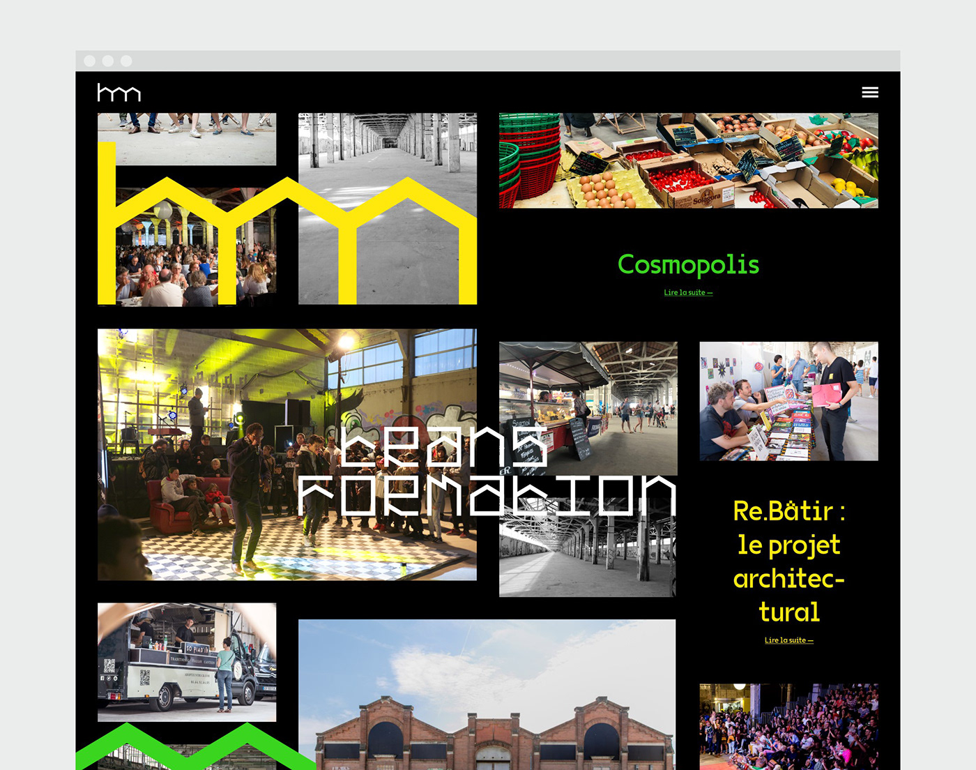
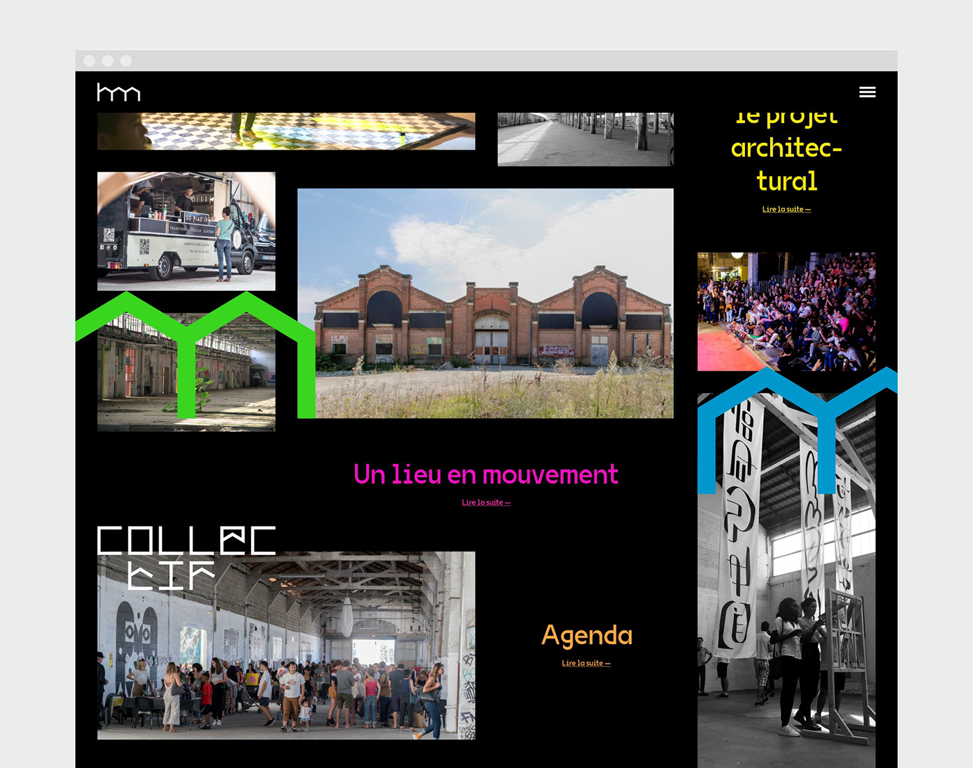
Les Halles de la Cartoucherie is the new third-place in Toulouse, located in the heart of former ammunition manufacturing workshops (14,000 m²) dating back more than a century, 15 minutes from the hypercentre. The project, which will be completed in 2020, will see its first concrete hours in spring 2019 with the launch of a cultural, artistic and gastronomic programme that will prefigure the site's future activities. In the long term, these halls, which open onto a brand new eco-neighbourhood, will bring together a wide range of activities around 4 poles: culture, gastronomy, sport/wellness, workspaces.
We were approached by Cosmopolis, the collective behind this giant project, to provide Les Halles with a graphic identity that would mark the official launch of the project and could support it at all stages of its development. The challenge was to be able to showcase the madness of a hybrid place, an experimental spirit and a taste for all cultures, both traditional and innovative, all in a conscious and responsible manner.
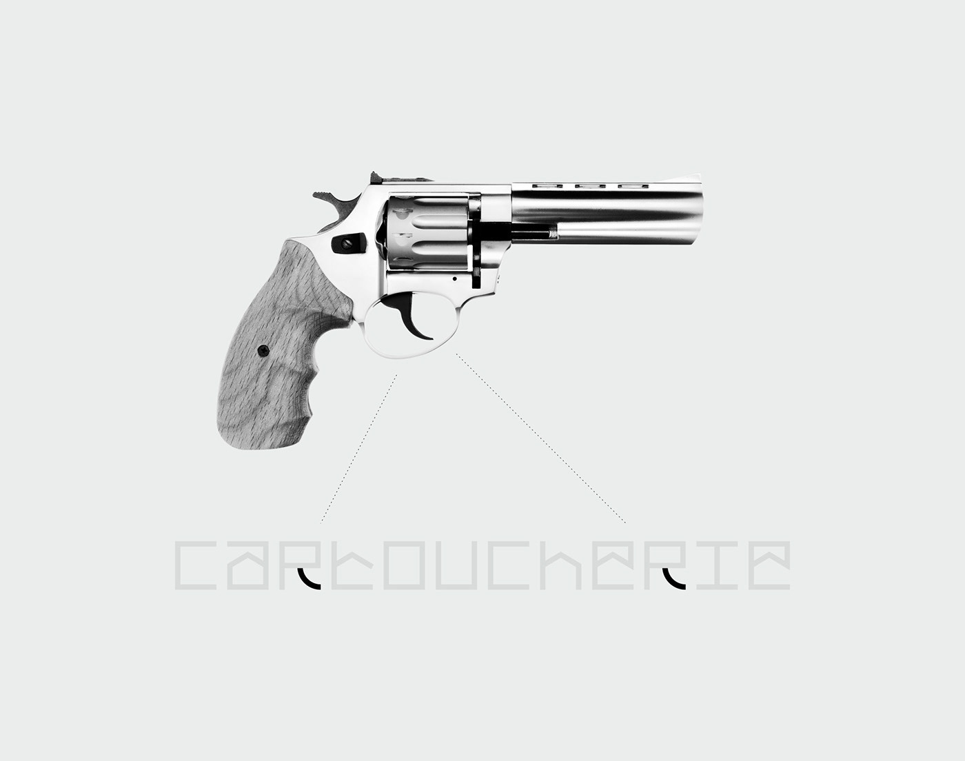
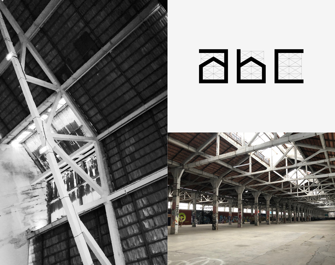
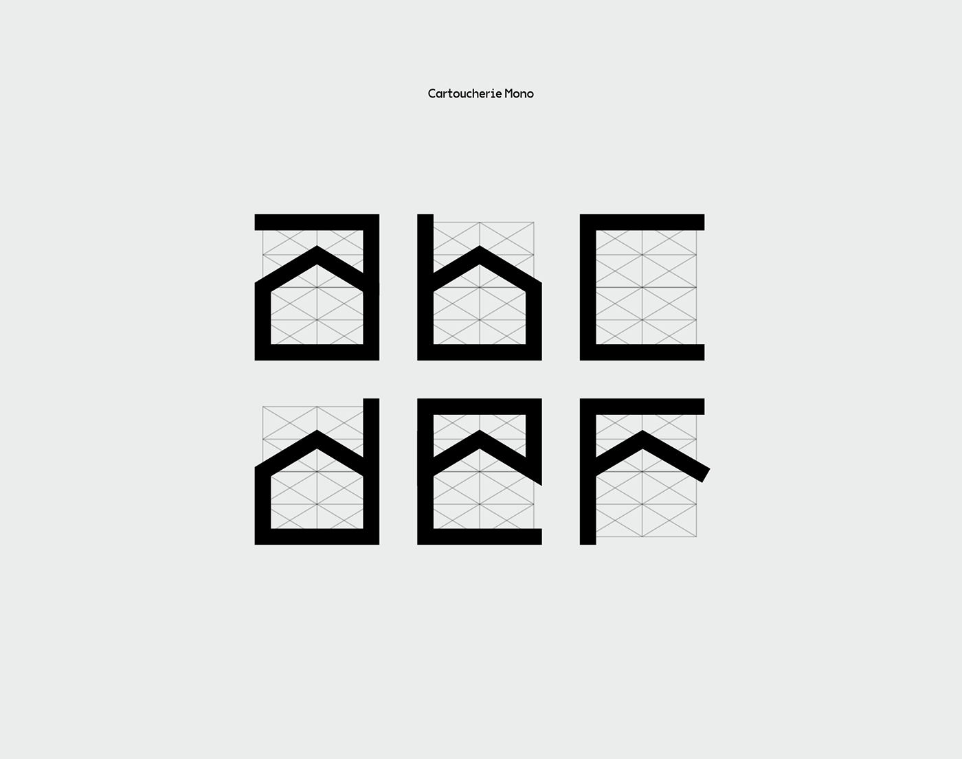
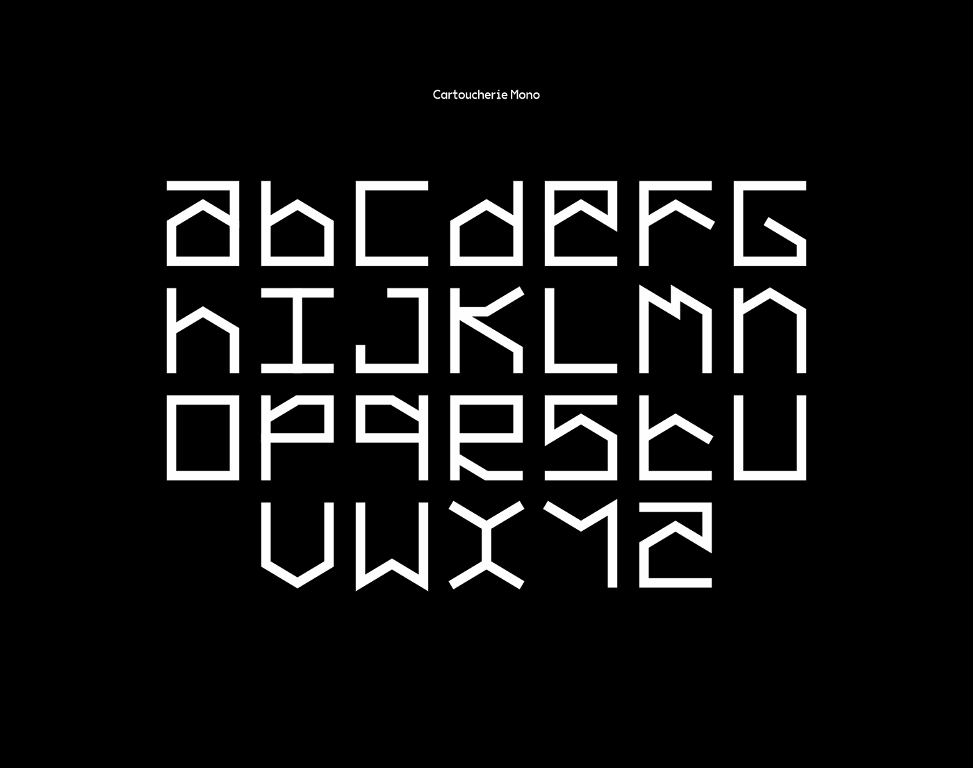
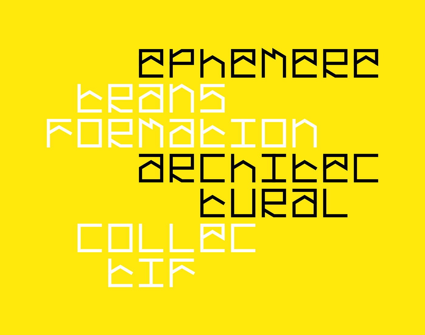
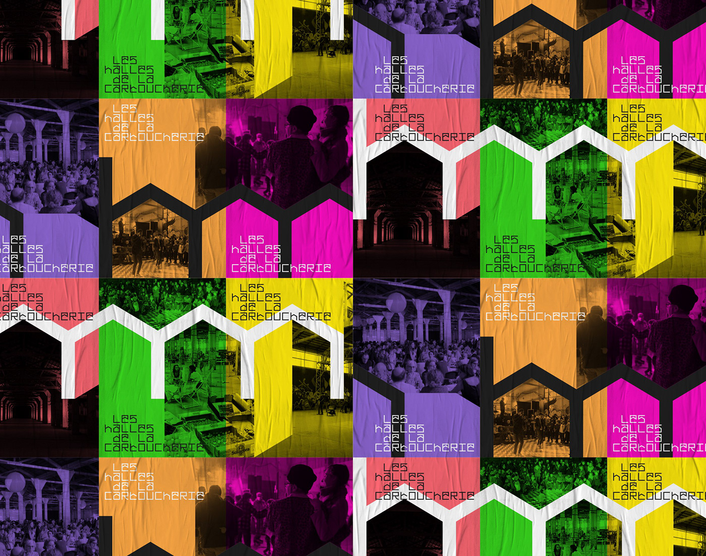
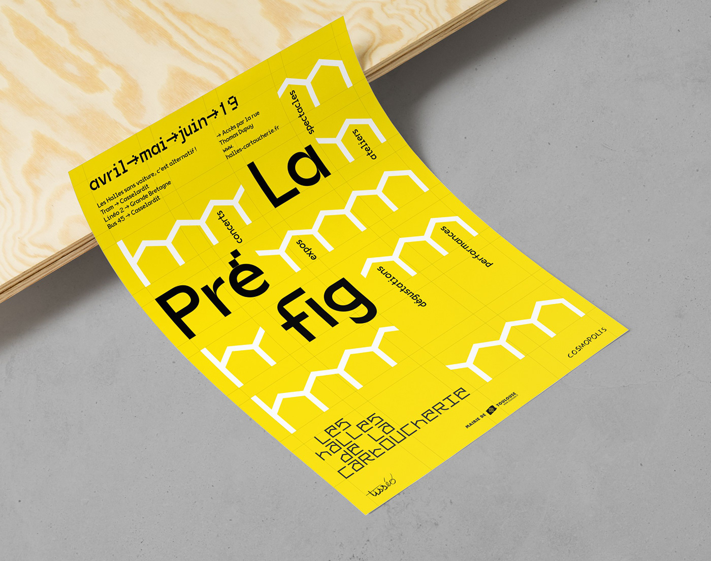
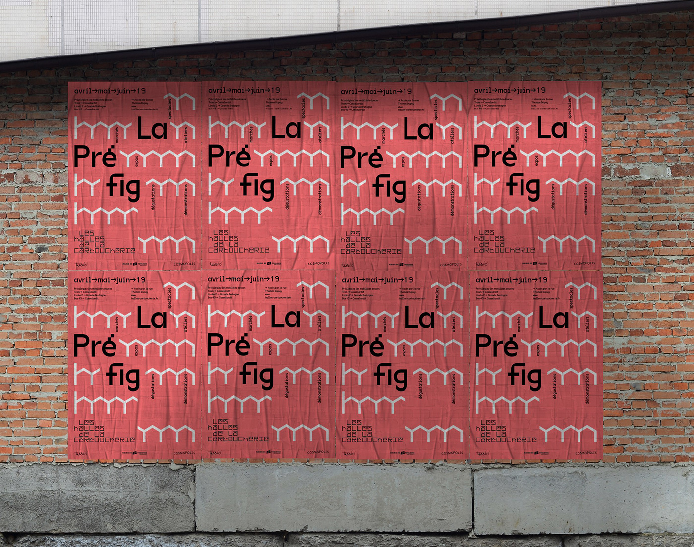
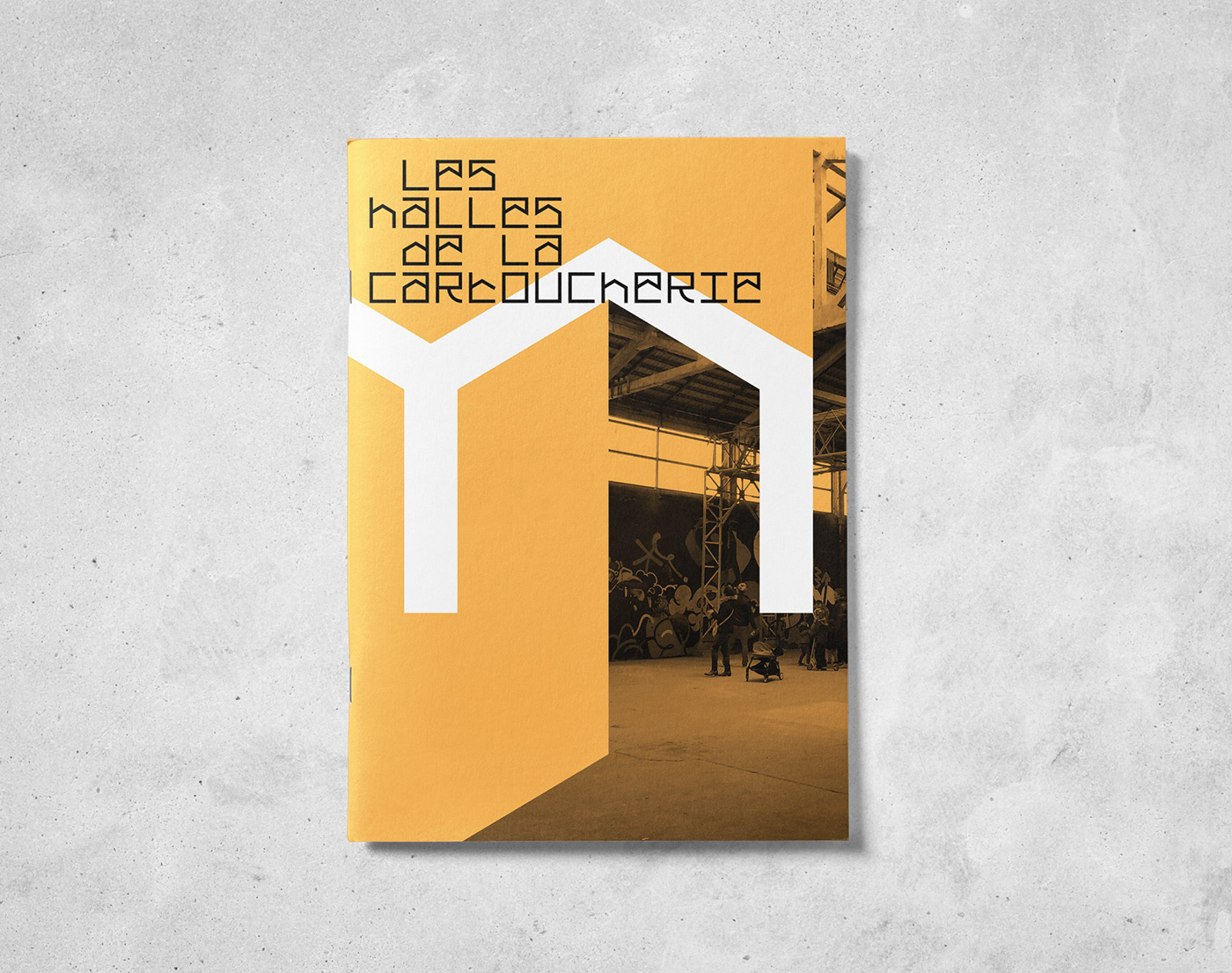
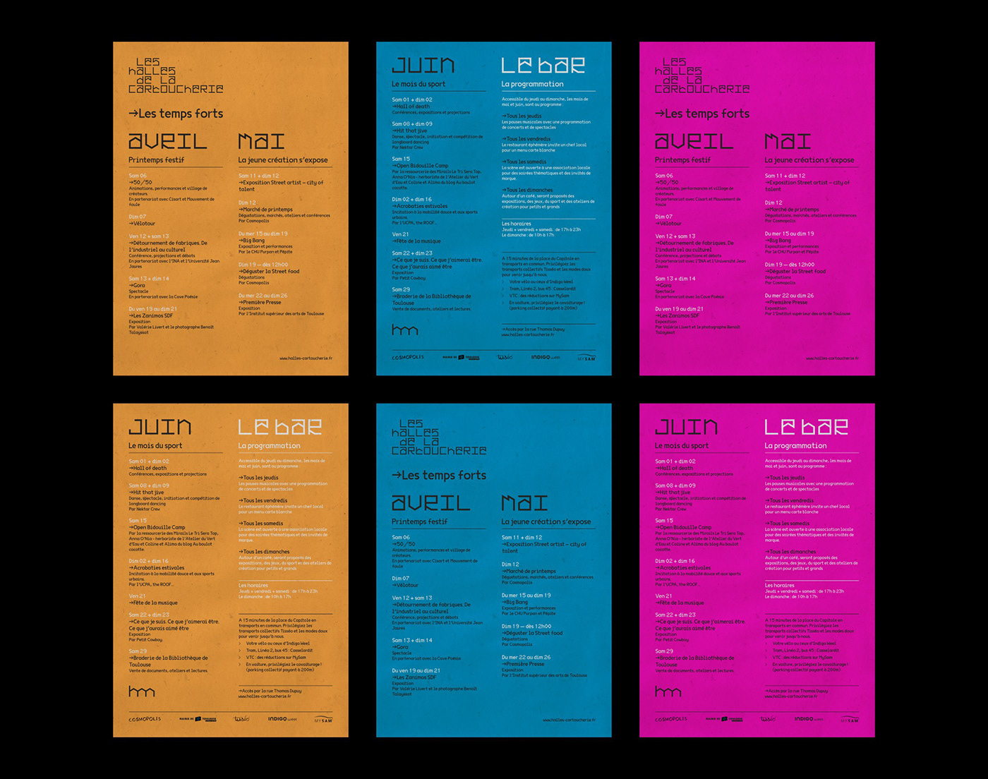
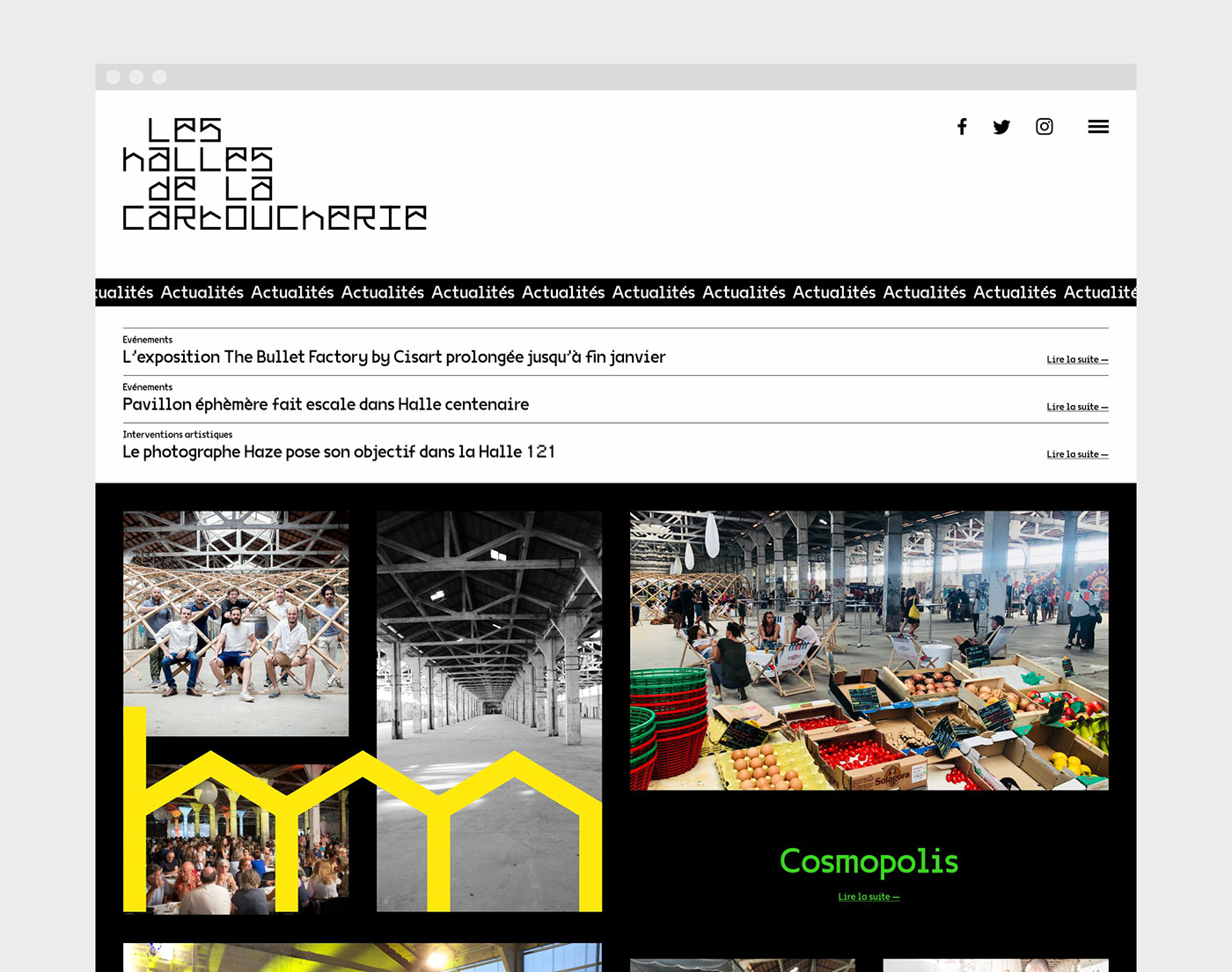
We have designed a typographic logo in a full monospaced headline font that reflects the structure of the halls. Based on a grid that takes up the design of the frames, this typography becomes the backbone of the identity and gives the Halls a unique character. We opted for a neon palette and the VG5000 (VTF) font to accompany this typogram, to obtain a modular and hybrid visual triptych, allowing powerful variations. We have worked on a set of print and web materials for the inauguration of the first season, other developments are to come.
_
FR
Les Halles de la Cartoucherie, c'est le tiers-lieu de Toulouse en devenir, implanté au coeur d'anciens ateliers de fabrication de munitions (14 000 m²) vieux de plus d'un siècle, à 15mn de l'hypercentre. Le projet, qui sera abouti en 2020, vit ses premières heures concrètes au printemps 2019 avec le lancement d'un programme culturel, artistique et gastronomique qui préfigure les futures activités du lieu. A terme, ces halles ouvertes sur un éco-quartier flambant neuf, réunira de multiples activités autour de 4 pôles : la culture, la gastronomie, le sport/le bien-être, les espaces de travail.
Nous avons été approchés par Cosmopolis, le collectif à l'origine de ce projet géant, pour doter les Halles d'une identité graphique qui marquerait le lancement officiel du projet et pourrait l'accompagner dans toutes les étapes de son développement. Le défi était de pouvoir faire transparaître la folie d'un lieu hybride, un tempérament d'expérimentateurs et un goût pour toutes les cultures, à la fois traditionnelles et innovantes, le tout dans un esprit responsable.
Nous avons conçu un logo typographique décliné en police de caractères de titrage complète, à espacement fixe, qui fait écho à la structure des halles. Basée sur une grille qui reprend le dessin des charpentes, cette typographie devient l'ossature de l'identité et confère aux Halles un caractère singulier. Nous avons opté pour une palette néon et la police de caractères VG5000 (VTF) pour accompagner ce typogramme, pour obtenir un triptyque visuel modulable et hybride, permettant des déclinaisons puissantes. Nous avons travaillé un ensemble de supports print et web pour l'inauguration de la première saison, d'autres développements sont à venir.