Creating Jack – UX&UI for Personalised Gifts Selling Platform
Role: Design Lead & Co-founder
Responsibilities: Branding, Product Design (UXD, IxD, UID), Visual Design
Year: 2015–2017
Thanks:
- Team of Jack for the awesome one and a half year
- Ondřej Bárta for pixel-perfect front-end code
Note: English copy in screens is only illustrative.
Platform was originally built in Czech, Slovak and German language.
Problem
To design an e-shop, where customers over the age 50 can easily personalize and buy products. On the phone and the tablet.
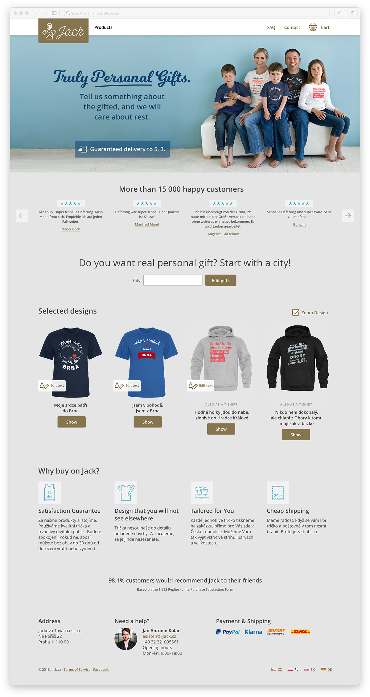
Our platform sold 400 products per day during Christmas 2016 in Germany, Austria, Czechia, and Slovakia. Most of our products were targeted to the audience 30–55, majority of the buyers were women from small cities. Some of them were buying online for the first time, so we had to be sure, that the shopping process would be as smooth as possible.


Sketches for the first version (MVP) that we created in just one month.
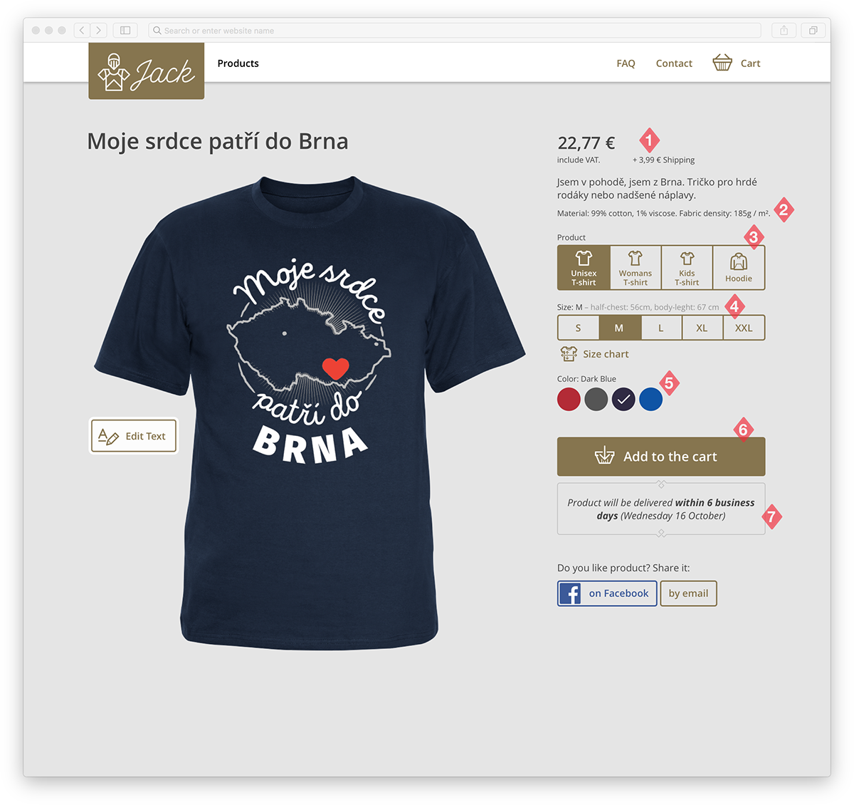
Product detail
Based on the qualitative and quantitative testing we enhanced the product detail page:
1 – Customer knows the final price from the beginning.
2 – Included information about the material decreased the number of questions for customer support.
3 – Button group is more effective than a classic select option in case of small amount of items. Icons add discoverability.
4 – Added measurement into the size bar does not take any more space and creates another visual check for the customer.
5 – Checker and colour name recapitulation help visually impaired users.
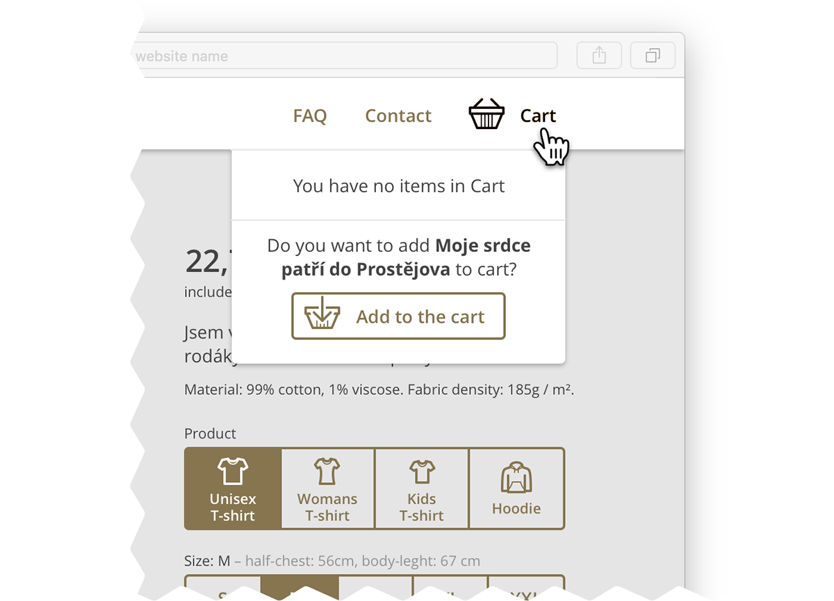
6 – Because some users wanted to add more products, our original behaviour that redirected them into the Cart did not work. They had a problem to get back. And we did not want to add a transition page, so we came with an idea to inform the customer directly next to the ‘Add to the cart’ button.
7 – Informing the customer about the expected date of delivery.
Because part of our customers were shopping online for the first time, we noticed strange behaviour of clicking to empty cart after selecting size. We checked the viewport and after exclusion other possible reasons we implemented simple tooltip that allowed users add item directly.
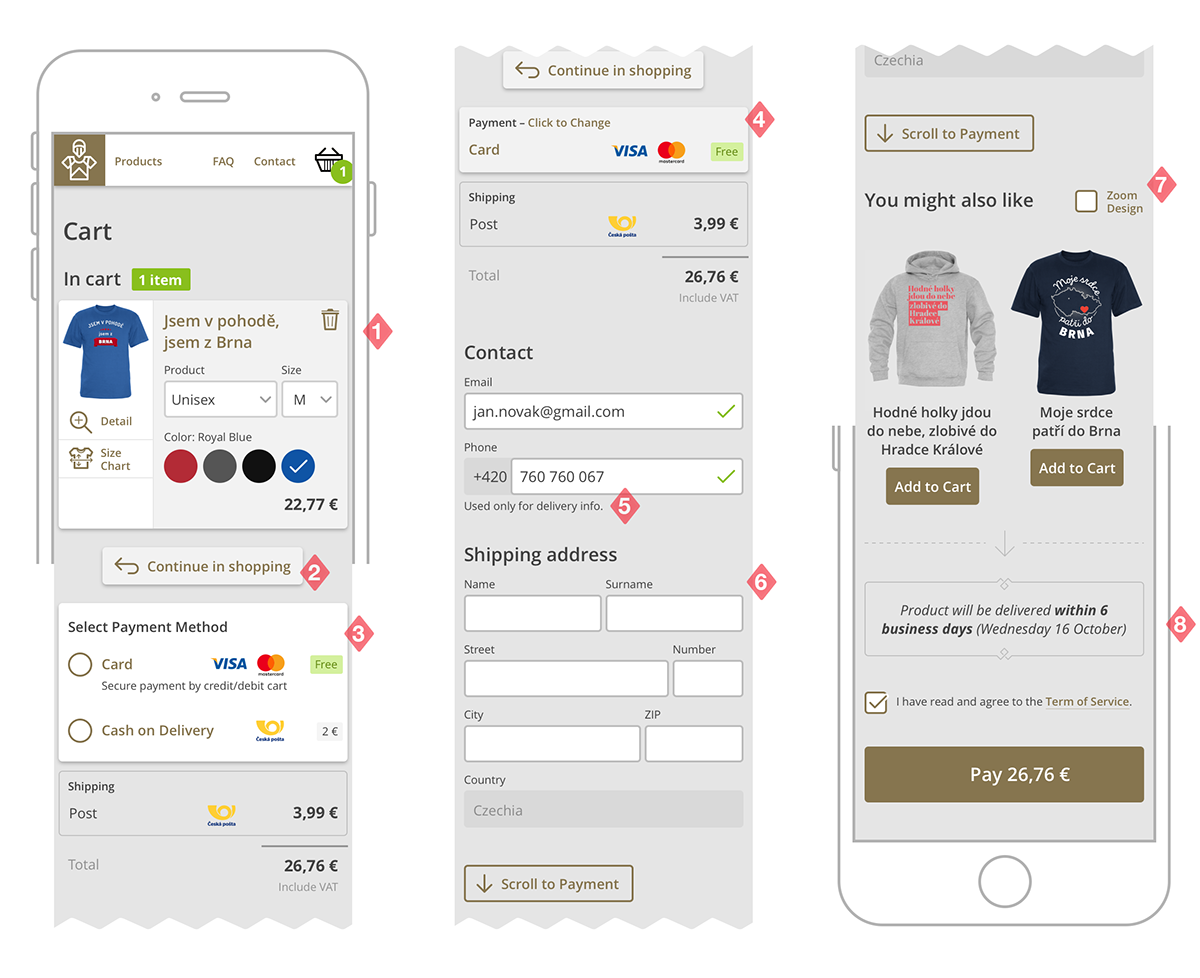
Cart
1 – Items are showed as cards. Originally, we explored many ways to let users copy the same product to the cart. But because there was no need for multiple amount of the same product and users rather wanted to go back to the Product detail, we abandoned all other ways (duplicate, number of items).
2 – ‘Continue in shopping’ button helps users to navigate back, as we discovered that the other proposed methods were not used significantly.
3 & 4 – Collapsible select option saves space.
5 – Assuring users that their phone number is used only for delivering.
6 & 7 – As soon as the customer inserts personal information, we can offer him/her a relevant cross-sale.
8 – Recapitulation of the delivery dates and the final price.
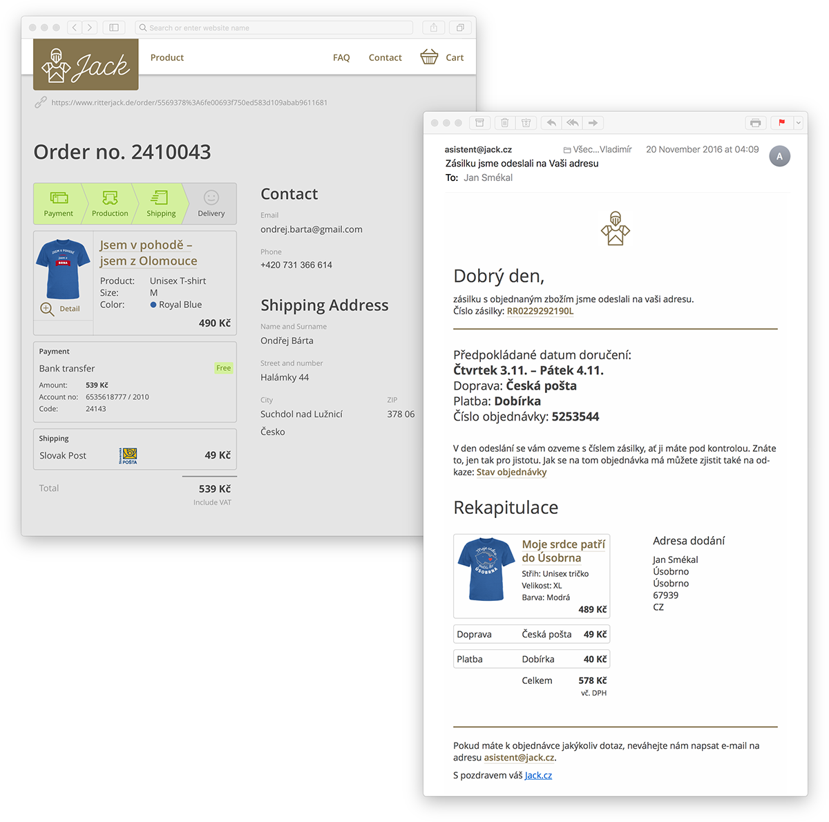
Emails uses similar elements as Order page to keep consistency.

Select the size modal let users select size of product directly.
And as always. Thanks for watching.


