_
EN
SuperSpaces, created by SUPERBIEN (one of the world's leading producers of innovative multimedia experiences, based in Paris and New York) are borderless artistic playgrounds that fuse live performance, creative technologies, gaming mechanics, and participative storytelling to create communal awakening adventures. At the edge of the explored and the unknown, SuperSpaces can find new meanings, new depths, new perspectives. It's about architecting a radically new form of purposeful entertainment that catalyzes acts of expansion, big or small, inspiring us to connect with our visceral emotions, open doors, and push boundaries.
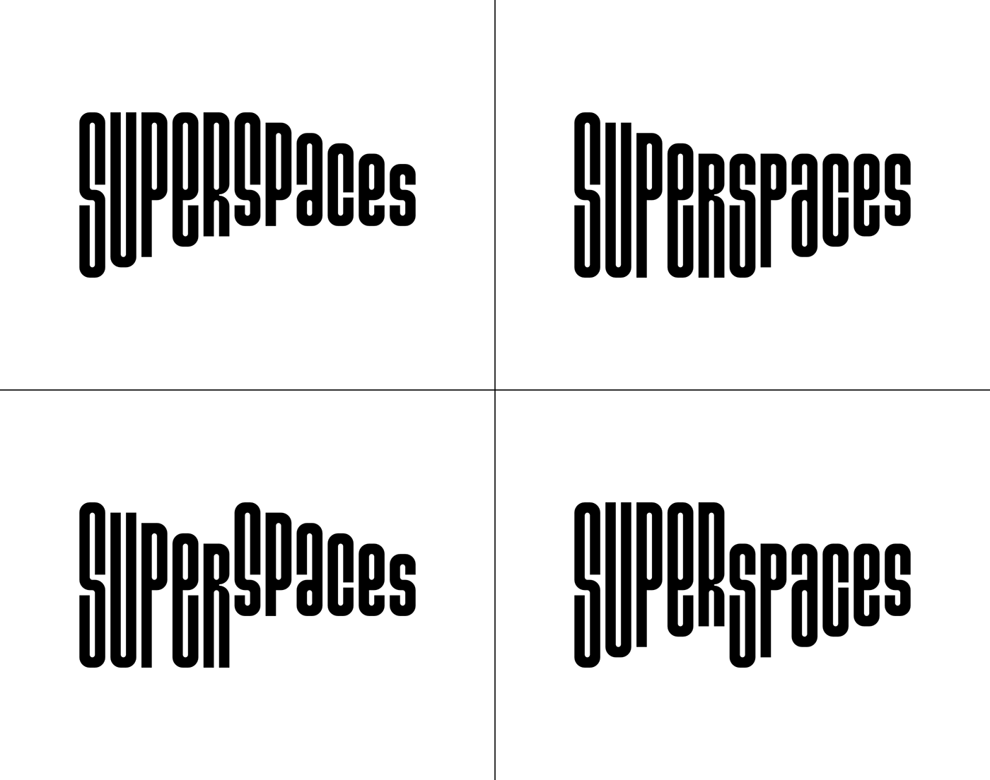
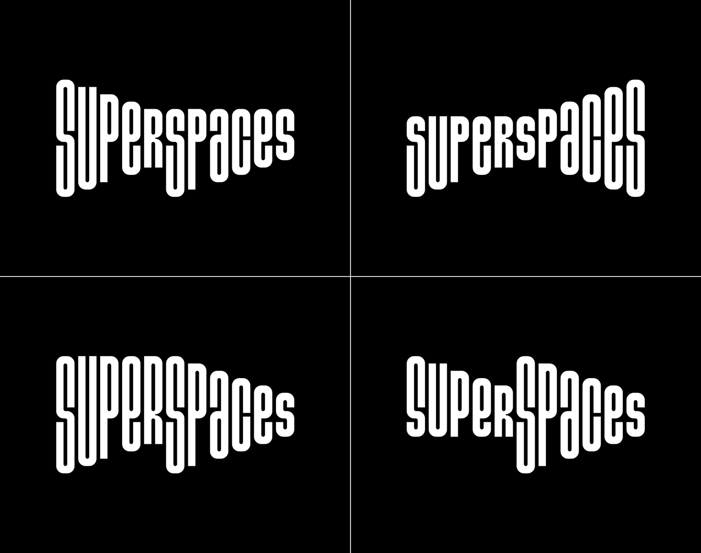
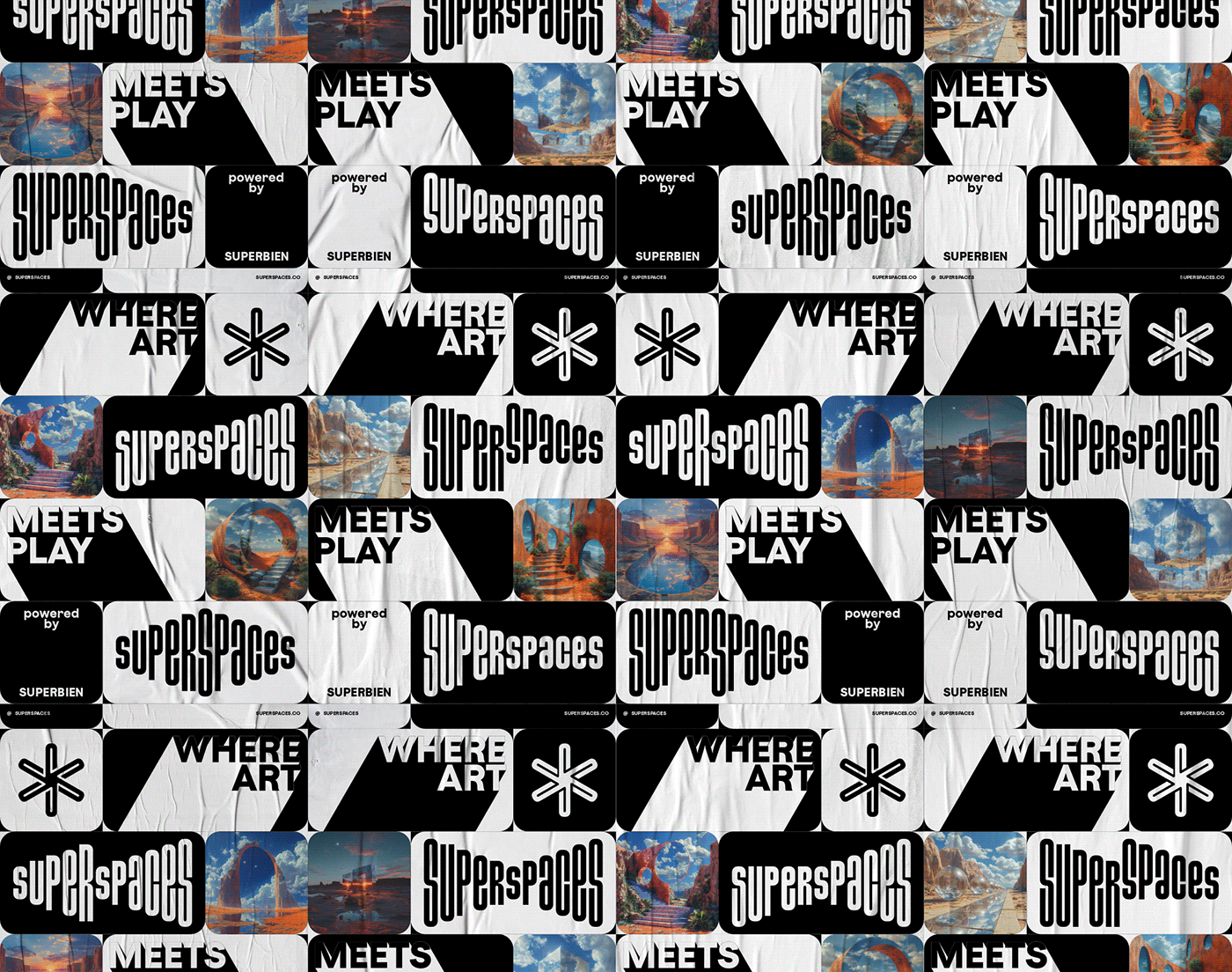
At the genesis of the project, SUPERBIEN approached Brand Brothers to design the identity territory for SuperSpaces. We designed a typographic language that recounts the plasticity of lived experiences, presenting an expression of the logo in constant motion. The SuperSpaces typeface, slender and spectacular, is offered in 20 different versions according to a precise construction matrix. Complemented by a star-shaped monogram resulting from the combination of 3 'S's, this identity spreads across a flexible, combinatory visual universe, blending narrative and image, destined to live on media of multiple proportions.
Unpublished project.

_
FR
SuperSpaces, créé par SUPERBIEN (un des principaux acteurs mondiaux de la production d'expériences multimédias innovantes, basés à Paris et New York) sont des terrains de jeu artistiques sans limites qui fusionnent le spectacle vivant, les technologies créatives, les mécanismes de gaming et la narration participative pour créer des aventures collectives. À la limite de l'exploré et de l'inconnu, SuperSpaces permet de trouver de nouvelles significations, de nouvelles profondeurs, de nouvelles perspectives. Il s'agit d'une forme radicalement nouvelle de divertissement utile qui catalyse les actes d'expansion, grands ou petits, en nous incitant à nous connecter à nos émotions viscérales, à ouvrir des portes et à repousser les limites.
A la genèse du projet, SUPERBIEN a approché Brand Brothers afin de concevoir le territoire identitaire de SuperSpaces. Nous avons ainsi conçu un langage typographique qui raconte la plasticité des expériences vécues, présentant une expression du logo constamment en mouvement. Le caractère SuperSpaces, élancé et spectaculaire, s'offre en 20 versions différentes selon une matrice de construction précise. Complété par un monogramme en étoile résultant de la combinaison de 3 'S', cette identité se propage sur un univers visuel flexible et combinatoire, mêlant narratif et image, destiné à vivre sur des supports aux proportions multiples.
Projet non publié.