2020
Allo Momê
A home can be a mess and a place of serenity at the same time. Allo Momê accepts both descriptions wholeheartedly, as an advocate for a family’s priceless moments together. Offering a selection of mom, baby, and home essentials, the brand boasts of well-curated and trusted items from educational toys to nursing dresses and home appliances.
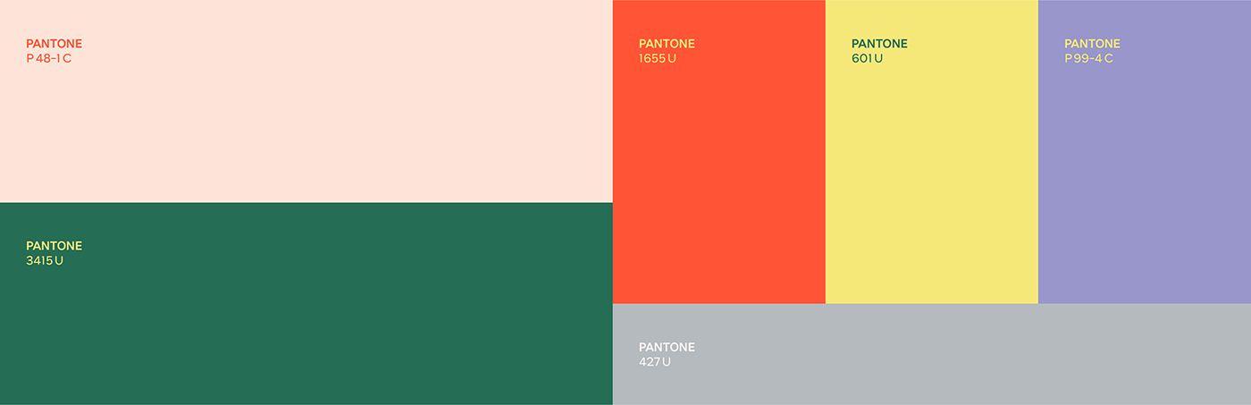
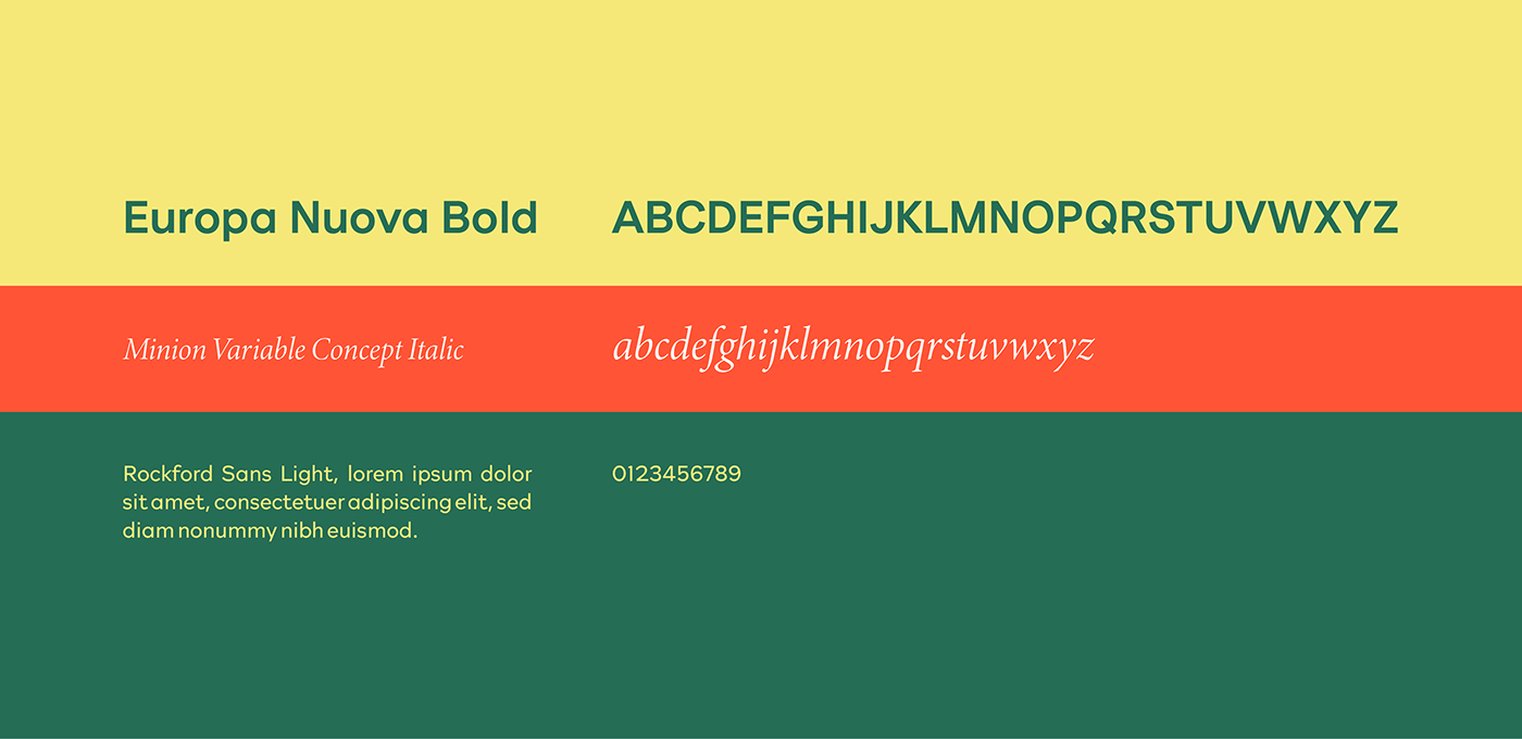
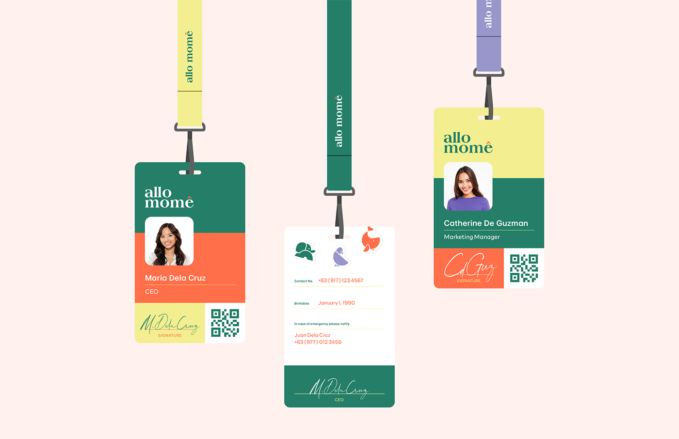
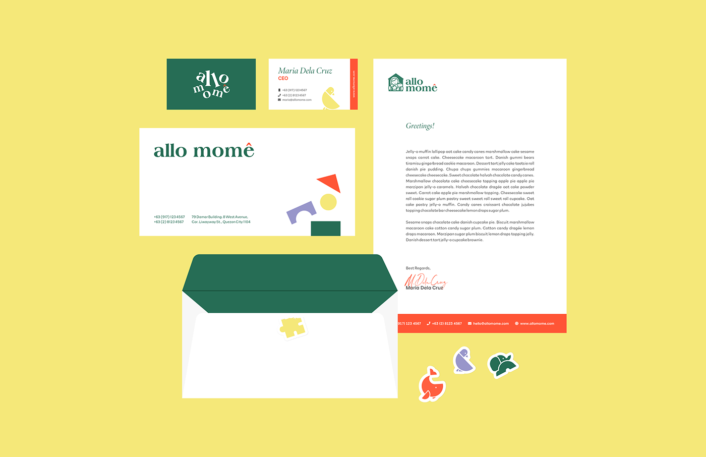
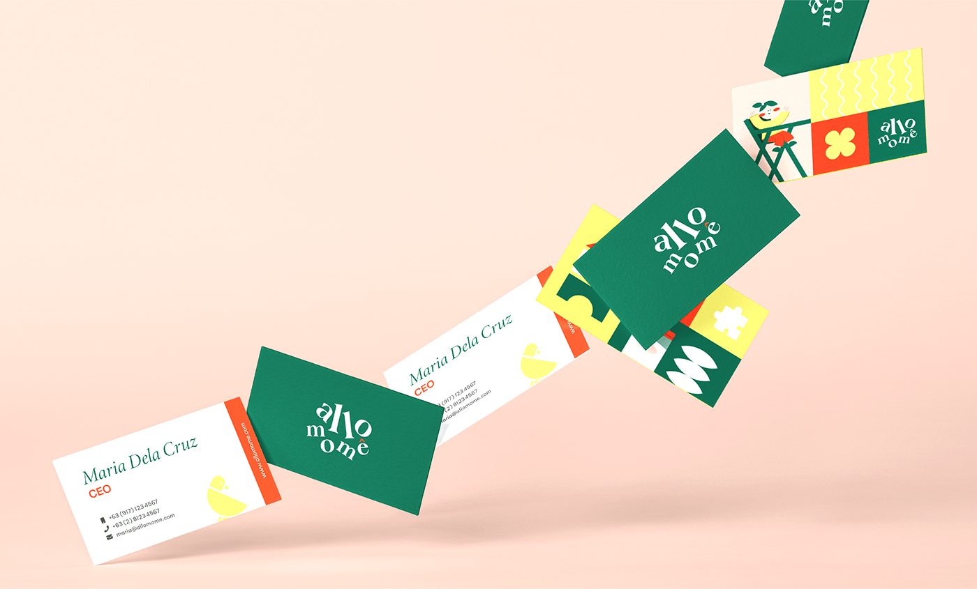
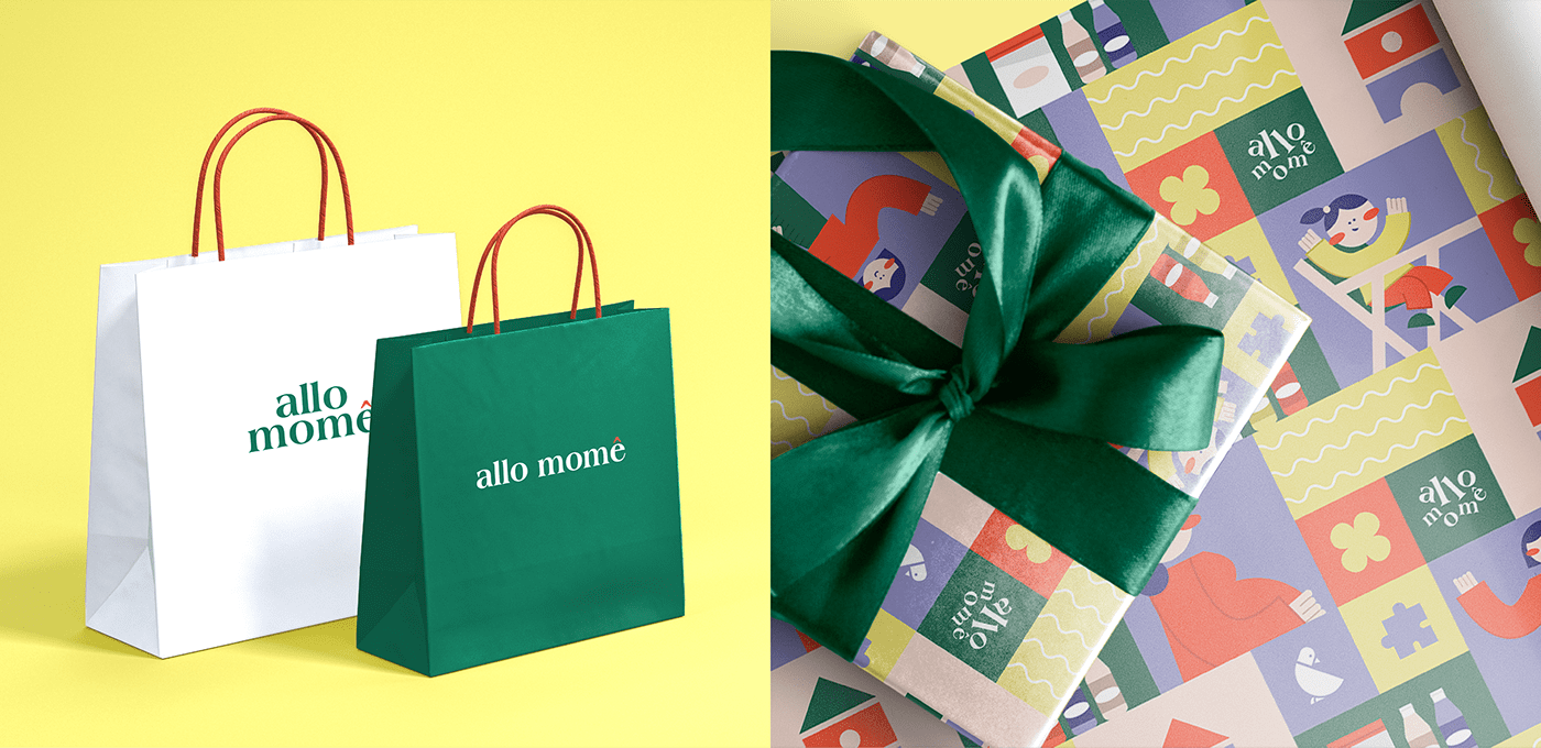
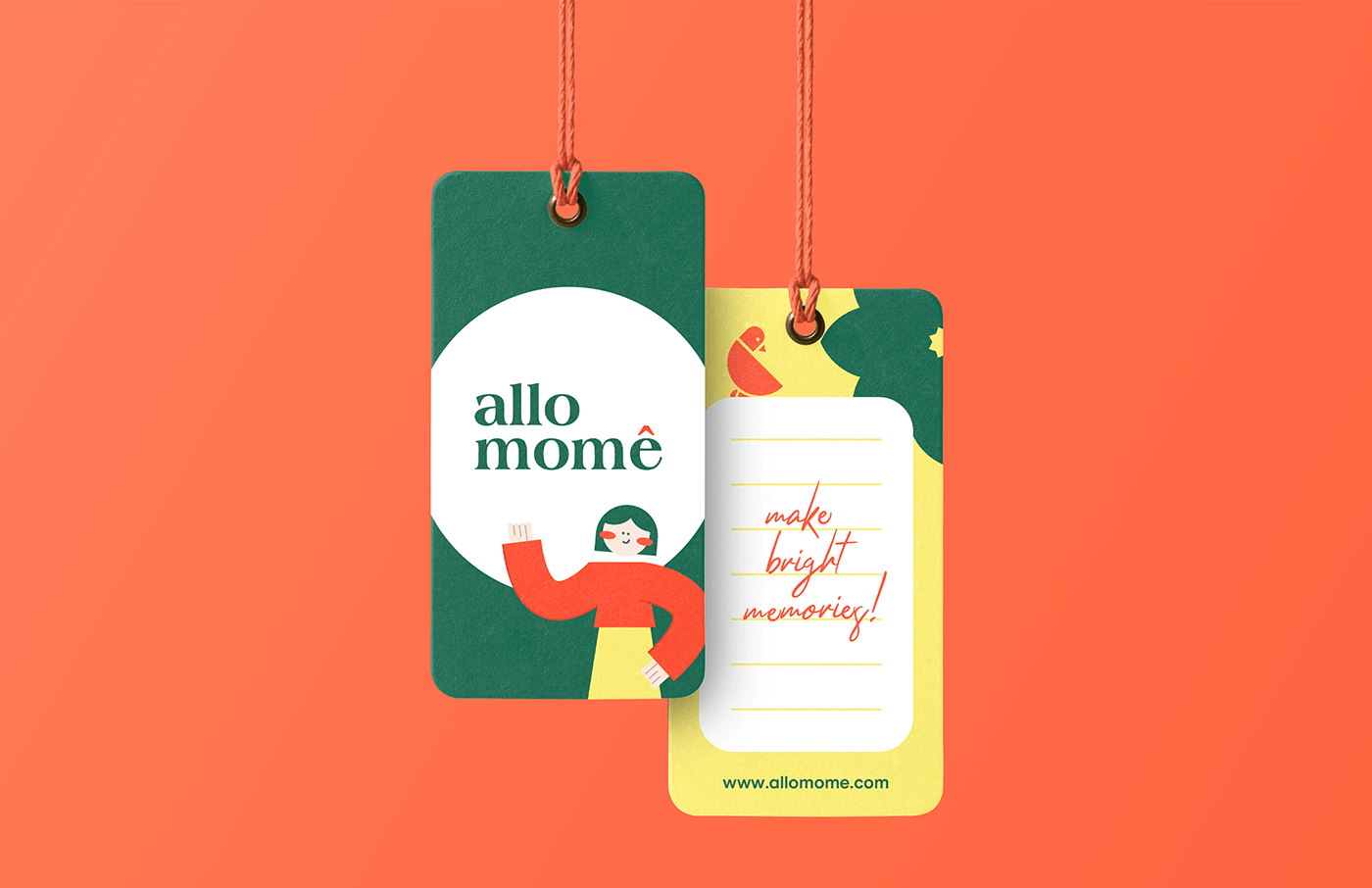
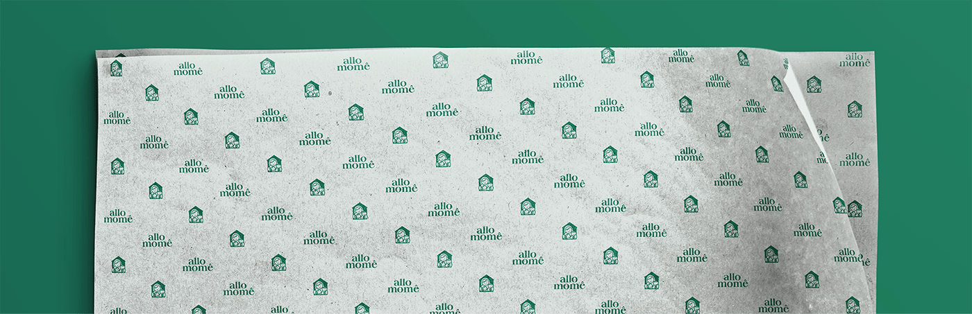
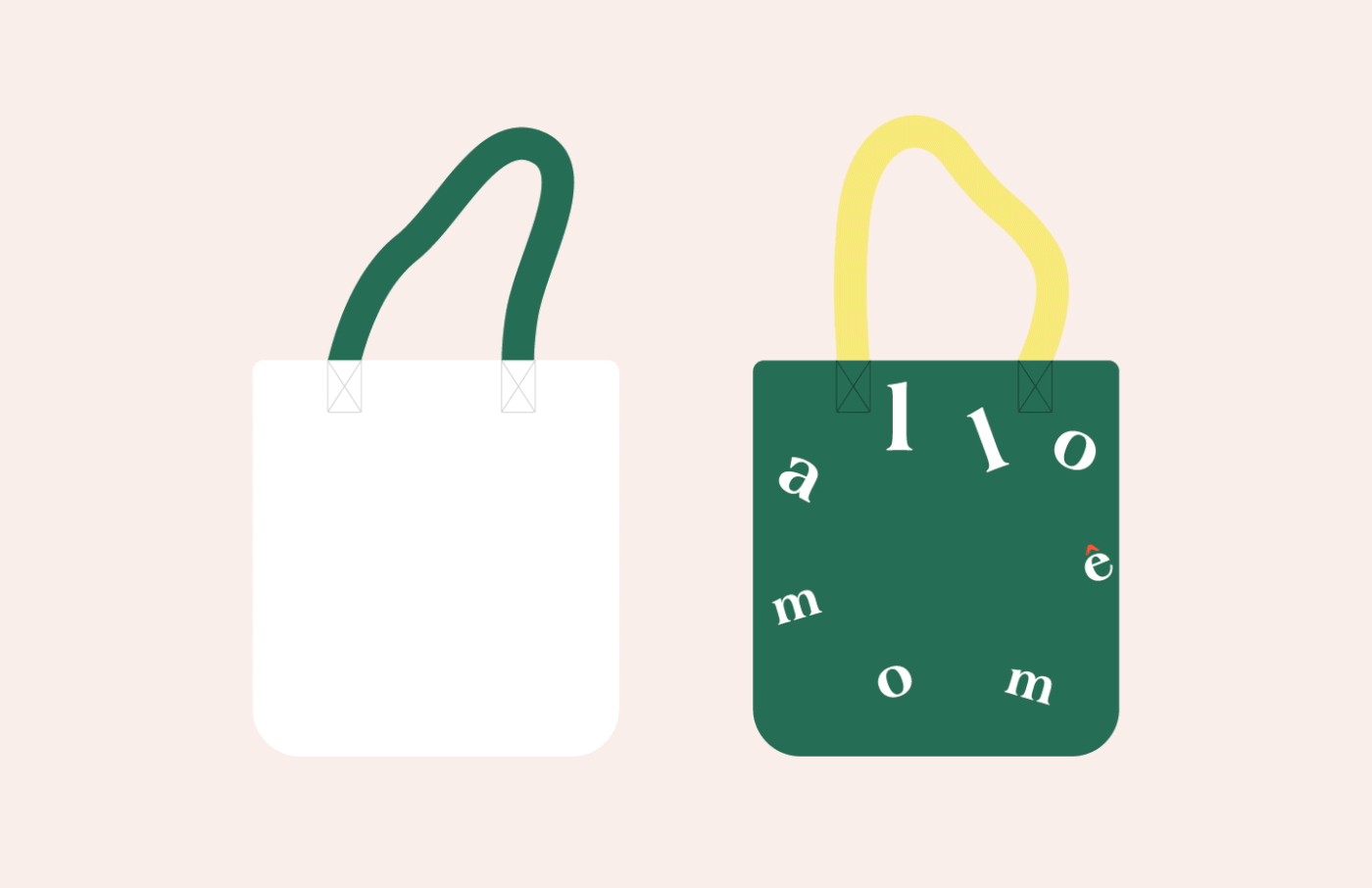
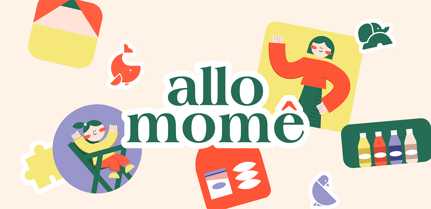
Fitting their image of a home into the concept, Allo Momê’s brand design matches its description completely: an explosion of color and a familiar scene simultaneously existing. Starting with their straightforward logo, it features clean text of the brand name in a calming shade of Viridian with a pop of Burnt Sierra over its accent – choosing to focus on the story behind the name: allomothering, the phenomenon of parenting done by individuals other than the mother, In that respect, Allo Momê fills in as the other provider of the family’s needs. Aside from Viridian and Burnt Sierra as their hero colors, a mixture of pastel and bold colors complete the bunch: Wheat, Sahara Sand, Blue Bell, and Athens Gray. The fonts chosen are Europa Nuova, Minion Variable Concept Italic, and Rockford Sans Light, all leaning towards elegance and legibility to clearly bring forward their ideas while still remaining friendly.
Every piece of the puzzle – down to the last detail – has its purpose. The scattered elements both on site and creative assets, the modern but simple illustrations, all depict the ordinary day-to-day life of a mother and her child, capturing the simple joys of a family at home.
Brand Identity, Logo Design, Stationery, Illustration, Website, Social Media