OPOP
Corporate Identity Revamp / Web Design
2020
Project owner: Marketingová Kancelář.cz
Project Account Manager: Ing. Richard Kafoněk
Research & Wireframe: Ondřej Janus / PORTA design
Main Photo: Tomas Q Prochazka, OPOP, Drazen
UI/UX & Graphic Design: Tomas Q Prochazka
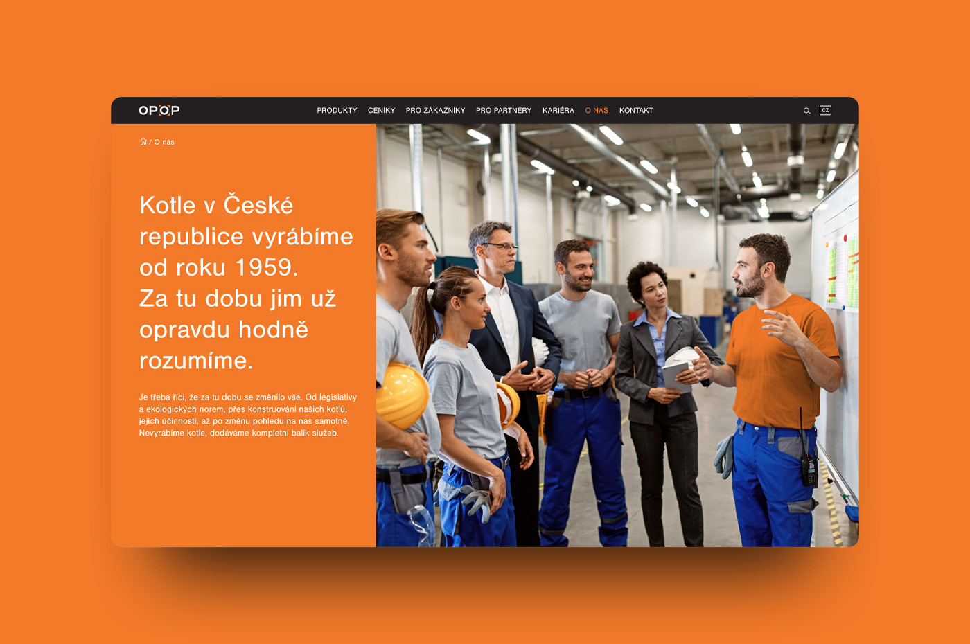
OPOP is one of the few truly Czech solid-fuel boiler manufacturers. With tradition dating back to 1959. The long continuity has brought a lot of experience to the company. Especially in technology, which is reflected in the high efficiency and quality of their boilers.
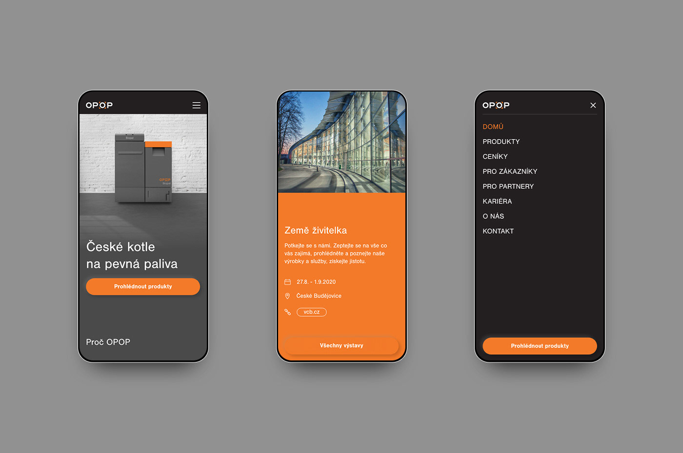
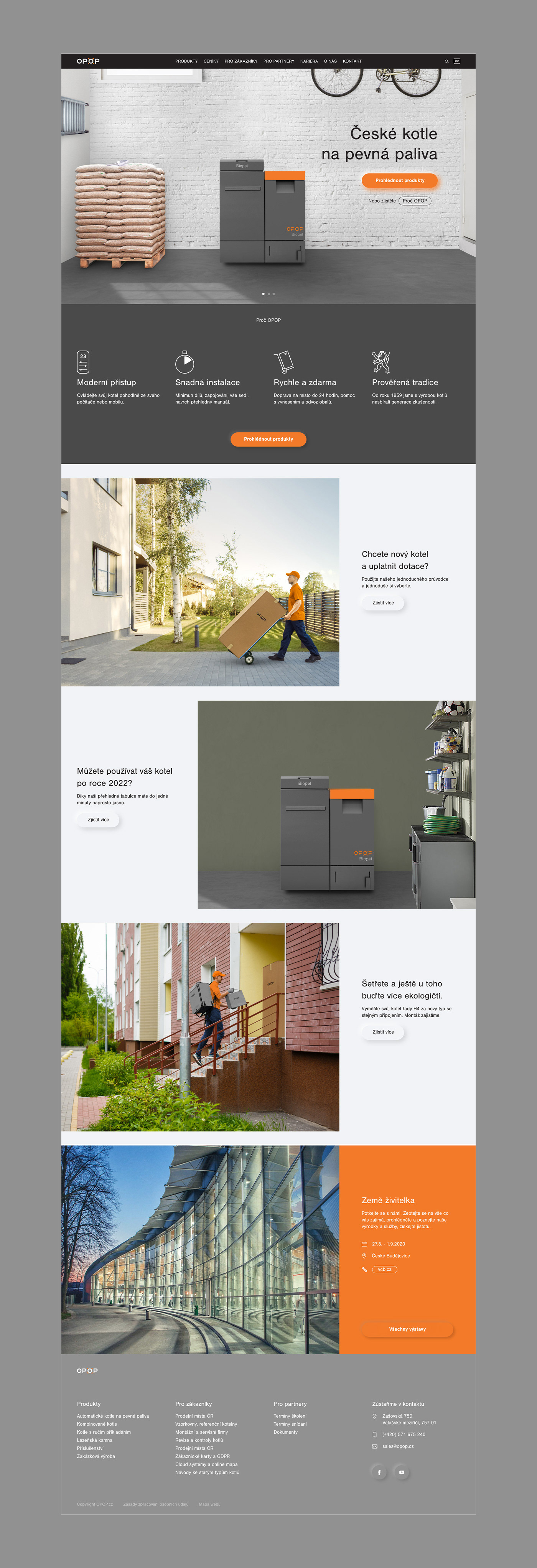
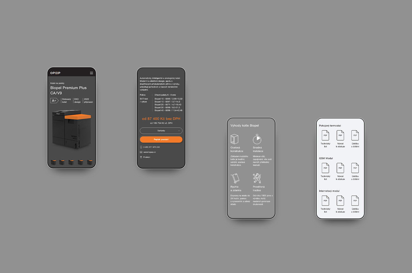
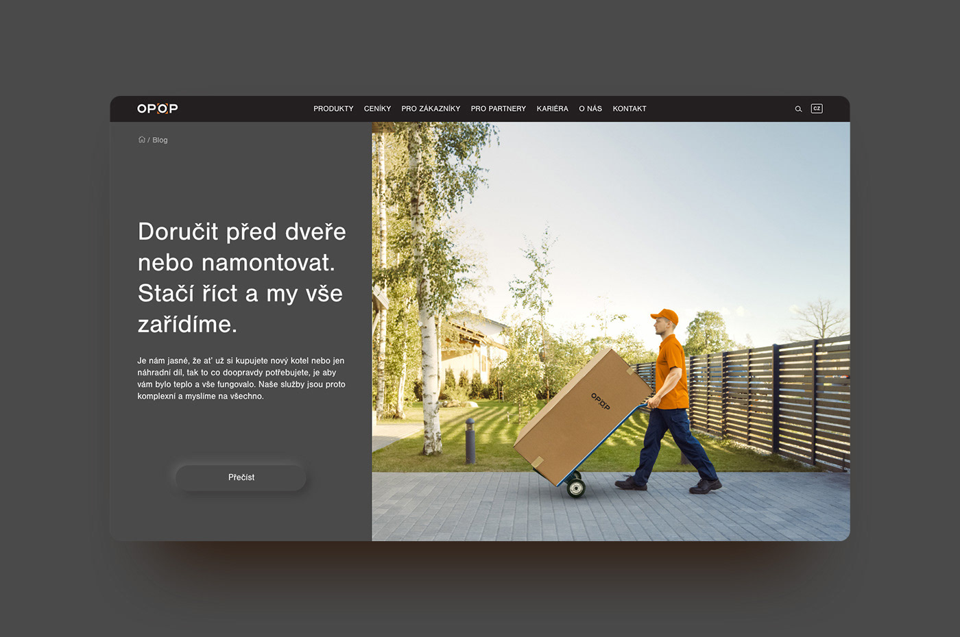
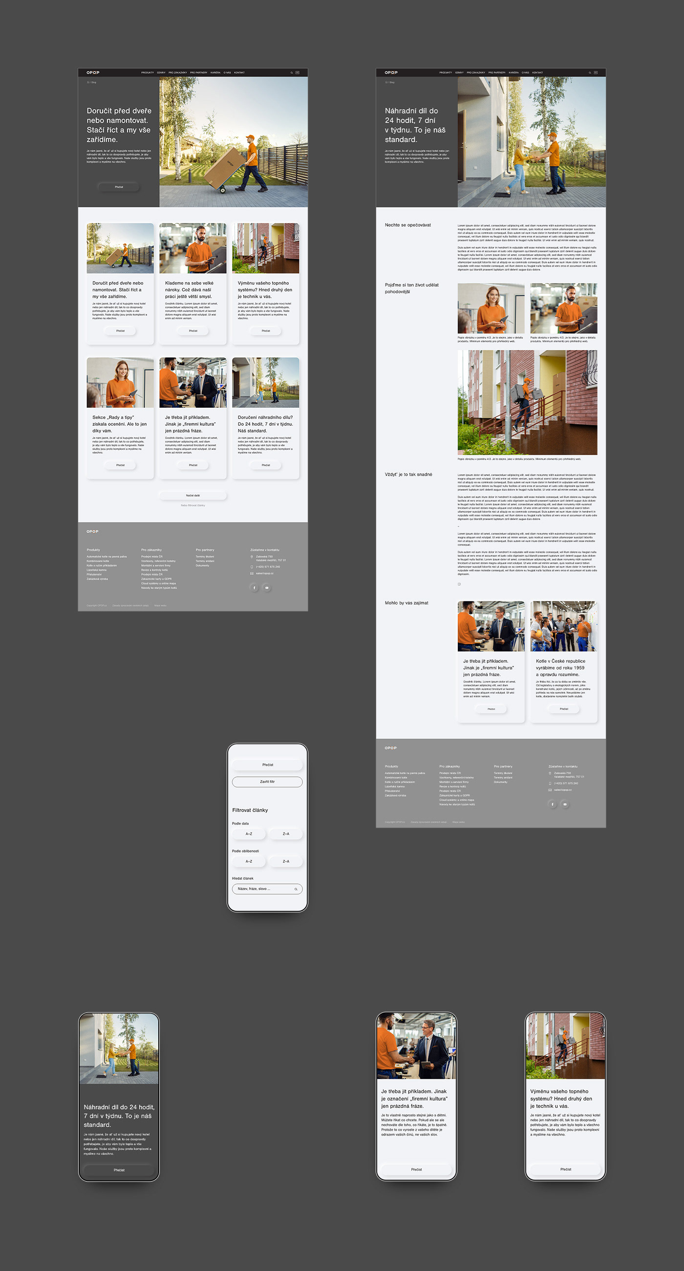
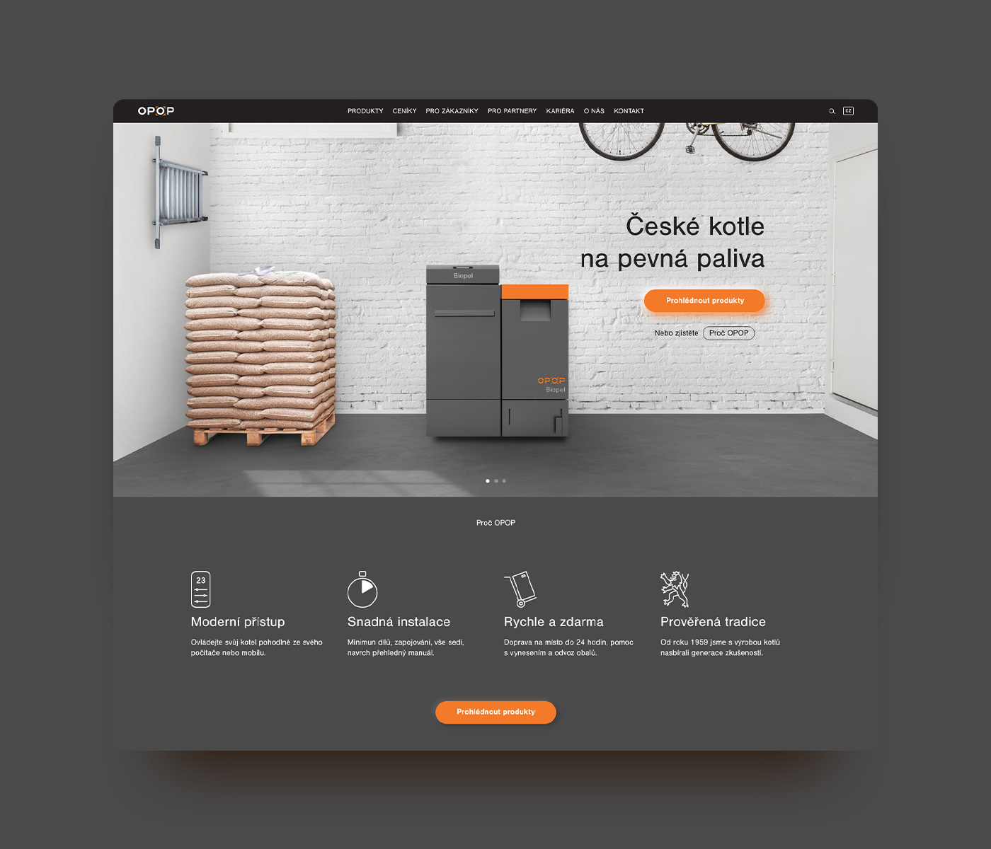
But their communication needed to shift focus from the final product. Instead, it should express the benefits of living with OPOP boilers. It was important to show that you basically don’t need to worry about them, that they’re almost completely dust-free and that your boiler room or garage can be clean. On top of that, OPOP will help you with installation and all related services. They needed to let more light into everything. To become more lifestyle-focused and modern.
To do that, we made a communication manual, updated visual style and a new website.