_
EN
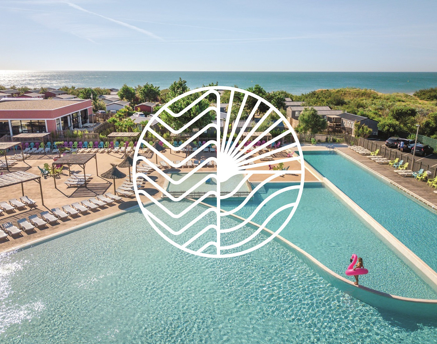
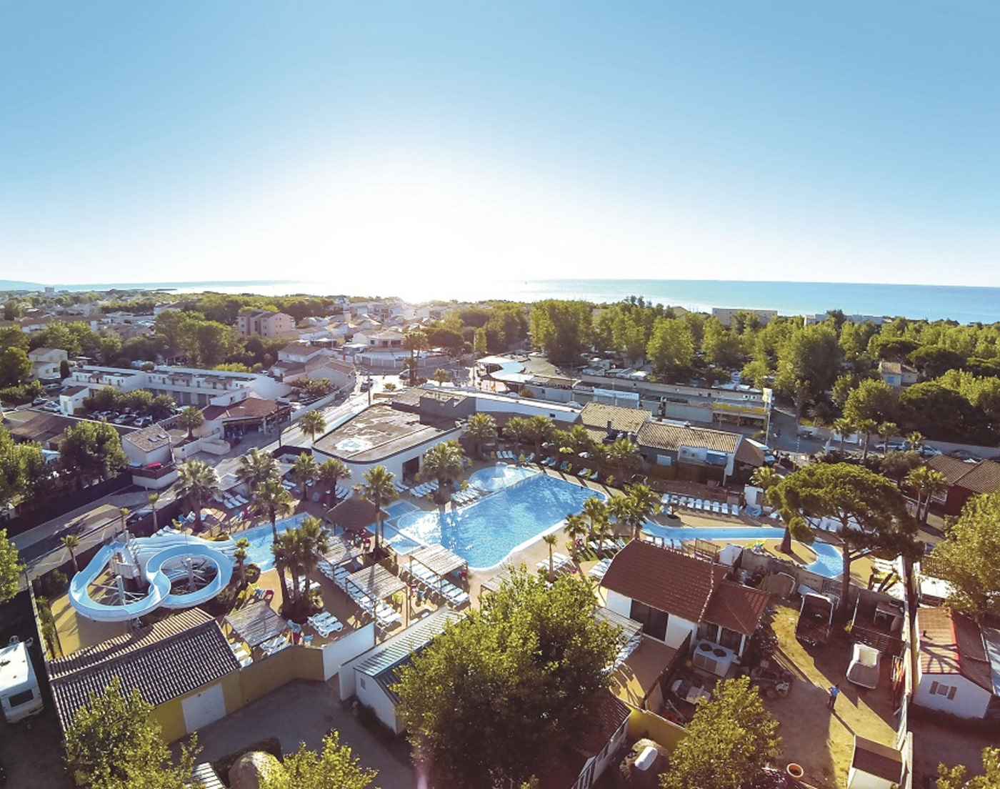
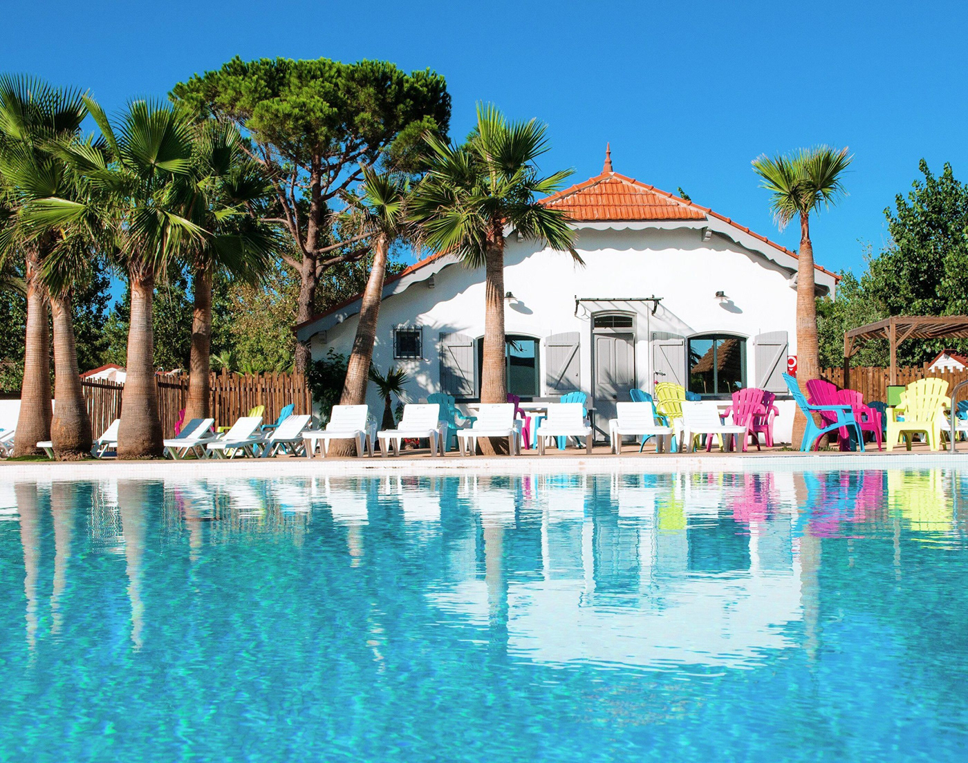
Since 1976 and the opening of its first campsite, the family of the founder of the Méditerranées, winegrowers and wine merchants of Marseillan (Hérault, South of France), has built a group of 3 luxury campsites in the heart of a privileged region. When General De Gaulle flew over Marseillan, didn't he say that this land looked like the new Florida? Charlemagne, New Florida and Beach Garden are three 5-star campsites with free access between the three sites and direct access to the sea. Voted the best campsites in Europe in 2016 by DCC Europe, Les Méditerranées are the finest example of French open-air hotel accommodation, including high-end accommodation set in the heart of nature, aquatic areas and a spa.
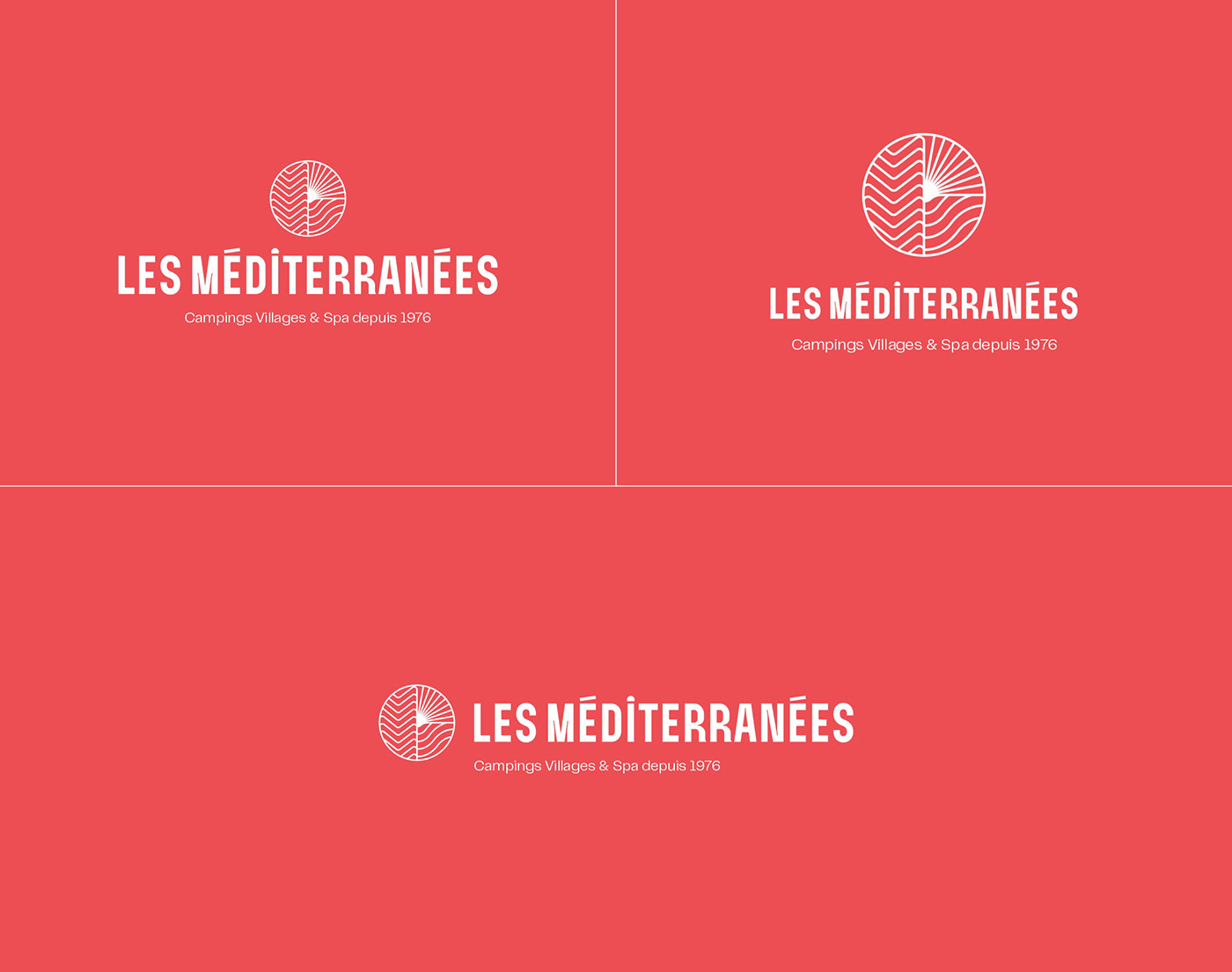
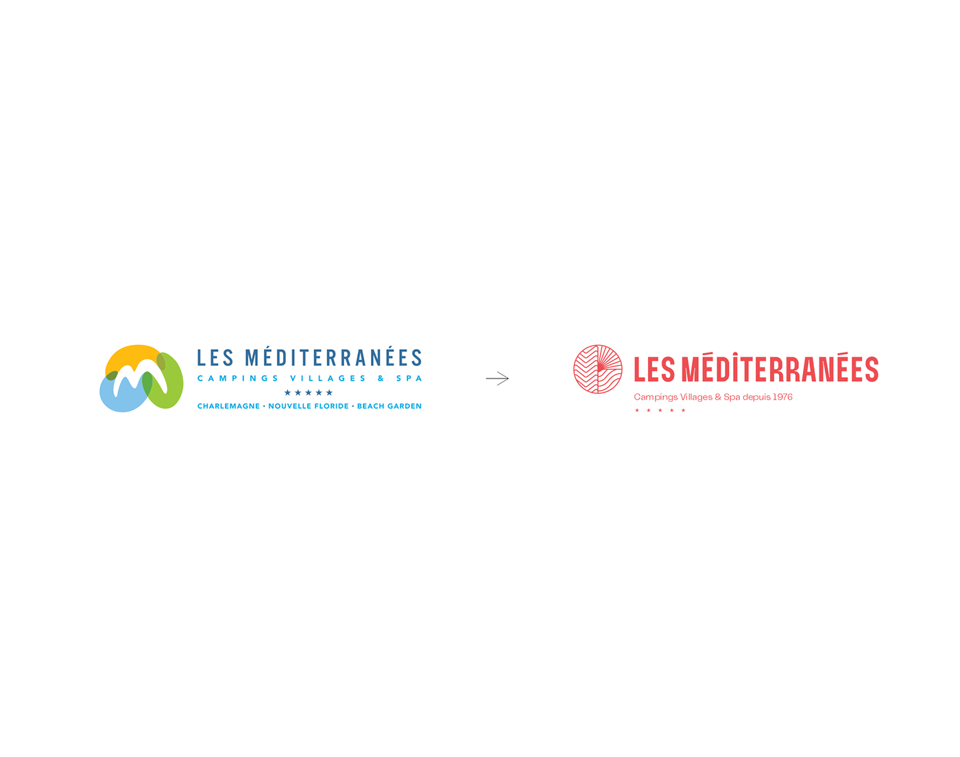
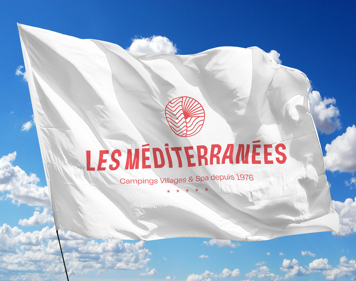
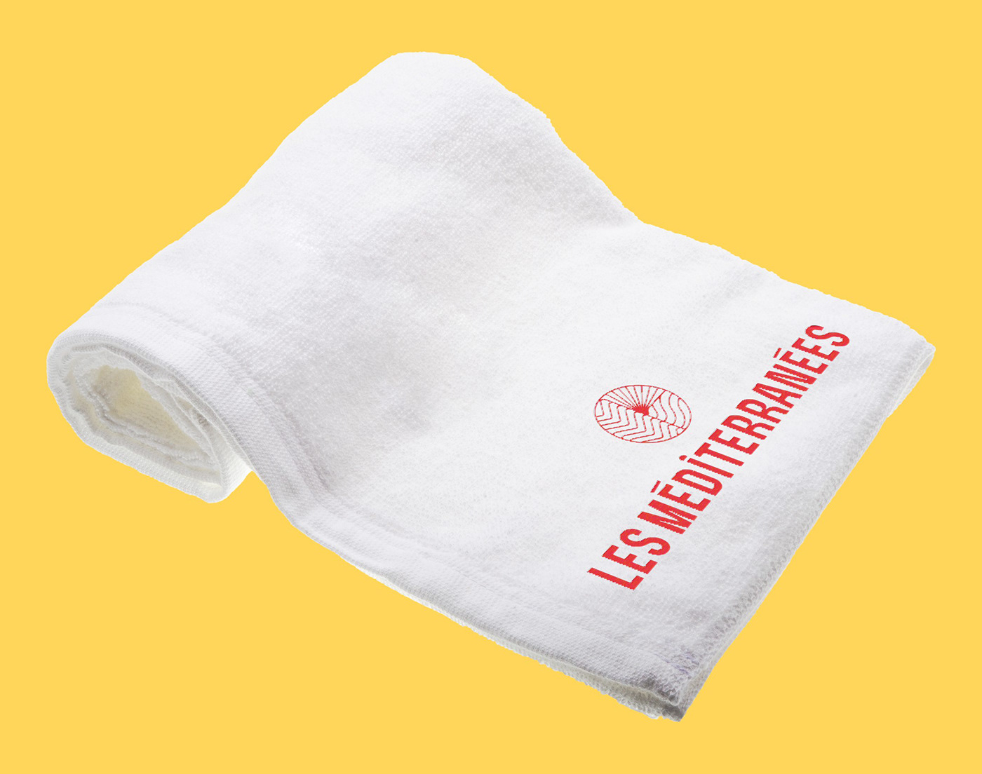
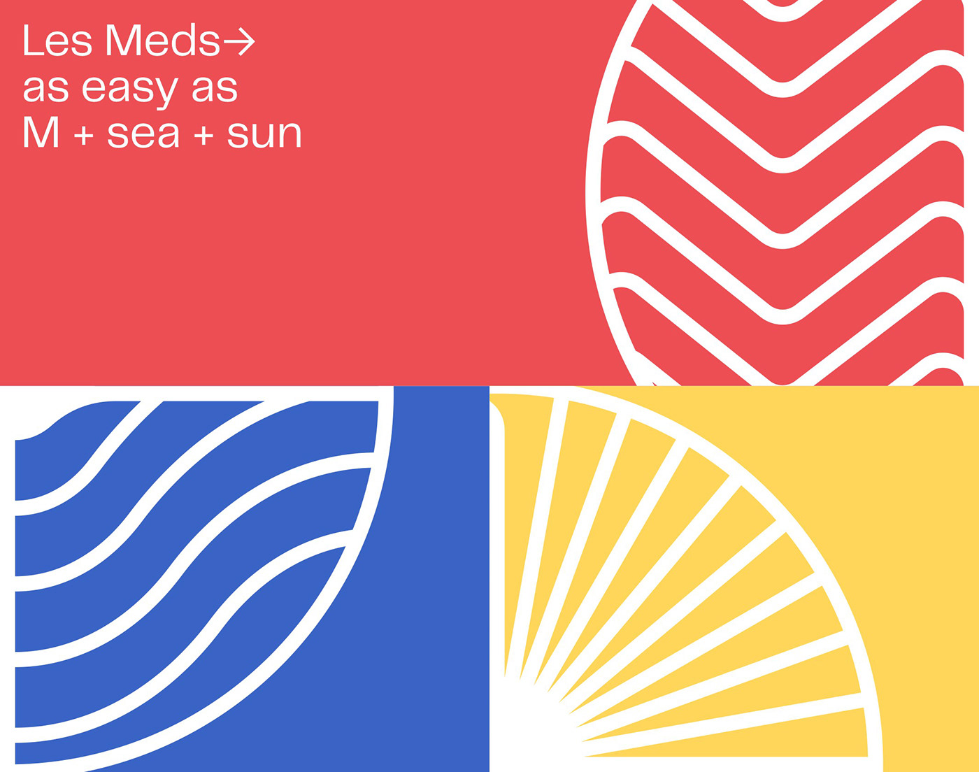
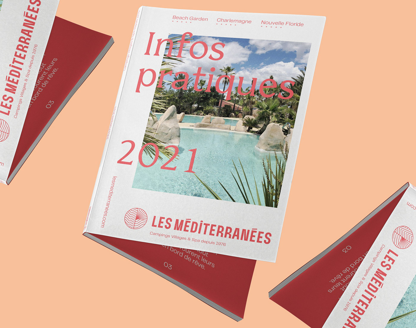
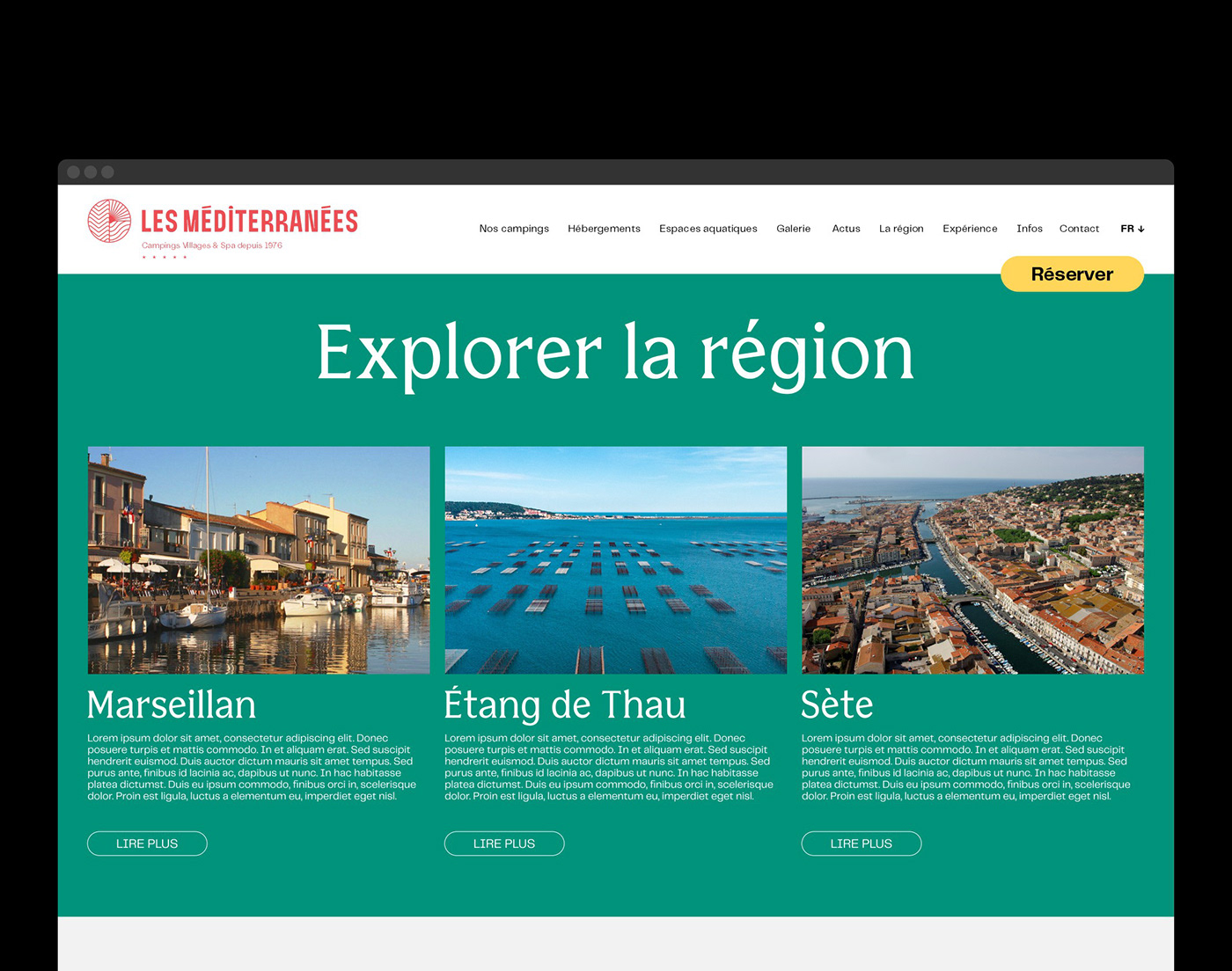
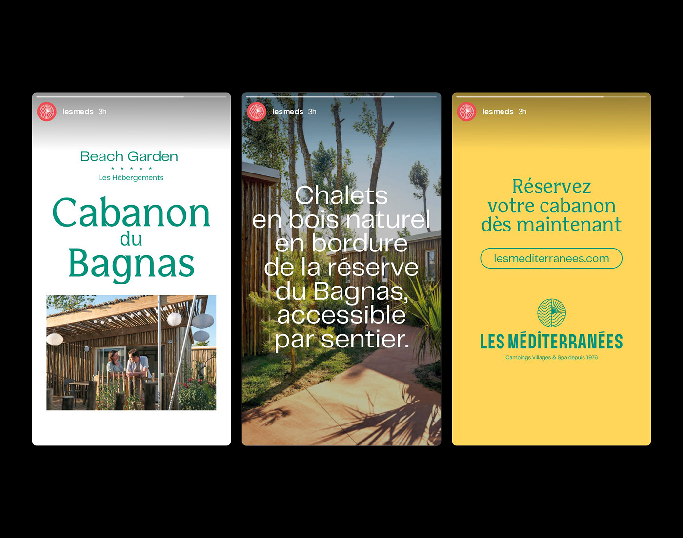
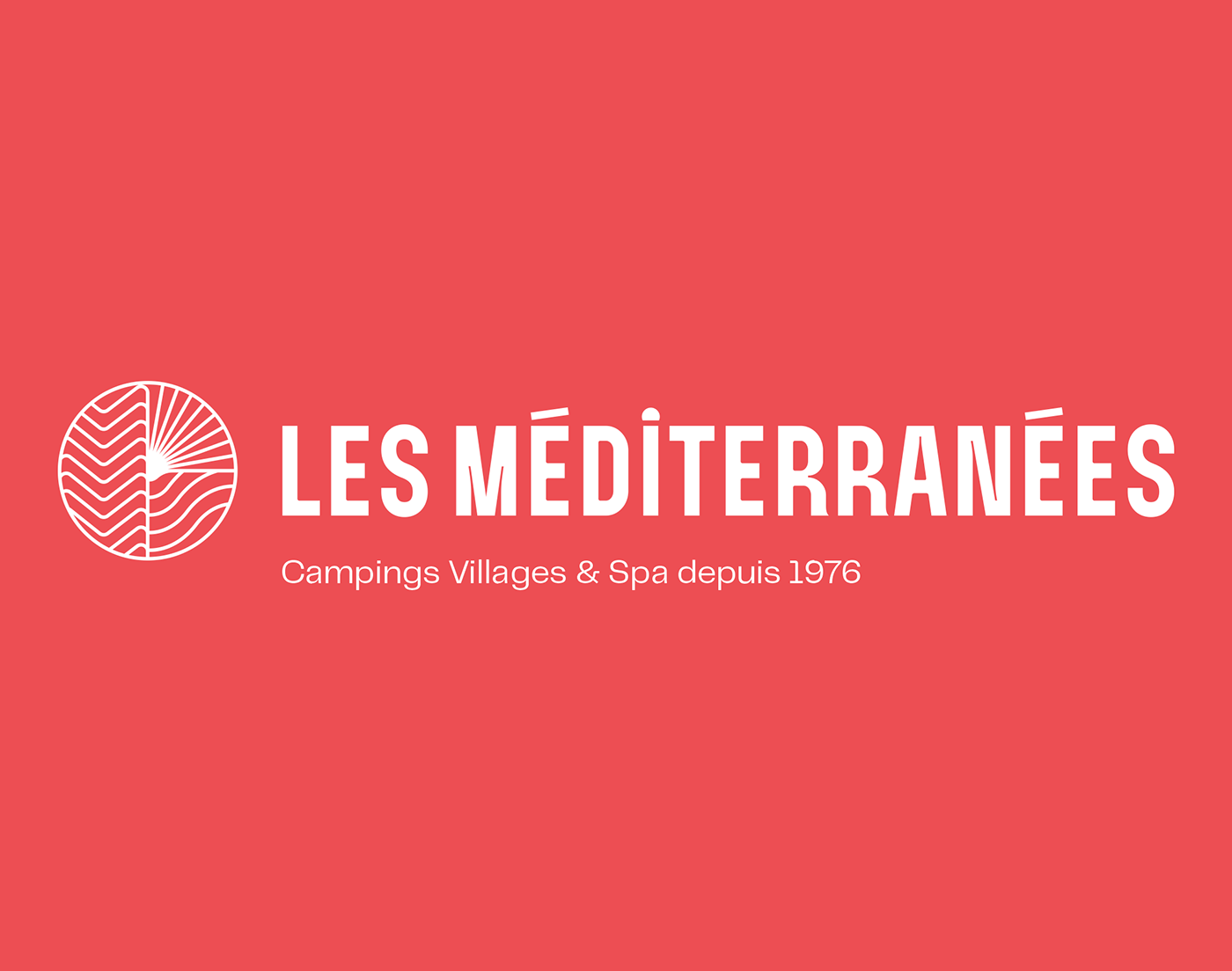
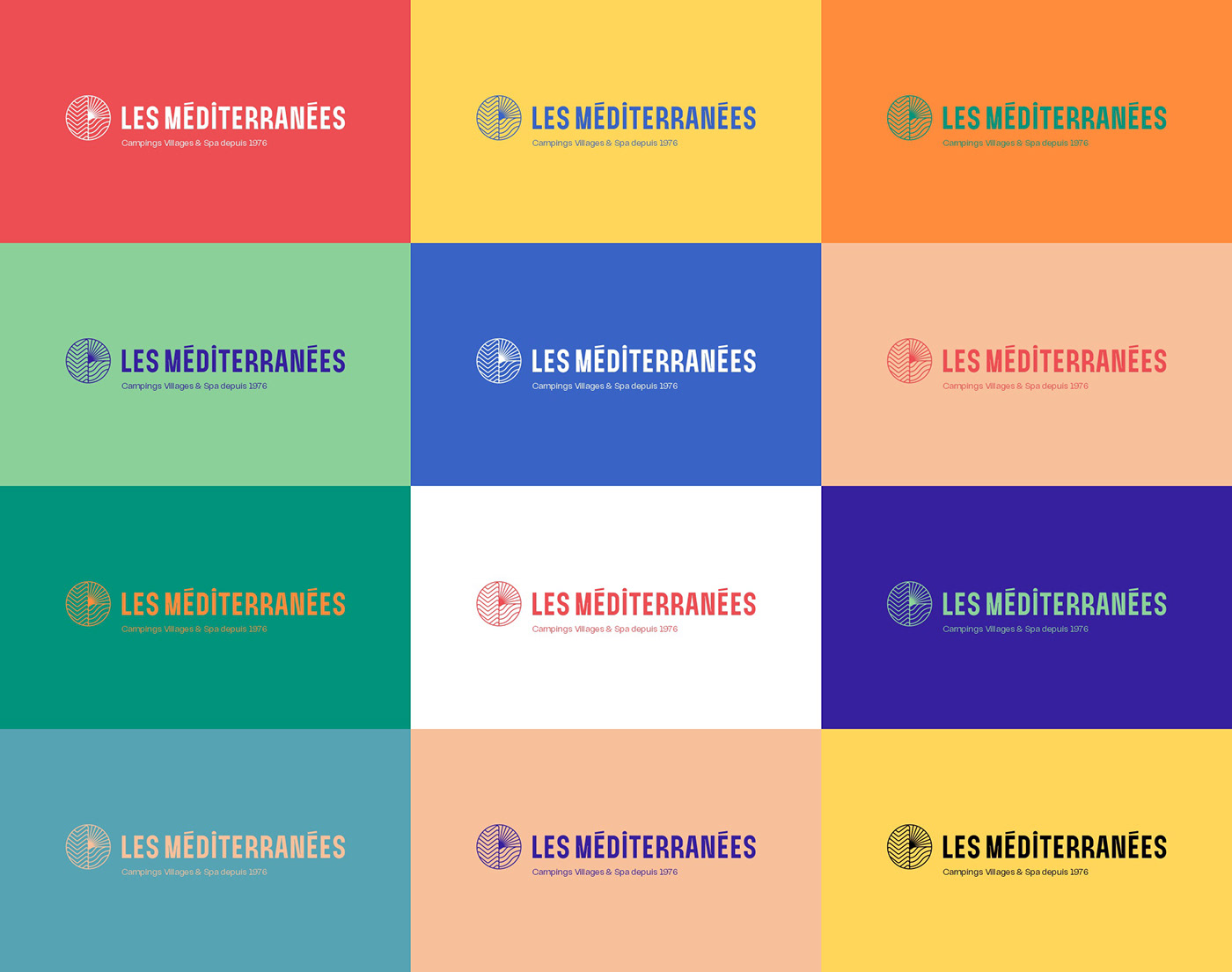
Les Méditerranées and the Leon Travel & Tourism agency have commissioned Brand Brothers to develop a new graphic identity, which was inaugurated in November 2020 and will be gradually rolled out on the sites for the opening of the 2021 summer season. For this first phase, a new logo was created, based on a typographic design developed in the studio and a new symbol. This identity cleverly bridges the gap between the elegance of a fine and harmonious symbol, in the evocation of more than in the representation, and a typographic block with a unifying and warm design.Navigating between sophistication and vividness, the new visual territory plays on a new colour palette and the association of two new typefaces, Bianco Serif and Telegraf, while leaving the emphasis on the images. The graphic language has been upgraded and is now used in editorial and online media, while awaiting its forthcoming roll-out on the 3 campsites.
_
FR
Depuis 1976 et l'ouverture de son premier camping, la famille du fondateur des Méditerranées, des vignerons et négociants en vin de Marseillan (Hérault, Sud de France), a bâti un ensemble de 3 campings de luxe au coeur d'une région privilégiée. Le Général De Gaulle, en passant au-dessus de Marseillan en avion, ne déclara-t-il pas que cette terre ressemblait à la nouvelle Floride ? Le Charlemagne, le Nouvelle Floride et le Beach Garden, ce sont trois campings 5 étoiles avec accès libre entre les trois sites et un accès direct à la mer. Elus meilleurs campings d'Europe en 2016 par DCC Europe, Les Méditerranées sont la fine fleur de l'hôtellerie de plein air française, comprenant notamment des hébergements haut de gamme intégrés en pleine nature, des espaces aquatiques et un spa.
Les Méditerranées et l'agence Leon Travel & Tourism ont confié à Brand Brothers l'élaboration d'une nouvelle identité graphique, inaugurée en novembre 2020 et qui sera progressivement propagée sur les lieux pour l'ouverture de la saison estivale 2021. Pour cette première phase, un nouveau logo a été conçu, sur la base d'un dessin typographique développé au studio et d'un nouveau symbole. Cette identité fait habilement le pont entre l’élégance d’un symbole fin et harmonieux, dans l’évocation
plus que dans la représentation, et un bloc typographique au dessin fédérateur et chaleureux. Navigant entre sophistication et vivacité, le nouveau territoire visuel joue sur une nouvelle palette colorimétrique et l'association de deux nouveaux caractères, le Bianco Serif et le Telegraf, tout en laissant la part belle à l'image. Une montée en gamme du langage graphique, déployée sur des supports éditoriaux et web, en attendant son déploiement prochain sur les 3 campings.
plus que dans la représentation, et un bloc typographique au dessin fédérateur et chaleureux. Navigant entre sophistication et vivacité, le nouveau territoire visuel joue sur une nouvelle palette colorimétrique et l'association de deux nouveaux caractères, le Bianco Serif et le Telegraf, tout en laissant la part belle à l'image. Une montée en gamme du langage graphique, déployée sur des supports éditoriaux et web, en attendant son déploiement prochain sur les 3 campings.