2020
Caela's Treats
There are so many forms of love— and baking is one of them. Since she was a little girl, founder Leanne Cruzin has been baking all her life. Now with a daughter of her own, she has turned her favorite pastime into a passion project: enter Caela’s Treats. Her sumptuous sweets were once only served to her friends and family to try, but she opened the doors in 2012 and offered us a seat at the table for her warm treats that bring comfort and joy to any home.
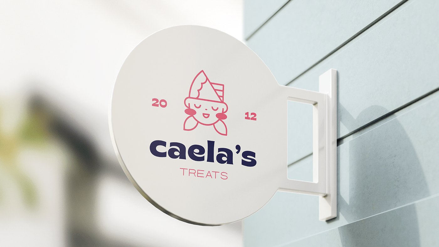
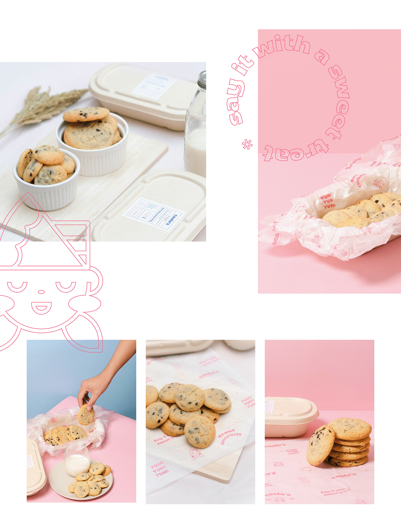
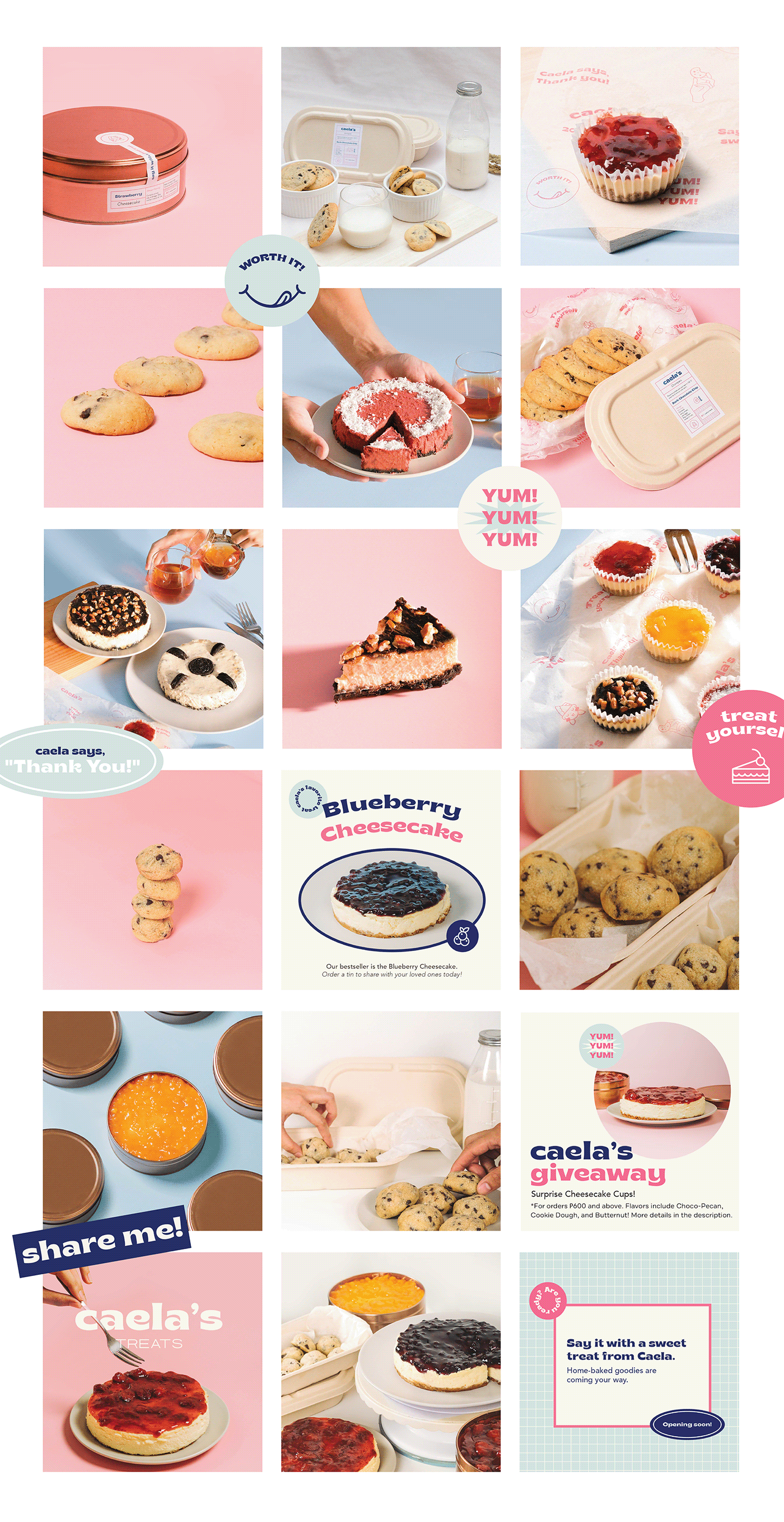
Taking this simple but meaningful concept, we drew inspiration from the history and heart of the brand – starting with the logo. It features a girl in pigtails with a layered cake as a chef’s hat, symbolizing the baker’s journey of both the owner and her daughter as they embarked on this business. A playful font treatment of Brice Bold and Avenir Regular matches the cheerful hero colors of Deep Blush contrasted with Edgewater and Cloud Burst.
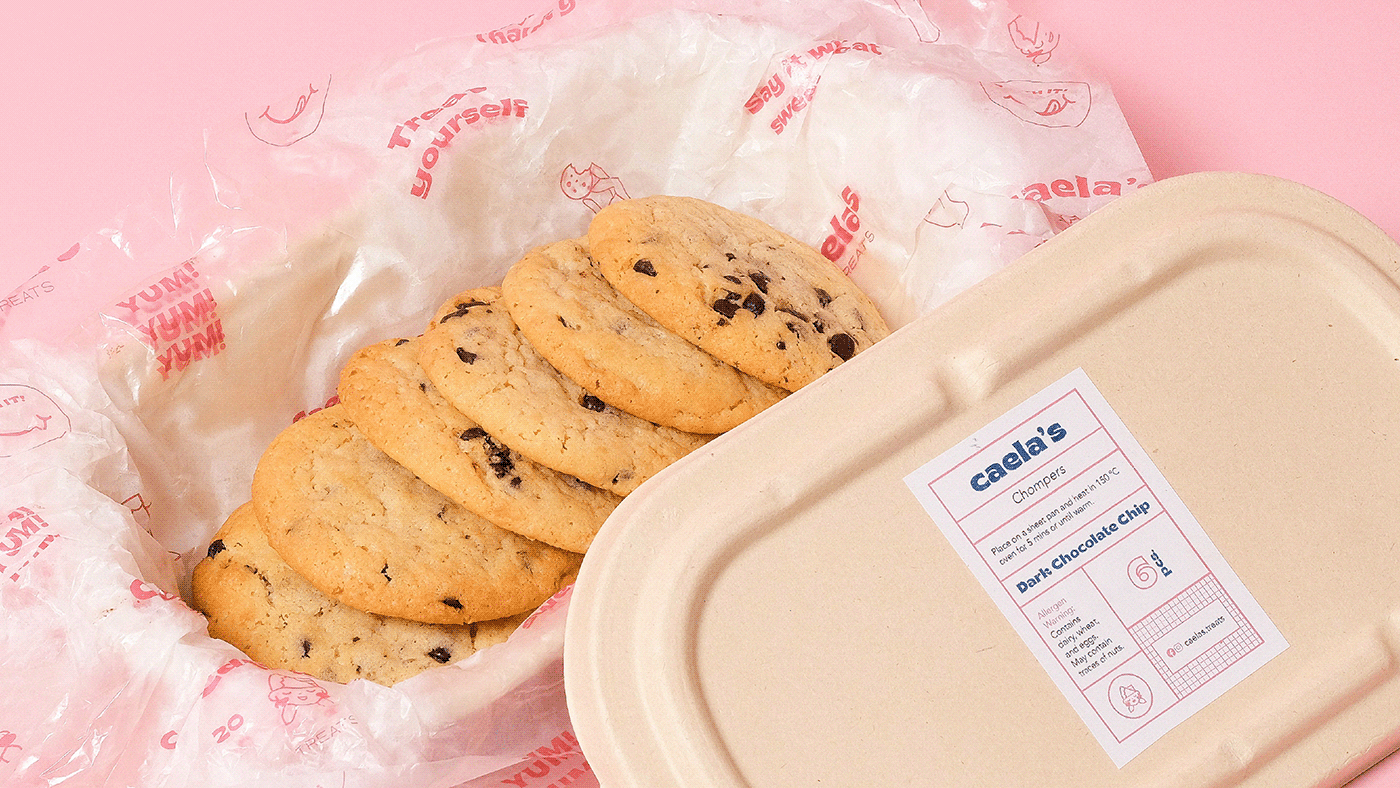
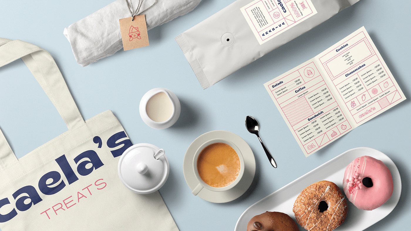
In application, the communication in packaging comes with sweet sayings! Sticker-like prints all over the orders remind customers that their order, be it cookies, a cheesecake, or even a vegan option, was made just for them. Lastly, the art direction of assets kept in mind every individual who’d envision eating these treats at home, paired with a cup of tea or a glass of milk just like a midnight snack. Take a bite of the brand identity we just got out of the oven, with sugar, Brice, and everything nice.
Visual Identity, Copywriting, Brand Guidelines, Social Media Content, Packaging Design, Art Direction, Photography