Manila Empanada
2019
OVERVIEW
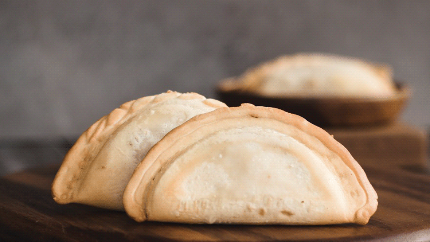
While there’s always room for more food on the table, the challenge for newcomers in the Filipino market is how to stand out amongst more familiar choices of families around. Establishing itself as a classic staple as of 2012, Manila Empanada bakes their way into your homes with freshly made good that are both innovative and timeless.
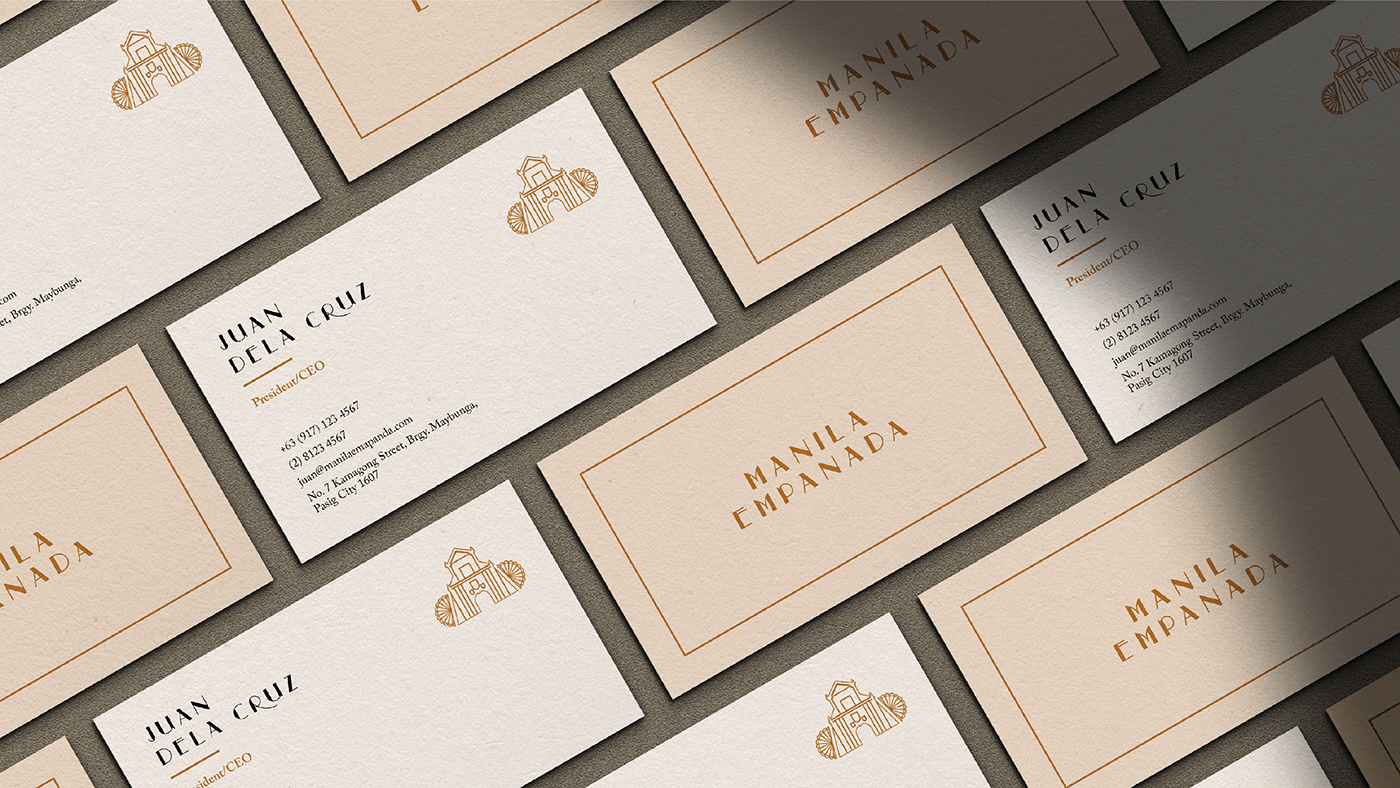
Building a classy but welcoming identity for the brand, the concept started at home. With their slogan “Pasalubong, pamilya, araw-araw,” the design drew on the strength of the Filipino family. For the logo, we went back to the origins of the empanada during the Spanish colonial period. Featuring architecture of that time, a simple infrastructure accompanied by the familiar pamaypay serves as the emblem for the brand. To remain cohesive with our roots, an another element is a textile band added to the packaging. Warm tones of Marigold, wine-like Buccaneer, and rural Pancho create a rich feel of nostalgic days at home sharing a meal with family. The overall concept, paired with the special recipe of the classic empanada, hope to take you on a trip down memory lane.
SERVICES
Visual Identity
Art Direction
Packaging
Collateral