Wenovia
_
EN
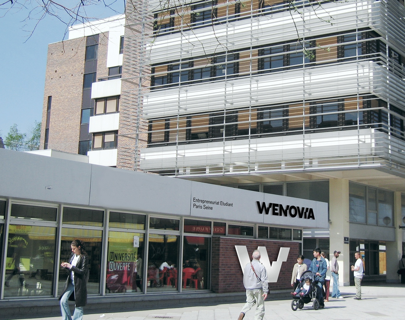
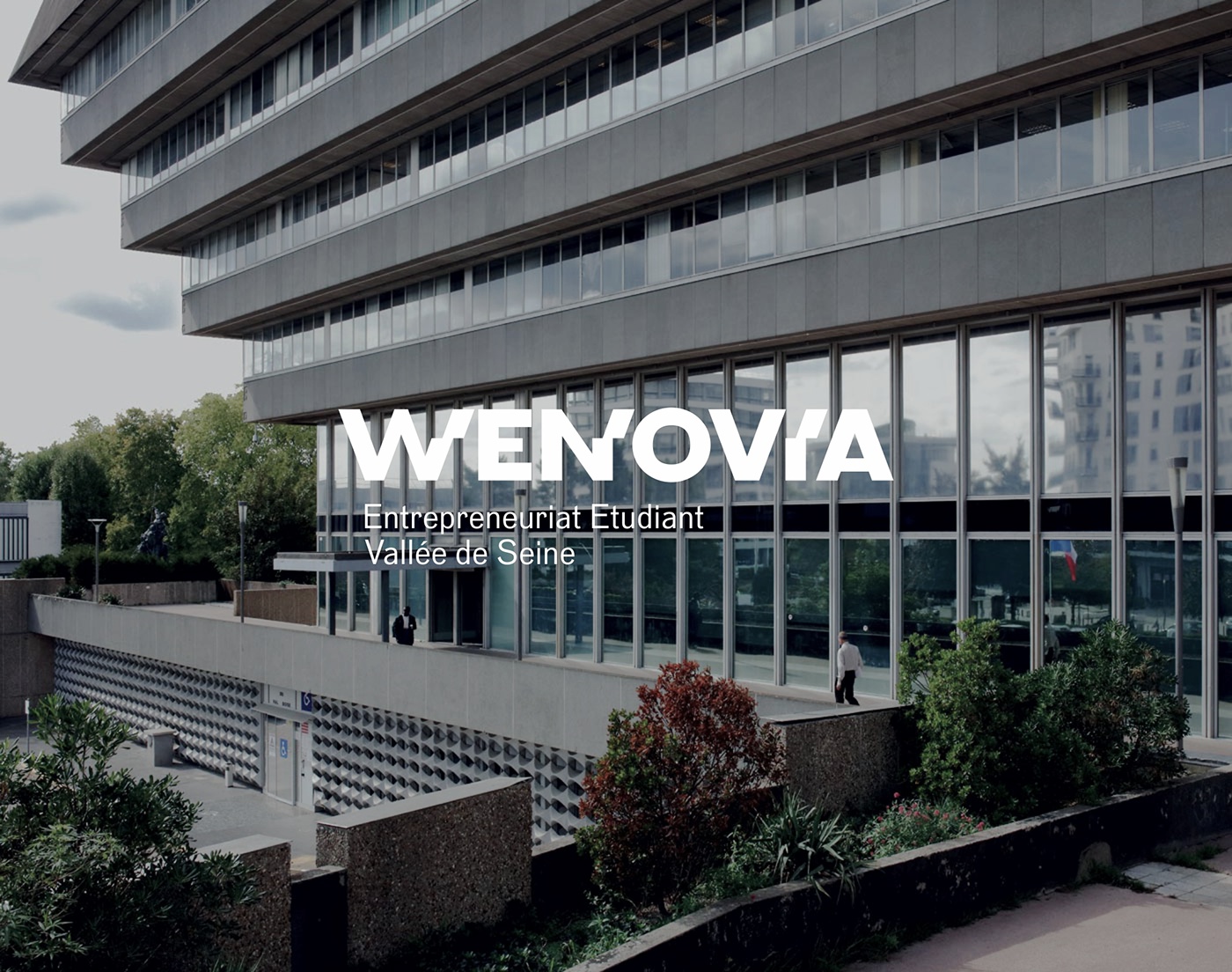
Wenovia is the centre of support for student entrepreneurship at the Université Paris Seine, composed of 15 schools and universities in western Paris, ranging from ESSEC to the University of Cergy-Pontoise, as well as renowned engineering schools. There are more than 37,000 students in the community; in the short term, Wenovia will be extended to Normandy universities. By boosting the students' capacity for innovation and boldness, the structure offers quality methods and support, enabling them to develop entrepreneurial projects during their studies.
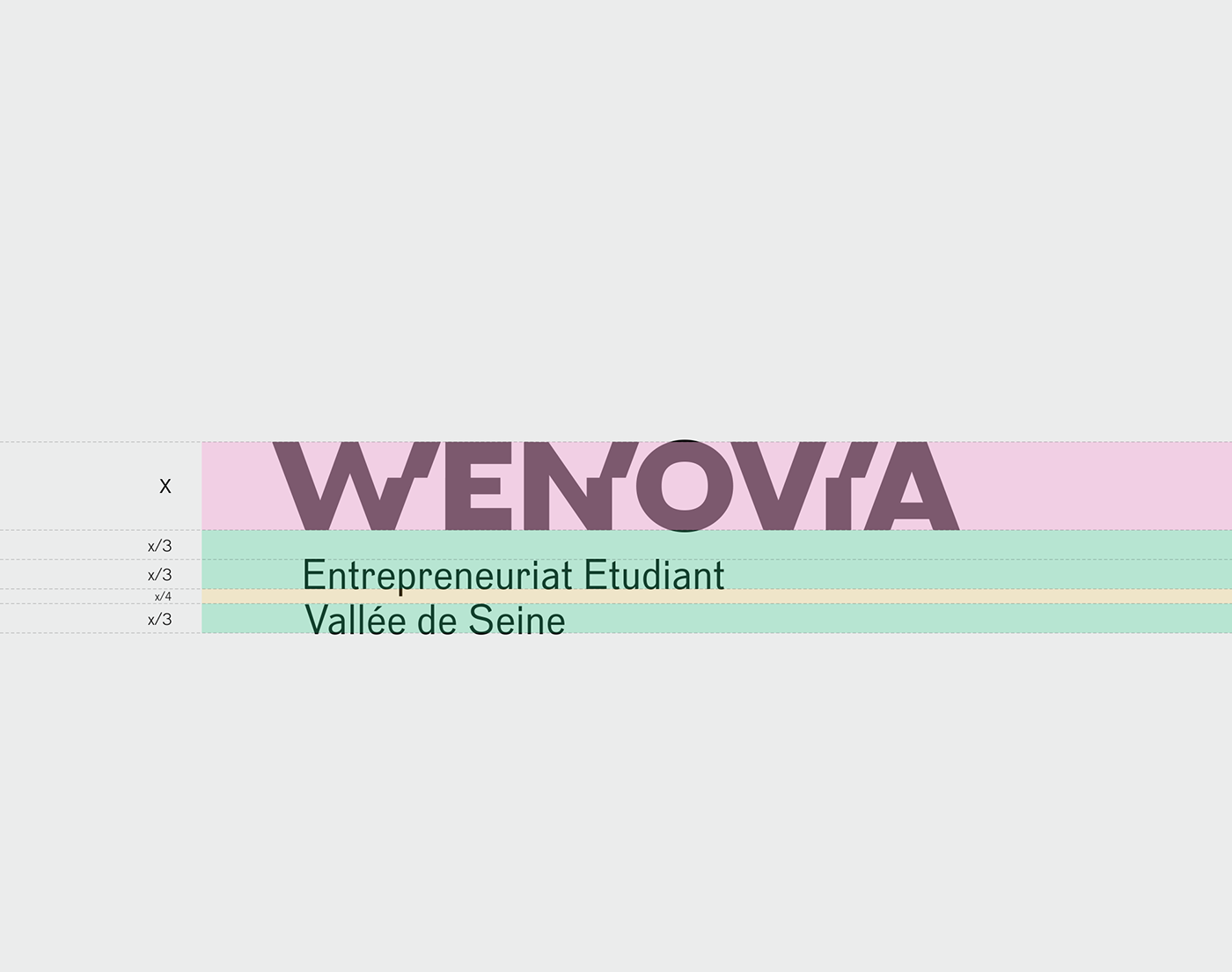
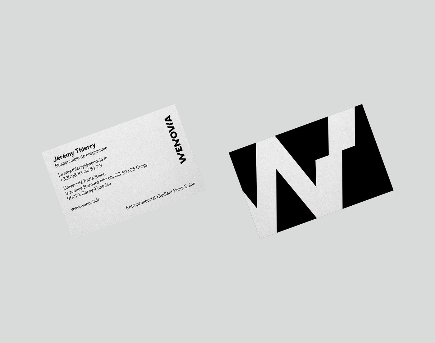
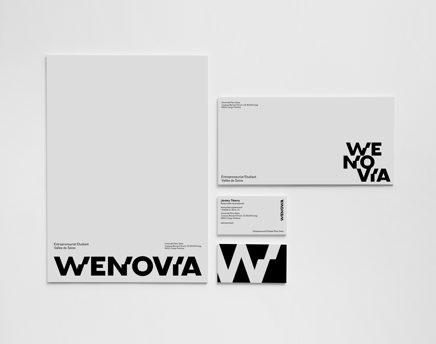
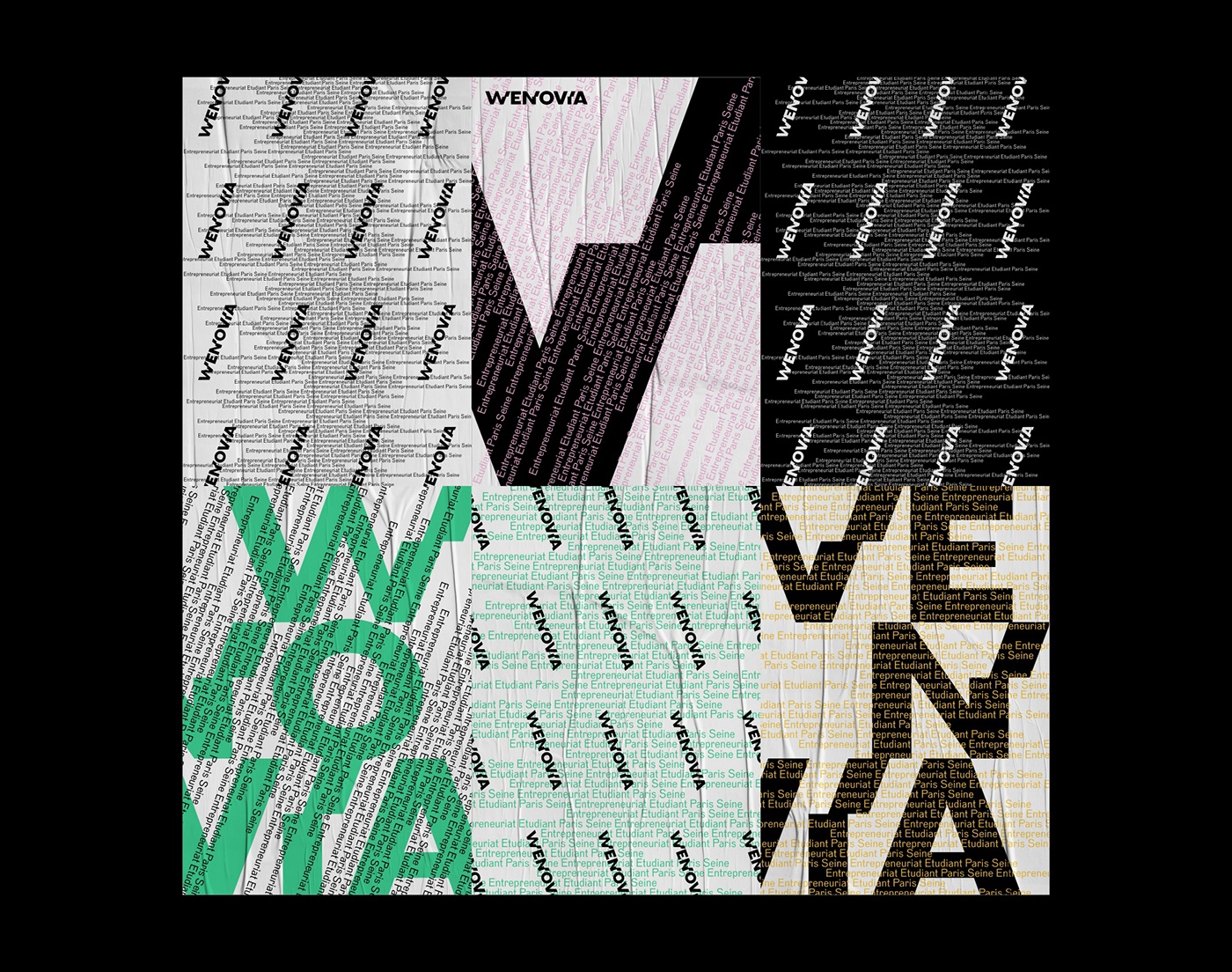
Brand Brothers was called upon to translate the ambition of this project into a visual identity. The first phase of the branding that we worked on was presented to the actors of the project and the local elected representatives, during the inauguration of Wenovia's Cergy-Pontoise coworking space in February 2018. The Wenovia logo is an original typographic design. Composed of capital letters, thick and solid, it includes 3 elements shifted within the lettering itself, referring both to the forward vision advocated by the approach, but also to the brutalist architectural style of the fief of Wenovia, Cergy-Pontoise (in particular its prefecture in the form of an inverted pyramid). We have developed a sober and structured graphic territory, in echo with the graphic radicalism of the logo, which will be brought in the coming months to expand on different physical, print and web applications.
_
FR
Wenovia est le pôle d'accompagnement à l'entrepreneuriat des étudiants de l'Université Paris Seine, composée de 15 écoles et universités de l'Ouest parisien, allant de l'ESSEC à l'université de Cergy-Pontoise, en passant par des écoles d'ingénieurs de renom. La communauté compte plus de 37 000 étudiants ; à court terme, le dispositif Wenovia est appelé à s'étendre jusqu'aux universités normandes. En poussant la capacité d'innovation et l'audace des étudiants, la structure propose des méthodes et des moyens d'accompagnement de qualité, leur permettant de développer des projets entrepreneuriaux pendant les études.
Brand Brothers a été appelé pour traduire l'ambition de ce projet en identité visuelle. La première phase du branding que nous avons travaillé a été présentée aux acteurs du projet et aux élus territoriaux, lors de l'inauguration du coworking Wenovia de Cergy-Pontoise en février 2018. Le logo Wenovia est une création typographique originale. Composé de caractères haut de casse, épais et solides, il comprend 3 éléments décalés au sein même du dessin des lettres, faisant référence à la fois au "pas de côté" prôné par la démarche, mais également au style architectural brutaliste du fief de Wenovia, Cergy-Pontoise (et notamment sa préfecture en forme de pyramide inversée). Nous avons développé un territoire graphique sobre et structuré, en écho avec le radicalisme graphique du logo, qui sera amené dans les mois à venir à prendre de l'ampleur sur différentes applications physiques, print et web.