_
EN
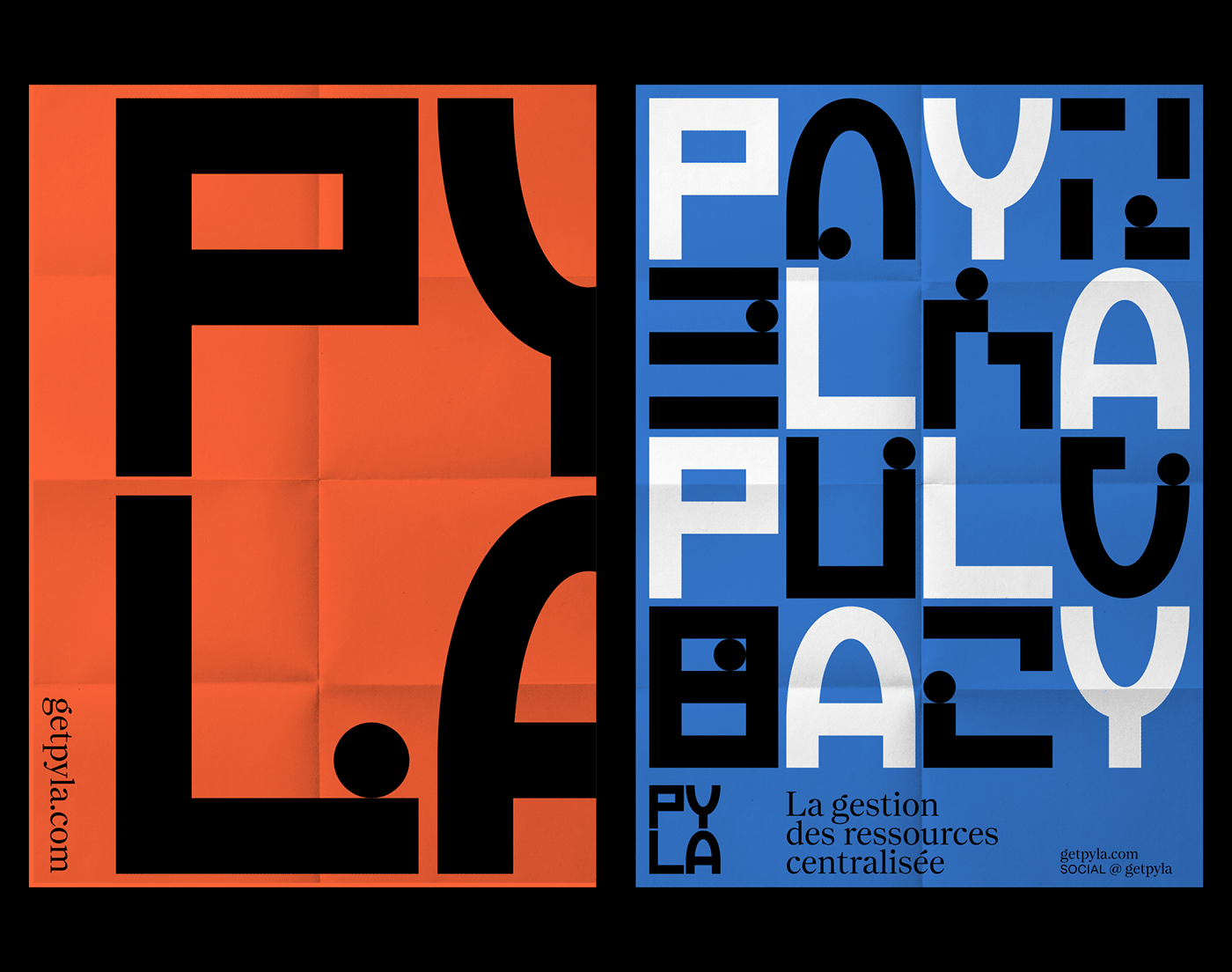
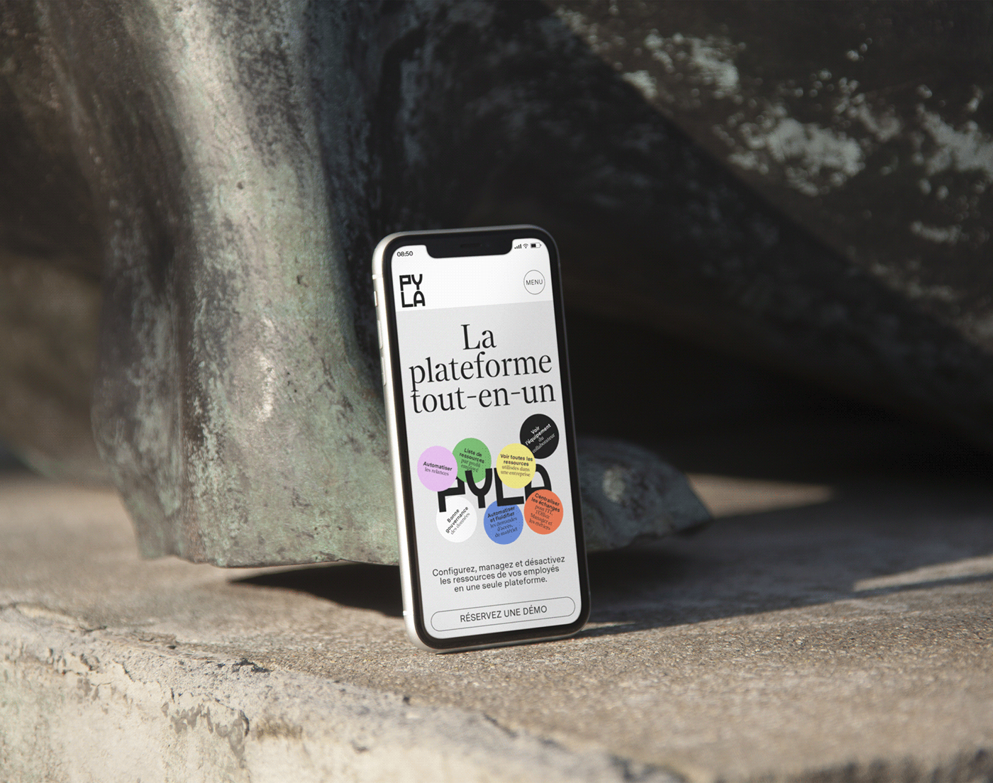
Pyla, formerly Sweelo, is a startup created around a simple observation: an employee needs several dozen application resources, software and equipment to be fully operational in his company. When they arrive and when they leave, the installations and manipulations generate financial, time and energy losses, not to mention the impacts in terms of data security. Pyla designed a solution that centralizes and automates the management of all these resources.
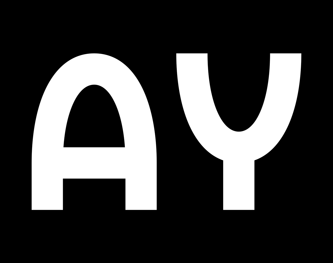
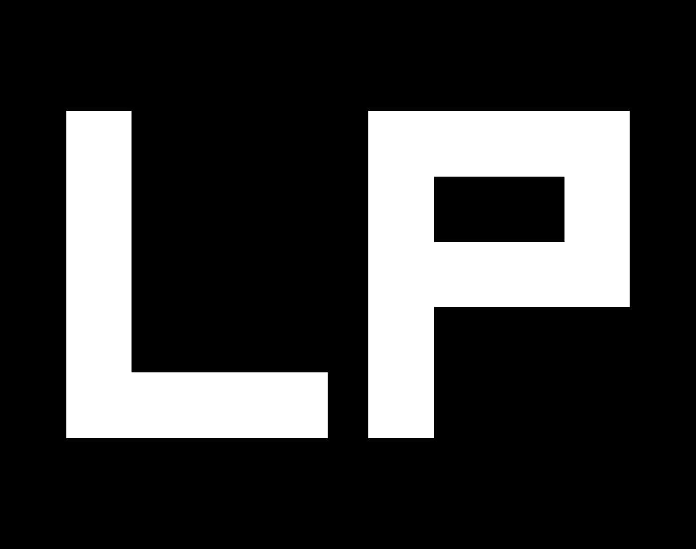
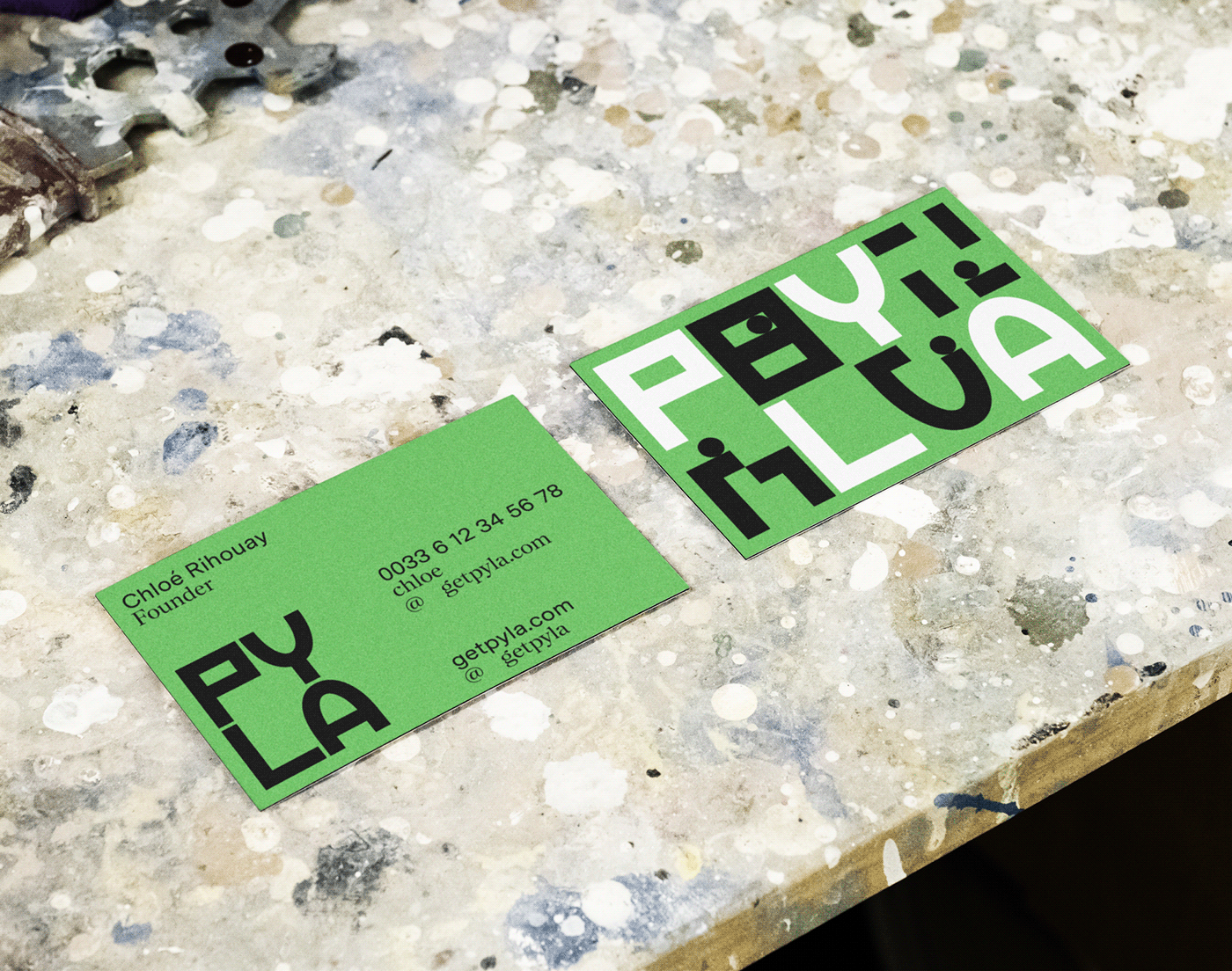
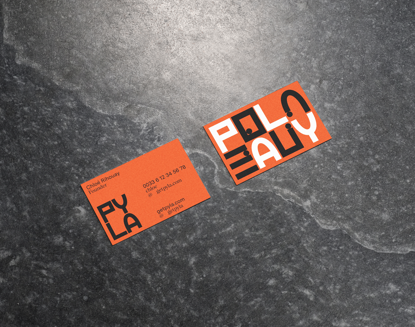
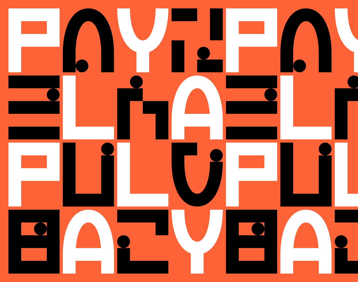
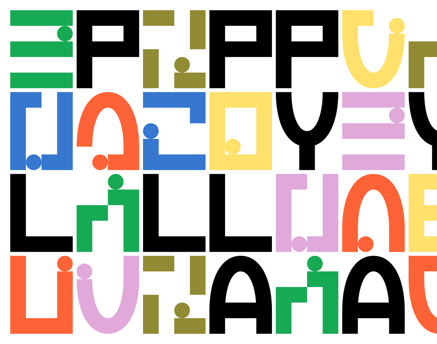
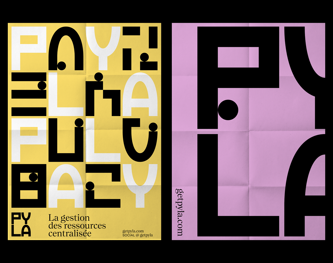
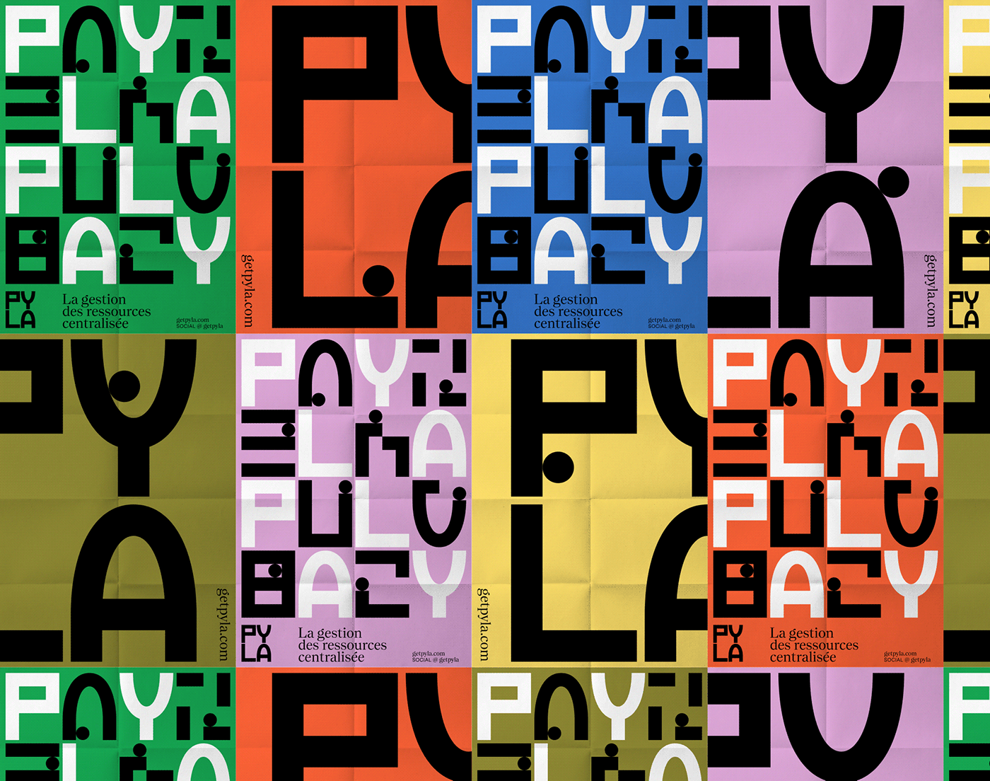
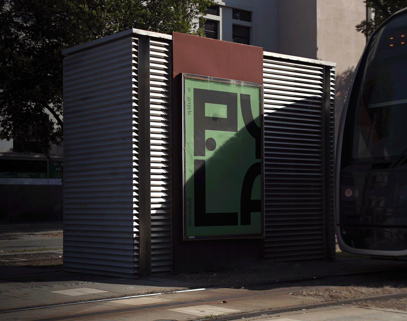
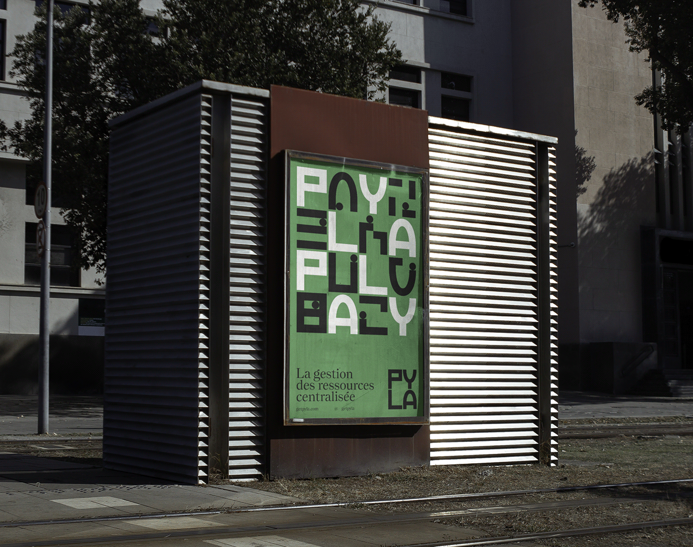
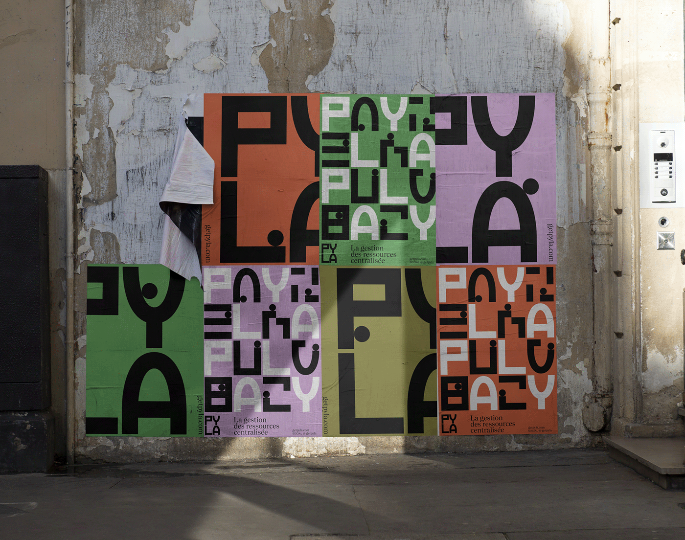
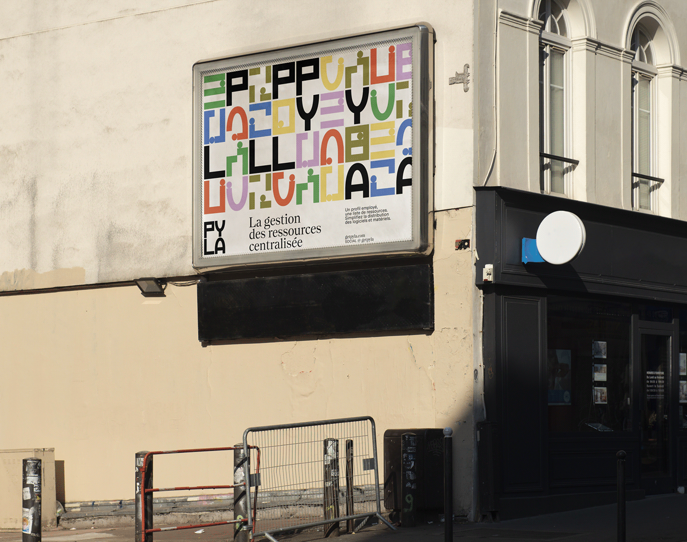
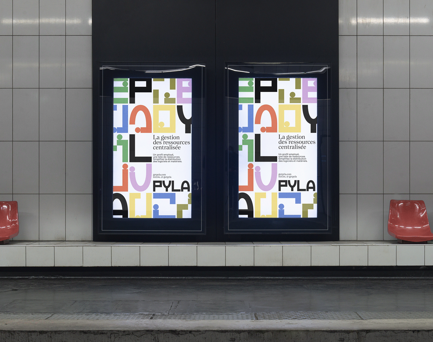
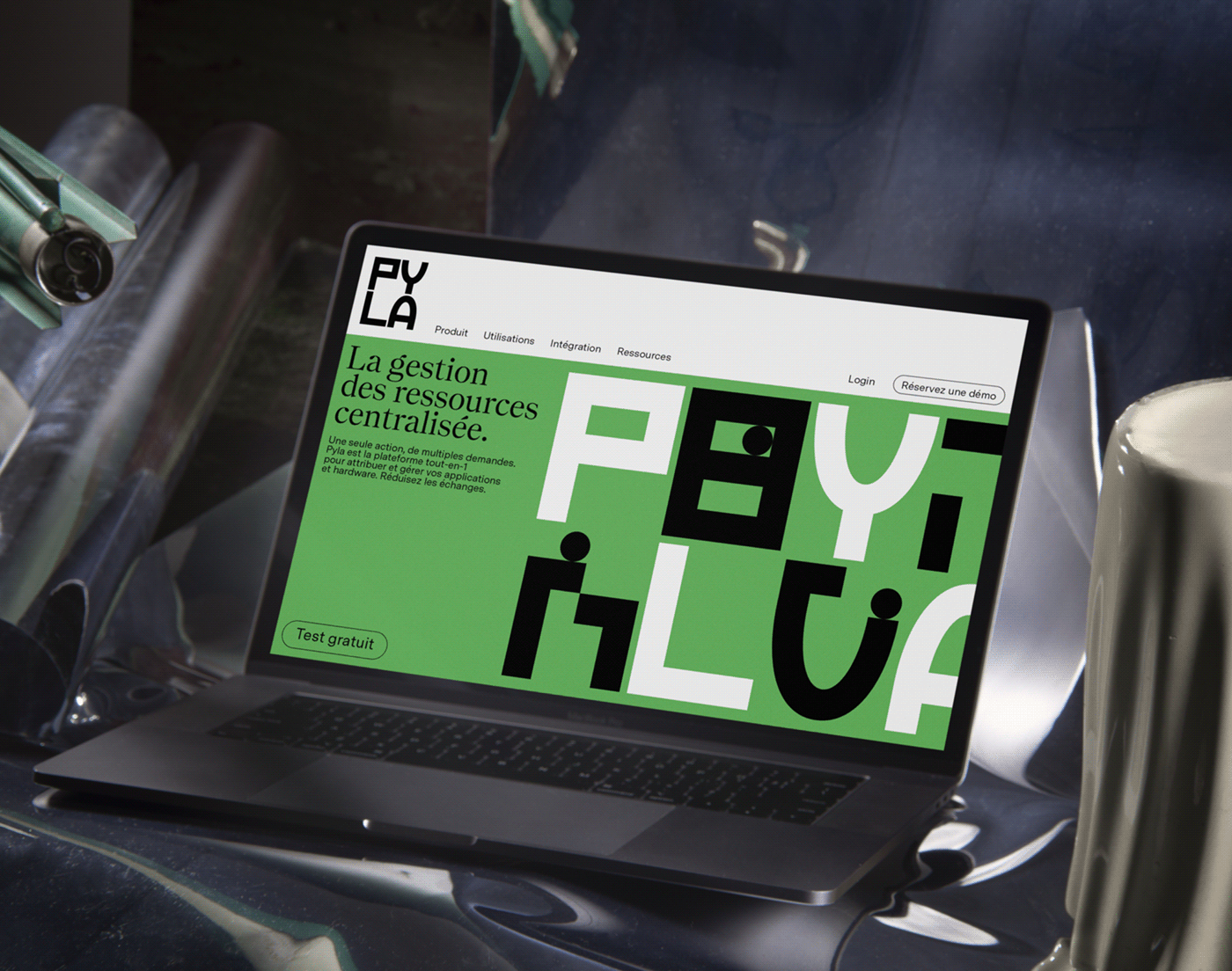
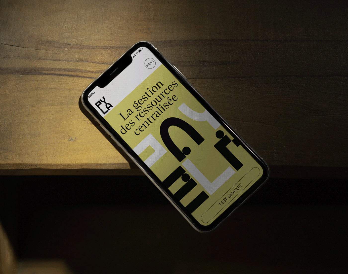
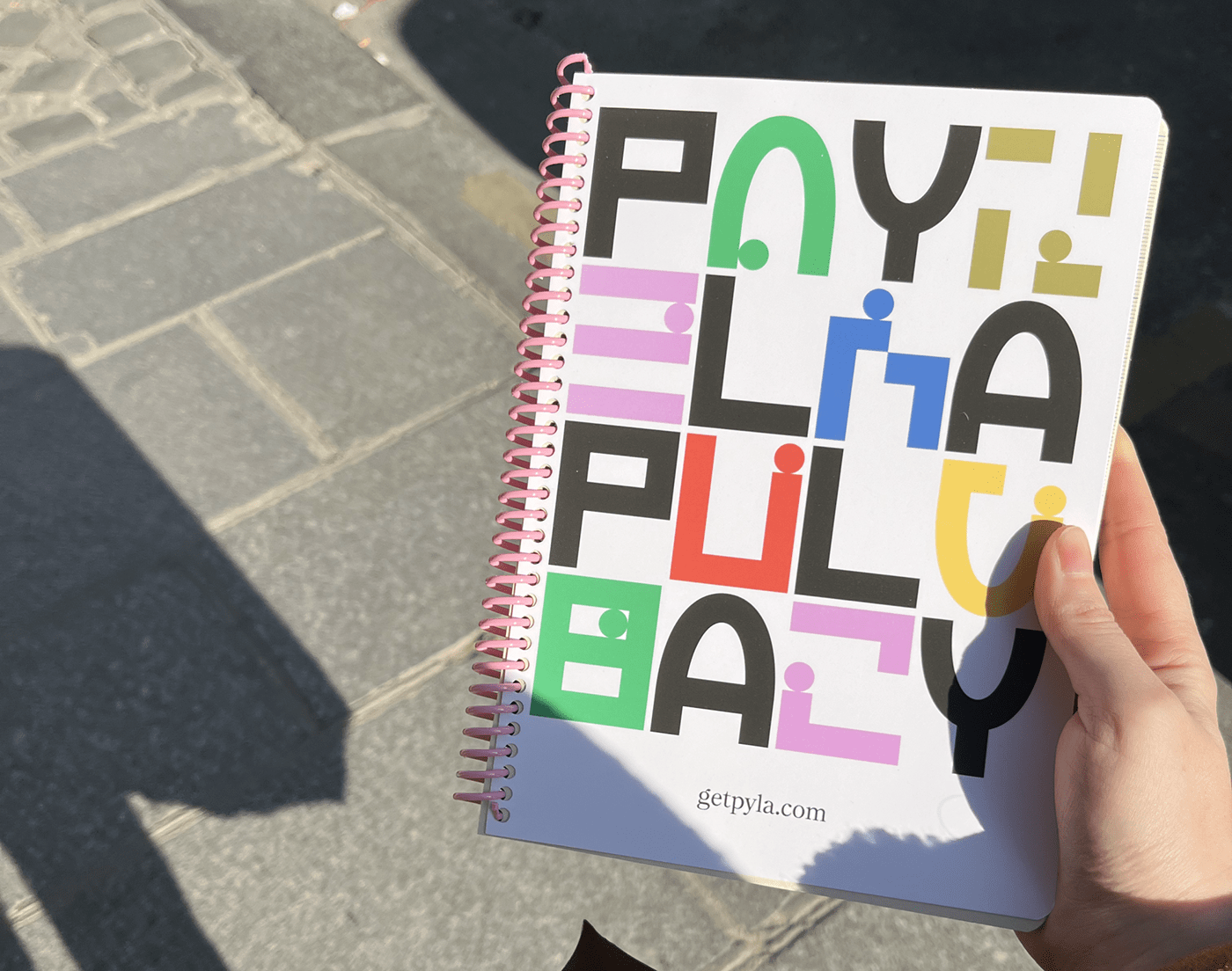
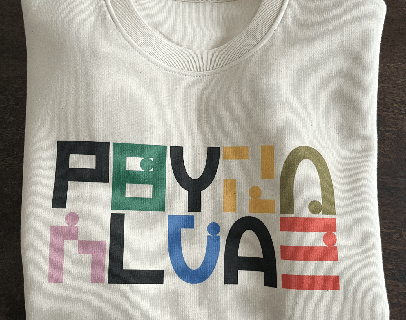
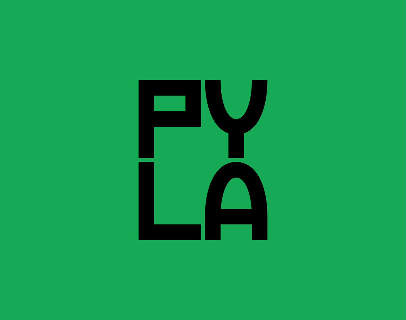
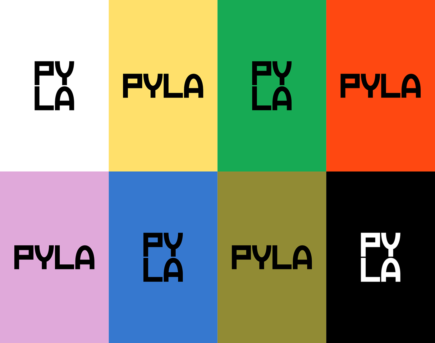
Brand Brothers developed Pyla's identity for its name change, based on a typogram whose character design resonates with the name. Thus, the P and L form a unity around a straight line, while the Y and A, based on an oval, act as a mirror. These 4 characters serve as the basis for an abstract system composed of 12 shapes and a ball, which tell the story of the stacking of applications, the flow of data and the user experience. A clear desire to remain in the metaphor, to give Pyla a lively and playful attitude within the world of data. The graphic environment, simple and colorful, is based on the Messina Sans and Nantes typefaces (Luzi Type, Bern, CH).
_
FR
Pyla, anciennement Sweelo, est une startup créée autour d'un constat simple : un employé a besoin de plusieurs dizaines de ressources applicatives, logiciels et équipements pour être pleinement opérationnel dans son entreprise. A son arrivée et lors de son départ, les installations et manipulations engendrent des déperditions financières, de temps et d'énergie, sans compter les impacts en terme de sécurité des données. Pyla a conçu une solution qui centralise et automatise la gestion de l'ensemble de ces ressources.
Brand Brothers a développé l'identité de Pyla à l'occasion de son changement de nom, autour d'un typogramme dont le dessin des caractères résonne avec le nom. Ainsi, le P et L forment une unité autour d'un tracé rectiligne, tandis que le Y et le A, basé sur un ovale, agissent en miroir. Ces 4 caractères servent de base à un système abstrait composé de 12 formes et d'une bille, qui racontent l'empilement des applications, le flux des données et le parcours utilisateur. Une volonté manifeste de rester dans la métaphore, pour conférer à Pyla un tempérament vif et joueur au sein du monde de la data. L'environnement graphique, simple et coloré, repose sur les caractères Messina Sans et Nantes (Luzi Type, Berne, CH).