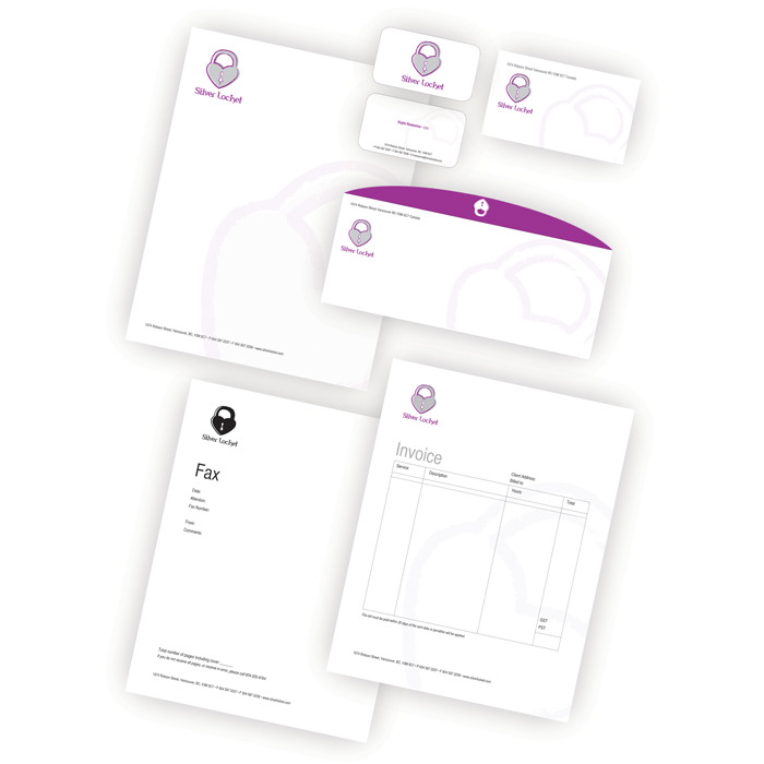
Silver Locket is a case study on branding. This project included developing the logo, brand standards guide, and the concepts for the company’s stationery, website, apparel, and advertising.
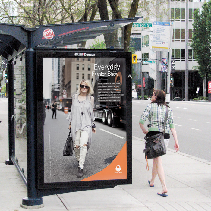
Silver Locket is the anonymous author of a fashion column that is in the new, free, street culture magazine Afoot. The column congratulates unsuspecting people on their innovative fashion style, trends or ideas.
The Silver Locket logo represents the tone and values of the brand and consists of three elements that work together as a whole. The symbol has a casual, fun, and edgy feel with the grunge brush stroke and the combination of the heart and lock shapes. The offset gray shape behind it also gives a more casual mood to the logo. The colours help further a mood of youth, fun, and fashion. The colour choices also lean towards the target audience of girls and women. And, the gray still keeps the logo connected to the brand name Silver Locket. The typography of the logotype gives it a strong foundation because of the serifs. It has very modern and edgy shapes to make it fresh and fashion forward. And the “k” in the type pairs well with the logo with its hook like form reminding viewers of a lock.
The typography used with the logo is very important. The primary typeface used is Helvetica CY. It is a simple and modern looking sans serif that represents the fresh modern feel of the brand.
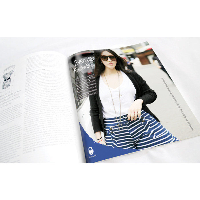