

ZVYK Brand Identity
Introducing ZVYK, a new skin care brand from Korea that celebrates the unique beauty in each of us and promotes small good habits that would lead to a healthier and happier self.
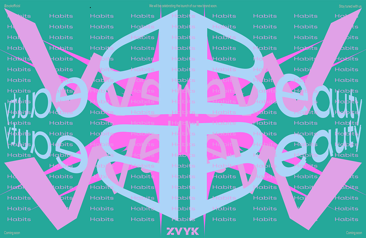
ZVYK is translated as “habit” from Czech. Habits are in the nature of skin care. This connects brand name directly to the beauty category.
ZVYK is translated as “habit” from Czech. Habits are in the nature of skin care. This connects brand name directly to the beauty category.
IG: @myzvyk
TikTok: @myzvyk
Concept
The visual identity is based on the concept of small habits — repetition & progression.
We take simple shapes, repeat them, rotate, scale, mirror, distort and repeat it again until they become unique, bold, beautiful, and expressive shapes — as rare as you are.
We take simple shapes, repeat them, rotate, scale, mirror, distort and repeat it again until they become unique, bold, beautiful, and expressive shapes — as rare as you are.
As the primary basic shape we chose sharp and dynamic triangle that would further push energy and composition.


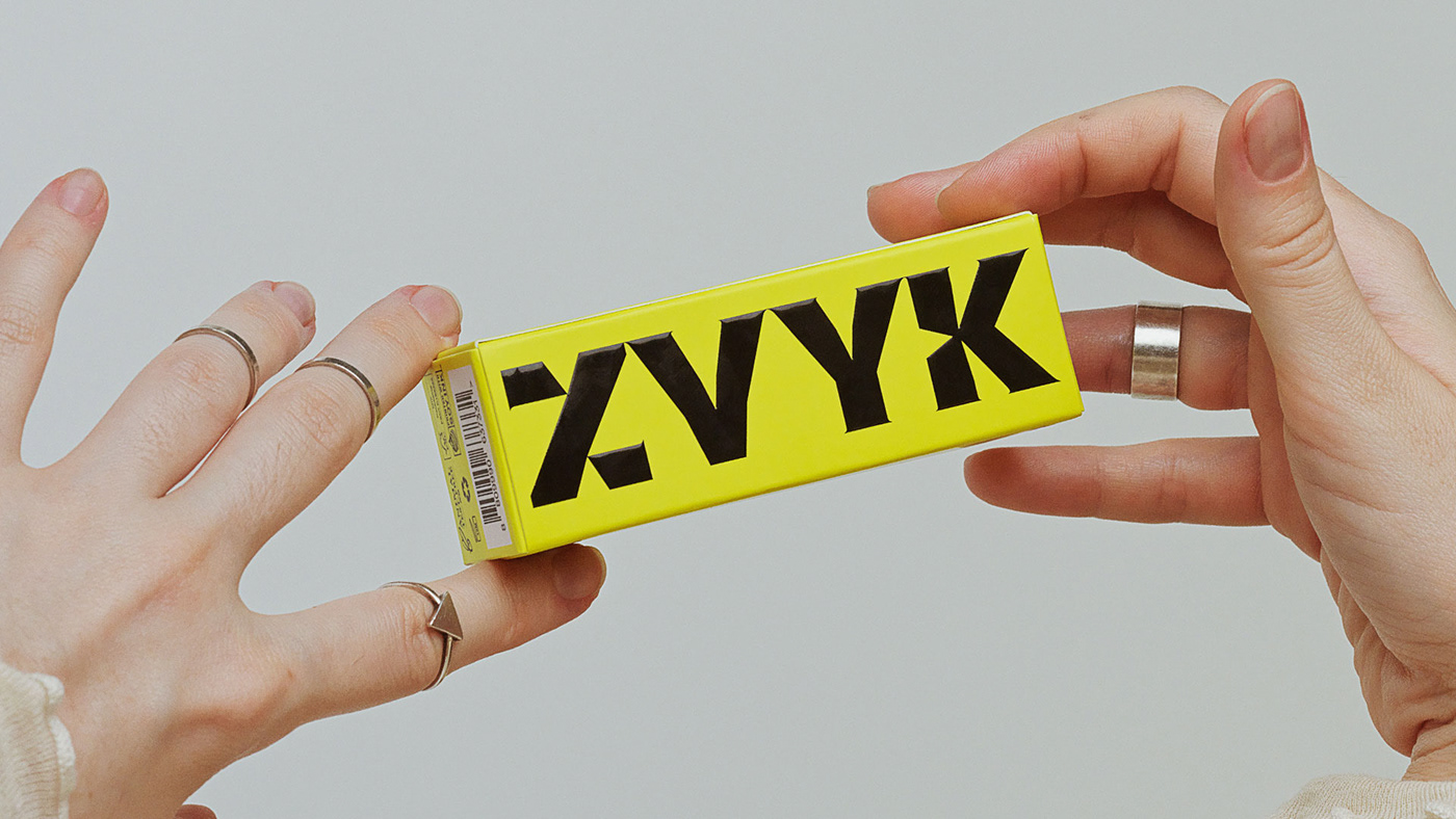
Logotype
ZVYK logotype features adorable little serifs. This quirky detailing, in an unconventional way, conveys a mood of youthfulness while still maintaining a visual relation to the traditional perception of a beauty brand.
ZVYK logotype was created by customising the Melanzane typeface, which was originally designed by Jonas Hecksher of PlayType in 2020.
Geometry of Y and V is customised, to achieve balanced alignment of key points within the logotype. Additional triangle cut-outs were added to the glyphs, first of all, to put emphasis on the vertex in the V and Y glyphs. Secondary, to jet the horizontal bars of the Z. Altogether, these cuts further enhance the energy of self-expression and bring a dynamic feel to the logotype.

Typography
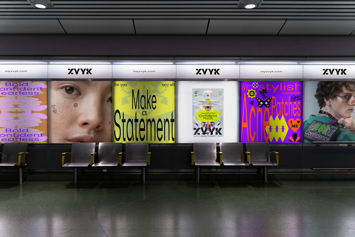
For the body copy, we chose powerful ES Klarheit Kurrent, for it’s rebellious character and an original glyph design. To further emphasise the youthful mood we disobey the holy rule of typography and not only allow but promote typeface distortion. Type is squeezed, stretched and overlayed and many ways. In combination with vibrant colour combinations, and geometric shapes the whole ZVYK identity reaches it’s maximum expression point.


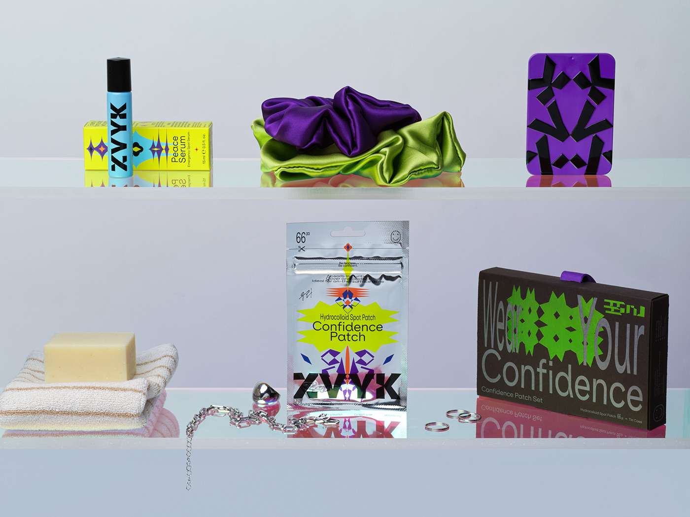
Packaging
Confidence Patch is a mirror-like reflective silver pouch. Besides its amazing appearance, this choice of material is linked to the concept of good beauty habits that we translated into a visual language of repetition, hence mirroring.
This collection includes 66 patches in various sizes and shapes, each with a unique design. From geometric shapes and mirrored glyphs to cute butterflies, and bold messages like "Slay", "Snatched", "Vibing", "I love me", "You are Art", and more, there's surely something to fit any need, look, and mood.


The Peace Serum packaging strikes a balance between a slick minimal and a crazy busy layout. This is a challenge that all designers face in the real world of packaging, where they need to fit all the mandatory information and comply with regulations while keeping the layout neat. We saw this challenge as an opportunity and explored the beauty of tightly packed typography. Squeeze of the typeface evolved from a bold aesthetic choice into a helpful tool. Obey the rules, but also make your own.


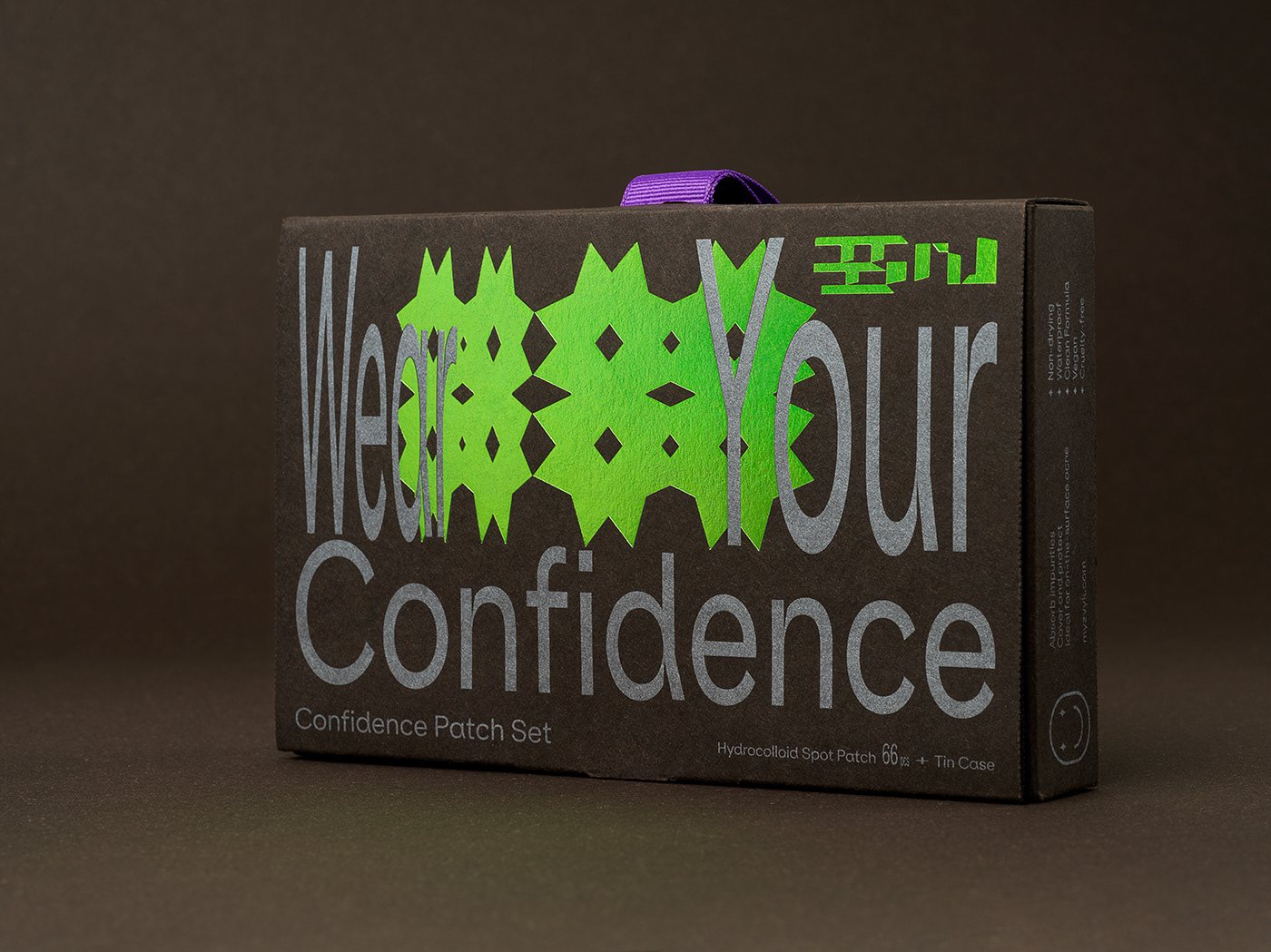
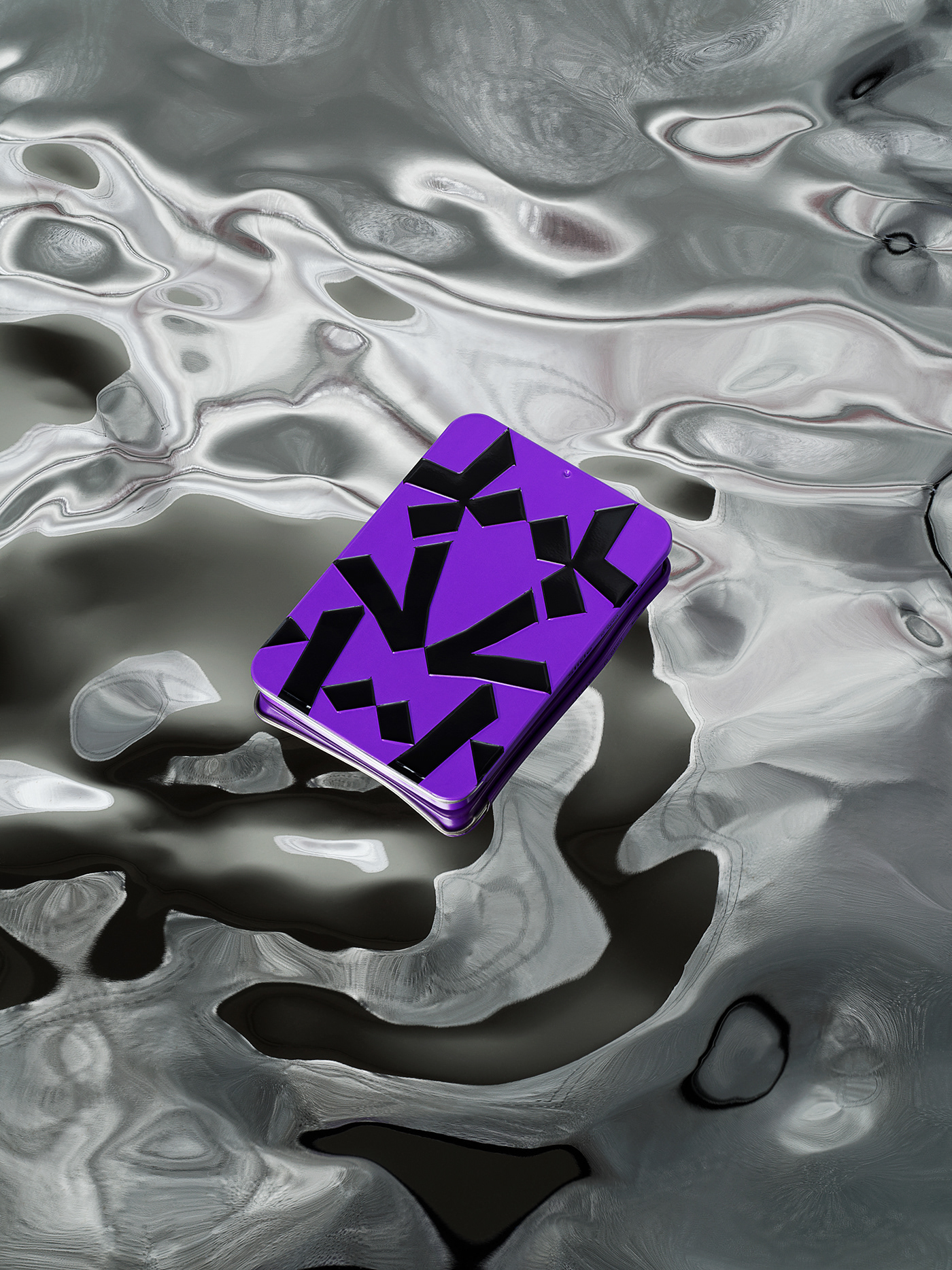
The Confidence Patch Set is a giftable item from ZVYK's collection. The set includes a pack of acne patches and convenient tin case for storing patches on the go.
The outer packaging is printed with Pantone Silver on G.F. Smith Colorplan Bitter Chocolate, with details in holographic hot foil stamping for the ZVYK symbol, featuring expressive typography of the core message "Wear your Confidence".
The front graphic of the tin case is created using ZVYK design principles of repetition and reflection, playing with the glyphs from the logotype. This stylish item has subtle branding.


The front graphic of the tin case is created using ZVYK design principles of repetition and reflection, playing with the glyphs from the logotype. This stylish item has subtle branding.


ZVYK is an edgy e-commerce website driven by UI and experimental UX. Each product is presented with a mood board approach, where clean product imagery is mixed with brand’s core messaging and styling aesthetic. It helps a newly-established brand to set its universe at a glance.
Through details of distorted typography on hover, mixing colours, and a little surprise of patches appearing all over the screen, clean and orderly UI supports its rebellious aesthetic through out.


We are honoured to have worked alongside ZVYK founder Grace Lee to develop the brand identity, from concept to packaging, website, video, and photography production.
With love, .Oddity Studio


