


Brand Story
Soft Storm专研「Ultra-Skinlike肌肤触感科学」的贴身服饰品牌,通过柔韧面料和匠心工艺设计提供给穿着者全天候的舒适自在感,时刻守护年轻一代拥抱世界的底气,去找寻独属自己的风暴般猛烈的生活热情。
在设计研发中,关注简约质感与充满细节的设计,探索年轻潮酷与混搭敢玩的风格。身心舒适与科技功能革新是Soft Storm大胆创想并持之以恒的努力。
Soft Storm is the underwear brand being dedicated to the [Ultra-Skinlike Skin Touch Science]. With flexible fabrics and ingenious design, it sets to provide users with all-day comfort, endow the young generations with the courage to embrace the world and the passion to embrace the storm in life.
Soft Storm not only gives priority to the simple texture and exquisite design, it also explores the mix-and-match style, highlighting the young and fashionable attitude. Soft Storm is committed to make you feel more comfortable in all ways through technological innovation.

Brand Slogan
Tough but tender柔软有张力是Soft Storm的品牌哲学。「柔性」寓意面料的柔软舒适,更代表我们与身俱来的内敛与温柔;「风暴」寓意基本款的不断革新,兼具力量。同时也诠释着年轻一代的我们以坚韧不羁的态度,热情而自由的内心,来面对过去、现在与未知。
「Tough but tender」serves as the brand philosophy of SoftStorm. 「Soft」refers to the comfortable fabric,representing our inherent humbleness and tenderness. 「Storm」implies the continuous innovation of everyday clothing as well as the strength that empowers the next generation, facing the past, the present and the future with passion and confidence.

Color
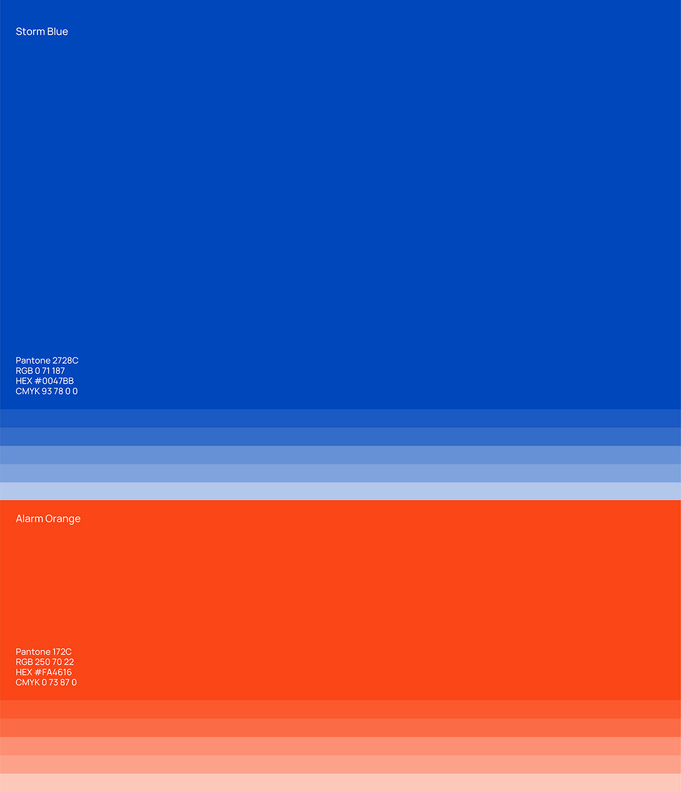
时髦冷静的蓝色与充满热情的橙红色是Soft Storm的品牌主色,互补色制造强烈的视觉吸引力,寓意着柔性风暴借以「科技功能革新」大胆突破基本款服饰的设计。
SoftStorm takes blue as the main colors of the brand, pair with orange red which strengthen the effect of each other, resulting an eye-catcher pair. The color pairs leaves a bold impressions that the brand is committed to breakthrough and innovate.

Visual Element of SoftStorm
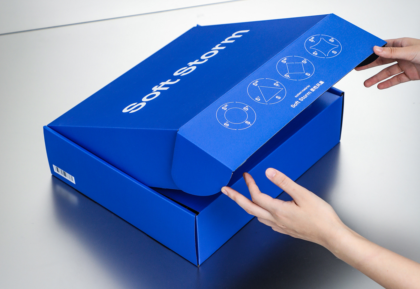
风暴系数SSTR是SoftStorm特有的产品系统,基于四个方向的设计原则与标准,SoftStorm不断迭代更新,螺旋上升,为用户构建全方位基本款的穿搭。
地理常识中影响气流变动的气旋反气旋概念启发了对应风暴系数的图形设计,构建视觉语言帮助区分与理解产品开发体系。四个系数S/SS/ST/SSR分别对应Standard微力风暴,Soft Style风格风暴,Soft Tech科技风暴,Spuerior Super Rare超强风暴。风暴系数的图形创造成为SoftStorm强有力的视觉识别元素。
「SSTR」is the product development at Soft Storm basing on four distinct set of principles, it continually innovates and upgrade everyday clothing. The four collections are S—Standard, SS—Soft Style, ST—Soft Tech, SSR—Superior Super Rare.
The concepts of cyclones and anticyclones in geography and the diagram of it inspires the graphic expression of Soft Storm’s product classification, which becomes a unique part of the brand’s visual identity.

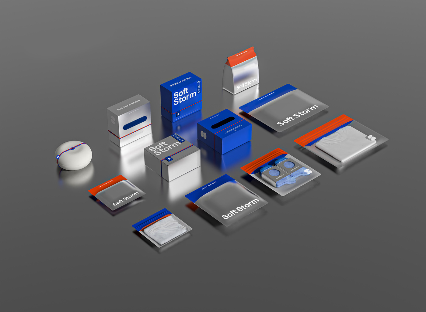
Packaging
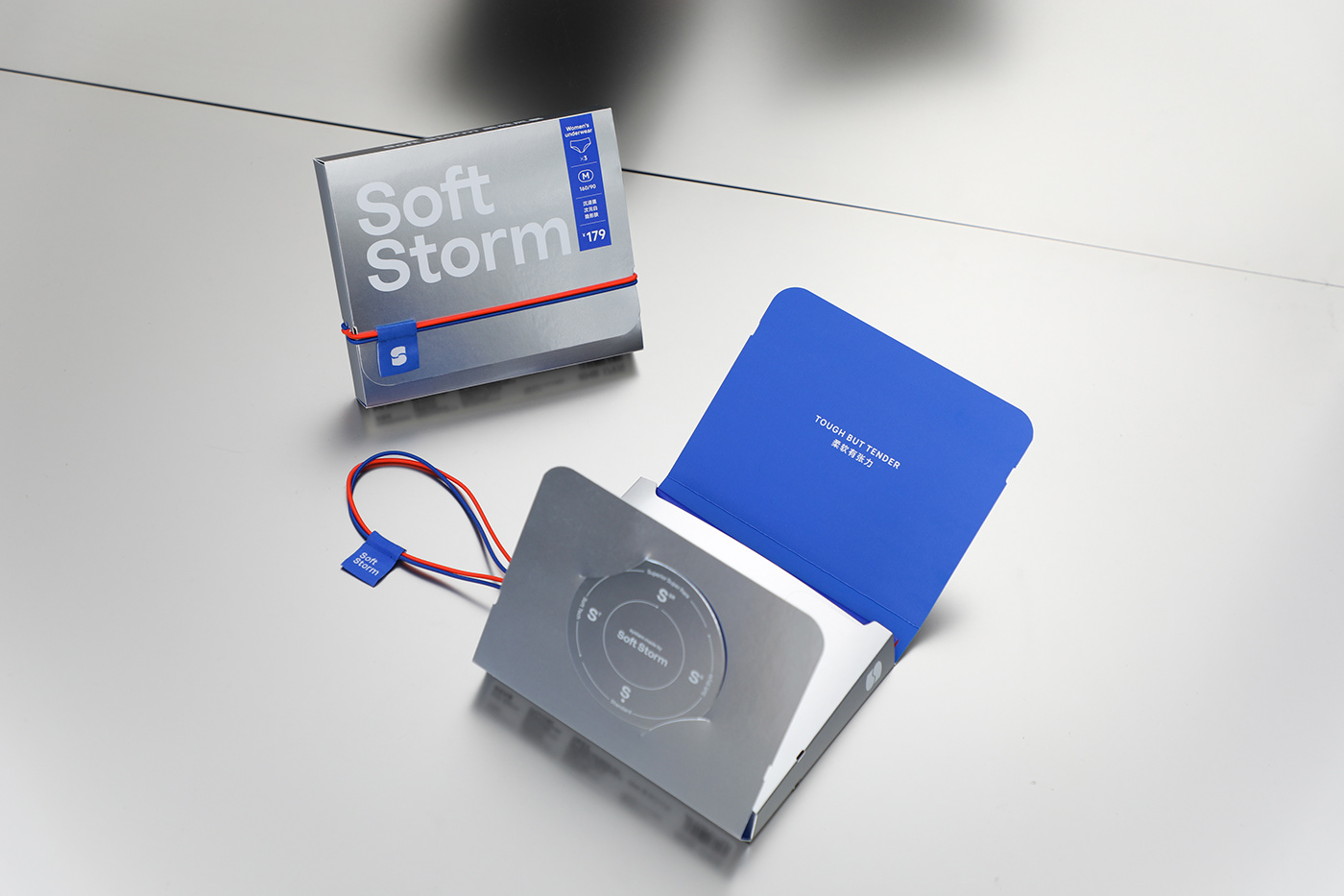
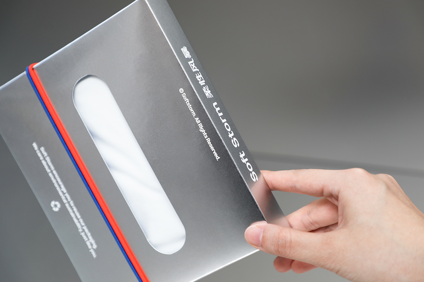
Soft Storm的包装系统以蓝色与银色为主创造深刻的视觉记忆。展开的信封盒与可降解的纸浆盒上统一运用代表品牌的橙蓝两色弹力带,搭配品牌辅助LOGO织标的设计,无论将来品牌以何种包装结构与形式出现,蓝色、橙色绑带与辅助LOGO织标将是柔性风暴永续的视觉元素。
Soft Storm's packaging system is dominated by blue and silver to leave a strong impression. The envelope box and the degradable pulp box are highlighted by blue and Orange red elastic band, along with a clothing label. This two element will always present on Soft Storm’s packaging no matter what form it takes.


Design & Photography
low key Design
Year 2022
OUR GRAPHICS OPEN THE DOOR FOR BRANDS TO CONNECT WITH PEOPLE.


