amble sheep VISUAL IDENTITY AND PACKAGING
overview
amble sheep是一家根植于“自然”意向,亲切且有活力的精品咖啡品牌。
成长于拥有悠久人文历史的徽州,崇尚徽州匠人精神,致力于为本土的居民和来自世界各地的旅客提供更高品质的咖啡,为他们敞开一个更放松,自在的舒适空间。
amble sheep始终相信,松弛的身体、自在的灵魂能够帮助我们更好地寻找自己、 更新自己、成为自己。
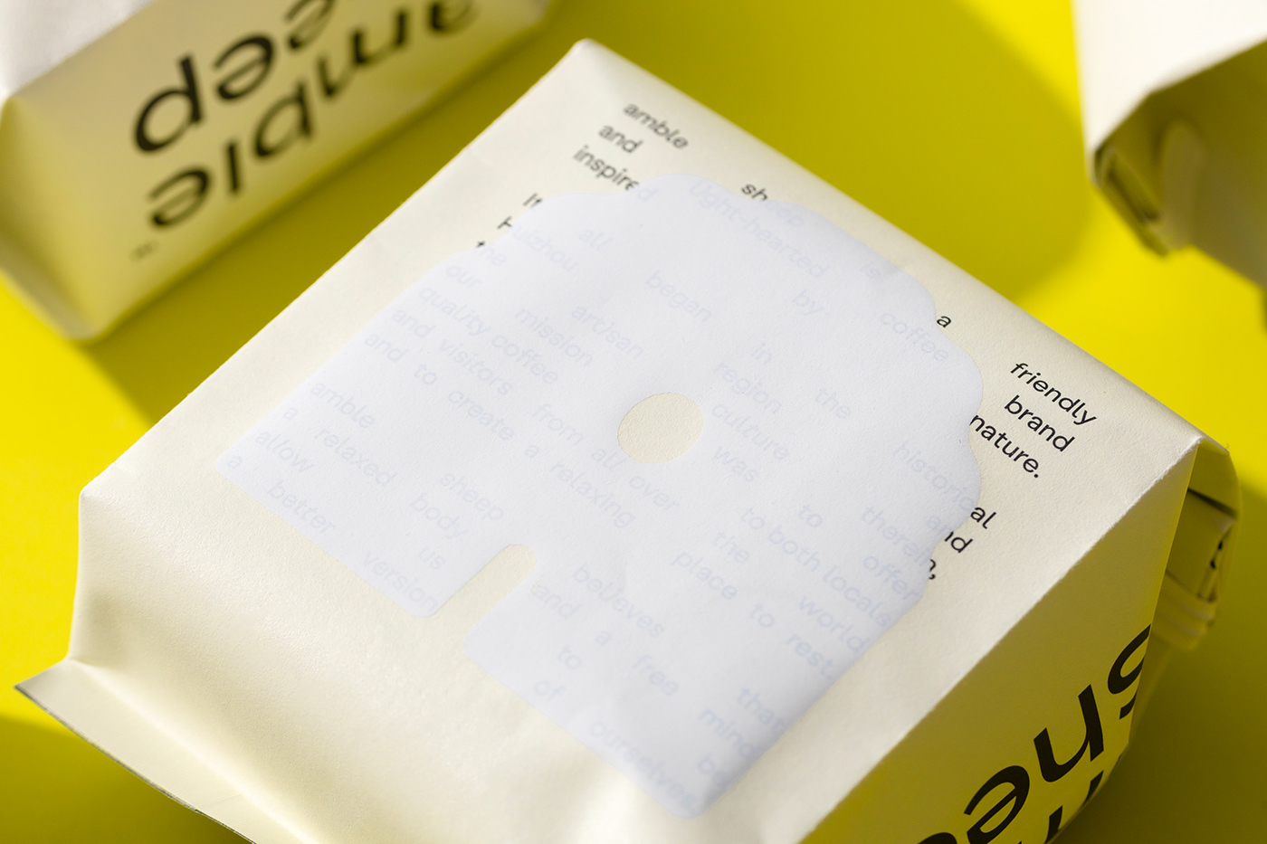
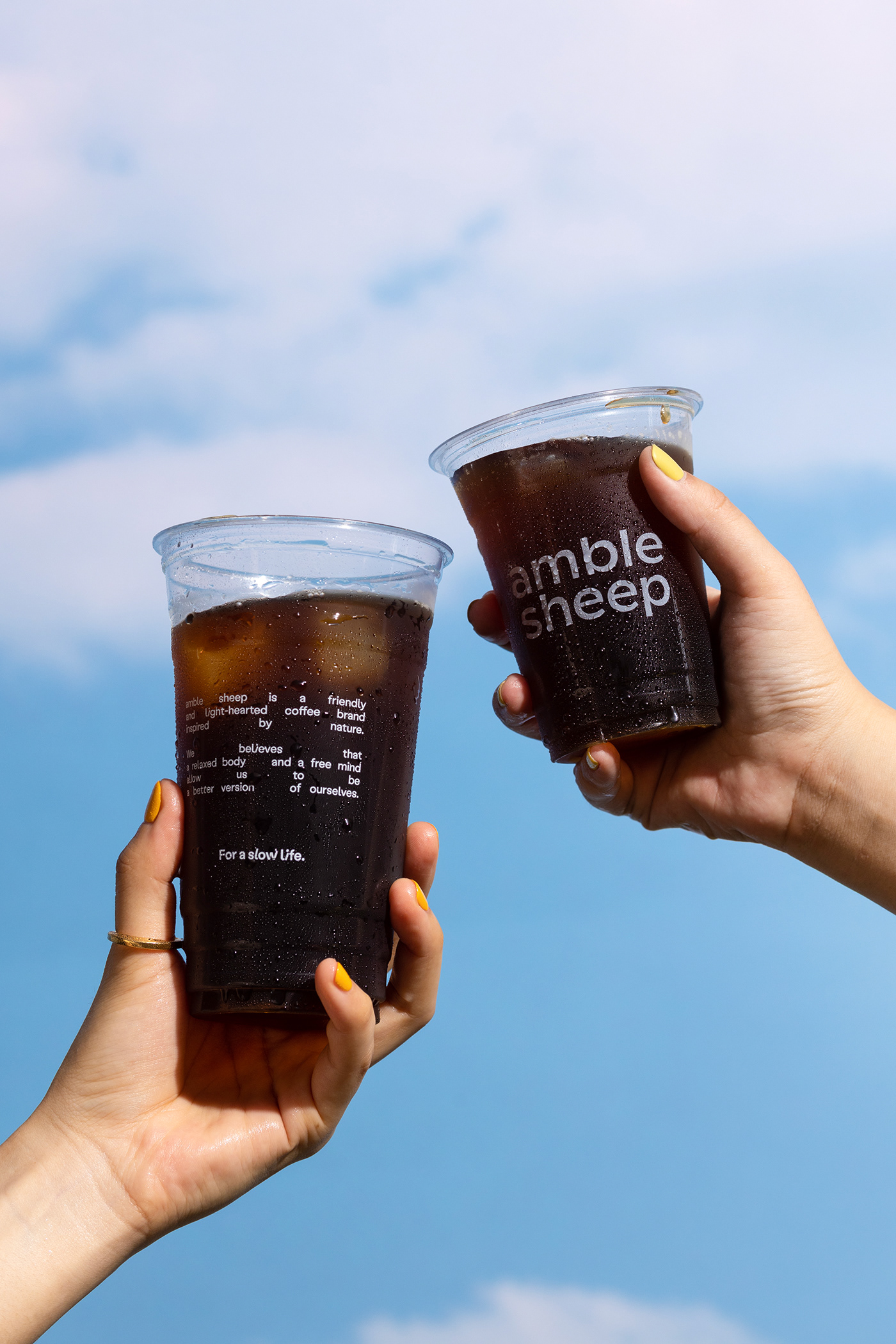
amble sheep is a friendly and light-hearted coffee brand inspired by nature.
It all began in the historical Huizhou region and the artisan culture therein, our mission was to offer quality coffee to both locals and visitors from all over the world and to create a relaxing place to rest.
amble sheep believes that a free mind and a relaxed body allow us to be a better version of ourselves.
Logo
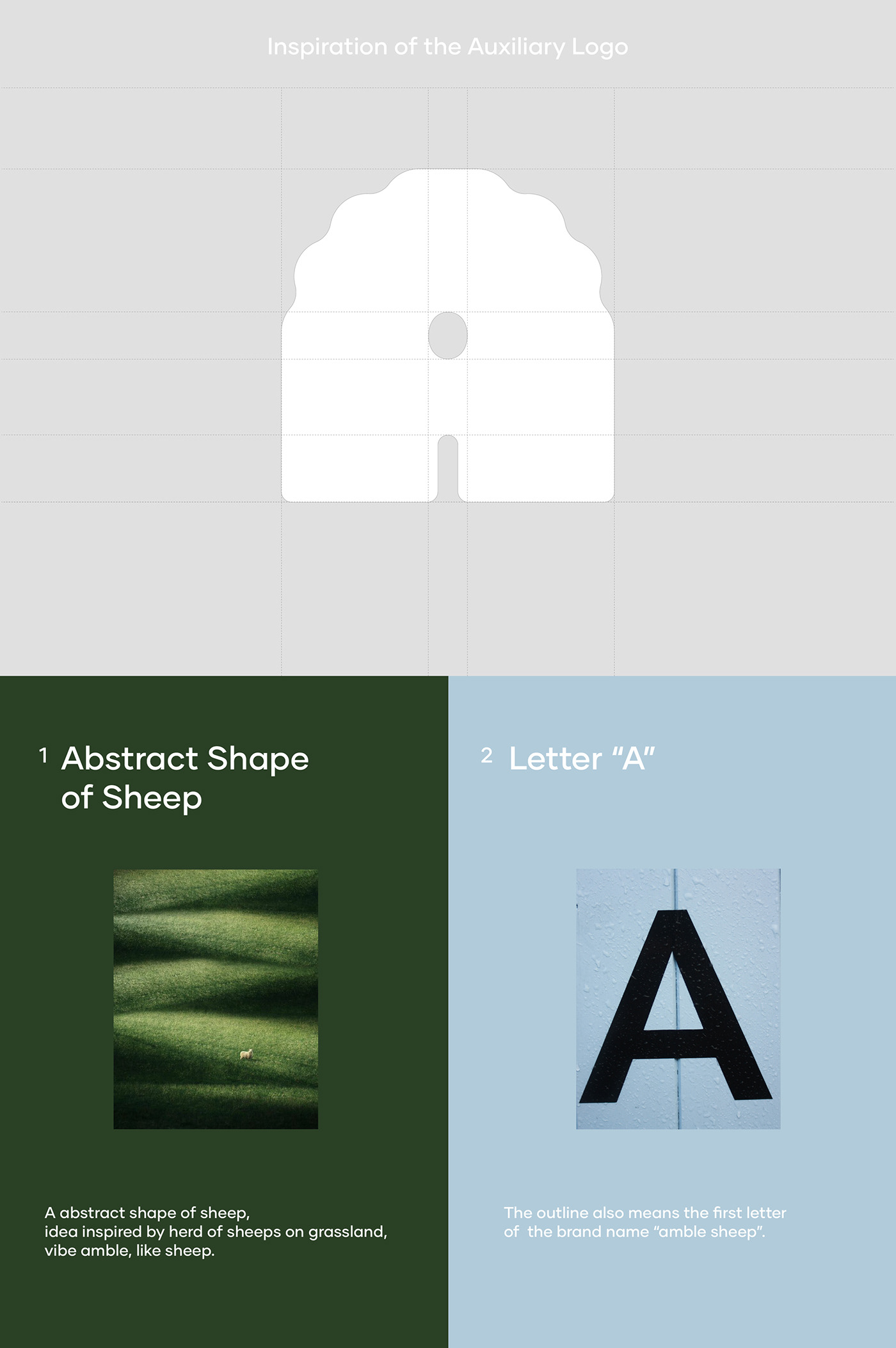
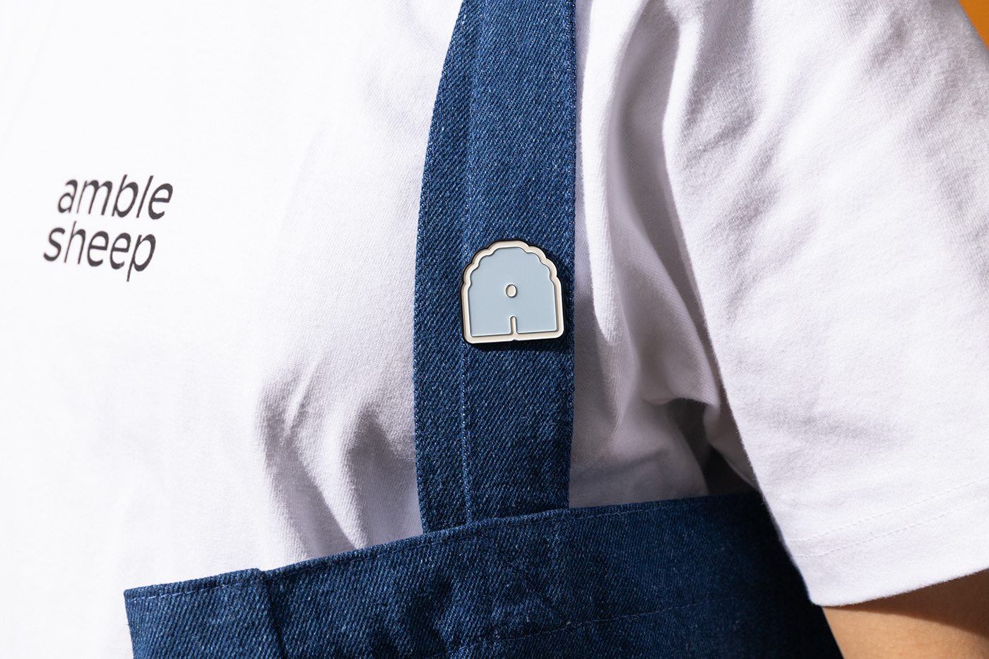
amble sheep英文Logo以小写字母呈现亲切、轻松的视觉感受。辅助logo的灵感来源于在草地上漫步的羊,我们提取了羊的轮廓,并用抽象的视觉表现形式重塑羊的廓形,同时,廓形也寓意着amble sheep首字母的“a”。
amble sheep logo uses lowercase letters to present a friendly and relaxed visual expression. The auxiliary logo is extracted from the outline of the sheep and combinded the silhouette with letter "A", idea inspired by herd of sheeps on grassland, vibe amble, like sheep.
Color
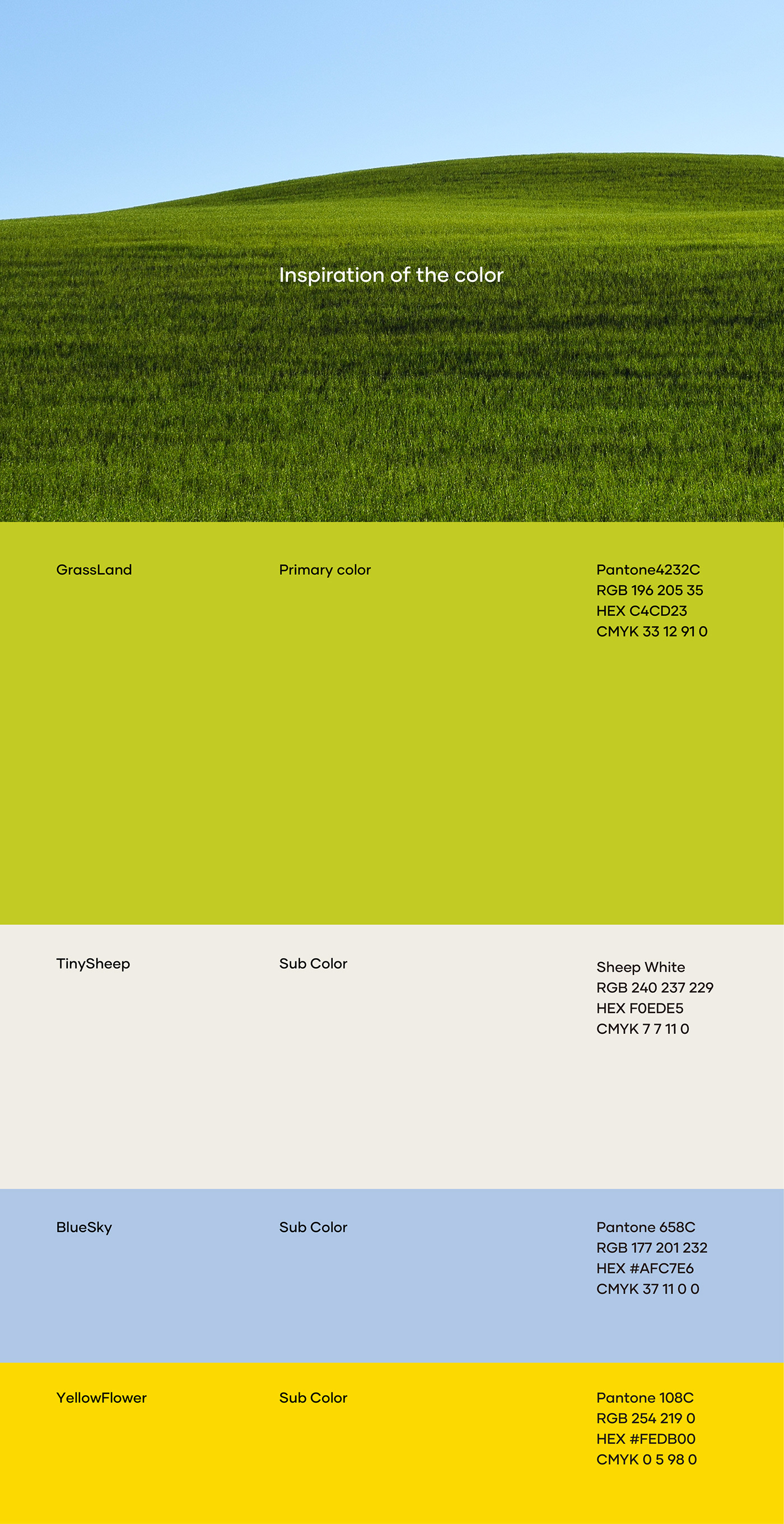
品牌色彩灵感来源于徽州的春光,晴朗的天空下,鹅黄色的油菜花海与绿油油的新叶层层叠叠,人群就像羊群一样,漫步在花海中,徜徉在草地间。将富有生命力的鲜绿色定义为品牌主色,同时,蓝色、鹅黄色与绵羊白为品牌辅助色。
amble sheep希望给当地的居民和来自世界各地的旅客轻松、明朗的心境,因此在包装系统的辅助色系以更鲜亮的色系呈现出松弛、愉悦的视觉感受。
The brand color is inspired by the spring scenery of Huizhou, Anhui province in China. Under the blue sky, the goose-yellow rapeseed flowers field, eco-system thrive with the city. Therefore we chose vibrant bright green as the main toneality color of Amble sheep; While blue, goose yellow and sheep white being the auxiliary colors of the brand.
Topygraphy
Labil Grotesk字体中结合部分斜体字母的混合排版,非常巧妙的体现出amble sheep轻快的视觉感受,像一只在散步的羊,踏着悠闲的步调。同时,我们选用Giulia Boggio所设计的字体Boris,手写的字体不失俏皮与轻松自在感,以作为标题字体与Labil Grotesk结合使用。
The mixed typeface of some italic letters in the Labil Grotesk font cleverly reflects the brisk visual experience of amble sheep. We also used the font Boris designed by Giulia Boggio. The handwritten fonts with a sense of playfulness, using as the title font in combination with Labil Grotesk.

Packaging
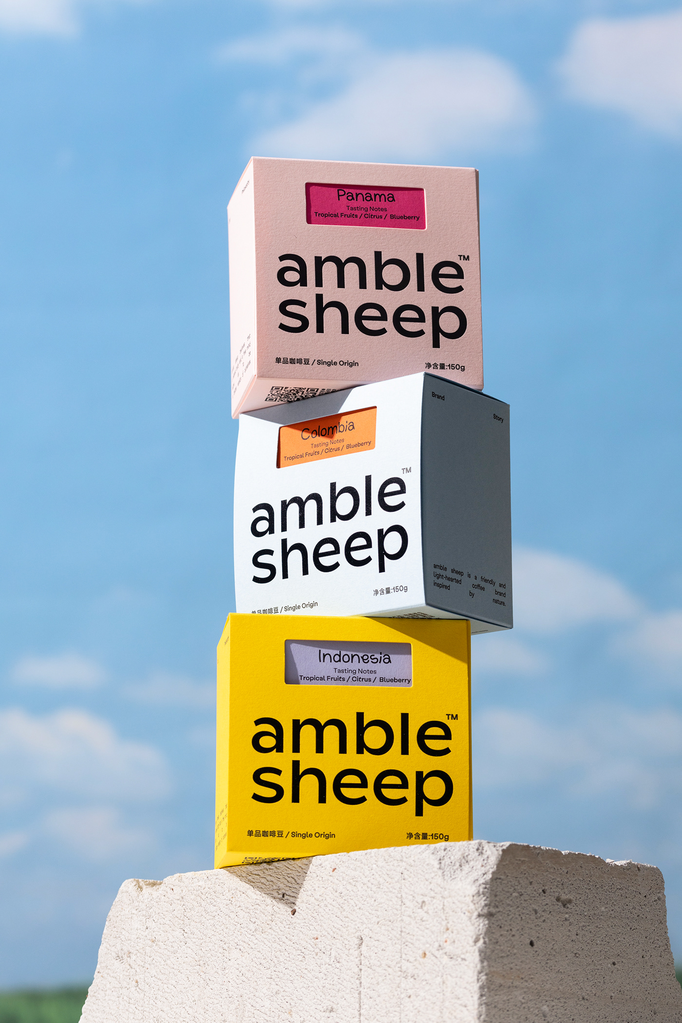
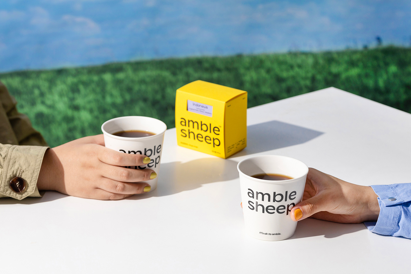
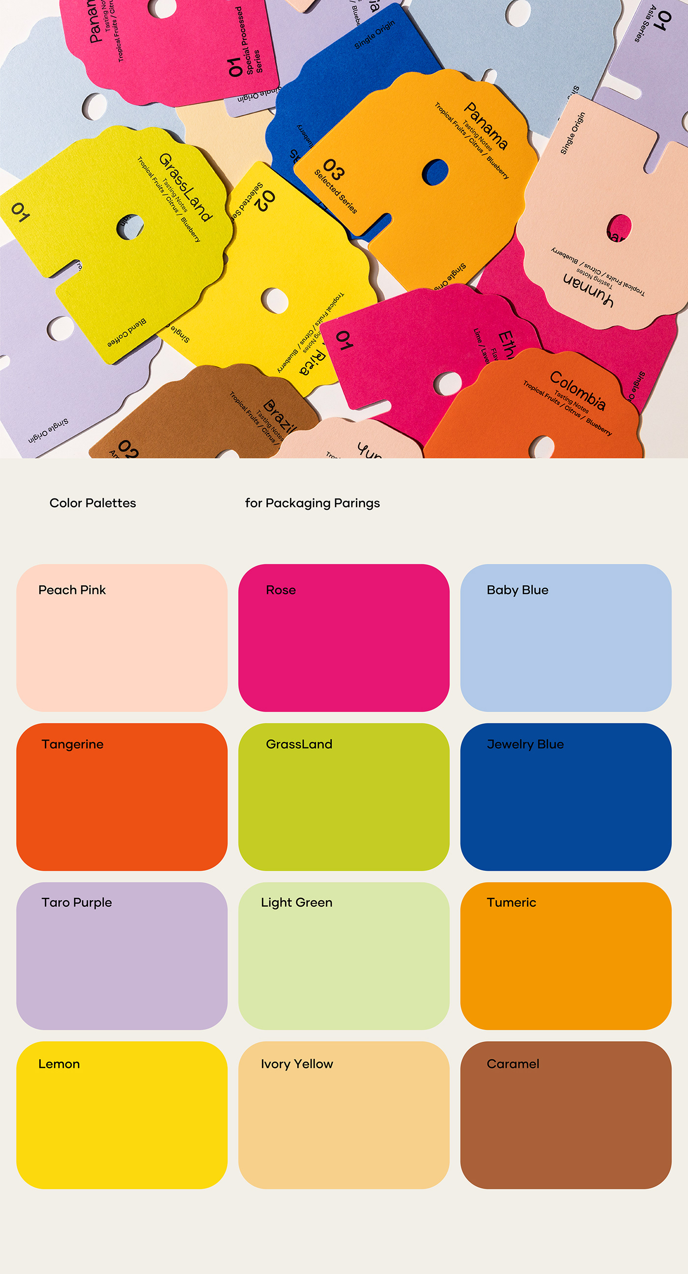
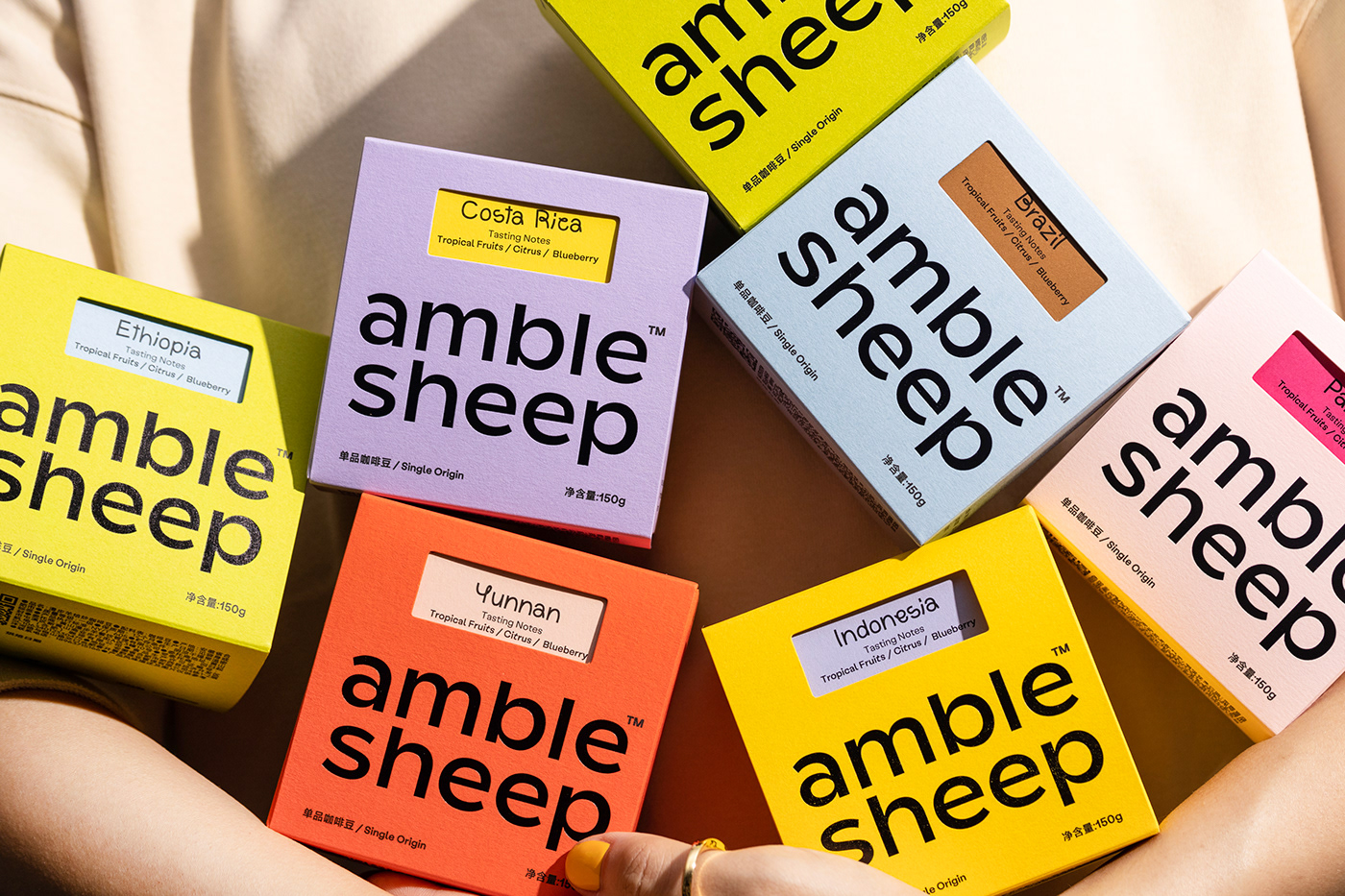
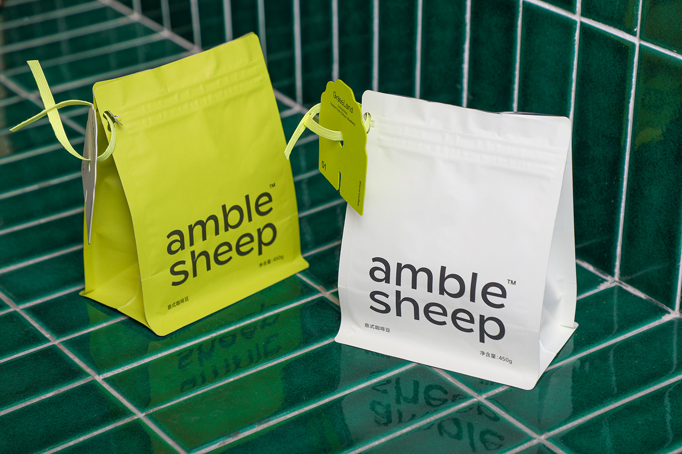
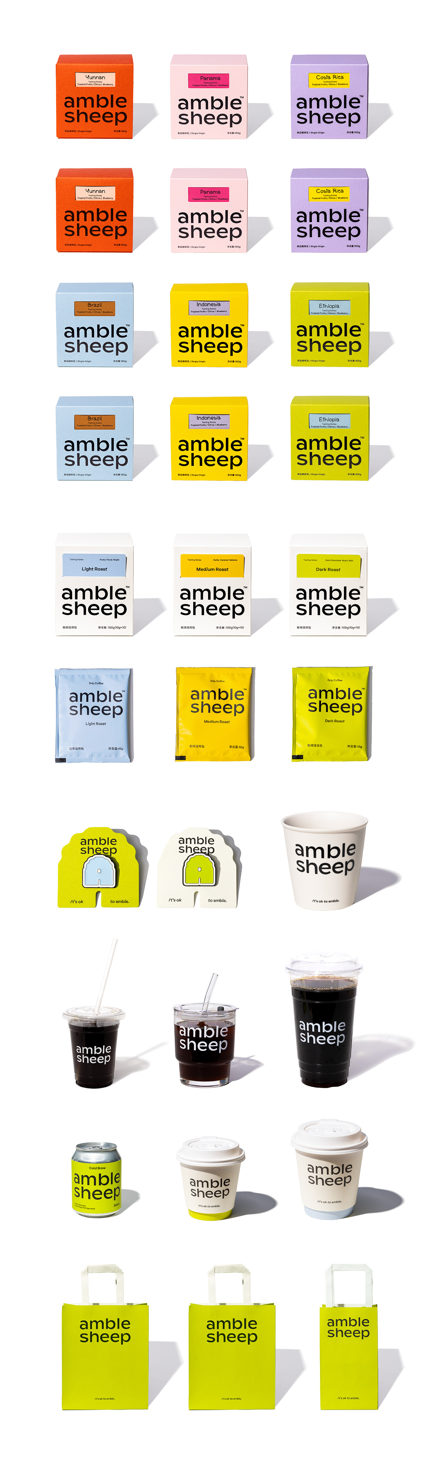
包装系统以单品咖啡、意式咖啡与咖啡挂耳包三个产品线展开设计。为了呈现来自全世界不同产区的单品豆丰富的风味特征,外包装使用更多明亮的色彩搭配。以“GrassLand”与“TinySheep”命名的意式咖啡豆,使用品牌主色绿色与品牌辅助色绵羊白来区分两款咖啡豆。挂耳包外包装以绵羊白与代表不同烘焙度的颜色来区别产品。
The packaging system is designed with three product lines: single-origin coffee, espresso coffee and individual coffee hang bags. In order to present the rich flavor characteristics of single-origin beans from different production areas around the world, the outer packaging uses more bright color combinations to reflect the flavor fun of single-origin beans. The Italian coffee beans named after "GrassLand" and "TinySheep" use the brand's main color of green and the brand's auxiliary color of sheep white to distinguish the two coffee beans. The individual hanging bags are designed with light roasting, medium roasting, and dark roasting product characteristics, so we choose blue, yellow, and green to show different roasting levels.


Design & Photography
low key Design
Year 2023
OUR GRAPHICS OPEN THE DOOR FOR BRANDS TO CONNECT WITH PEOPLE.


