16开 Ceramics Visual Identity and Packaging
Overview
16开是以设计杯子为主的陶瓷家居品牌,2017年创立于景德镇。从传承老工艺到创新设计,再到建立属于自己的釉料色彩系统,只为创作出兼具历史温度和纯粹色彩的当代日用陶瓷。
16Mo is a ceramic brand founded in Jingdezhen in 2017, with a focus on designing cups. From inheriting traditional craftsmanship to innovating designs, and establishing our own glazing color system, we strive to create contemporary porcelain that combines historical significance and pure colors for everyday use.
Logo
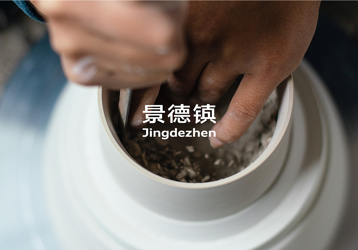
16开Logo是以定制中文字体「16开」、 「景德镇」与「16开图形logo」组合而成。品牌名「16开」与「景德镇」的Logo组合形式意在表达品牌成长于景德镇,而景德镇代表着精湛的陶瓷技艺和民族自豪。
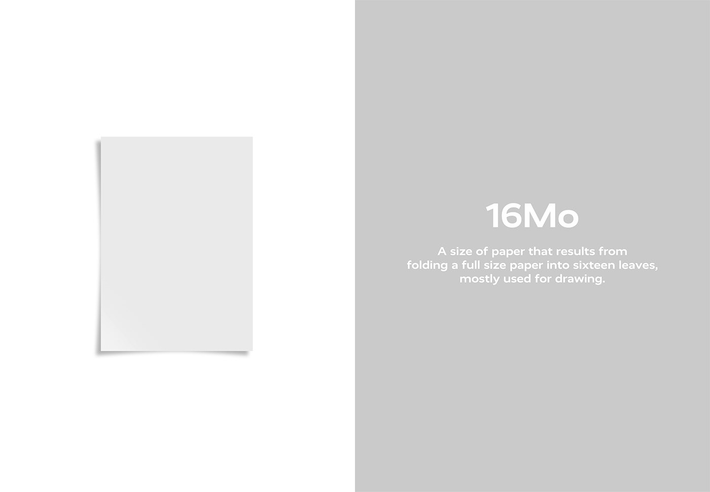
取名为「16开」灵感来源于品牌主理人热爱绘画,从儿时起练习素描绘画的纸张尺寸便是16开大小。因此,绘制一张16开比例的纸张图形作为辅助图形,在这16开的纸张上,铺开所有对陶瓷器物的想象。
The 16Mo logo is created by combining the custom Chinese font "16开", "景德镇". The combination of the brand names "16开" and "景德镇" in the logo design aims to express the brand's growth in Jingdezhen, a place symbolizing exceptional ceramic craftsmanship and national pride.
The choice of the name "16开" is inspired by the brand founder's passion for painting, who has been using size 16Mo paper for sketching since childhood. Therefore, a 16Mo proportioned graphic is used as an auxiliary element to visualize the boundless imagination for ceramic objects.



Pattern
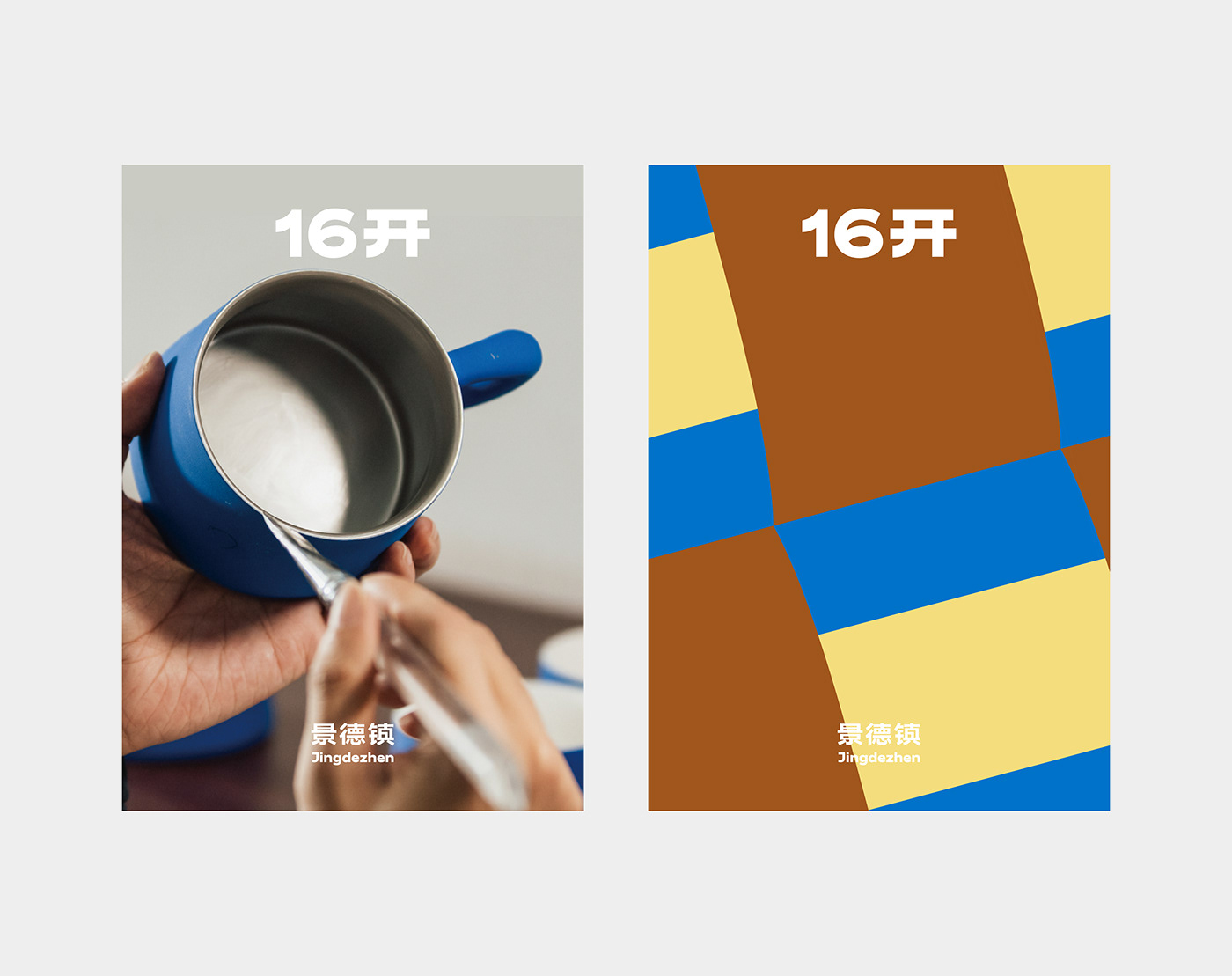
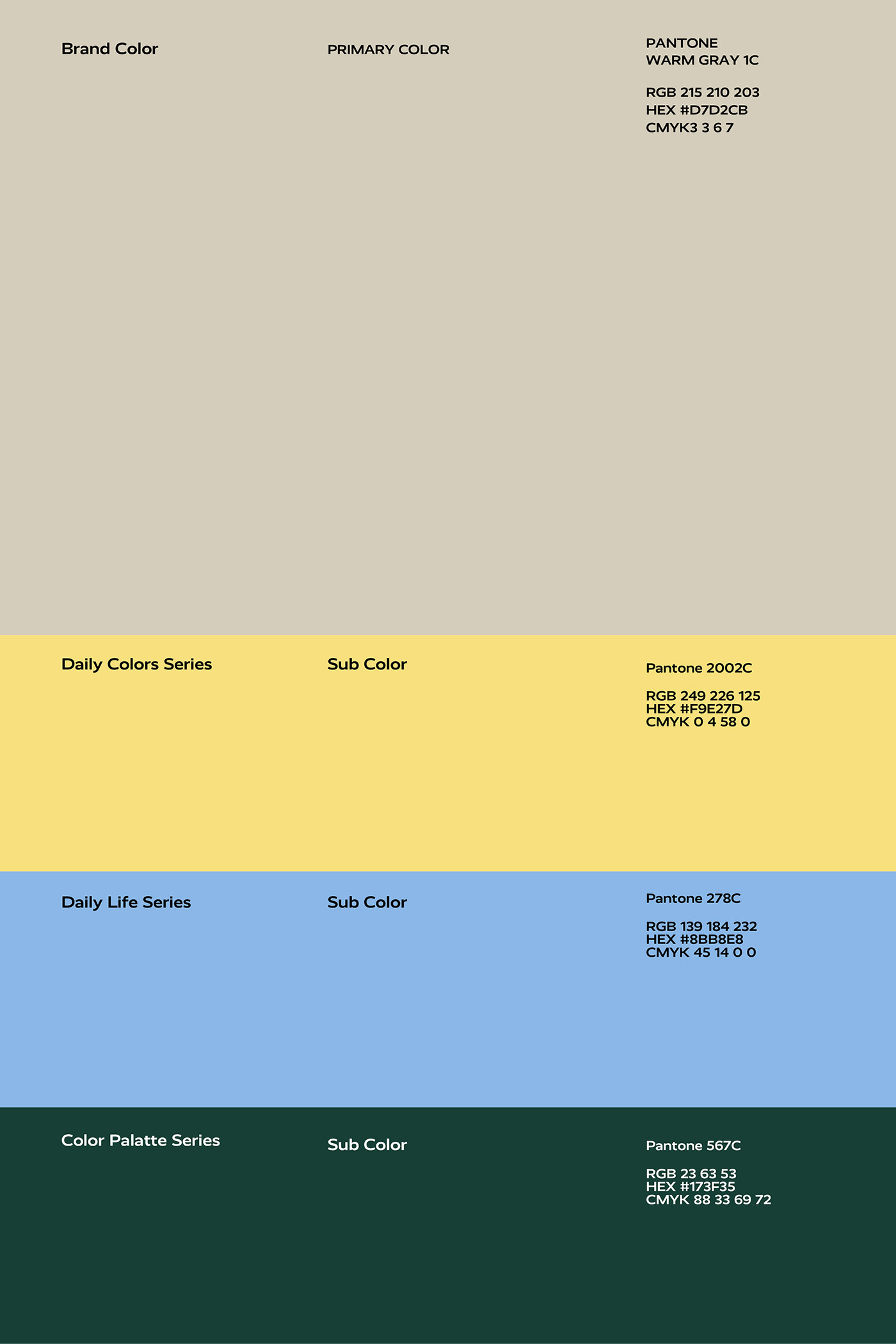
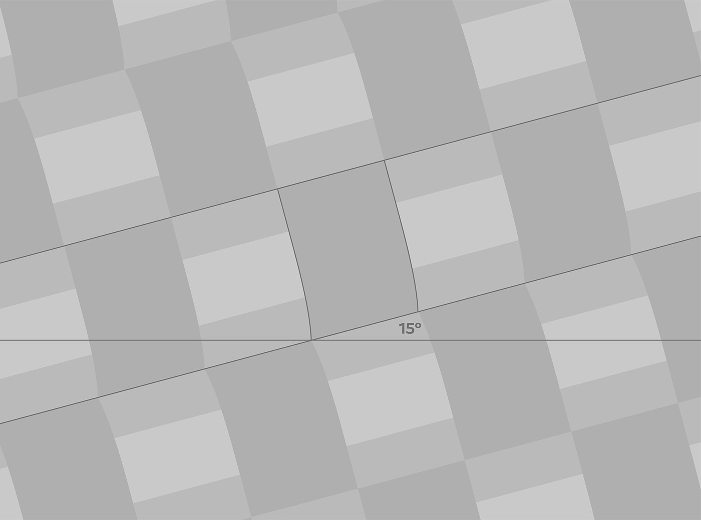
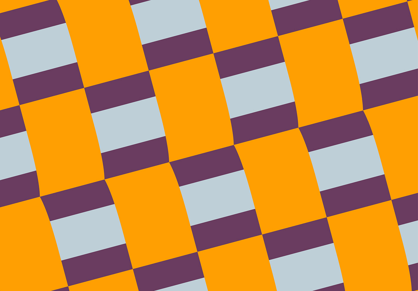
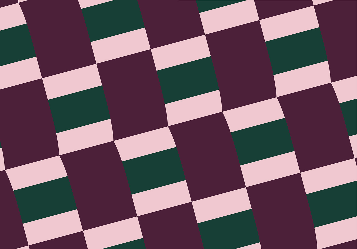
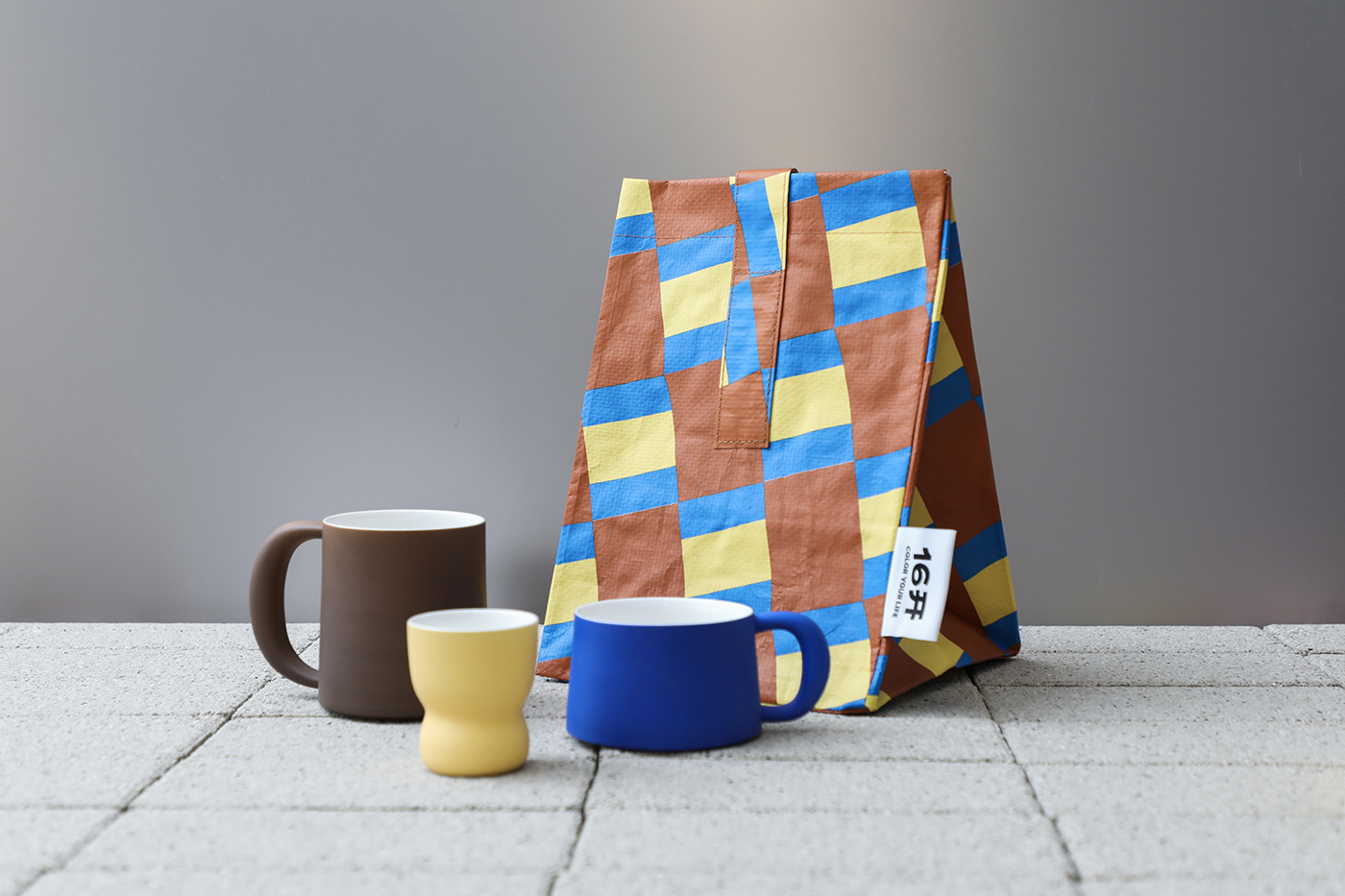
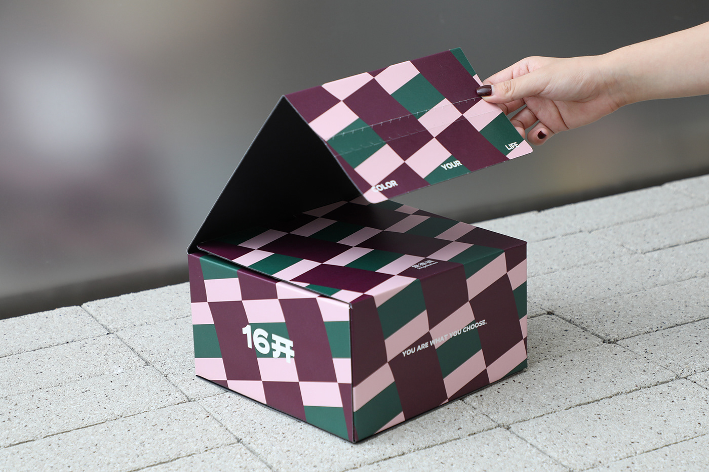
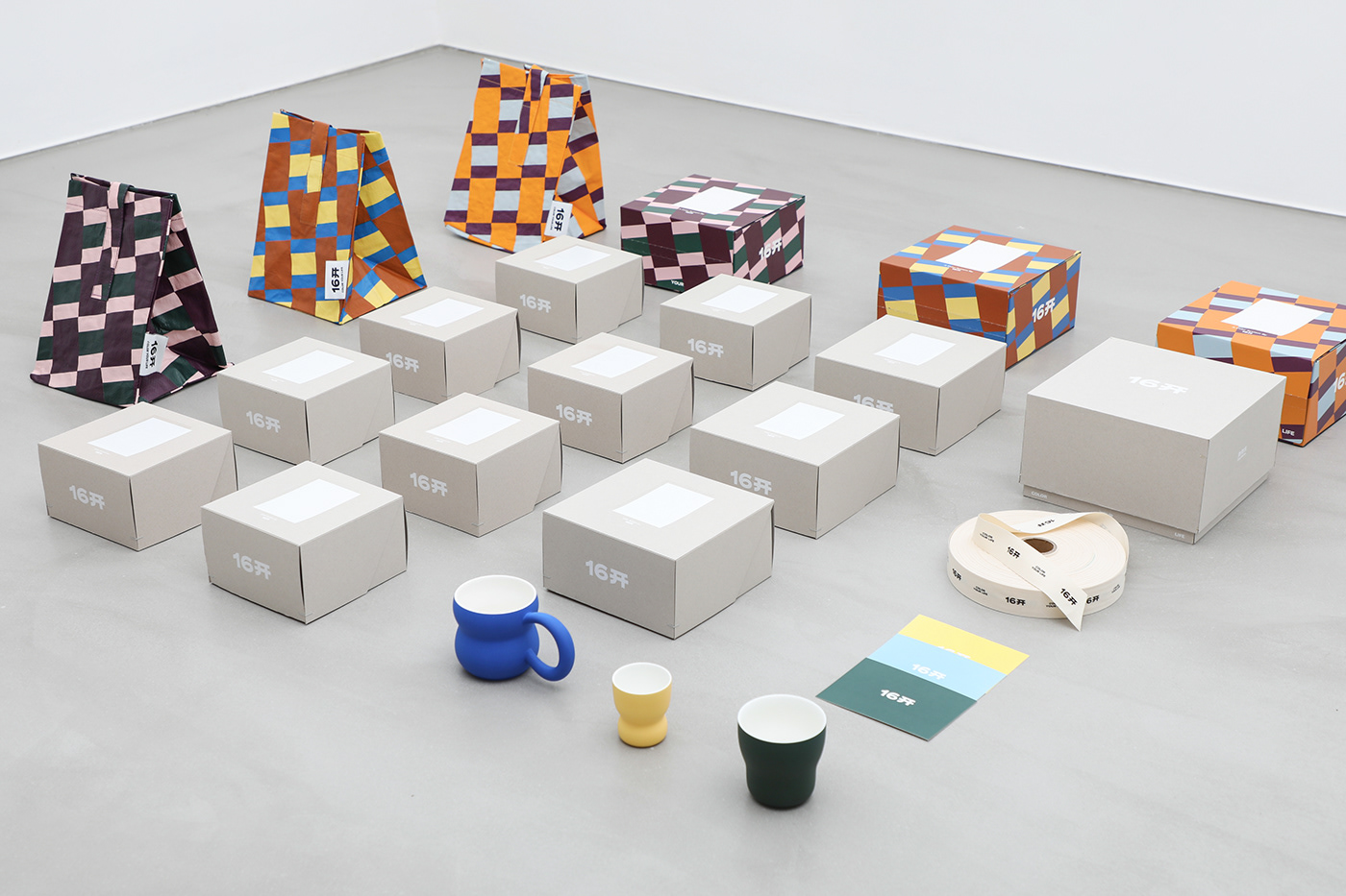
以16开的图形Logo作为基础形,搭配16开陶瓷色釉系统中的色彩,大胆铺开属于16开的专属品牌图案。我们更希望用这些图案来表达足够纯粹的色彩与色彩带来的无限灵感与活力。
In the pattern design, the basic form of the 16Mo graphic logo is combined with the colors from the 16Mo ceramic glaze system, creating exclusive brand patterns that reflect the brand's aspiration for pure colors and the unlimited inspiration and vitality they bring.

Packaging
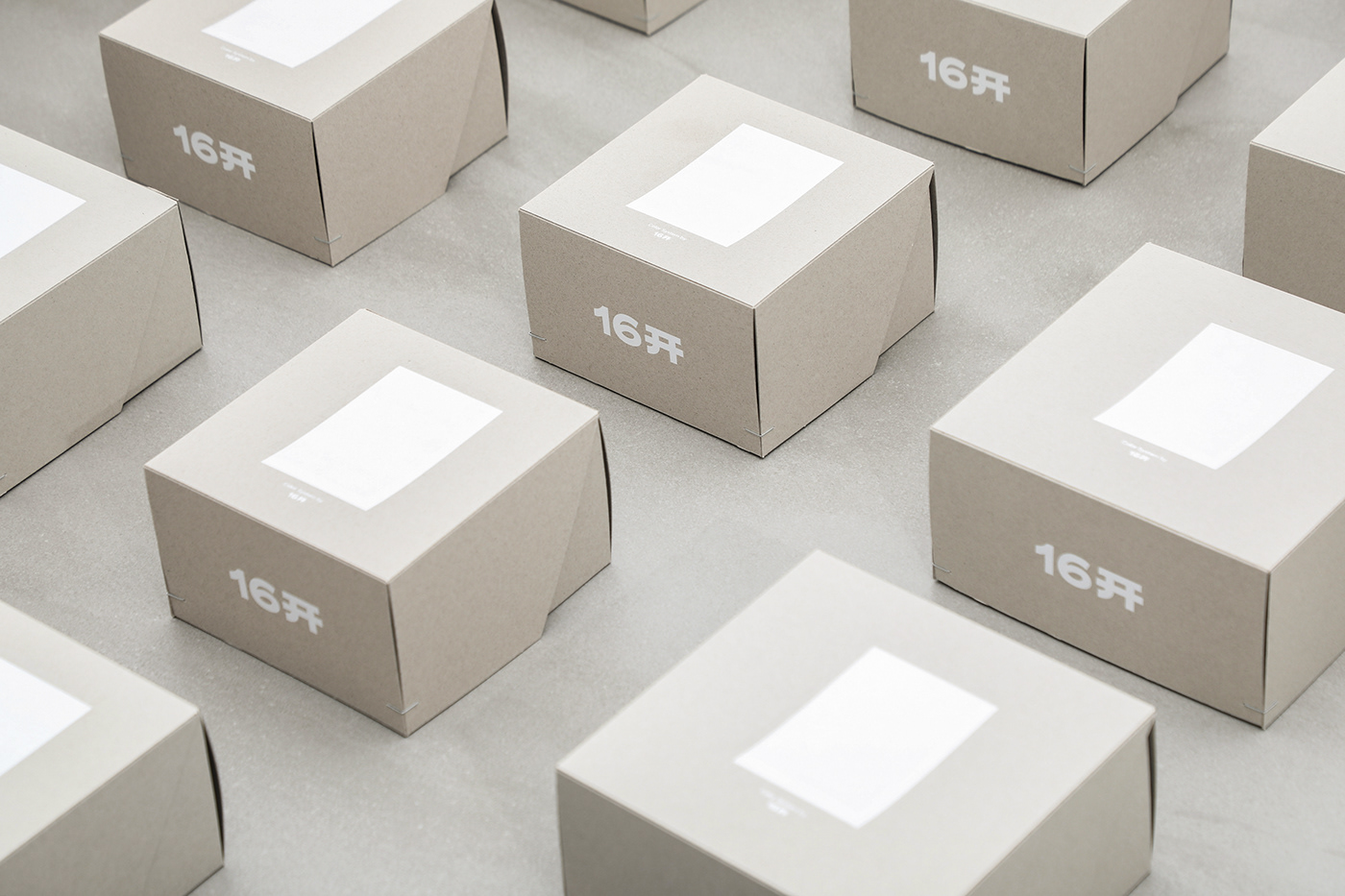
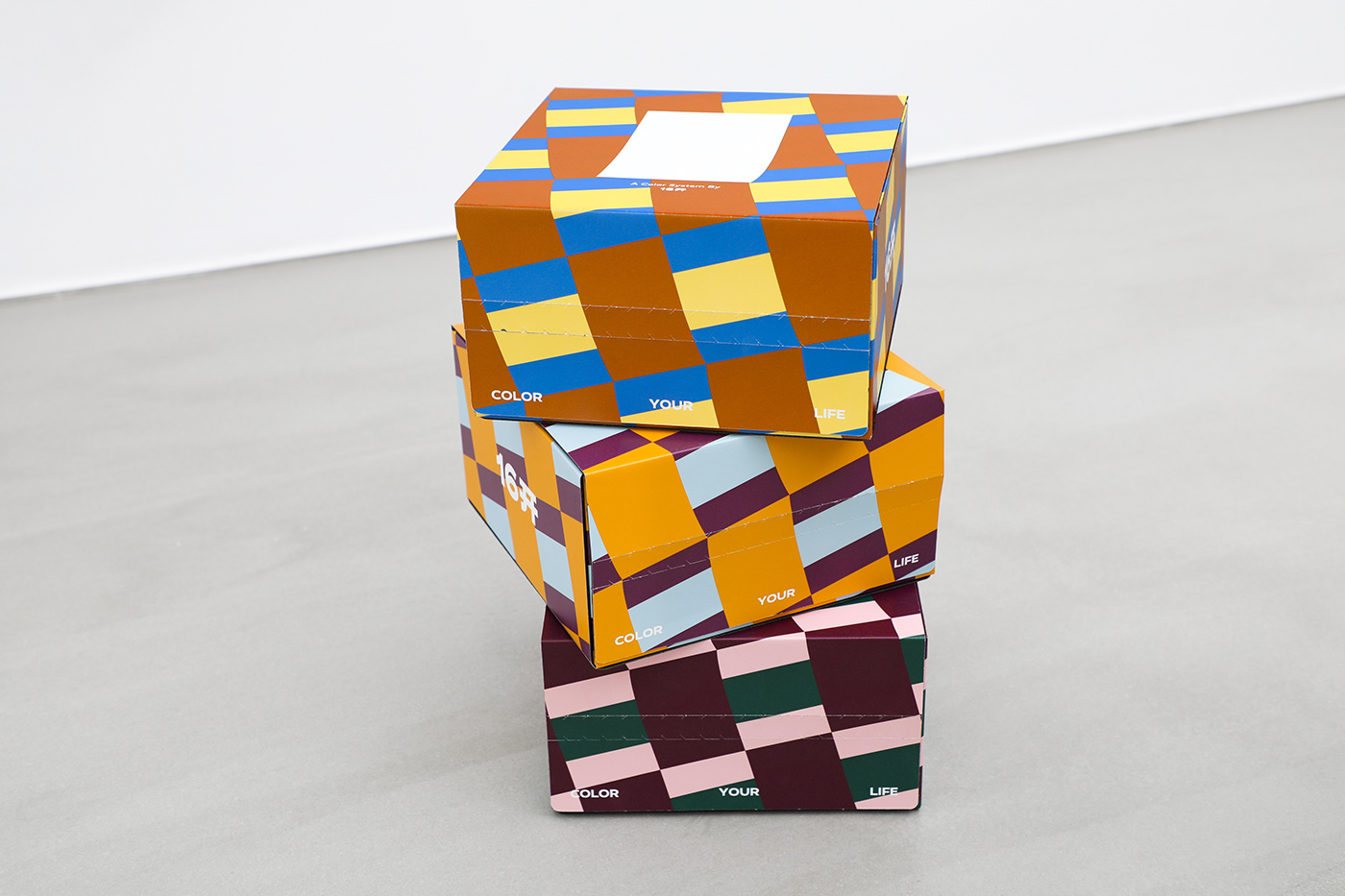
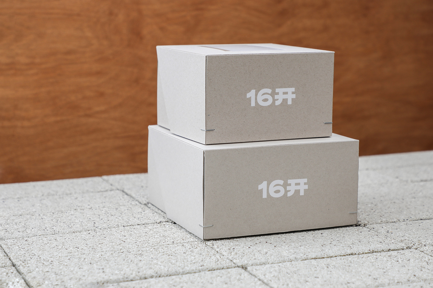
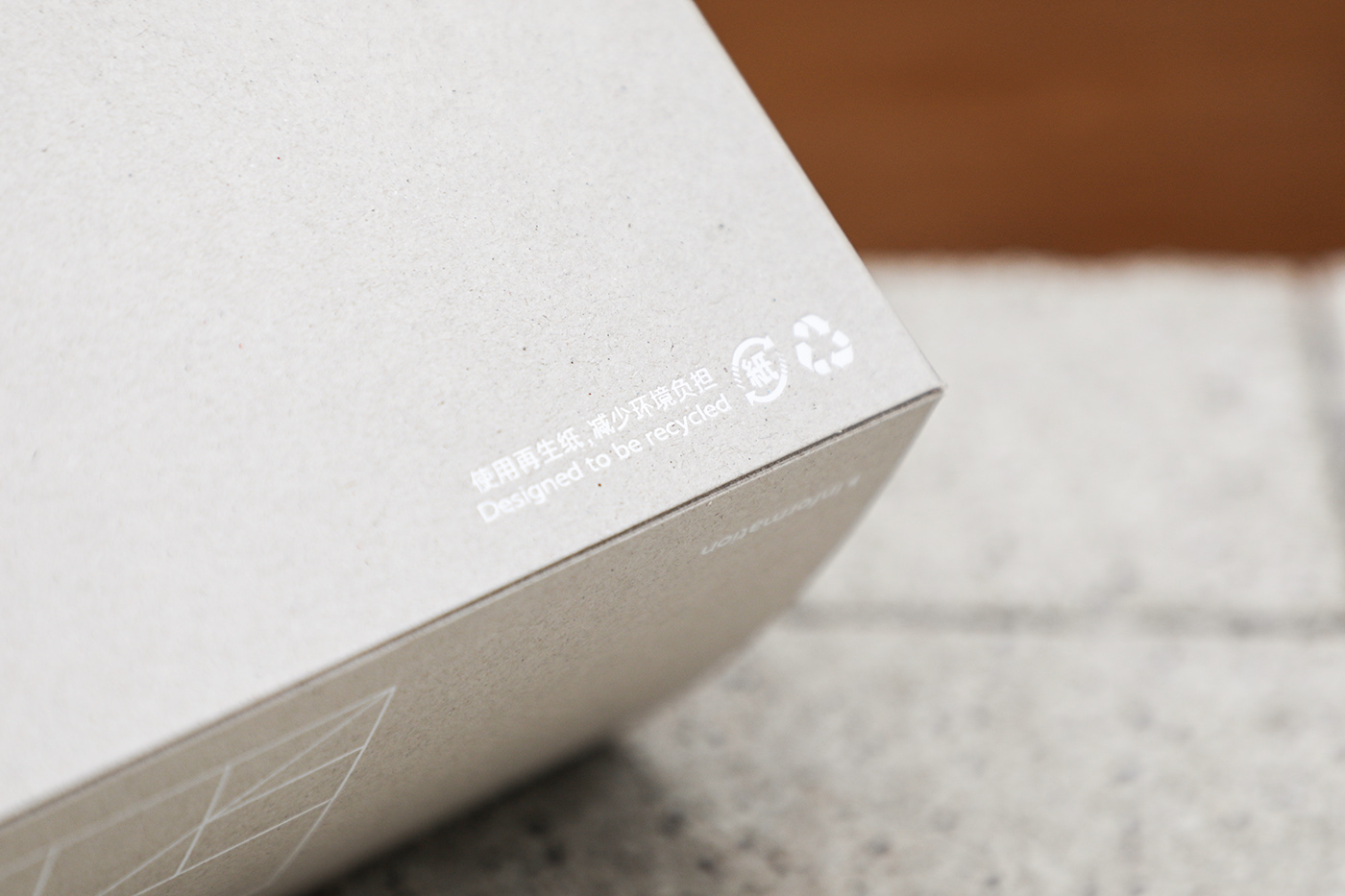
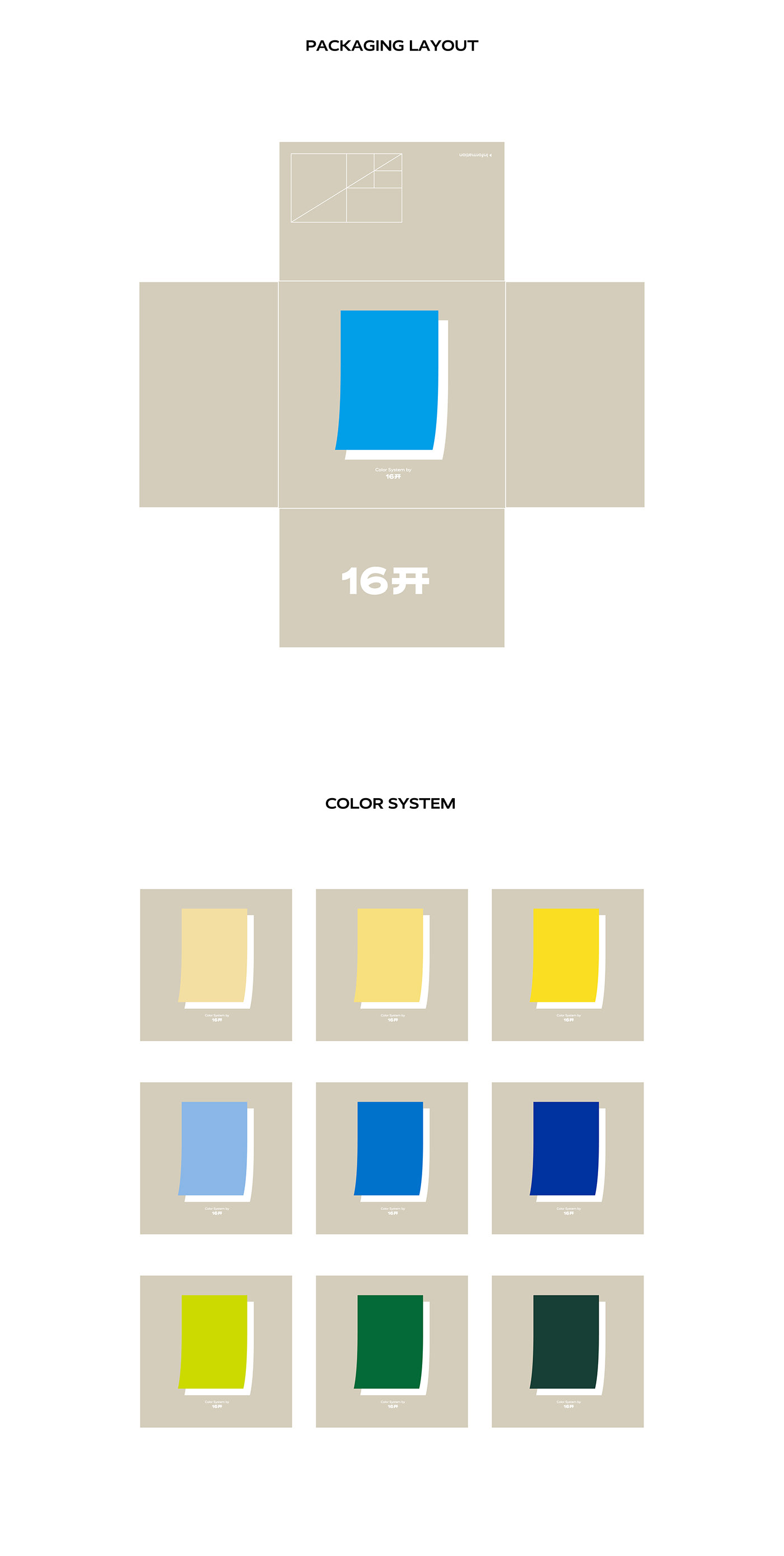
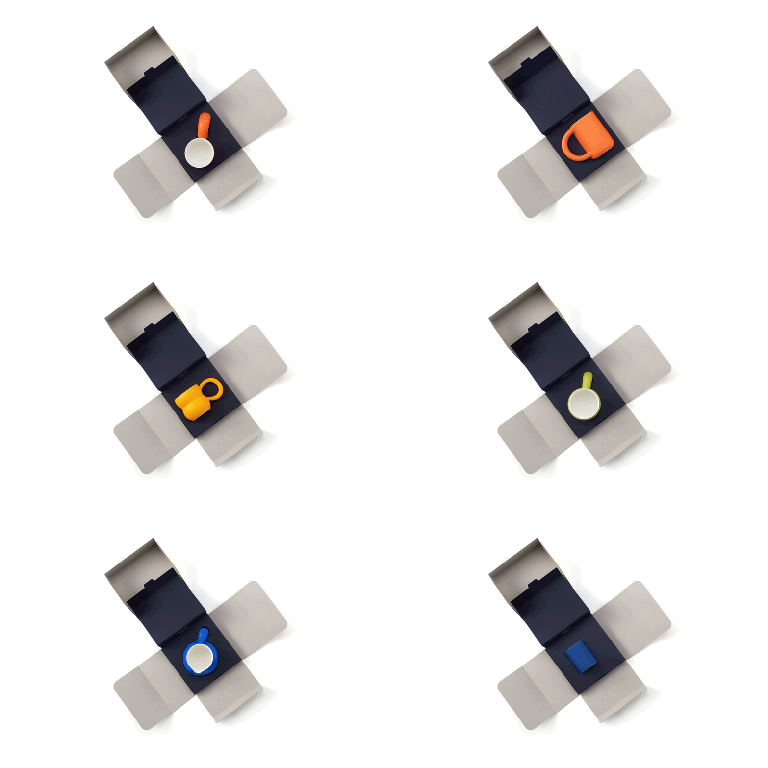
16开崇尚环保可持续而摈弃一切塑料包装,整个包装系统均采用环保再生纸。独特的盒型结构,让消费者在打开包装的过程中,增加更多的仪式感。
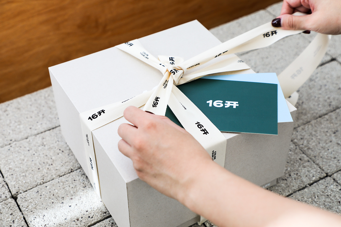
丰富多彩的杯子是16开的产品灵魂所在,因此在外盒上,我们设计了代表每一款杯子的色卡纸,并且在色卡纸的背面印上了16开对于这款颜色的解读。
In terms of packaging, 16Mo advocates for environmental sustainability and completely avoids the use of plastic packaging. Instead, the entire packaging system is made from eco-friendly recycled paper. The unique box structure enhances the sense of ceremony when consumers open the packaging.
The colorful and diverse cups are the soul of 16Mo's products. Therefore, on the outer packaging, color card papers representing each cup are designed, with 16Mo providing their interpretation of the colors on the back of the color cards.












Design & Photography
low key Design
Year 2023
OUR GRAPHICS OPEN THE DOOR FOR BRANDS TO CONNECT WITH PEOPLE.

