Hard Candy 硬糖 Visual Identity and Packaging
Design Concept
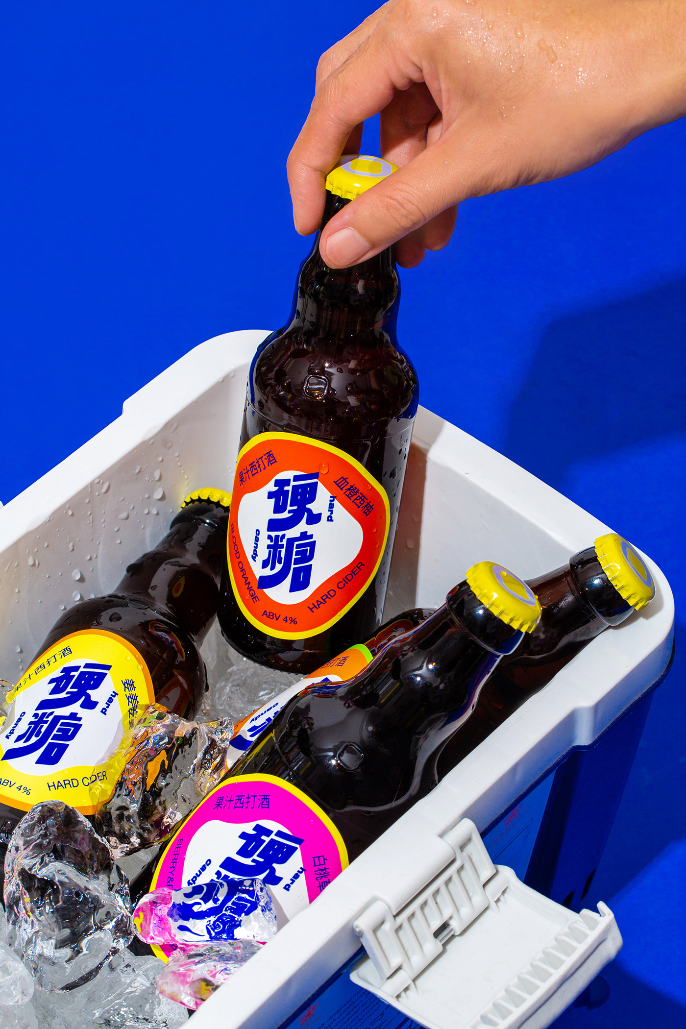
反叛内核,释放甜蜜因子
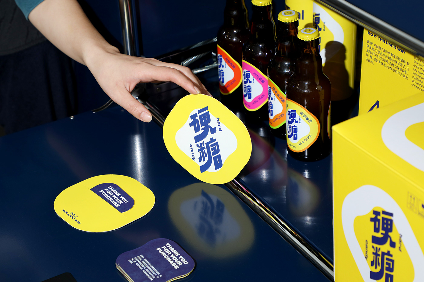
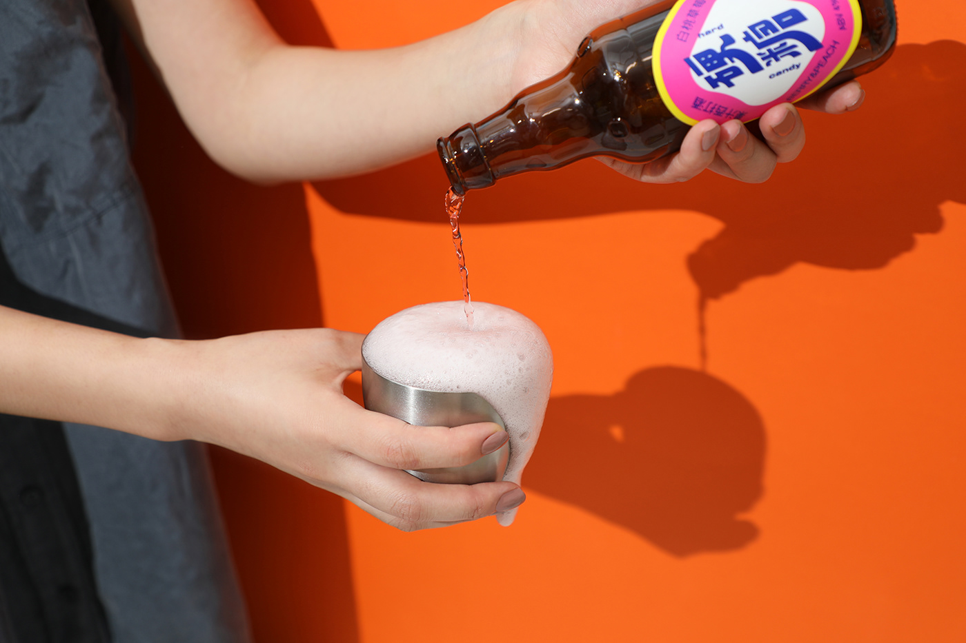
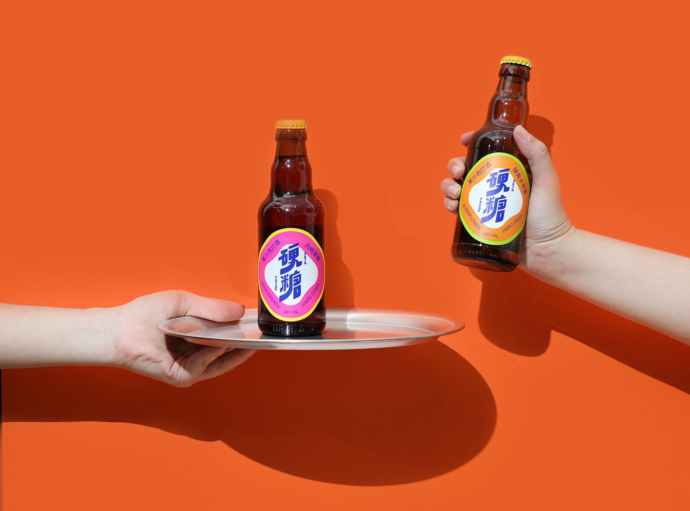
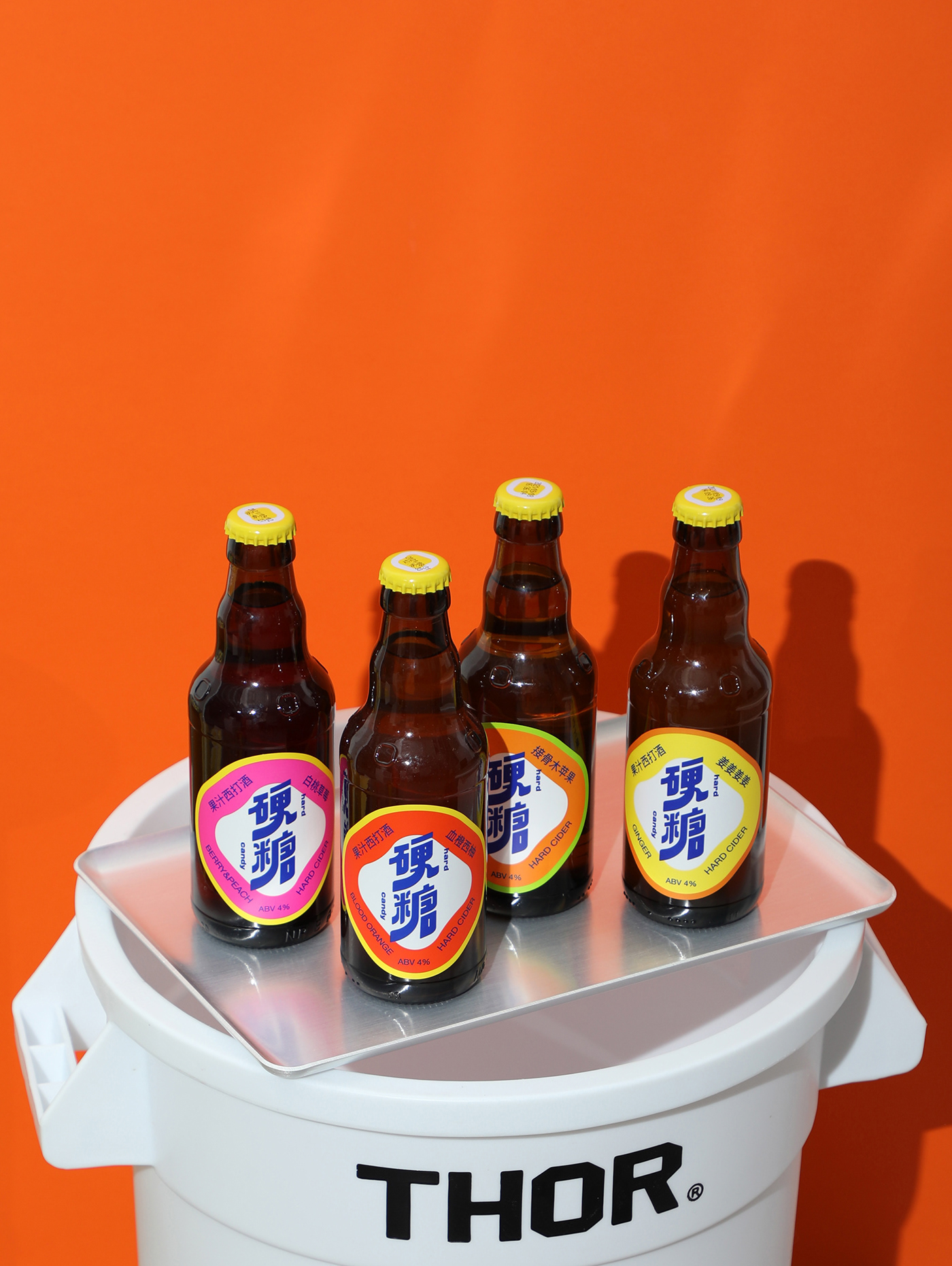
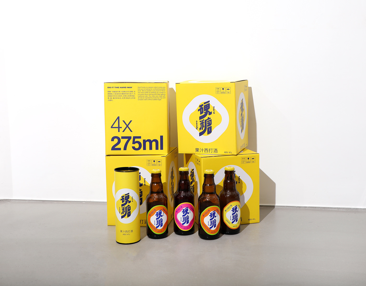
硬糖® 创立于2019年,是一个专注西打酒的品牌。“硬”暗示反叛内核,“糖”释放快乐因子。 用酸甜的果汁包裹凌厉的酒精,软硬兼施。它是迸发在嘴里的快乐因子,也是圈层中的社交暗号。四种口味带来甜、辣、躁、暖四种体验,给梦游般的日常来点硬的。
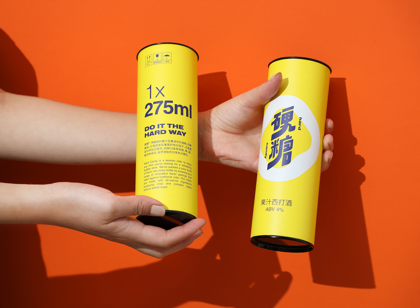
Hard Candy is a session cider to enjoy any time you’re looking for a refreshing bubbly drink. We’ve packed a juicy burst of flavor into every bottle by brewing up a range of innovative flavor pairings that rebel against traditional cider. Our ciders are made with all-natural ingredients producing crisp and complex ciders without added sugar.
硬糖®视觉符号
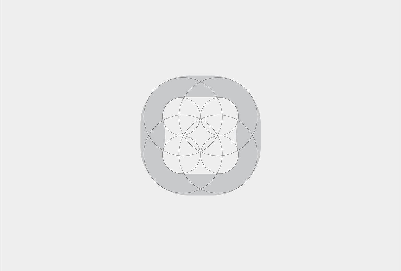
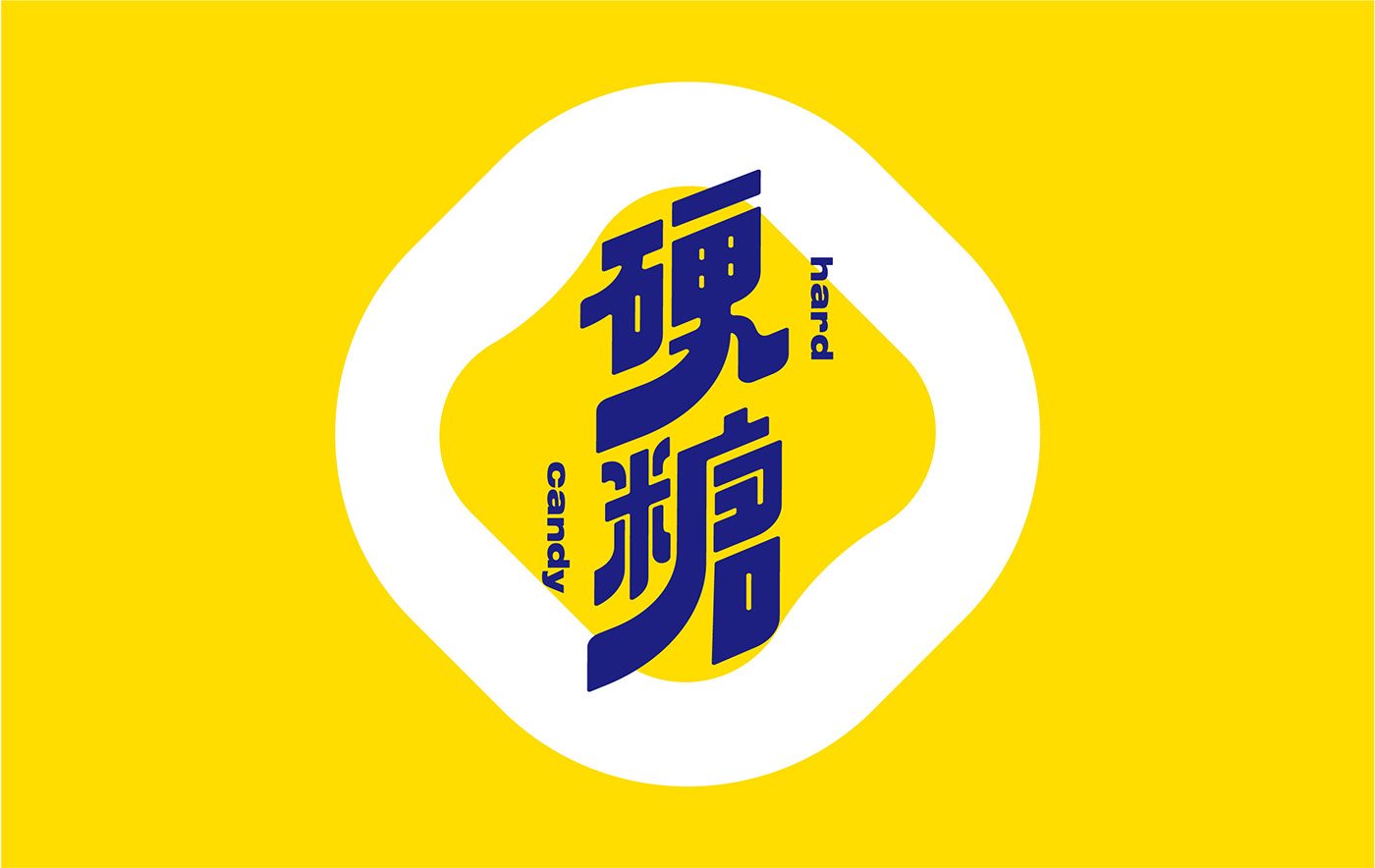
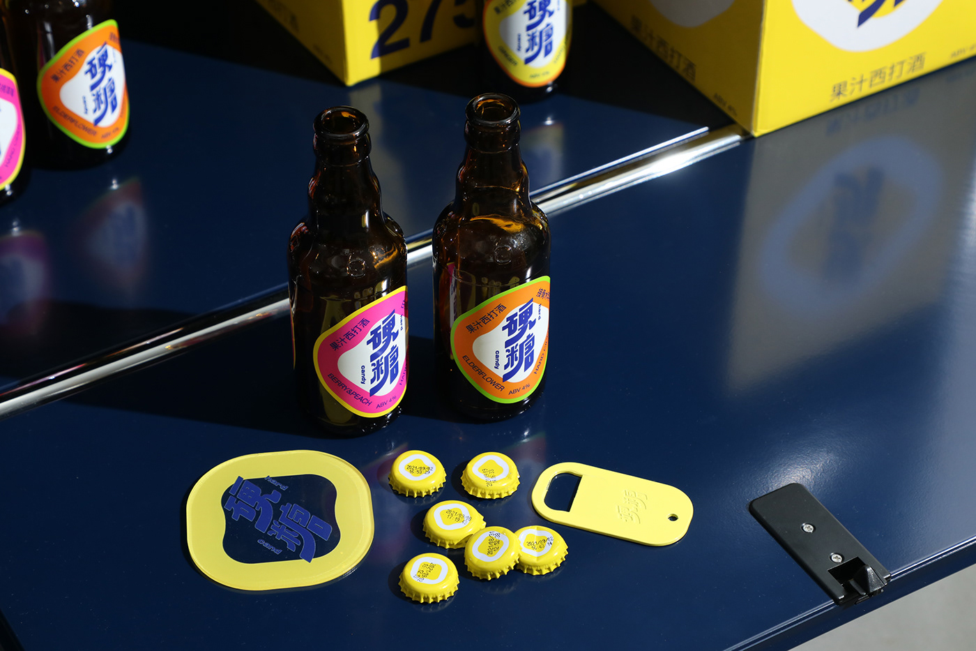
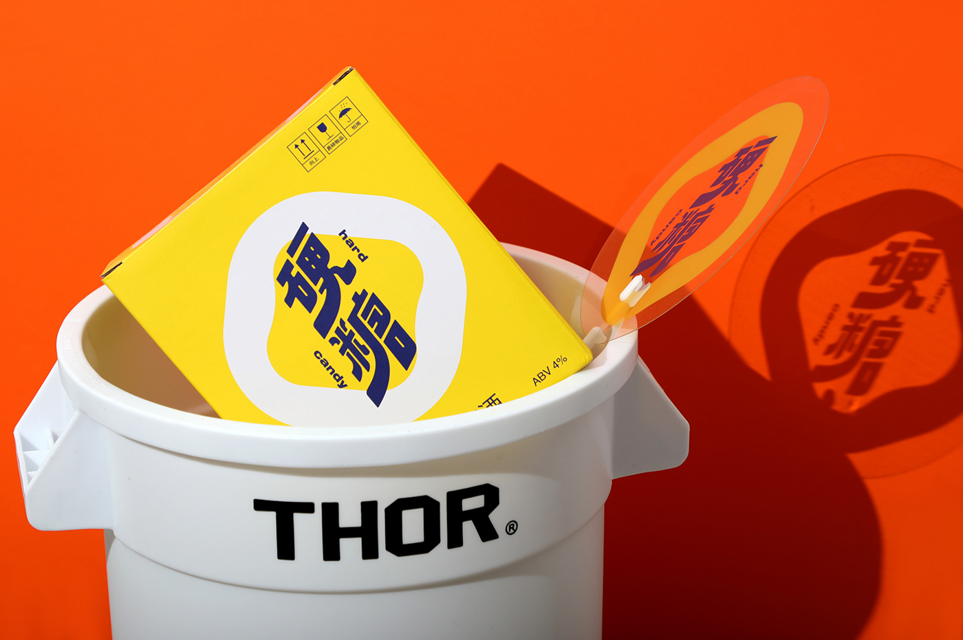
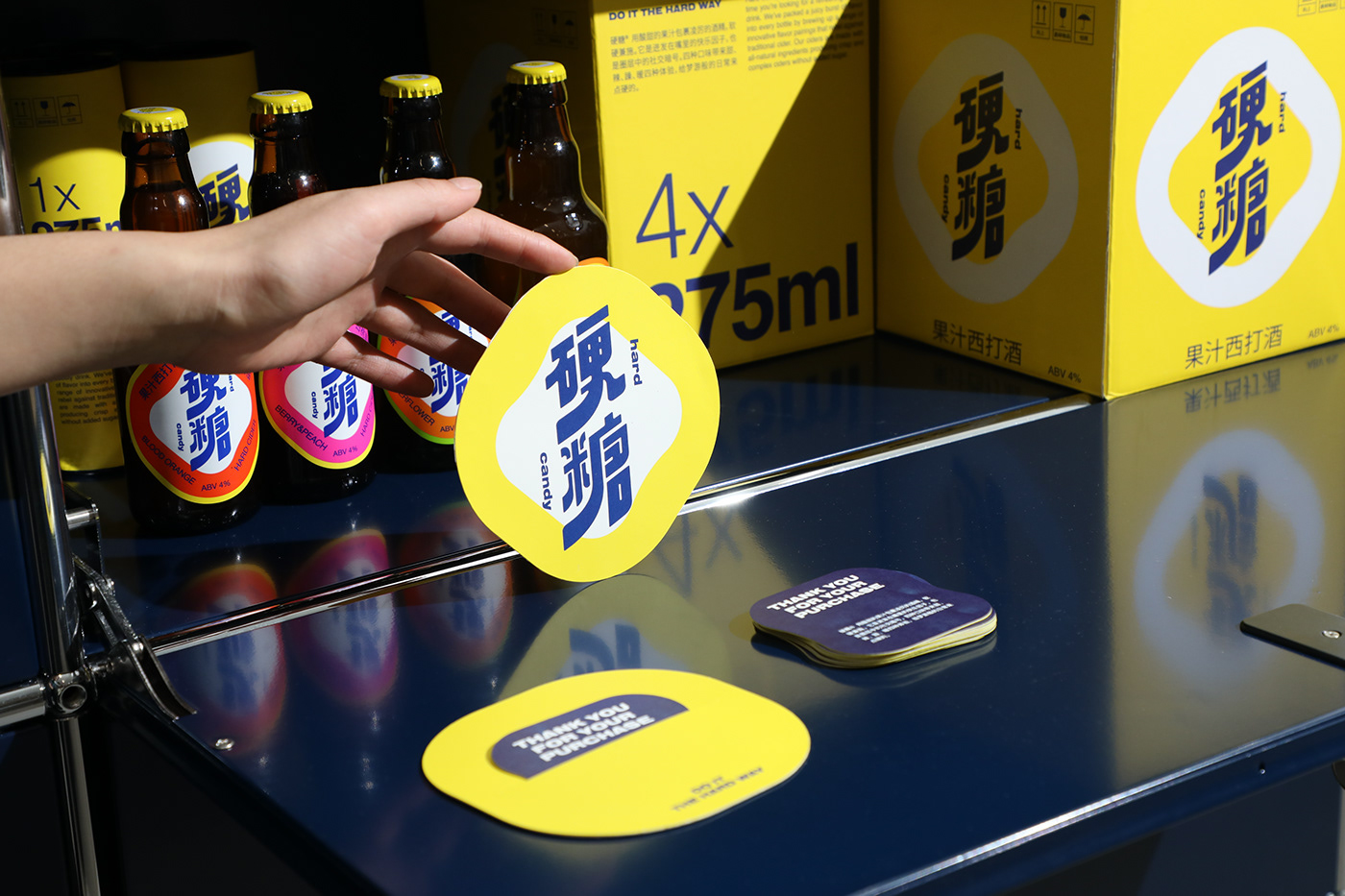
用一颗「硬糖」的图形作为品牌视觉符号,由此迫不及待释放属于「硬糖」甜蜜、丰富的视觉张力。
同时,以缤纷色彩来彰显它的独特性与丰富性,大胆的配色亦是糖果世界的甜蜜回忆,也希望通过撞色视觉体验来表达品牌突破传统,重新定义西打酒的反叛内核。
Hard Candy® Visual Symbol
With a [hard candy] as the visual symbol, the brand is eager to express its distinctive visual tension of sweetness and richness.Meanwhile, contrasting colors are used to show its uniqueness and ampleness. The bold color scheme is also a sweet reminder of the candy world, with the intention of conveying the brand’s rebellious kernel of redefining cider through a colorful visual experience that breaks with tradition.
With a [hard candy] as the visual symbol, the brand is eager to express its distinctive visual tension of sweetness and richness.Meanwhile, contrasting colors are used to show its uniqueness and ampleness. The bold color scheme is also a sweet reminder of the candy world, with the intention of conveying the brand’s rebellious kernel of redefining cider through a colorful visual experience that breaks with tradition.


Design & Photography
low key Design
Year 2021
OUR GRAPHICS OPEN THE DOOR FOR BRANDS TO CONNECT WITH PEOPLE.
