


Every typeface has its own charisma. Not only does its presence in design lend an attribute to the identity of a product or project, but also reflect the taste, personality and attitude of the designer behind. Most designers keep a list of favourites with no more than ten typefaces throughout their trajectory. Some make a statement by sticking to just one typeface in every piece of their work. The choice for typeface is the flag held high by designers.
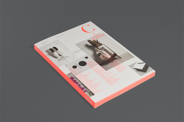
The jacket is printed in CMYK, plus a Pantone neon color and a holographic metal hot foil stamp. As well as the spine, the edge is colored with the neon color. Each book of the series is going to have another color, so when all the books are displayed together they will form a neon rainbow.
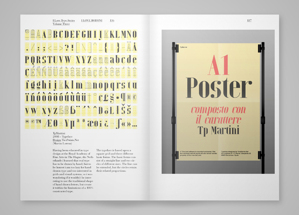
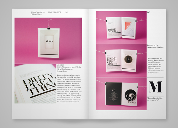
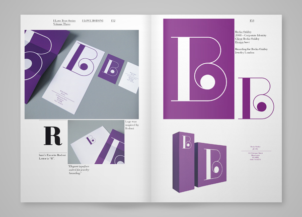
I Love Type is a collaboration betweenViction:ary and TwoPoints.Net. The type collection series, with focus on one specific typeface at a time, documents the fashionable comeback of a selection of timehonored typefaces in a myriad of contemporary designs gathered from around the world.
The preface for I Love Bodoni was written by Wolfgang Hartmann of BauerTypes.
-
Publisher: Viction:ary
Distribution: Gingko Press
Año: 2011
More information at: http://twopoints.net/en/project/i-love-din
The jacket is printed in CMYK, plus a Pantone neon color and a holographic metal hot foil stamp. As well as the spine, the edge is colored with the neon color. Each book of the series is going to have another color, so when all the books are displayed together they will form a neon rainbow.
I Love Type is a collaboration betweenViction:ary and TwoPoints.Net. The type collection series, with focus on one specific typeface at a time, documents the fashionable comeback of a selection of timehonored typefaces in a myriad of contemporary designs gathered from around the world.
The preface for I Love Bodoni was written by Wolfgang Hartmann of BauerTypes.
-
Publisher: Viction:ary
Distribution: Gingko Press
Año: 2011
More information at: http://twopoints.net/en/project/i-love-din

