"Das Scharze Brett" (literally, "The Black Board") is the online version of the traditional black board in universities where information is posted, such as sales or people looking to buy something. This particular one is dedicated to the city of Leipzig - Germany, home of the one of the best universities in the world.
The current version is not very user friendly, so it was meant for a redesign.
UX Study - Problems / Solutions
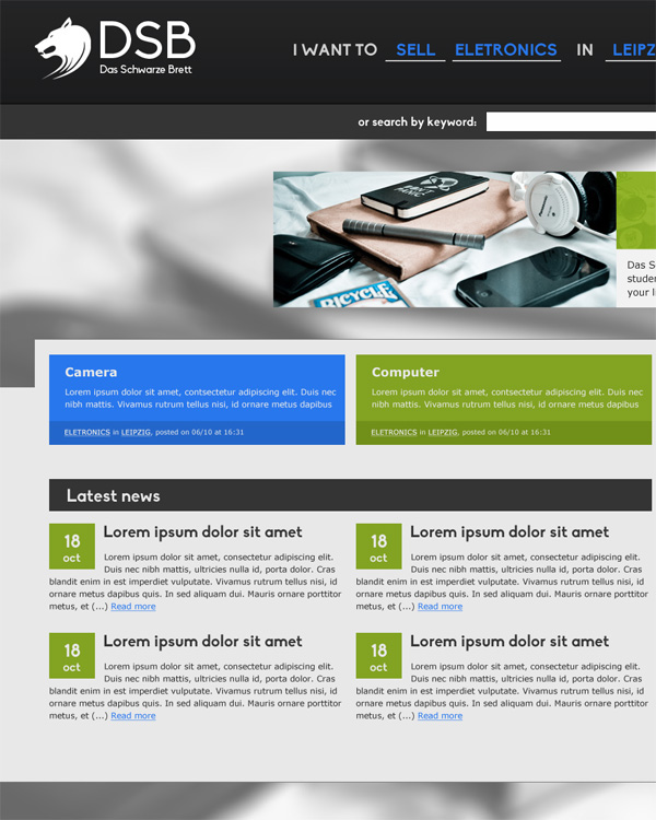
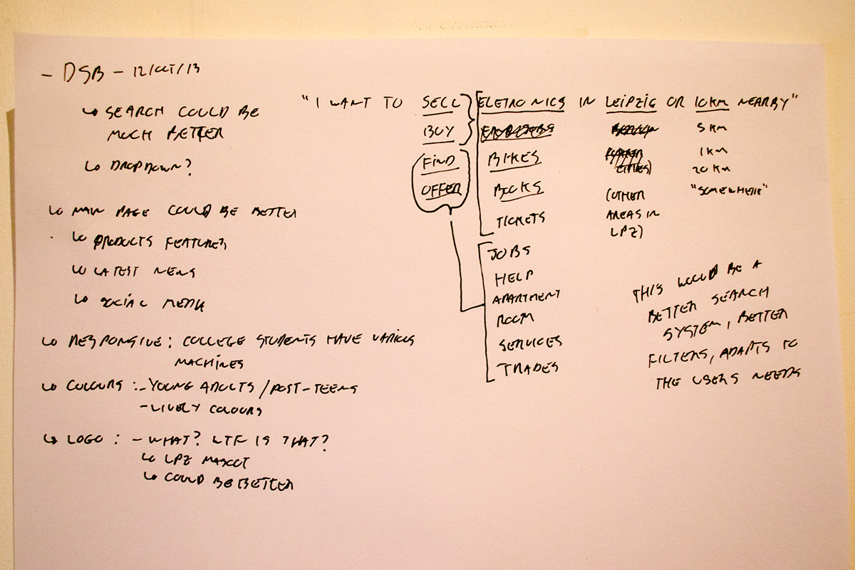
Search system
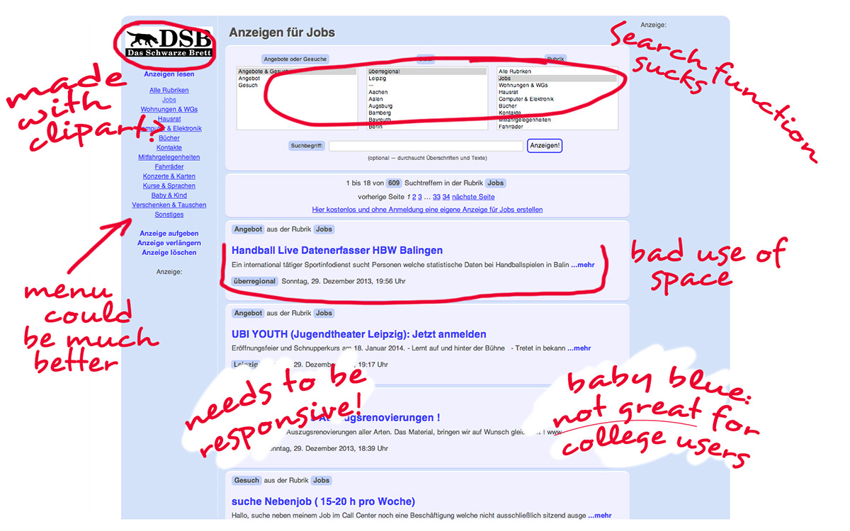
Although the website is dedicated to students / young adults / post-teenagers, the search system could be overwhelming for non-tech-savvy people. With this is mind, the search system had to change; it displays too much information. It's also not available on all pages and doesn't always follow the page the user is on.
The solution to this was to include a search bar at the center top of the page. This bar will have by default the most used search info - usually the sale of eletronics in Leipzig. If users uses different search criteria, this would be shown as default in the search area.
The search system would be done in a comprehensible language, clearly marking out what can be selected and showing possible options in a dropdown menu, including also an area to manually input the criteria.
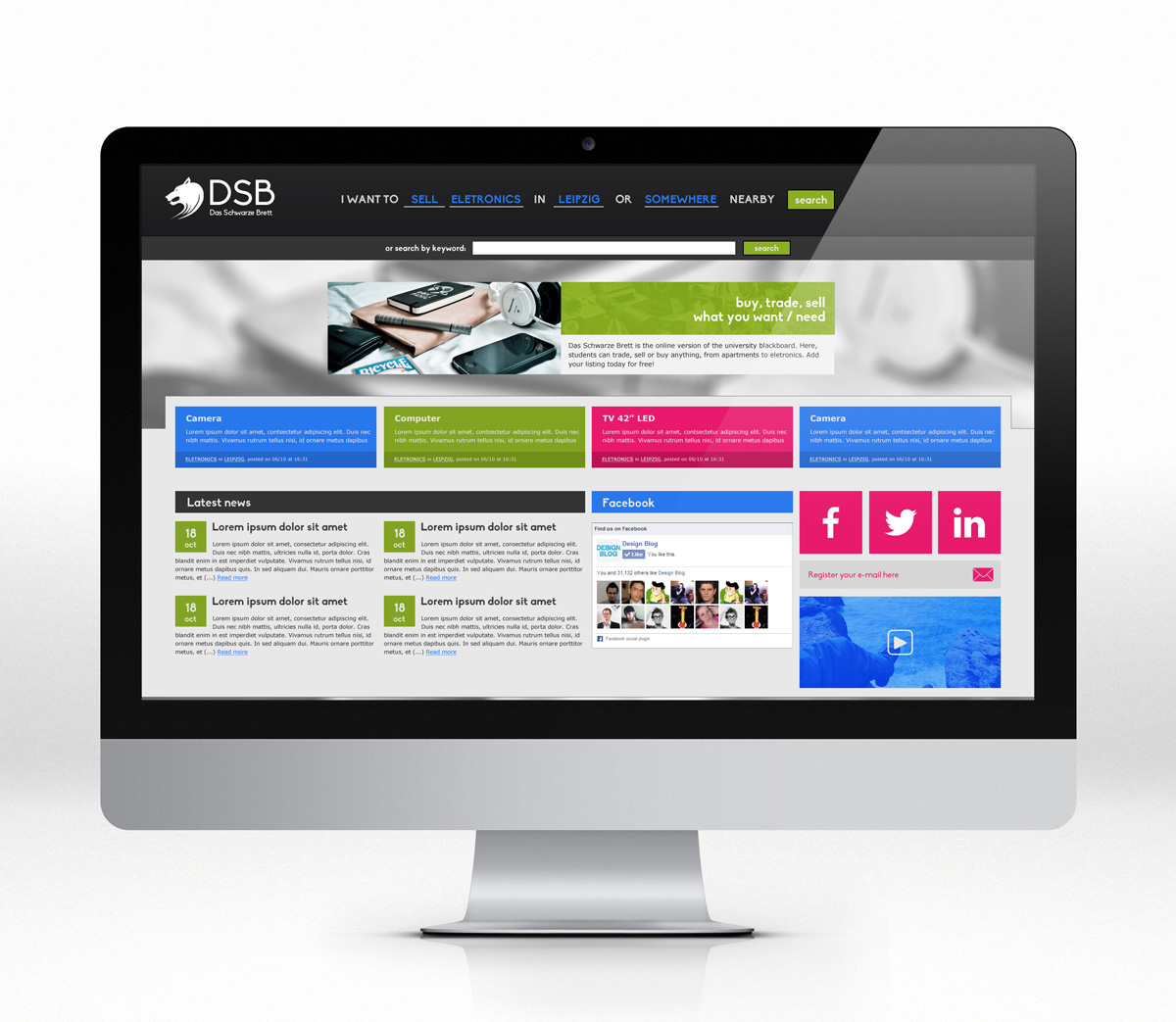
First page
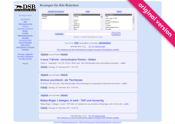
The first pages tries to seem very Google-like, but fails miserably. There is a need for a space to insert news, but the current layout won't allow it. There is also no space for most recent / featured products / other on sale.
The first pages tries to seem very Google-like, but fails miserably. There is a need for a space to insert news, but the current layout won't allow it. There is also no space for most recent / featured products / other on sale.
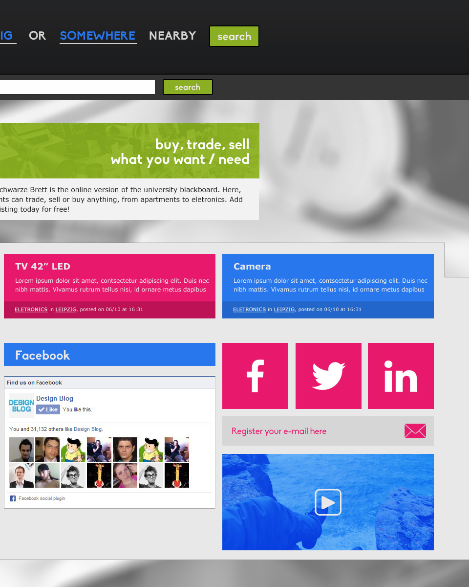
There is also no focus on social media, something vital with the intended audience - specially usefull to connect with other students looking to sell their stuff.
The logo
Although the initial idea was to use a representation of the city of Leipzig, the client decided on a sniffer-hound to try and convene "search", but it doesn't make much sense in the context.
With this in mind, I offered a stylized logo of a wolf - the city's symbol. This symbol, together with the changed typography (focusing on something younger and not so serious), the logo can be eastily identifiable.
Colours
Baby blue and pure blue for links is not the ideal colour for the intended audience. It helps better transmit the aspect of an amateuristic design.
With a focus on high-contrasting colours, my solution was to bring the "young" back to the website with a background image. The blue colour for links was maintained, but on a different hue for better harmony.
Original version:
Process:
Redesign: