2020
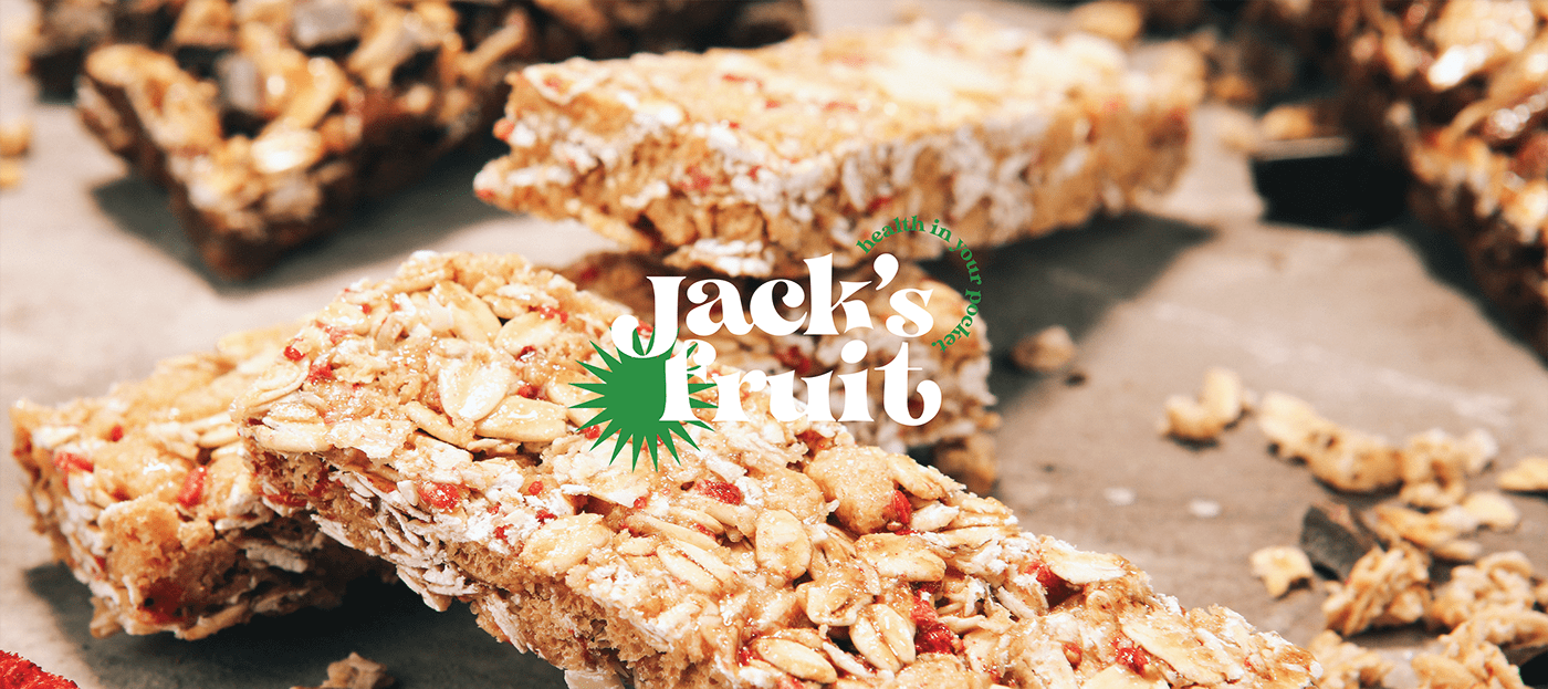
Jack's Fruit
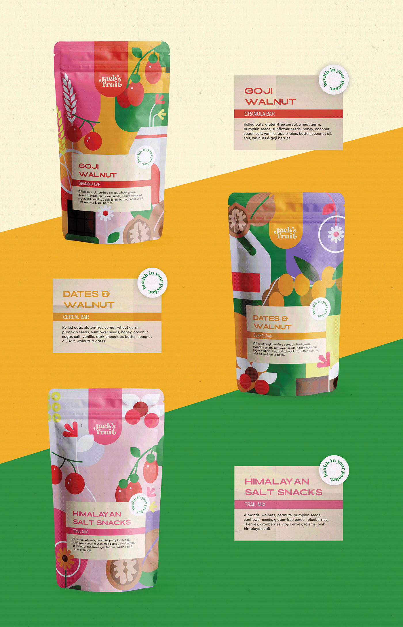
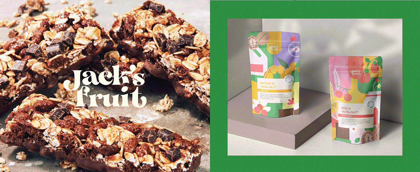
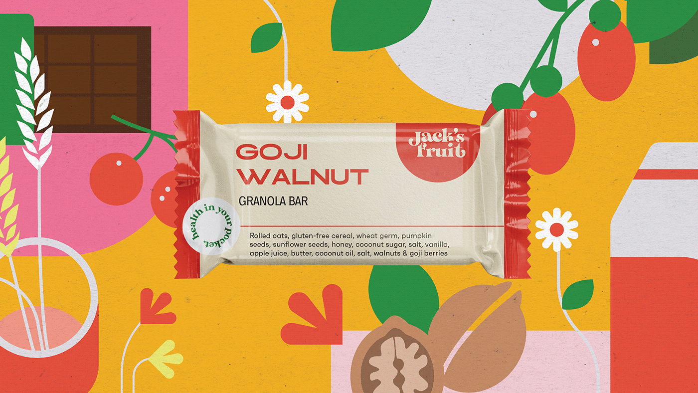
Some people go nuts for greasy food, but Jack’s Fruit offers healthy snacks that hit the spot. For years now, they’ve been getting lots of love for their delicious and nutritious selection of granola bars, cereal bars, and trail mixes that boost your energy and immunity.
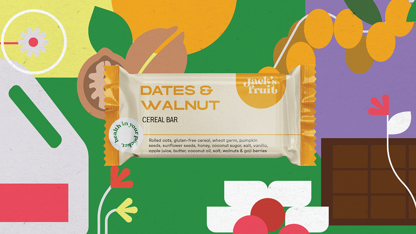
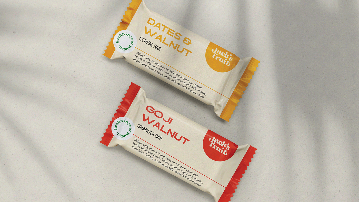
Although their original look featured a minimalist design that echoes its clean and green products, we decided to take a different trail. Reimagining their visual identity, we explored the whole spectrum of color to capture the burst of different flavors in each bar. The logo of Jack’s Fruit features a funky font with a splash-like element that resembles – you guessed it – a jackfruit. With a dozen hero colors, they vary from the warm tones of Amaranth, Deep Blush, Beauty Bush, Bone, and Lavender, to the bright, jungle tones of Fruit Salad, Killarney, Manz, and Fuel Yellow, and lastly the woodsy Leather, Jambalaya, and Antique Brass. Applied to the packaging, the bold colors illustrate an array of fruits, grains, and nuts that make it all the more appetizing. With health in your pocket, there are as many bursts of flavor in Jack’s Fruit as there are colors.
Visual Identity, Verbal Identity, Packaging Design