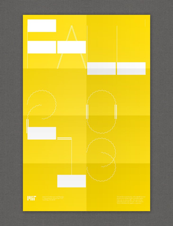
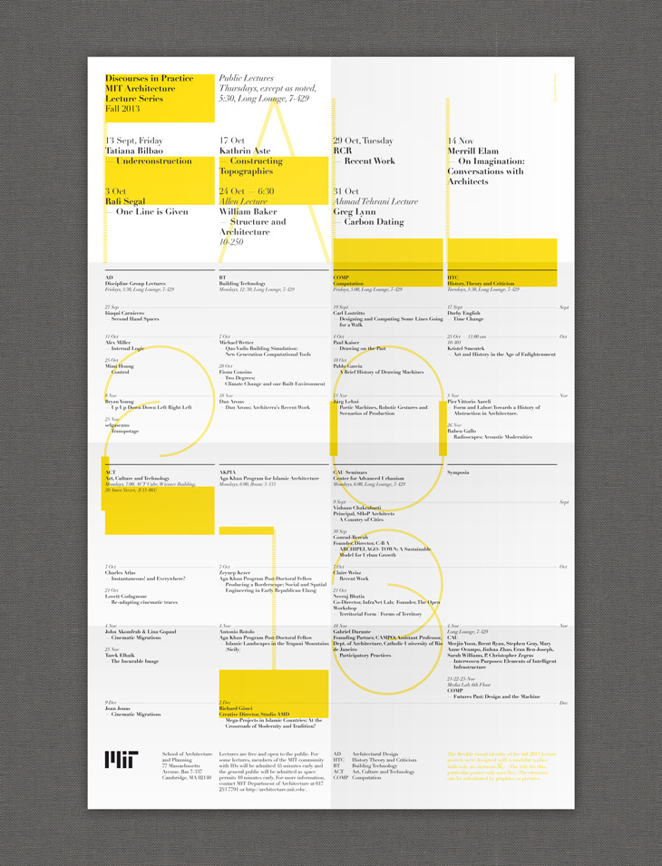
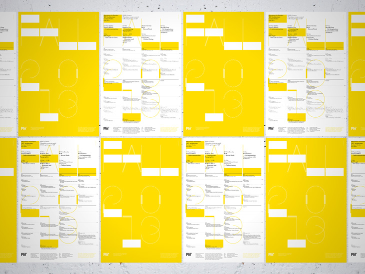
Front — This is the complete programme of the fall 2013 lectures. The yellow is a fluorescent pantone color. For the weekly lecture posters we chose 14 different tones, going from yellow to orange, representing the colors of fall.
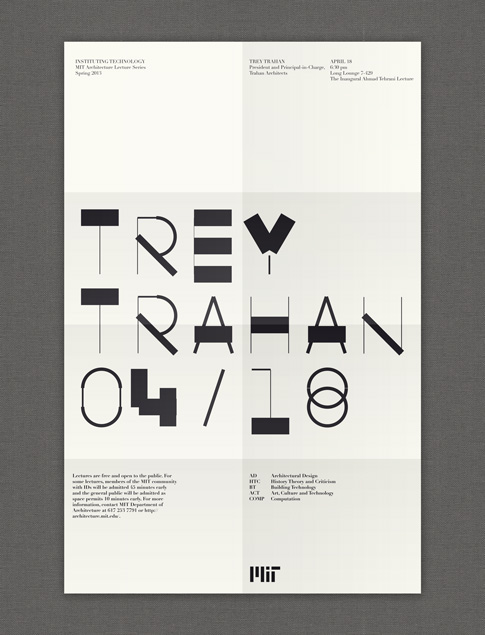

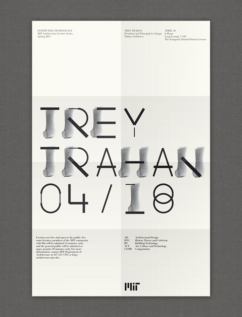

Originally we were planning to use as well fragments of the work of the speakers (On these particular poster proposals you see fragments of the work of the architect Trey Trahan.), but unfortunately there was no time to ask for proper images, get their copyrights and reduce the amount of text on the poster. We still really like these first sketches. Also because they explain well the potential of the visual system.
The MIT asked us to design a poster series for their fall 2013 lecture series of the architecture department. We developed a flexible visual system based on a modular typeface (VLNL TpKurier Sans). The elements of the typeface can be substituted by graphics or pictures.
The idea for the visual system came from a critique we had towards nowadays flexible visual systems (FVS). FVS are often understood as the automization of the application of a visual identity. We think that this is a huge mistake. Intuition, talent and taste can’t be automised and are essential to visual communication. We believe FVS’s need to be understood as tools, rather than machines for the execution. The visual system we developed for this poster series allows the designer to intervene in the application process.
—
Client: Massachusetts Institute of Technology (MIT Architecture)
Year: 2013
—
Client: Massachusetts Institute of Technology (MIT Architecture)
Year: 2013
—
More information at: http://www.twopoints.net/en/project/mit-architecture-lecture-series-2013


