

Mohyla Strategic Agency
Project goal: develop a complex design system from scratch, creation of a visual design code for quick identification, and effective visual brand communications.
Concept: a driving force.
Tone of voice: expertise, trust, partnership, and the strength of solutions.
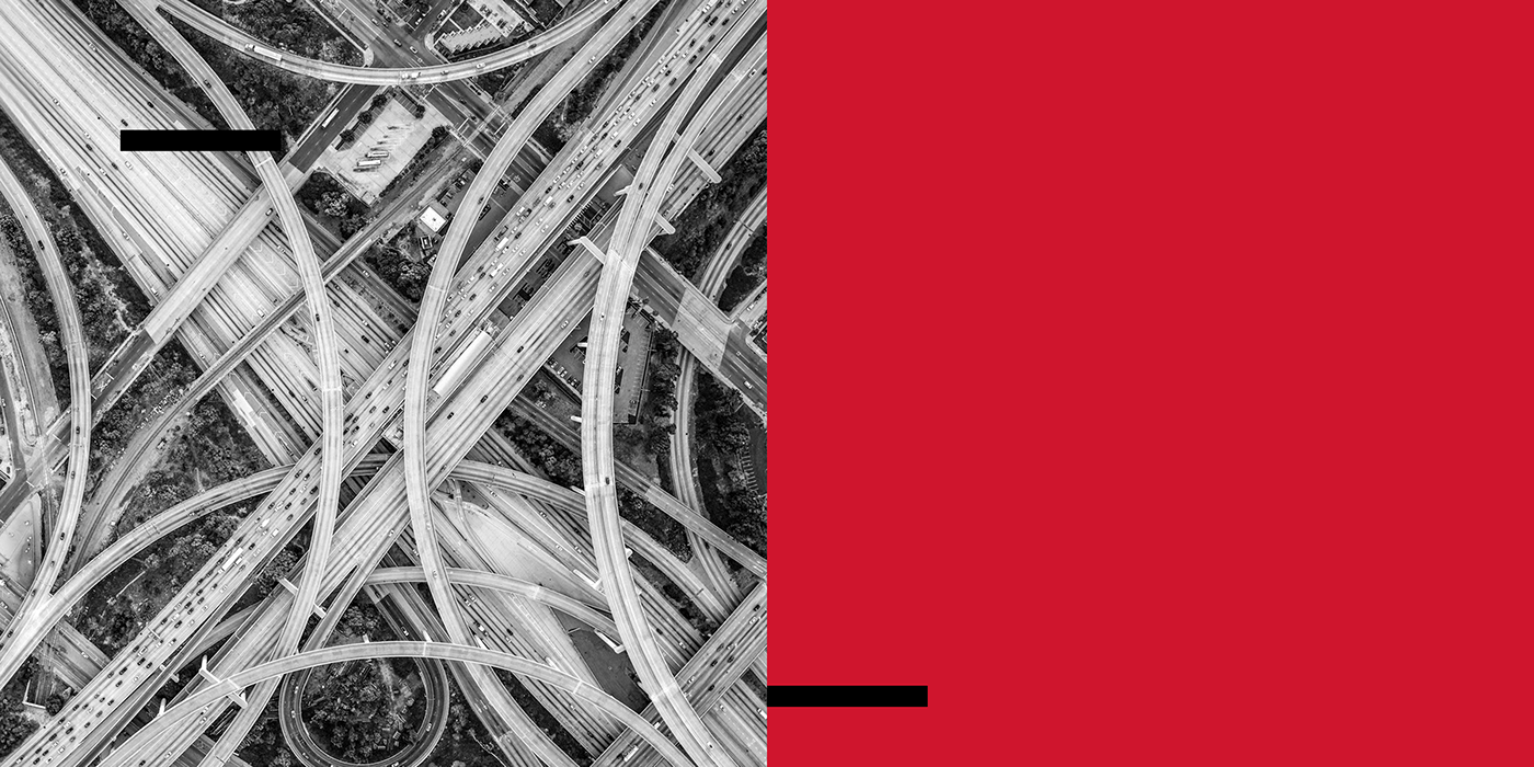
General visual image: a major traffic interchange – a metaphorical image that successfully conveys the energy and dynamics of moving heterogeneous flows concentrated in one place. On the other hand, it is the embodiment of structural engineering thought, streamlining a complex system, and providing simple solutions for different participants.
The Agency assumes the function of the strategic design of beneficial relationships for different participants of public life: state, business, cultural sphere, and social policy, having in its assets long-term expertise and partnership, as well as essential projects built on this basis.
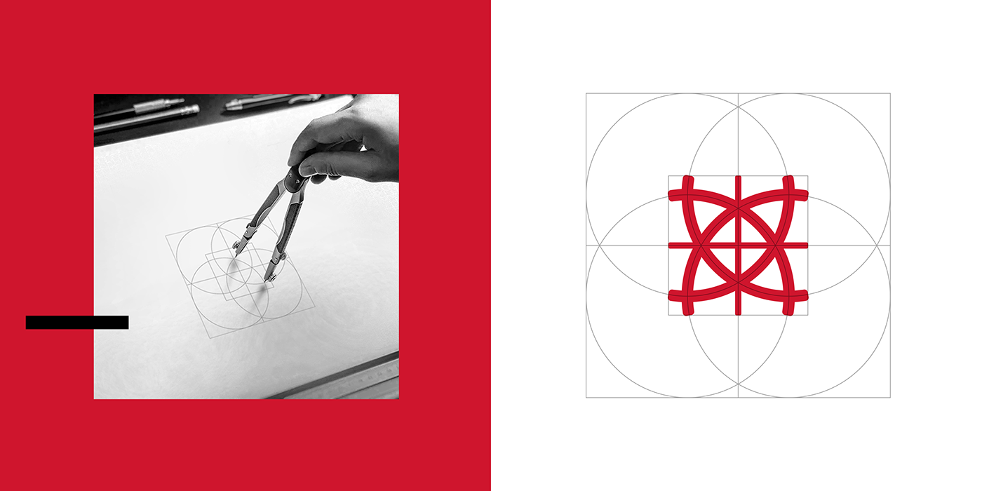
The visual box of graphic elements is based on the same scheme as the logo. Thus, all style-forming elements are in harmonious relations and complement each other.
When developing new graphic elements, one should rely on this scheme to preserve the visual integrity of the brand identity.
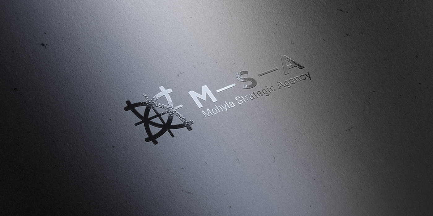
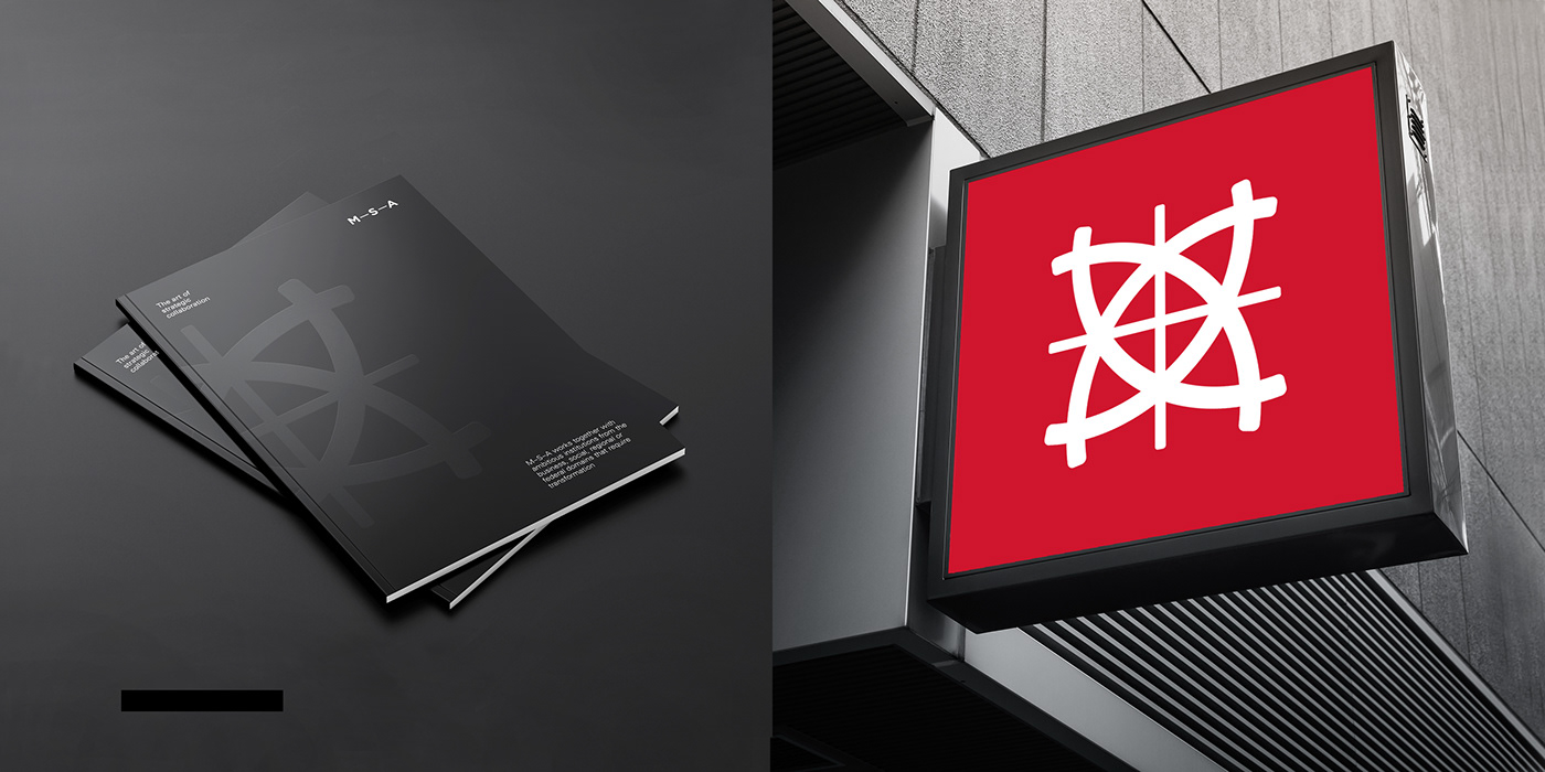
Logotype
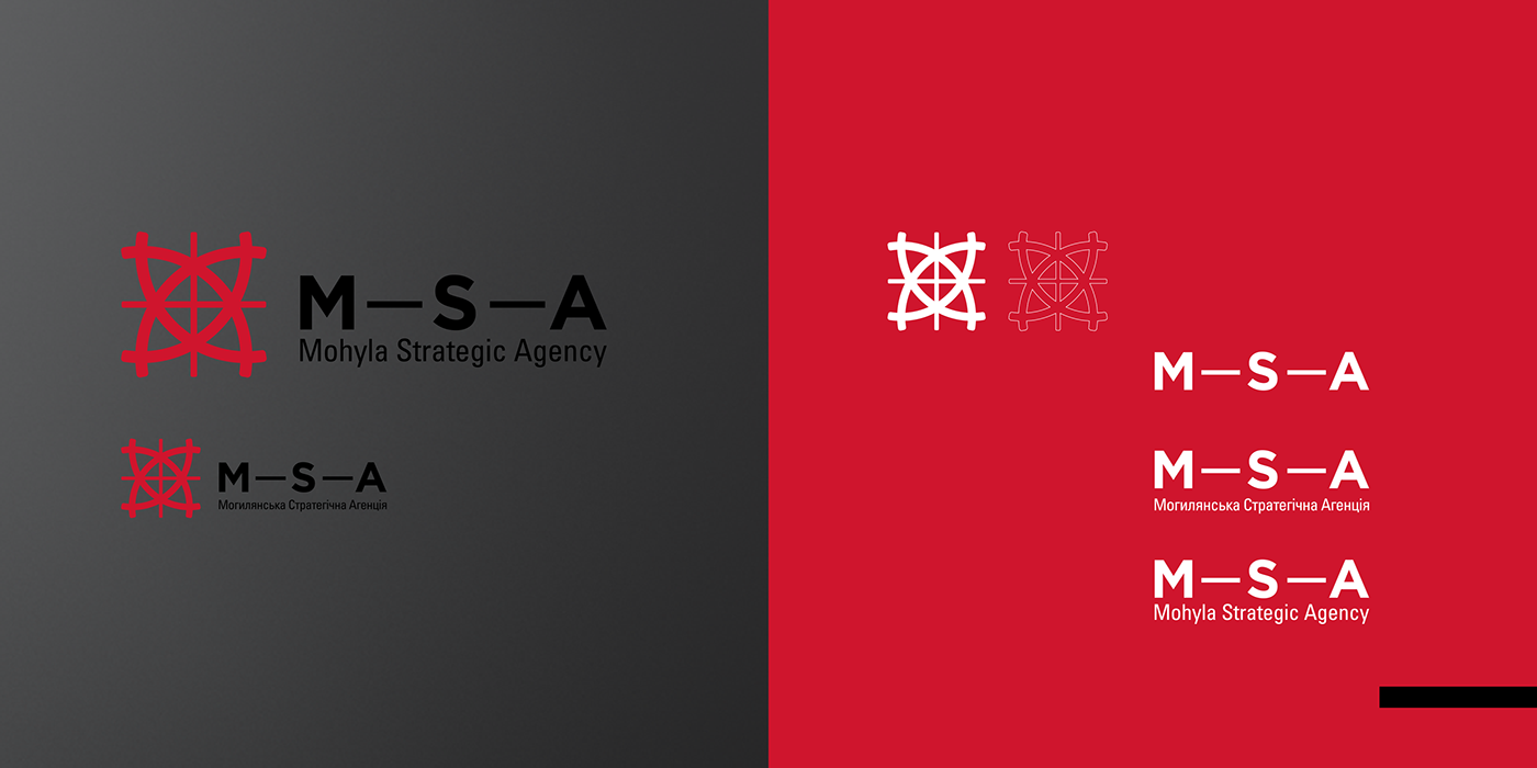
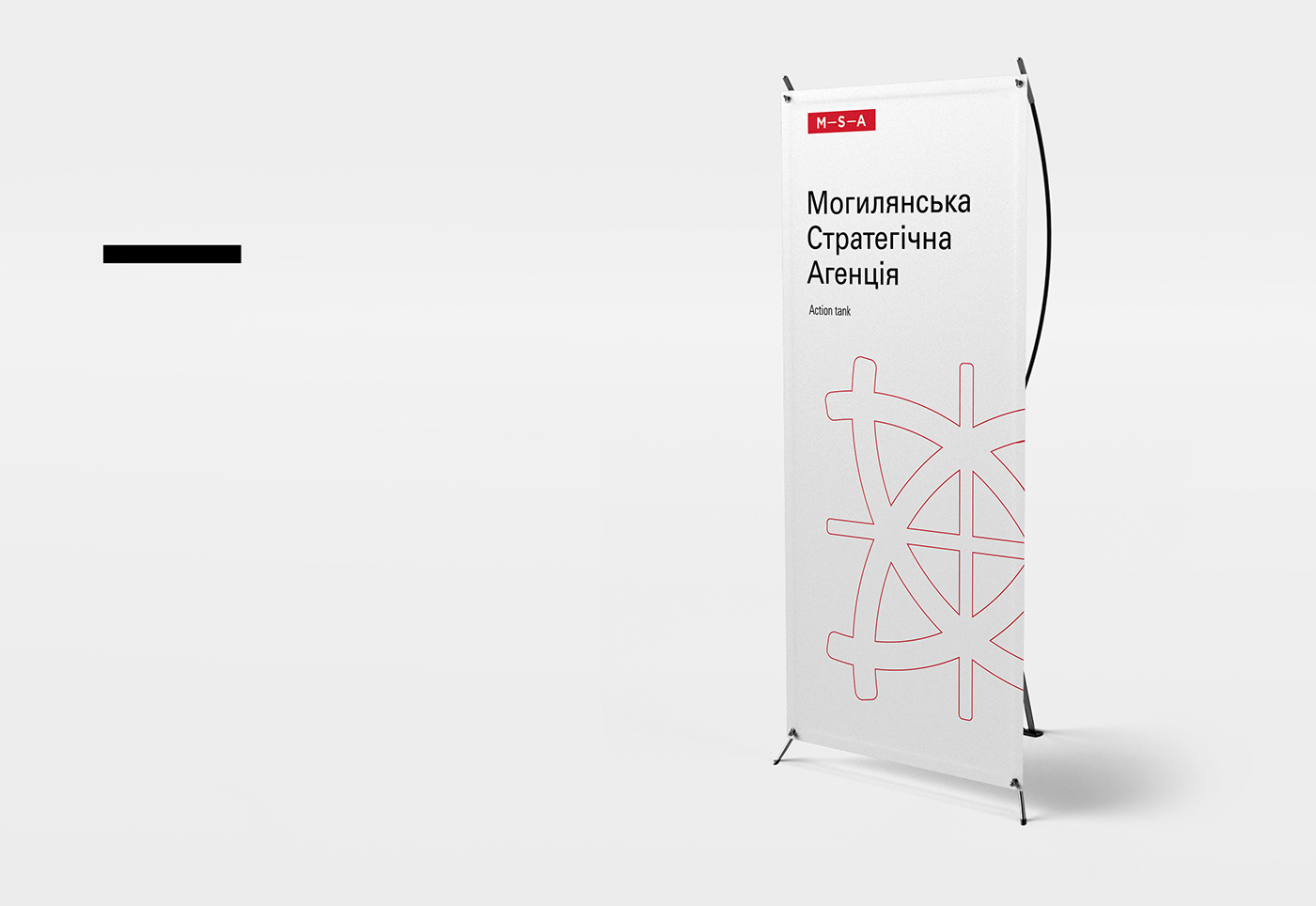
The full version of the logo contains the sign, logo, and status line.
The logo and sign always remain unchanged, and the status line is available in English and Ukrainian versions and can vary depending on the work task.
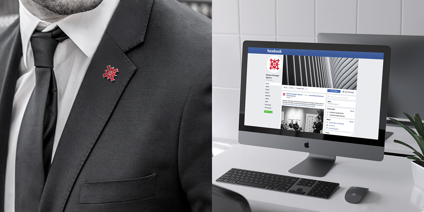
The mark, as well as the logo, can be used independently if the task requires it.
The logo can be used without a corporate mark, with or without a status line.
Identity
The primary color in design solutions is white.
Gray is used as a filter for photos and as a separate solution for graphics.
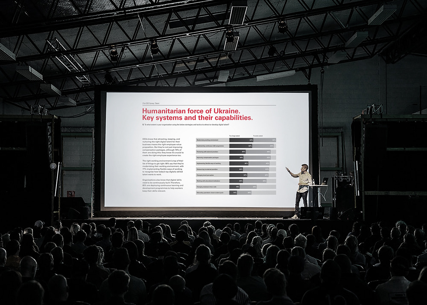
Black is used for text and graphics that should be highlighted. In individual cases, it can be used as the primary color.
Red is the main color for accents in text and exciting graphics. The amount of red can be used to control the "volume" of communication.
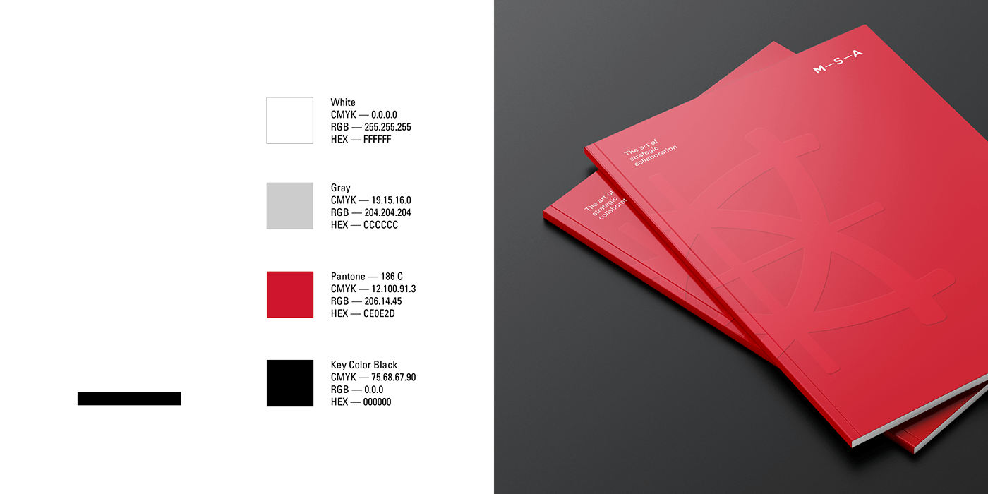

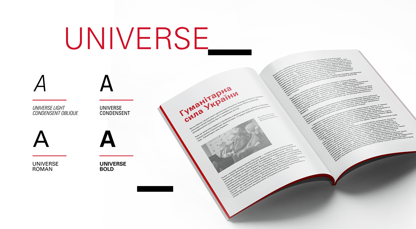
The only font used in identity is Universe.
Depending on the task, you can use Roman, Bold, Condensed, Light Condensed Oblique.
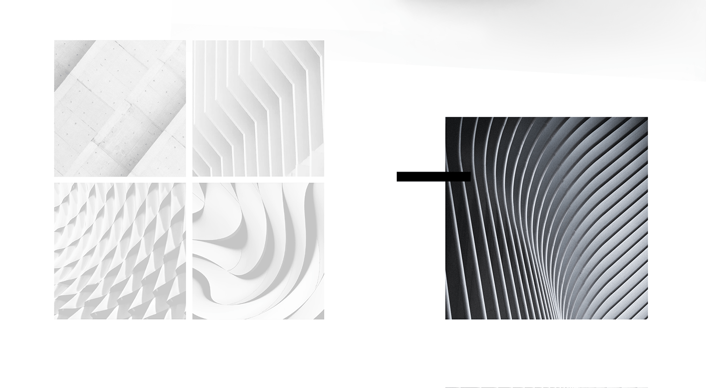
If it is necessary to use a photo for the background, you should take a picture of the architecture with a pronounced emphasis
on the linearity of forms. Linearity is an effective means to convey the emotional nature of the message, so it is essential to take into account the context of communication and choose a photo with visual characteristics that will better meet
the communication task.
on the linearity of forms. Linearity is an effective means to convey the emotional nature of the message, so it is essential to take into account the context of communication and choose a photo with visual characteristics that will better meet
the communication task.


Tags: branding, brandbook, logo, logotype, sign, company, identity, font, brand language, visual system, visual communications, color, color trends, graphic design, conception, visual, typography, social media, facebook page, facebook post, form, slide, business card, brochure, stationery, cup, badge, mockup, teamwork, presentation, mockup, top management, creators of a company, personalities, meta2, design studio.


