About the project
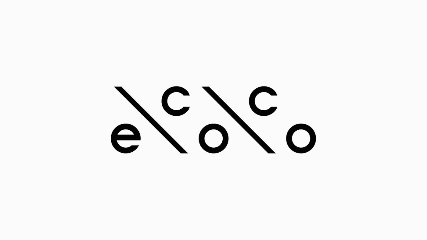
Client: Ecoco is the blog about environmental education, principles of sustainable development on the planet, reducing the burden on the planet through personal responsibility of a person who leads a conscious lifestyle.
Objective: to create a static and dynamic logo, which draws attention to the project already at the stage of visual reading of its main visual communication object.
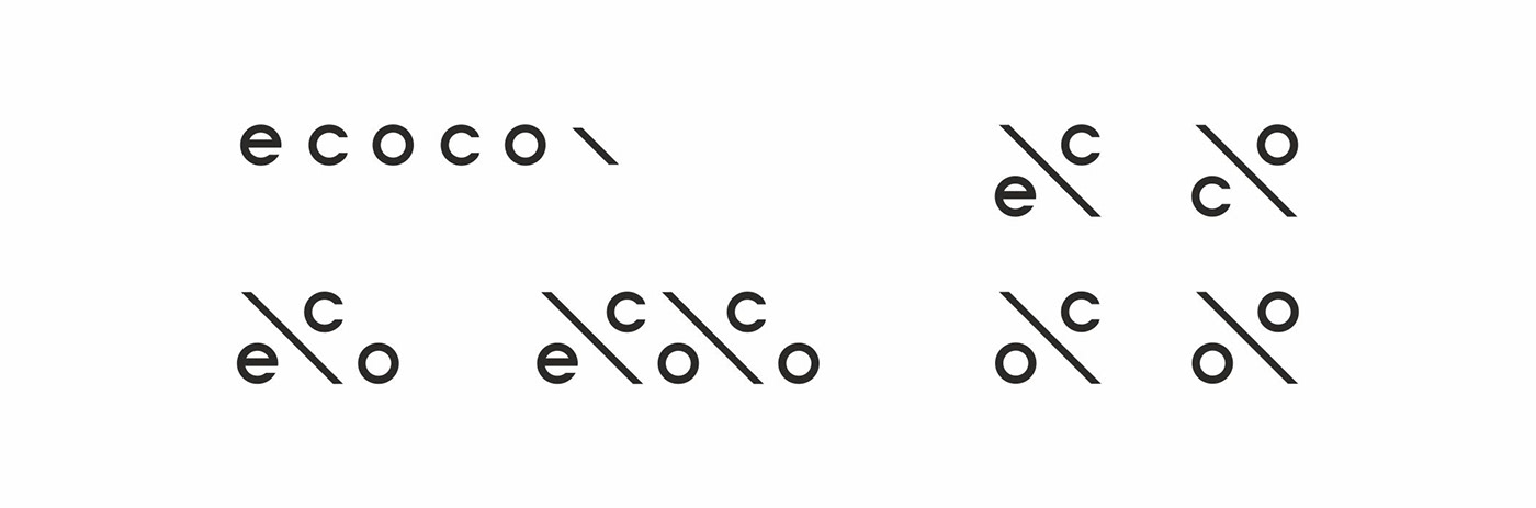
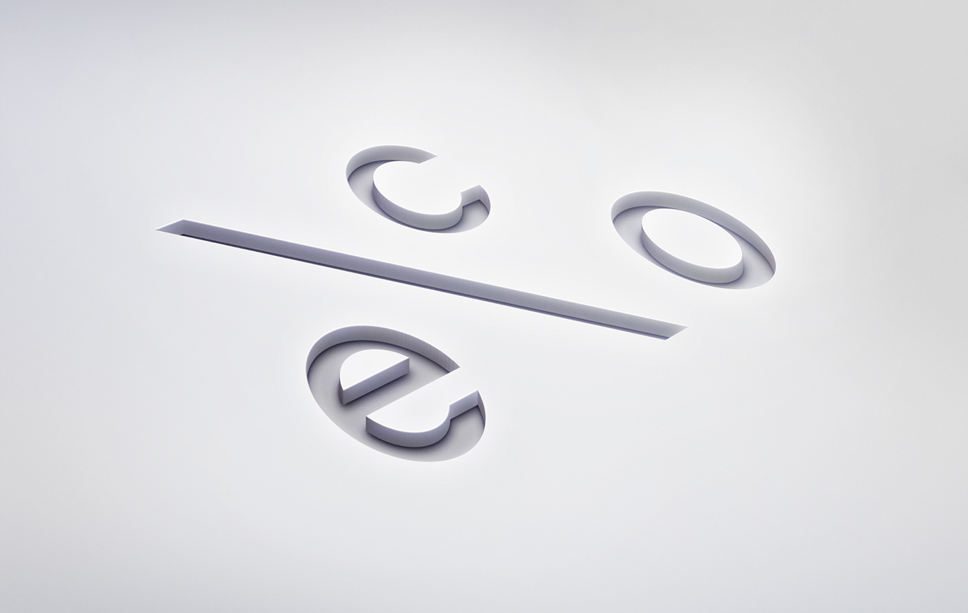
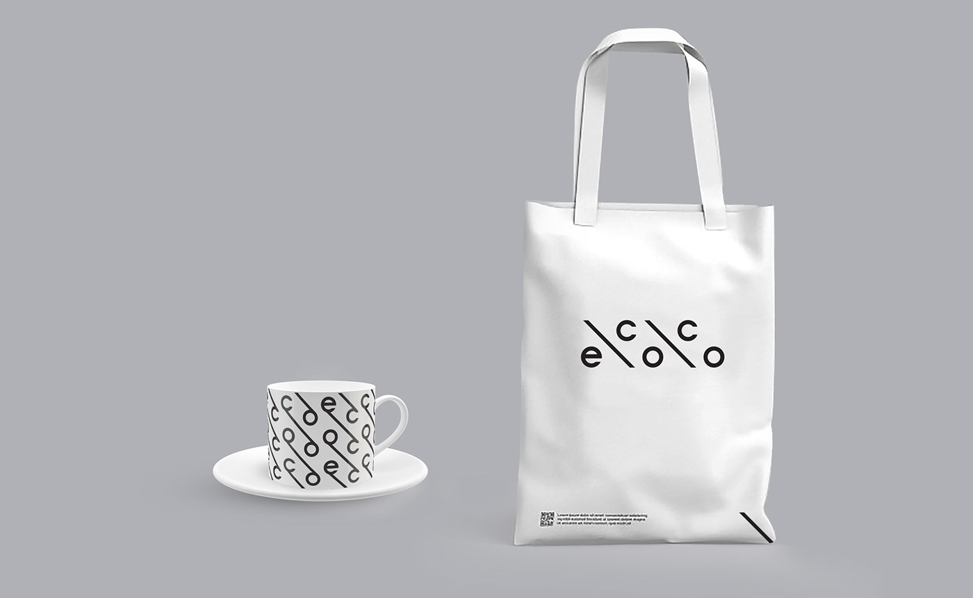
Solution: a clean, dynamic logo, in a concise form, conveys to the audience the idea of living in balance, and in its brief version, rhymes with the symbol "%" thus demonstrating the desire for a meaningful and balanced approach to life. The logo also refers to the sorting symbol, gently and non-aggressively engaging the audience in a sustainable lifestyle.
Key visual principle: a conscious and balanced relationship between humans and nature.
Tonality: inner and outer harmony and balance.
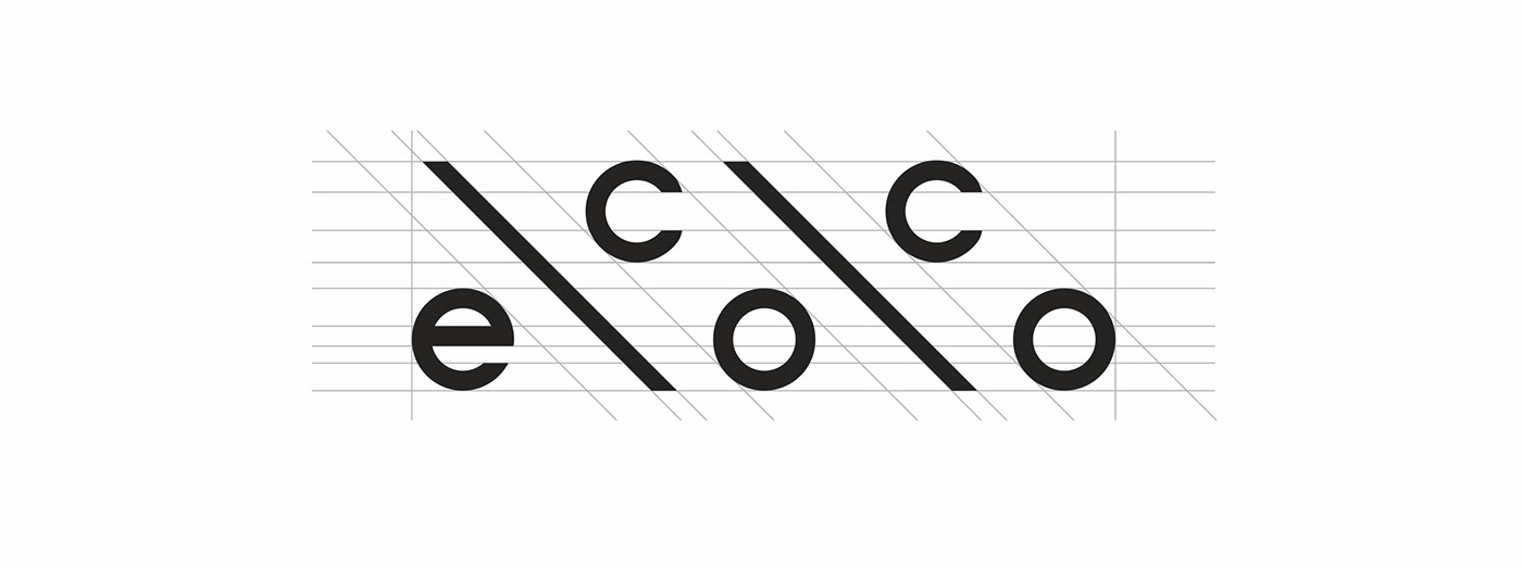

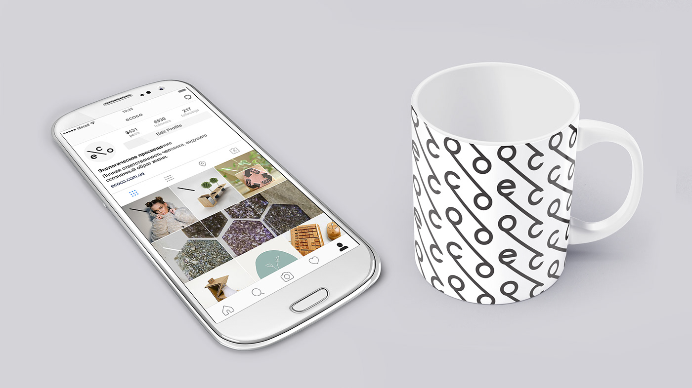
Dynamic logotype
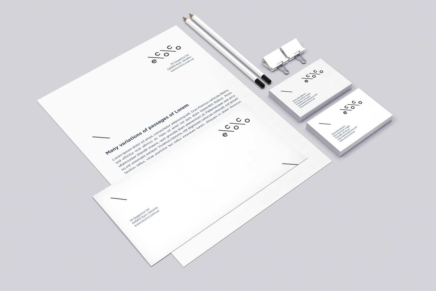
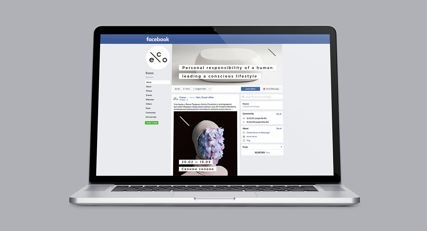
Options for different formats and communication channels
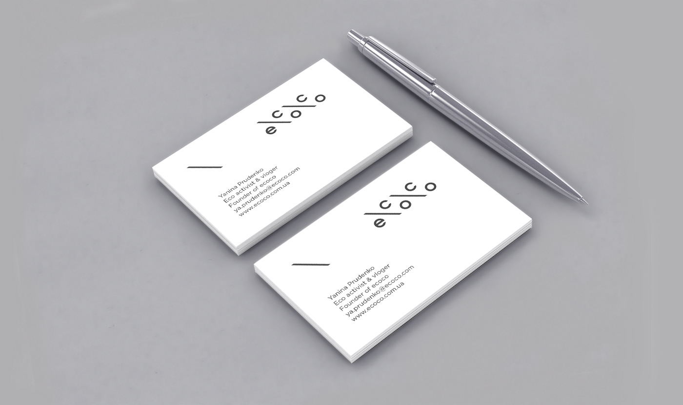
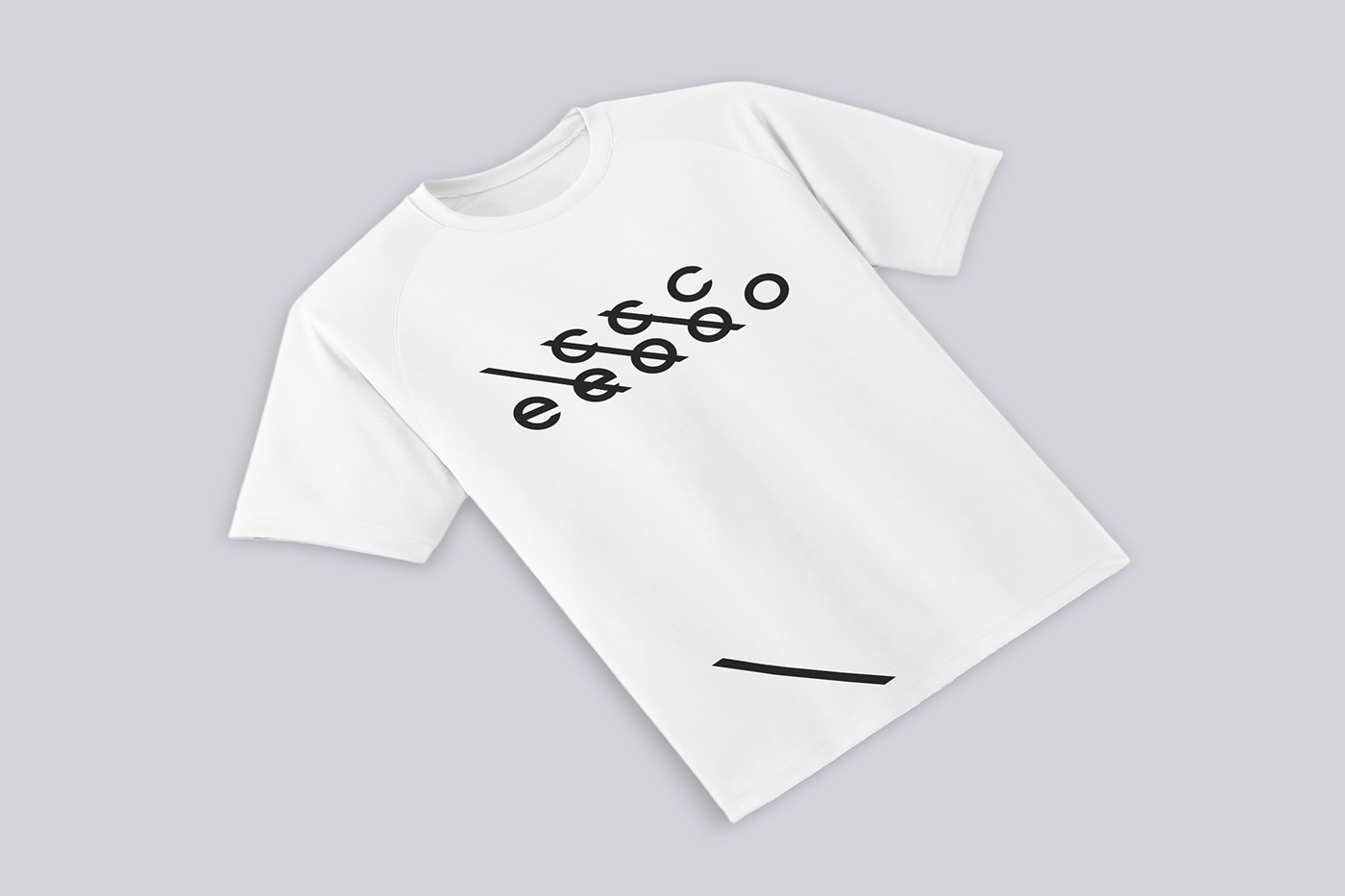

Tags: branding, logobook, logo, logotype, dynamic logotype, animated logo, animation logotype, company, identity, project, brand language, individual voice, tone of voice, visual system, design system, visual communications, visual metaphor, color, black, color trends, minimalism, graphic design, business card, t-shirt, blank, form, envelope, eco bag, cup, social media, facebook page, facebook page style, facebook post, instagram page, mockup, teamwork, presentation, meta2, design studio, sustainable development, sustainable lifestyle, ecology, education, personal responsibility, conscious lifestyle, living in balance, balance, garbage sorting, sorting, harmony