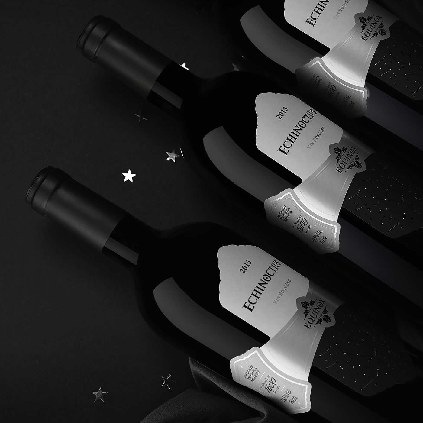
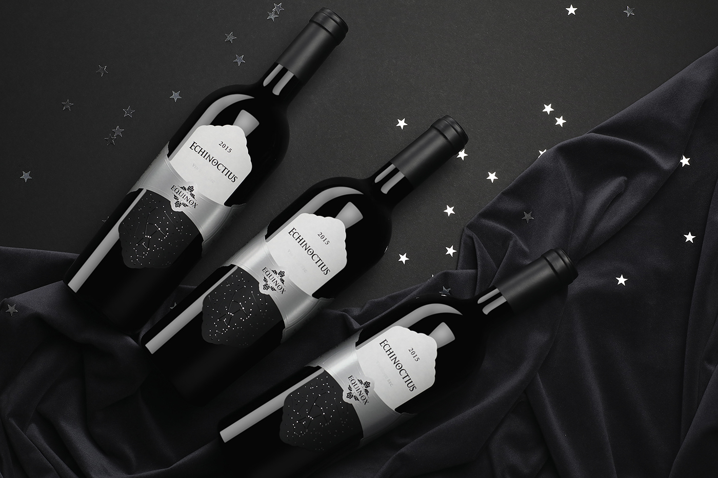
Echinoctius 2015
Limited Edition Premium Wines
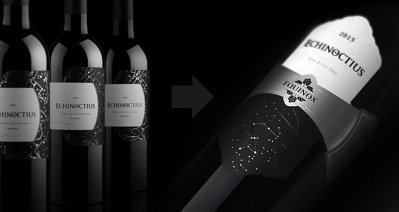
Echinoctius – это вино с историей. Это слово образовано, как превосходная степень от названия бренда производителя – Equinox (день равноденствия, который бывает два раза в год). Именно эту идею, но в превосходной степени, необходимо было отразить в концепции оформления этого вина.
Впервые мы разработали оформление для этого вина в 2014 году. Спустя 5 лет появилась необходимость в значительном обновлении концепта. Тому есть ряд причин.
Прежде всего, производитель вина сменил бутылку, а это означало, что необходимо менять и саму этикетку. Так же, со временем стало очевидно, что существующий концепт нуждается в обновлении и корректировке. Требовалось выразить основную идею более чётко, более ясно, более очевидным и понятным образом.
Echinoctius is a wine with a story. This word is formed as the superlative degree of the manufacturer's brand name - Equinox (Equinox Day, which occurs twice a year. These are the days when the day is equal to night). It was this idea, but in a superlative degree, that had to be reflected in the design concept of this wine.
The first time we developed a design for this wine series was back in 2013. In 5 more years, there was a need for a significant update of the design concept, for a number of reasons.
First of all, the winemaker changed the bottle used for the product, which meant that the label itself had to be changed. Also, in time, it became obvious that the existing concept needs to be updated and improved. It was necessary to express the main idea in a clearer, more detailed, obvious and understandable manner.

УНИКАЛЬНОСТЬ
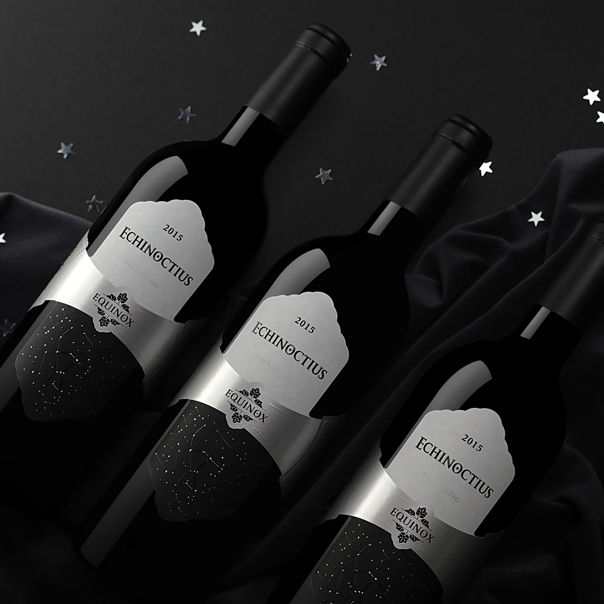
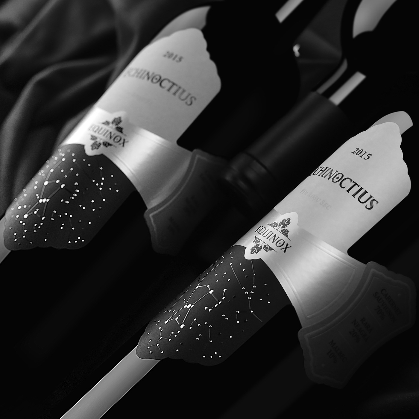
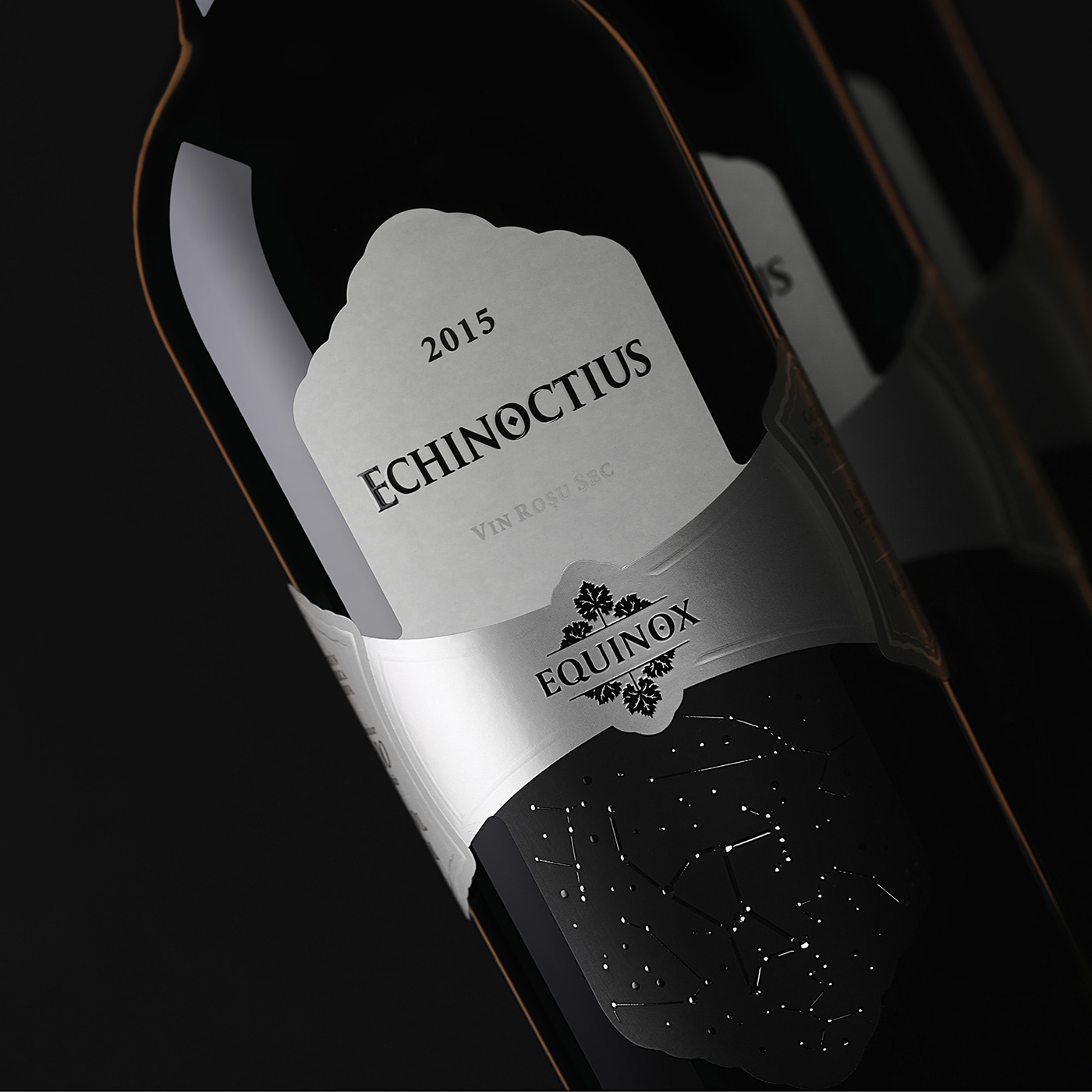
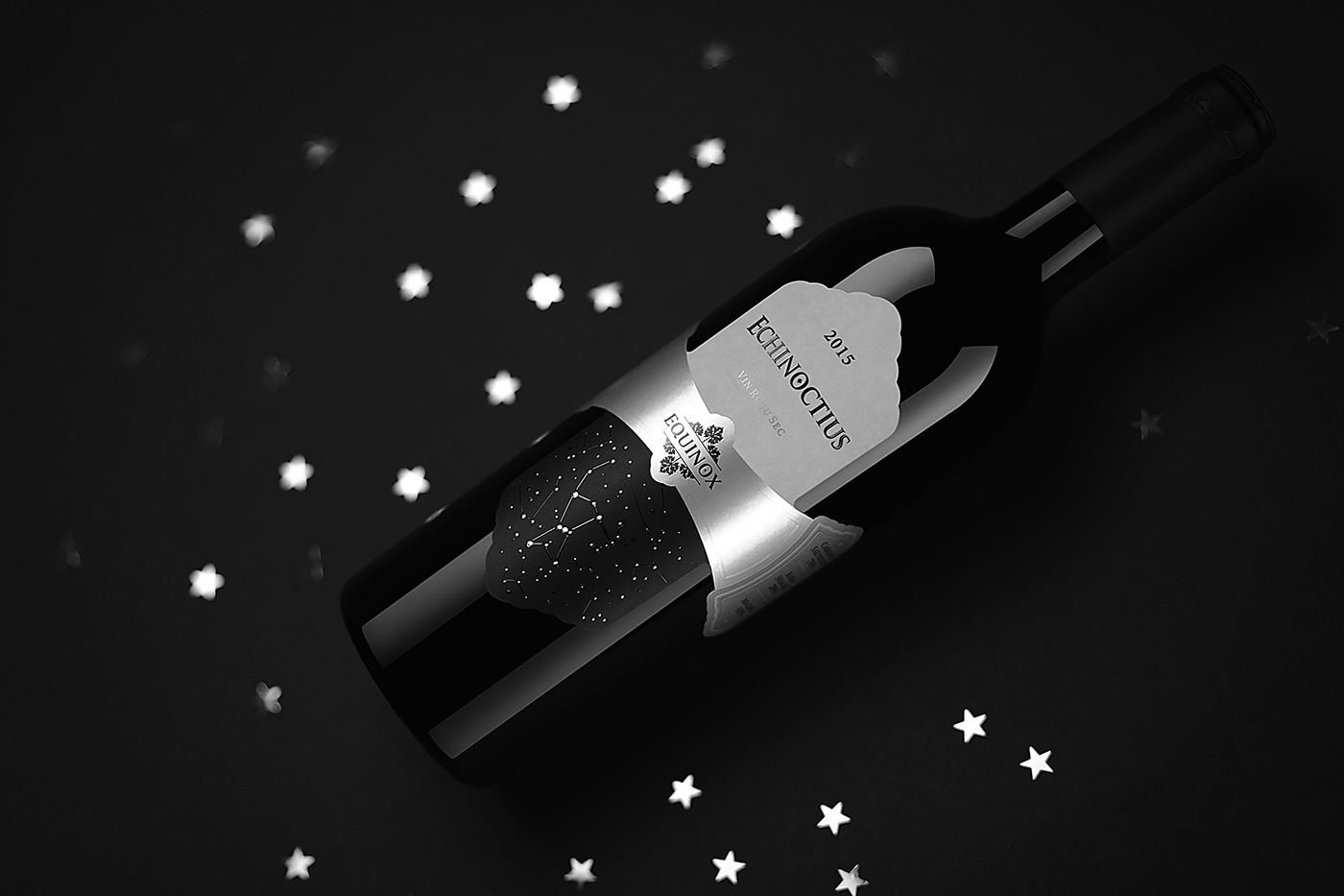
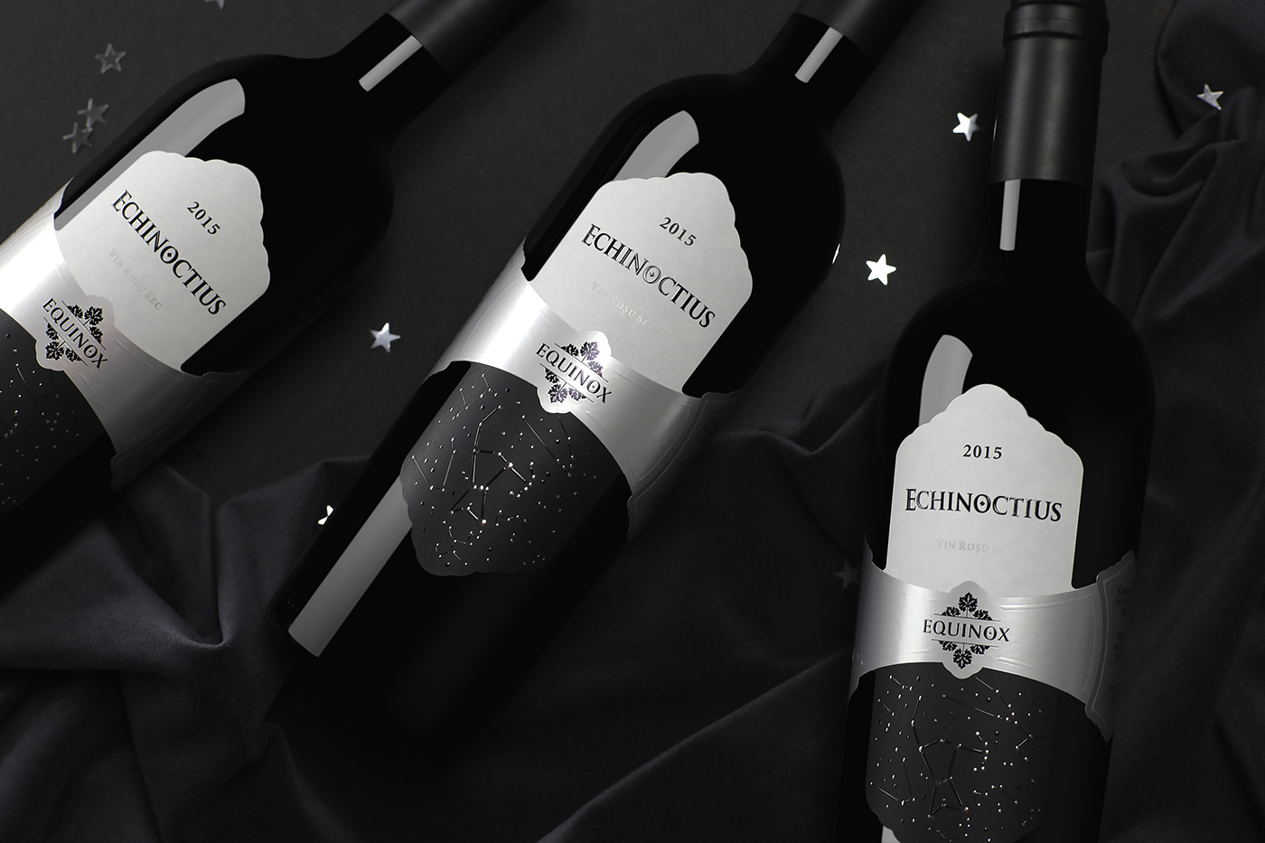
Данный проект имеет ряд инновационных решений в области брендинга и дизайна. Прежде всего, это успешный, качественный ребрендинг уже существующего продукта. Сделать лучше, чем было – задача не из простых и нам удалось с этим справиться. Во-вторых – мы разработали и реализовали этикетку сложной конструкции. Форма этикетки транслирует идею премиальности, эксклюзивности, высокого статуса продукта. Сдержанная цветовая гамма подчёркивает элитарность вина. Применяемые пост-печатные эффекты, как драгоценные камни, украшают и помогают выразить сдержанно и лаконично основную мысль концепта.
UNIQUE
This particular project compiled a number of innovative solutions in the field of branding and design. First of all, it is a successful, high-quality rebranding of an existing product. It is not an easy task to make it better than it was and we truly managed to cope with it. Secondly, we have developed and implemented a label of complex design features. The label shape conveys the idea of a premium class, exclusive, high product status. The restrained colors emphasize the elitism of the wine itself. The applied post-printing effects, like true gems, decorate and help to express with restraint and precision the basic idea of the concept.
ТЕХНОЛОГИИ
При разработке данного оформления было предусмотрено использование современных печатных и пост-печатных технологий, таких как тиснение, конгрев и нанесение специального тактильного лака. Печать производилась на высококачественной бумаге, что, в сочетании с применением целого спектра техник, позволило добиться идеальной реализации визуального оформления и обеспечить приятные визуальные и тактильные ощущения при непосредственном контакте с продуктом в магазине.
TECHNOLOGY
While developing this design, we combined the use of modern printing and post-printing technologies, such as embossing, stamping and special tactile polish. Printing was executed on high-quality paper, which, combined with the use of a wide range of techniques, made it possible to achieve the perfect vision of the visual design and to deliver pleasant visual and tactile sensations to the customer at direct contact with the product in the store.


ИТОГО
Данный проект являлся значительным профессиональным вызовом для нашего агентства. На протяжении более чем 10 лет мы сотрудничаем с данным производителем вин (Equinox). С проектами для данного бренда мы не раз побеждали на различных международных конкурсах. И в очередной раз, от нас требовалось создать настолько уникальный концепт, настолько уникальный дизайн, который по своим эстетическим и концептуальным характеристикам не просто не уступал бы предыдущим успешным проектам, но и на голову превосходил бы их.

IN TOTAL
This project was a significant professional challenge for our agency. For more than 10 years we have been working with this winemaker (Equinox). We have won various international competitions with the designs for this client. And once again, we were required to create such a unique concept, such an exquisite design, which in its aesthetic and conceptual characteristics wouldn’t be inferior to previous successful projects and would even be better than the best of them.


AWARDS:
2019
MUSE Design Awards / SILVER WINNER
for Packaging Design Category in 2018-2019

Branding, identity, packaging design & post production by SHUMI LOVE DESIGN (TM)
3D visualization by Maxim Kulikov


