Producing the renewed main Russian publication on topics of art, sociology and philosophy.
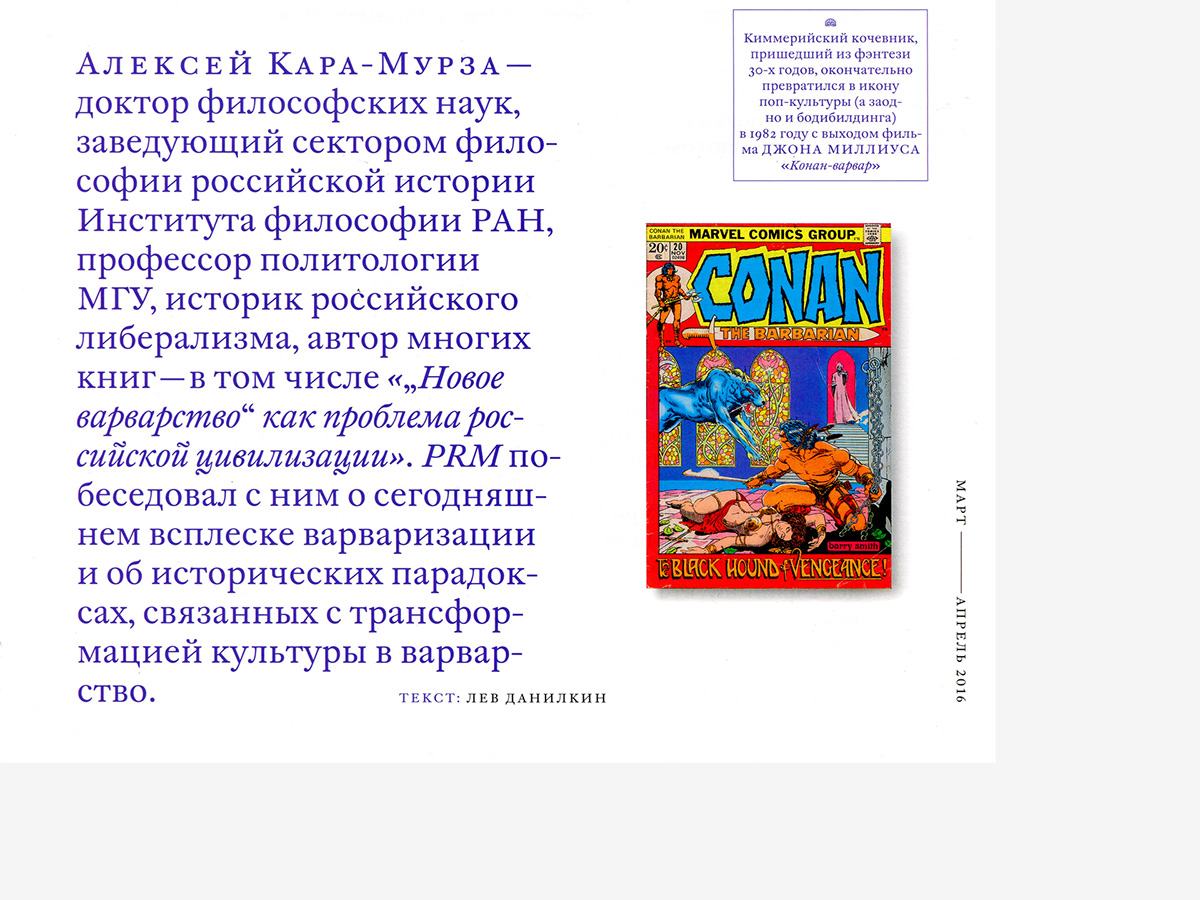
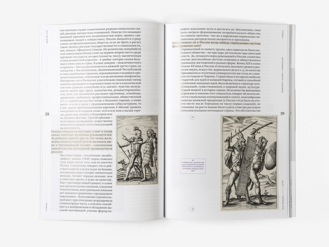
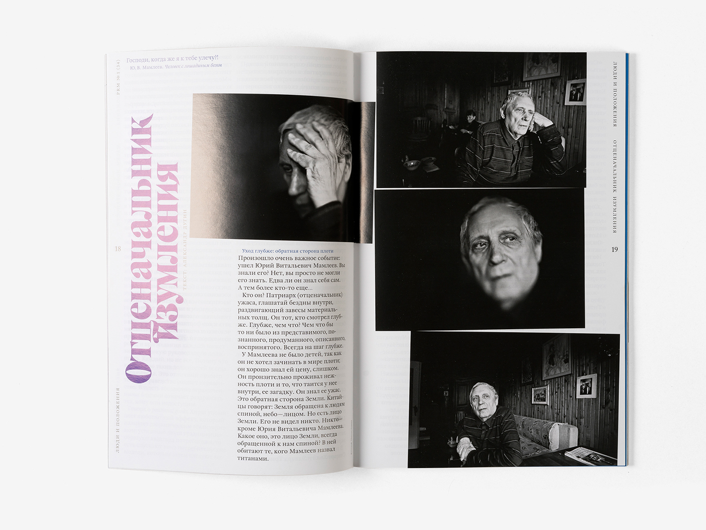
Before it’s abrupt ending Prime Russian Magazine had changed it’s long and lush title to short, simple and completely undecipherable PRM. The updated version lasted only for 2 issues but for sure boasted a top design, which is presented below.
Specially for Prime Russian Magazine we’ve developed a distinct font, reminiscent of Times Modern font, which was used by prominent German publishing house Suhrkamp Verlag for the series of pocket books on philosophy. With this symbolic move we’ve continued the tradition of providing accessible philosophy to the mass audience.
#shukadesign 2015–2016


CREATORS:
FOLLOW SHUKA ON:
designed by shuka®
© all rights reserved


