
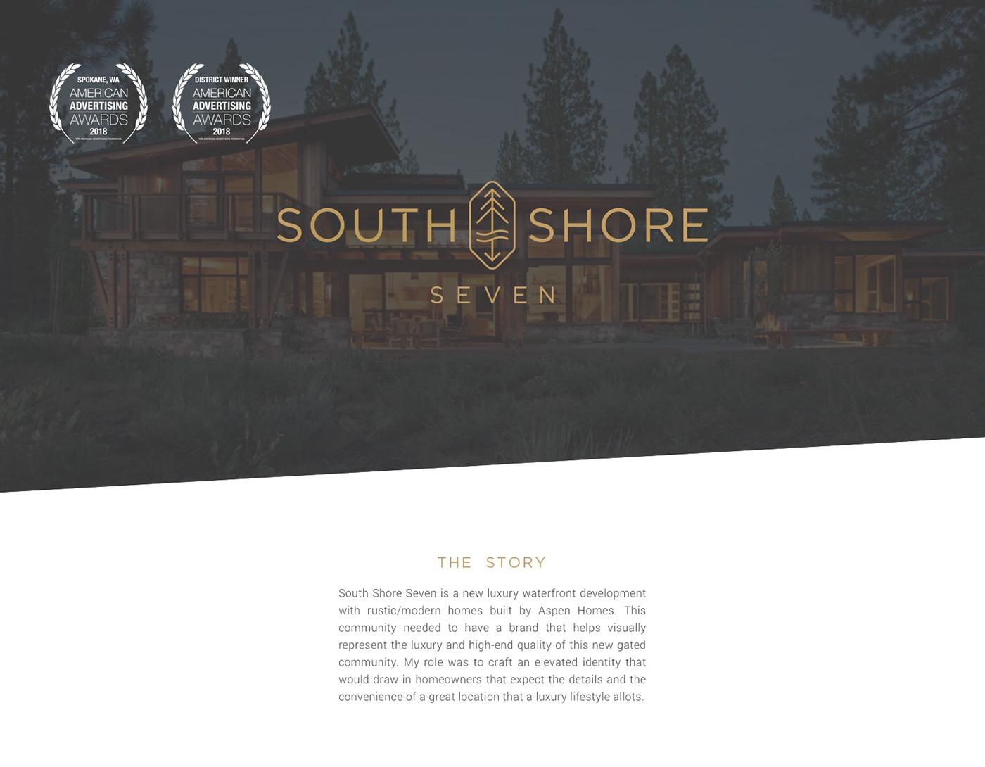


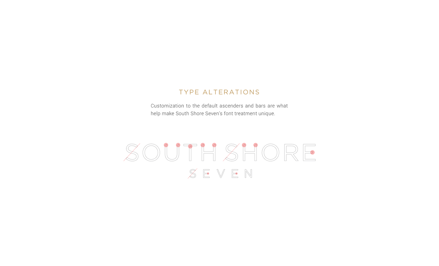
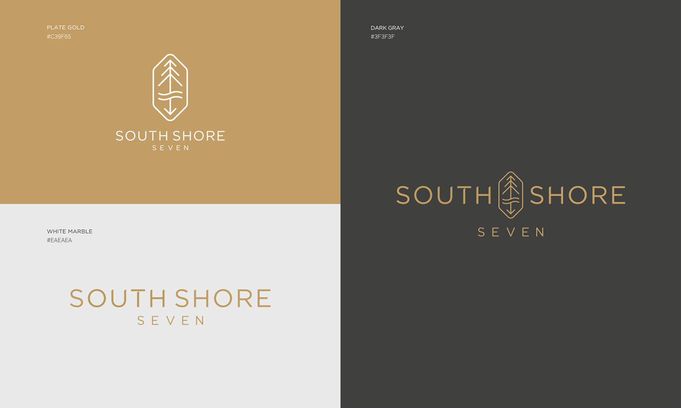
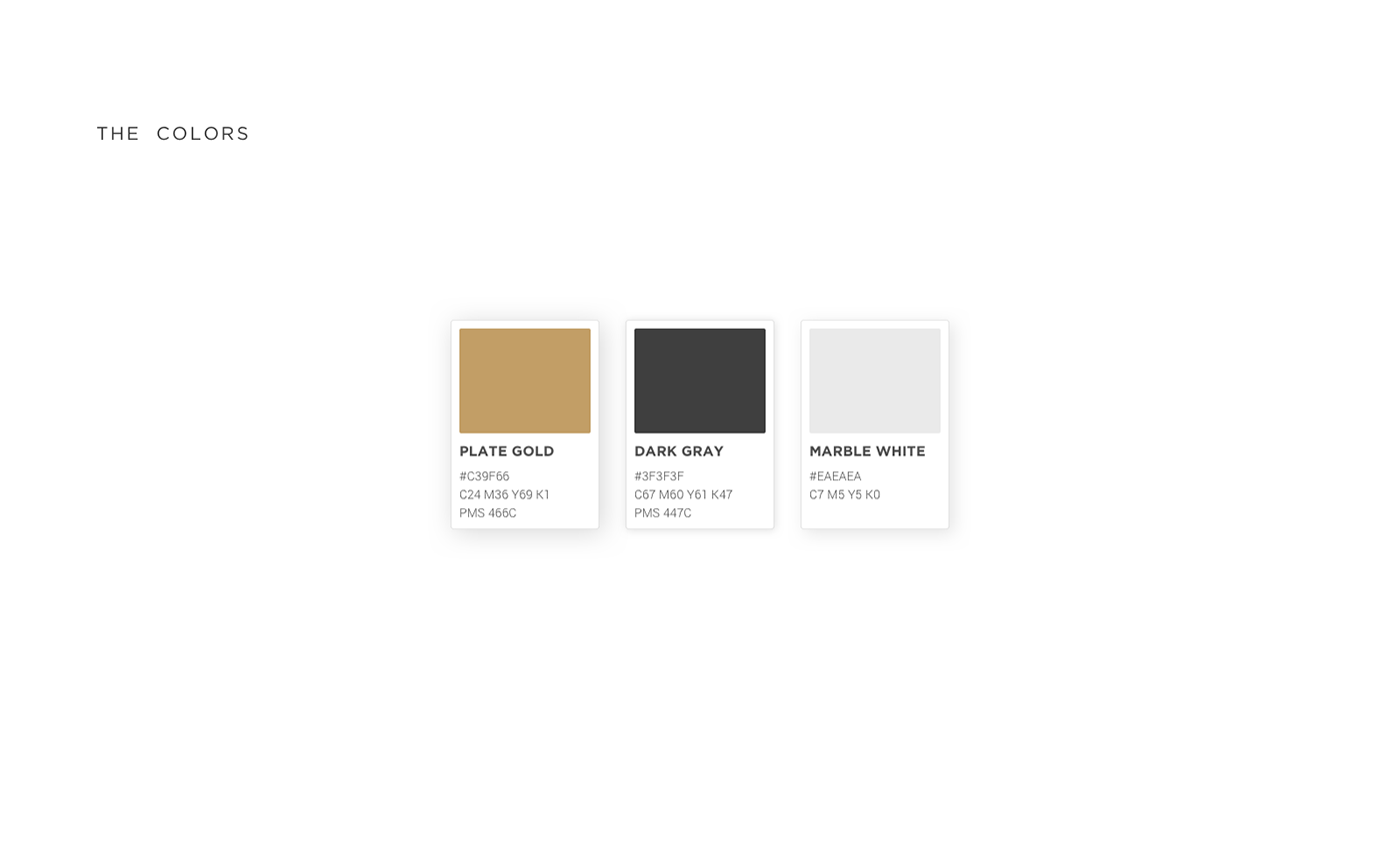
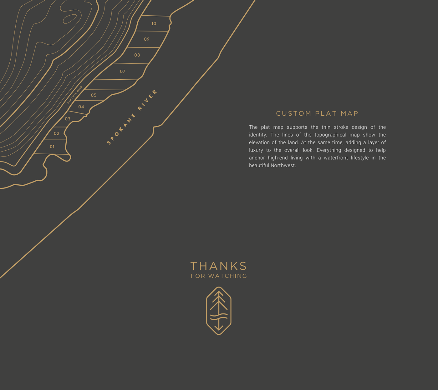
South Shore Seven is a new luxury waterfront development with rustic/modern homes built by Aspen Homes. This community needed to have a brand that helps visually represent the luxury and high-end quality of this new gated community. My role was to craft an elevated identity that would draw in homeowners that expect the details and the convenience of a great location that a luxury lifestyle allots. The breakdown of the mark has three parts that represent the area the development resides. Since trees and water are an integral part of the lifestyle of South Shore Seven, they are the core elements used in the mark. The arrow pointing south plays two roles, one for the word “South” and another for a reflection element from the trees on the other side of the water symbol. Customization to the default ascenders and bars are what help make South Shore Seven’s font treatment unique. The plat map supports the thin stroke design of the identity. The lines of the topographical map show the elevation of the land. At the same time, adding a layer of luxury to the overall look. Everything designed to help anchor high-end living with a waterfront lifestyle in the beautiful Northwest.

