THE BRAND
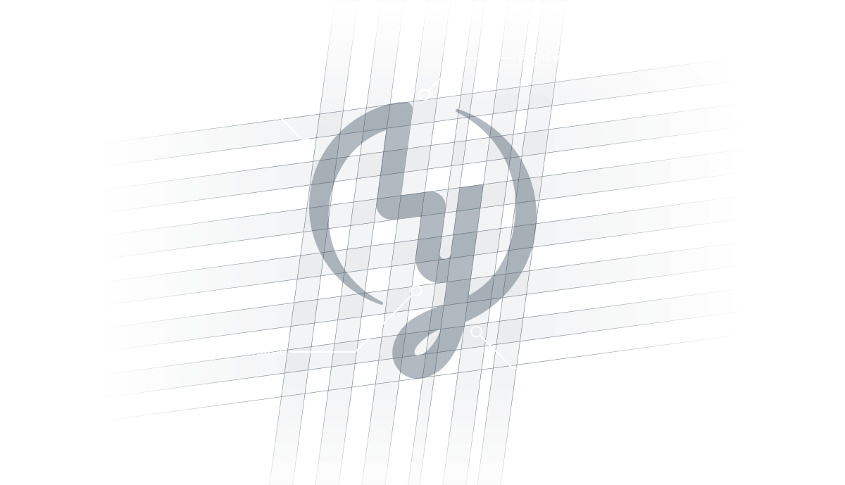
The Luke Yates Brand was developed with two thoughts in mind. Create a unique look that relevant to its space, and design a brand that uses a logo mark and type treatment. The client wanted something that could be used on its own over time with the goal that just the mark would help identify him in his industry.
The challenge was making a mark that could signify the name “LUKE YATES” as well as work in harmony with the type teatment. The application of a distressed texture was to give a bit of grit, and blocky type treatment which is more masculine. The application of sweeping lines was to help resonate with Luke’s large female target audience. With both the grit and sweeping lines the mission is to create balance.