I took on this personal project after freelancing for several months and realizing there was no good solution to a freelancing platform out there (although many have tried). UpWork.com is just one of these sites.
UpWork is well-branded and visually pleasing, but it hides a lot of problems.

Problem Statements:
1. Bad navigation creates a "jerky" user experience, having to memorize certain task flows or go back and forth between pages. User flows are not properly built in. Two task bars on top add to the confusion.
2. No content strategy. nav elements have names that aren't consistent/clear. There is no clear hierarchy or structuring of information either. Iconography is also misleading on most pages.
3. Often times, clients disregard your previous resume and only care about your UpWork statistics. In other words, talented freelancers would still have to work their way up from the bottom on UpWork. Freelancers need to see relevant jobs, but the current way to do this on UpWork is to build rapport ON the platform.
4. In addition, search filters are not always showing you relevant jobs. Ties back into content as well because some jobs are not properly labeled/bad descriptions.
5. Bad customer service. Based on user reviews and interviews I conducted, UpWork's support services often leave the freelancer feeling distrustful of the whole site.
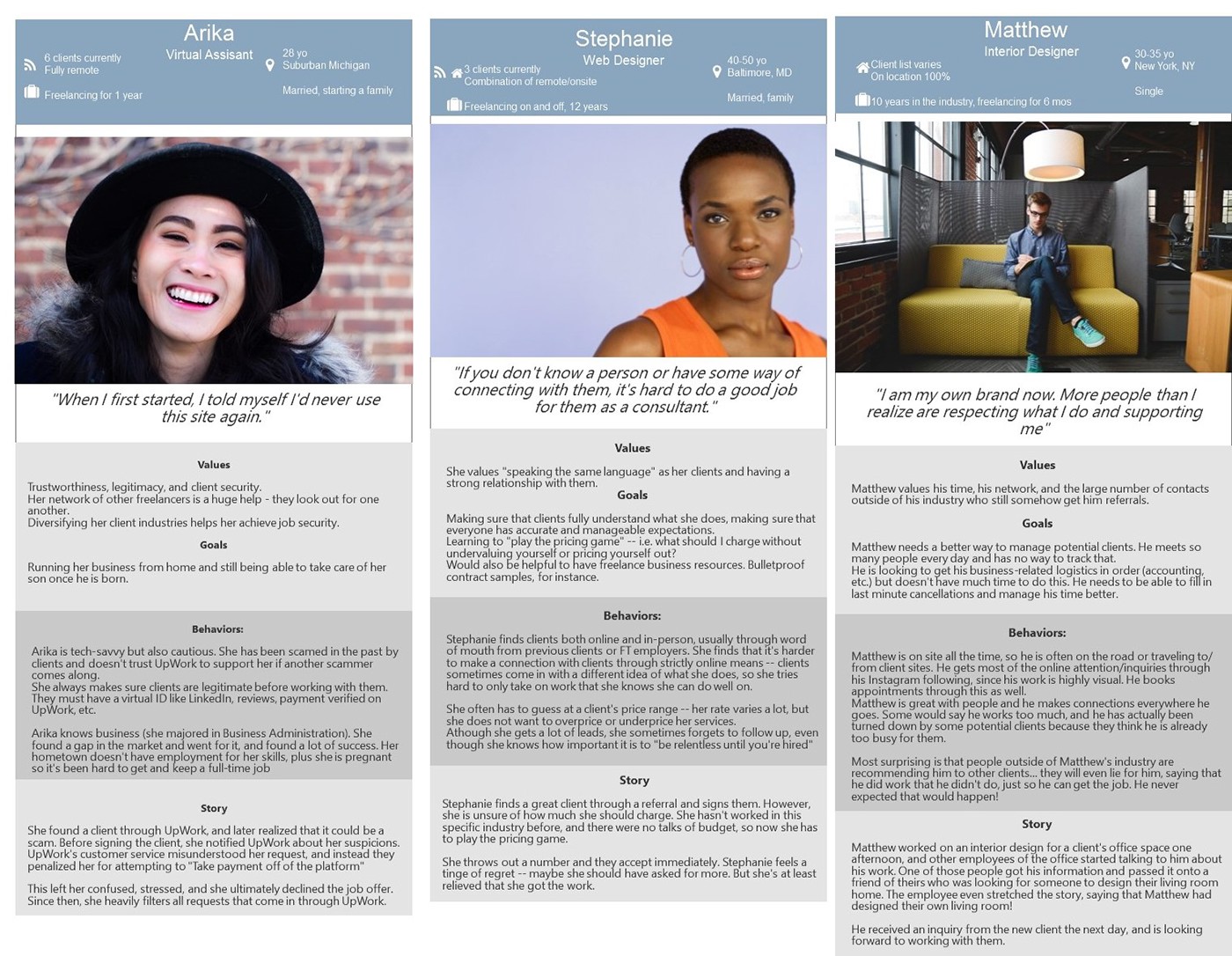
I surveyed and interviewed a wide range of freelancers. They helped inform the personas below:
Not pictured, but I did a competitive analysis of other platforms (Guru, freelancer, TopTal, peopleperhour, fiverr) to see what works. I concluded that each site has its own way of approaching the freelance market, but all of them tend to treat freelancers like commodities rather than people looking to build relationships.
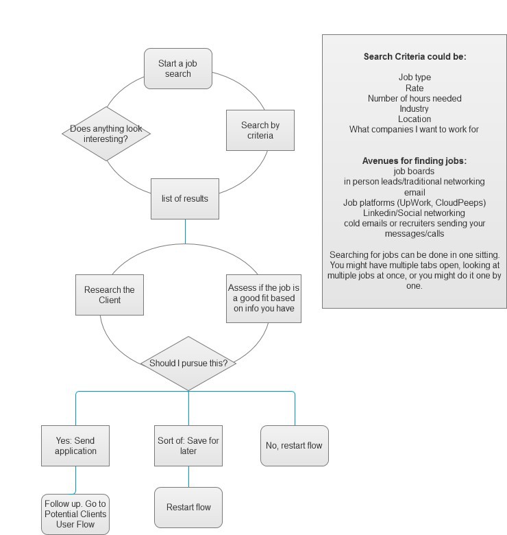
The user flows below show how freelancers go about finding and securing jobs. This can get complex especially if a freelancer is managing several leads at once (they usually are)

Not pictured, but I did a content audit of UpWork's main pages. Not surprisingly, most content came up as confusing or irrelevant in context. Did a card sort re-prioritize the content types:

Two sitemaps.. the second is the final one


Initial wireframe sketches. I focused on a desktop website mainly:

A sampling of the final prototypes! Here I wanted to explore:
1. A home page with personalized tiles that acts as a landing page, showing you what's most urgent and needs to be done. Instead of a home page that shows you new jobs, this shows you what you're currently pursuing.
2. Clients and job descriptions are vetted, and job search results are highly tailored to the freelancer's interests. This might have to be done by an in-house employee (similar to Cloudpeeps.com)
3. Navigation is simple. Nothing is buried. Content is clear and consistent, and iconography is only used when really necessary. Calls to action in the form of links in each tile are also important for driving people to the right task flow.
Other stuff that's important:
4. Not design related but you need to have a service department that is trained well and sympathetic to the problems of freelancers AND clients.
5. High quality communities/blogs/resources throughout the site

These solutions could lead to happier freelancers, more high quality jobs, and could foster lasting relationships between freelancer and client.


