The Department of Defense uses software to track requests for military health aid, such as military mental health counselors or personal finance counselors, who help military members live their lives to the fullest.
I worked as a UX researcher and UI designer to create a more intuitive version of this software.
Some things I accomplished:
1. Usability sessions with stakeholders to identify major workflow and design flaws
1. Usability sessions with stakeholders to identify major workflow and design flaws
2. Working with an agile team to flesh out user stories and prioritize usability problems, which were leading to an influx of bad data and an overall broken workflow.
3. New UI designs that would be more user friendly and serve the multitude of user groups who used the system.
4. Large workflow and design enhancements.
5. Advocating for usability among a development team that was very, very new to user experience design methods.
6. Working with the product owner to roadmap the product's future
7. Presenting to stakeholders and the client regularly.
Some artifacts are shown below.

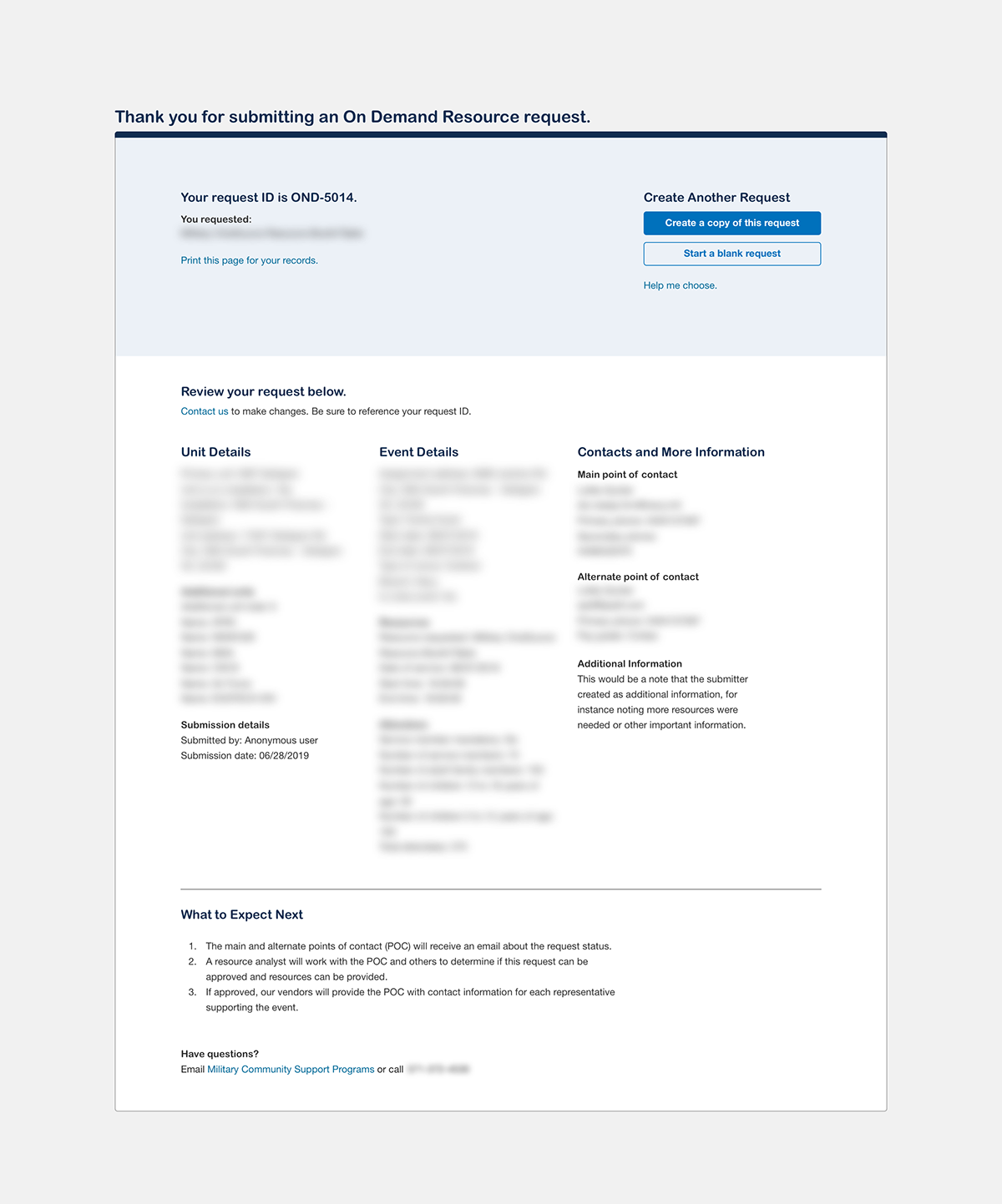
The above is an existing screen that I was tasked with redesigning, I identified a number of problems and was able to iterate on a couple different versions to come up with the screen below, which was put into production.
I identified this as a transaction confirmation screen and singled out several UI and workflow issues that the current screen had. While the client never specifically asked for a redesign (they only asked to make the text more prominent and give more context to the links), I could see that the problem went deeper than just the original user story.
The screen below is the final of 3 iterations where I was able to make this page much more useful by adding complete details of the form submission, letting users know what they just did, a print feature, several jump-off actions, and contacts in case there were questions or concerns.
This story involved research, iteration on wireframes and design reviews, creating a design style guide, and working very closely with developers to ensure proper implementation.

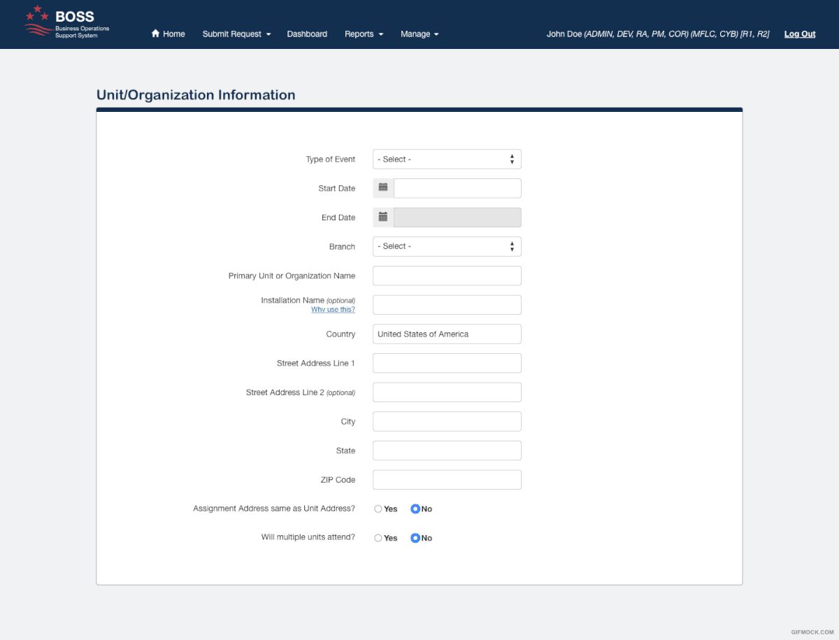
The screen above is a current existing forms page within the application. Forms inside the application had many workflow-related issues, were long and cumbersome, and their design tended to confuse users.
I worked with a multidisciplinary team to research and redesign the core functionality and introduce several styling changes that would yield better user-inputted data and lead to a more intuitive experience.
I worked with a multidisciplinary team to research and redesign the core functionality and introduce several styling changes that would yield better user-inputted data and lead to a more intuitive experience.
Such improvements included, but weren't limited to: the use of location APIs to better fill address data, hint text, making colors/fonts/alignments consistent, getting rid of buggy behavior, and working with devs to unravel quite a bit of technical debt.
The government was excited about the outcomes when I presented and handed off the new functionality. They had not been able to fix this critical area in years.
I can talk more about the functional aspects as well and how I brought this design from low to high fidelity.
Below is a sample workflow that was used to help product owners, business analysts, and the client understand the impacts of a new change to the software's workflow. This was used to start conversations among the team and flesh out new UI designs, impacted areas, dependencies, and much more.

Below is a UI cleanup of an important status and messaging feature, this was an example of "low hanging fruit" that could easily be made more usable with some UI and Interaction design and rapid low-to-high fidelity prototyping.

I enjoyed this project and learned a lot from it. If you want to chat more about this project, you can reach me at khans1025@gmail.com.
