


CLIENTE / CLIENT:
AGR! Food Marketing
AGR! Food Marketing
Creative Direction and design: Ana Vañó (UVE) Francés, Cristina Toledo
Project by nueve estudio
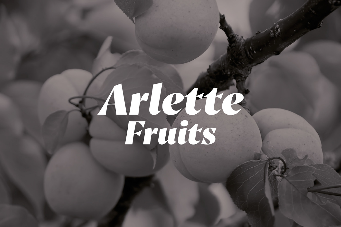
year: 2016.ARLETTE FRUITS:
In collaboration with AGR Food Marketing agency we have developed the naming, branding and packaging for a new fruit brand with a premium target audience in foreign markets. On one side, an apricot brand – escande variety, which is the star fruit of the company. And on the other side, another brand covering the rest ofr the premium fruits: other apricot varieties, pears, kakis and saturn peaches.
Naming
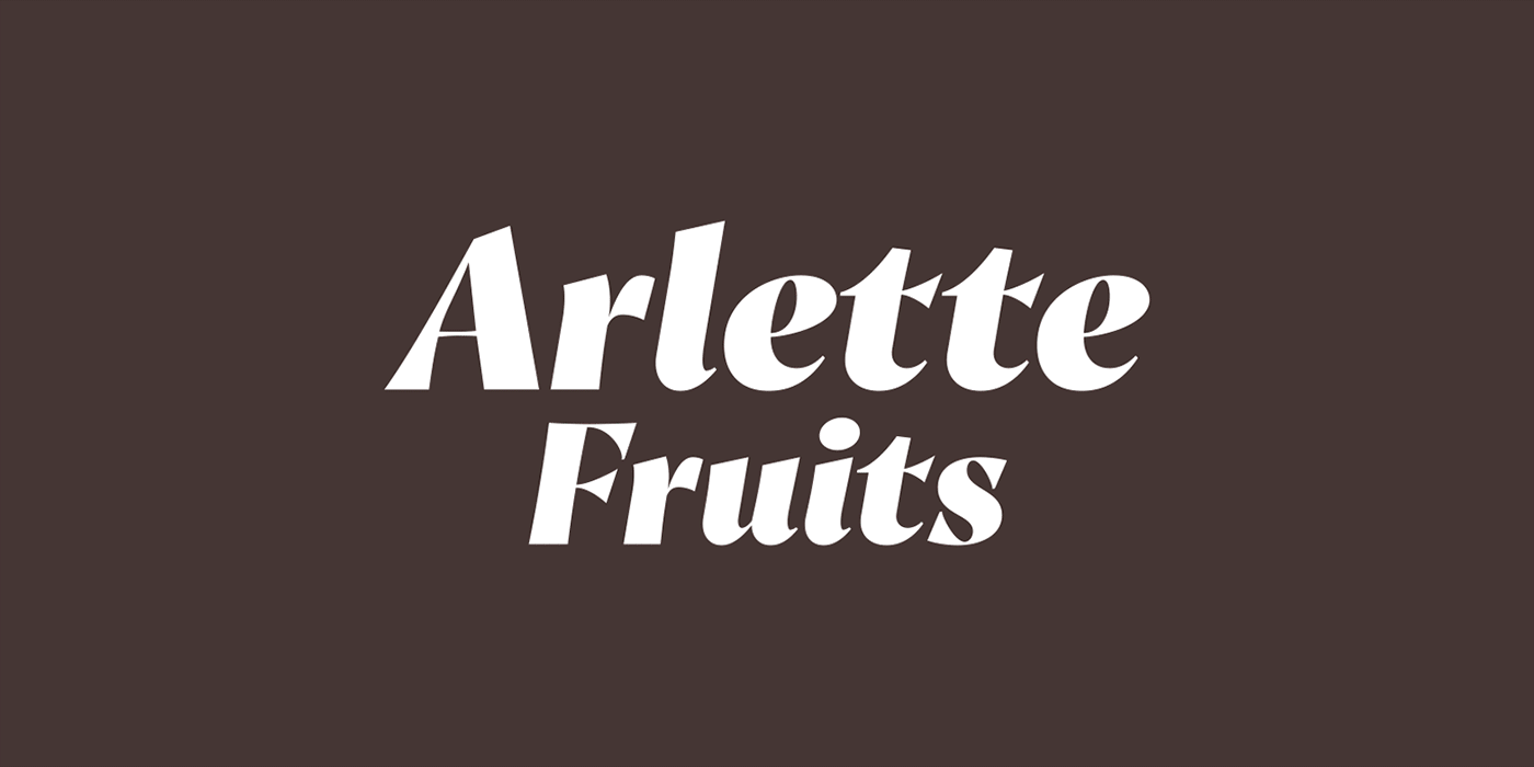
Arlette Fruits: we used a French term for the sophistication and premium quality French words have in the consumer’s mind. An easy name to pronounce in the different markets where it is present. It is a female name, recalling a delicate, different as well as sumptuous fruit.
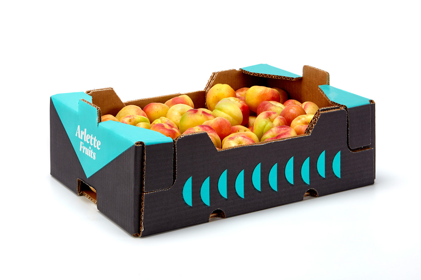
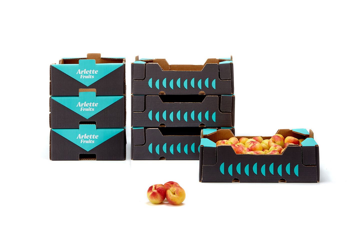
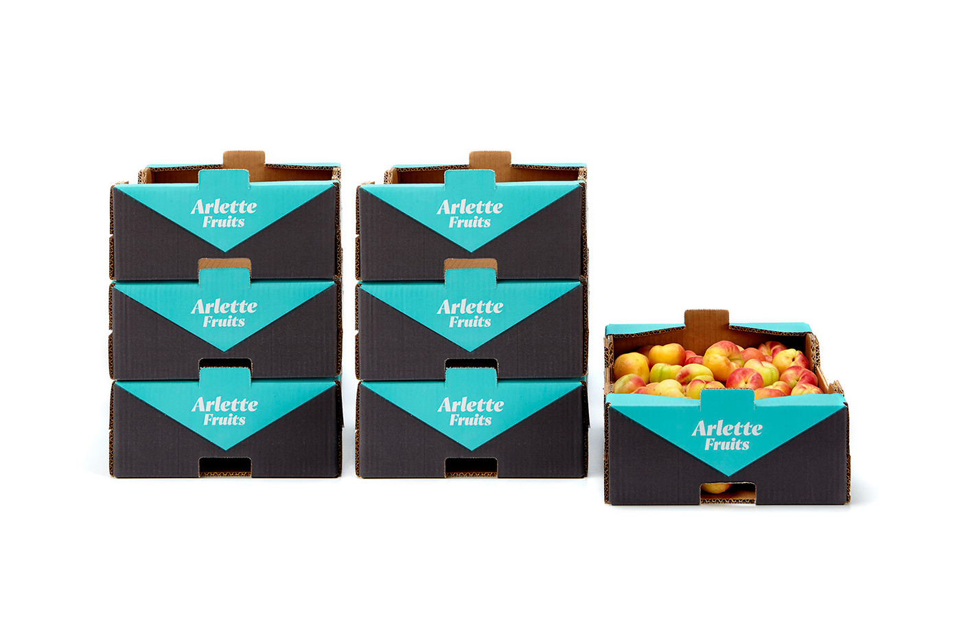
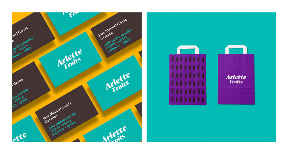
Branding and packaging:
To reference the French origin of the naming, an emphatic as well as sophisticated font which gives the brand its premium character. The chosen palette for Arlette Fruts represents the land and the fruits. Green, yellow, orange and violet. A touch of freshness in these colours, far from the traditional gold – black combination.
As for the packaging, we have been in charge of the design as well as the production. It is a graphic representation of the fruits through basic geometric shapes (fruit pieces), giving it a premium yet casual character.
As for the packaging, we have been in charge of the design as well as the production. It is a graphic representation of the fruits through basic geometric shapes (fruit pieces), giving it a premium yet casual character.


thanks! for watching


