The Challenge
Create a new brand identity for a line of oatmeal. Target audience is your choice, but you must justify reasoning behind chosen market.
Key Research Insights
Even though the cereal aisle is filled with plenty of products aimed at children, the oatmeal section is not, with Ready Brek shown as the only current example (a visually unappealing brand, that doesn’t look child friendly).
Even though the cereal aisle is filled with plenty of products aimed at children, the oatmeal section is not, with Ready Brek shown as the only current example (a visually unappealing brand, that doesn’t look child friendly).
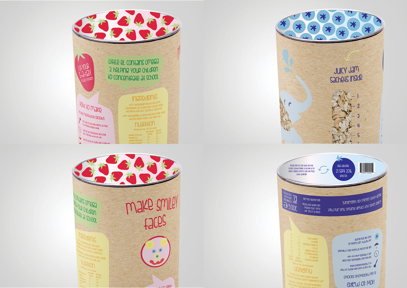
Oatmeal helps to develop children’s brains and improve their reading, writing and spelling, through its high Omega 3 content.
Most oatmeal packs visualise oatmeal in an unappealing way; photographs of it cooked and in context.
From our analysis of different children’s brands, we found that they all feature predominantly male brand mascots (e.g Tony the Tiger and Coco the Monkey), not even one female is shown.
The children’s breakfast sector is highly populated with products that look fun but are unhealthy.The majority of oatmeal product packaging is rectangular, from the box to the sachets inside.
“Children who eat porridge for breakfast ‘get better exam results’
Feeding children high energy breakfast foods such as porridge at a young age boosts their exams results at school, new research suggests. Children who followed such a diet before their third birthday had improved scores in reading and problem-solving tests compared to their peers, it was revealed.”
The Telegraph, 2009

Whilst developing our brand mark, it was important to create a simple yet fun design to both appeal to our target audience and sit
alongside a mascot which would be the focal point of the packaging.
alongside a mascot which would be the focal point of the packaging.
The typeface we sourced for our brand mark is playful to appeal to children, yet sophisticated enough to attract their parents and create a brand identity that they feel they can trust.
After our initial ideas with the droplet motif becoming a prominent influence, we then took a different direction as it was decided that our brand should have a healthy, natural focus. Using bold and simple fruit illustrations to create a dynamic brand that can be adapted across our range of products means that the brand mark is more attractive to both children and parents.

Strawberry, Blueberry, and Peach Mock Up Shots
The thought process behind making our mascot an elephant was that these animals are considered to be very intelligent, with excellent memories. They are also friendly, relatable and different to any other mascot in the childrens’ cereal market.
Our initial digital illustrations featured an adult elephant, which we then decided should be changed to a young elephant to relate to the children eating our porridge. The elephant was illustrated in a variety of poses to be used across the product range.

Strawberry Pack
Once we decided to use the fruit illustrations for our logo and branding, and after refining our mascot, we incorporated
these elements into these more developed packaging designs. Th e colour schemes relate to each flavour, making them
easy to distinguish. For the later stages of development, we incorporated the speech bubble holding device into the
designs on the front and back of pack.
After deciding on a cylindrical packaging format, we decided that this should be as sustainable and easy to re-use as possible, as well as being eye-catching at point of sale. The brown ‘kraft’ style packaging has ecofriendly connotations and works well when paired with bright colours and the cut-out showing the oats.

Blueberry Pack
Our final packaging design incorporates all of our most pertinent research insights and design elements into a well-rounded product that would appeal to both young children and their parents. We have included a simple guide for how to make the
porridge, as well as suggestions for making Little El’s animal friends using additional fruit in the child’s porridge.

Peach Pack

Individual Jam Sachets
The jam sachets that accompany the porridge oats will sit inside a separate compartment at the top of the packaging. They will have a window similar to the cut-out in the cylindrical packaging, showing the fruit puree inside, so the parent can see exactly what they are feeding their child.

Mock Up Shot in Context
Mock Up Shots
Promotional Material was also created, in order to promote the new product range. Both online, print, and in-store merchandise was designed, to make sure the target market was reached appropriately. Fun for children, yet informative for the parents.
These pieces will be added to this document shortly!


