
This is my logo for the Liverpool Tate online exhibition 'Composition.' During research I realised Patti Smith mainly used sans-serif typefaces for her identity on both her website and album artwork. Robert Mapplethorpe used serif typefaces for his. For the logo, to show their collaboration I then combined both a sans-serif typeface and a serif typeface together.

This is my poster to promote the online exhibiton. I experimented a lot with arranging my text in a grid structure. My concept for this piece is based on Patti Smith's "Memorial Tribute." This tribute was dedicated to Mapplethorpe just before his death. It features the word 'emerald' a lot, which is to do with his green eyes. It declares how much she wished he could stay, and shows their strong relationship. I cropped images of both the artists to just show their eyes, I then composed them in order of time. The first images are of when they were younger, and the final images of Mapplethorpe are from the year before his death.

A context shot of my exhibition poster.

The home page for my Composition micro site. It has an interactive feature in which the user can adjust the composition themselves to create their own versions.
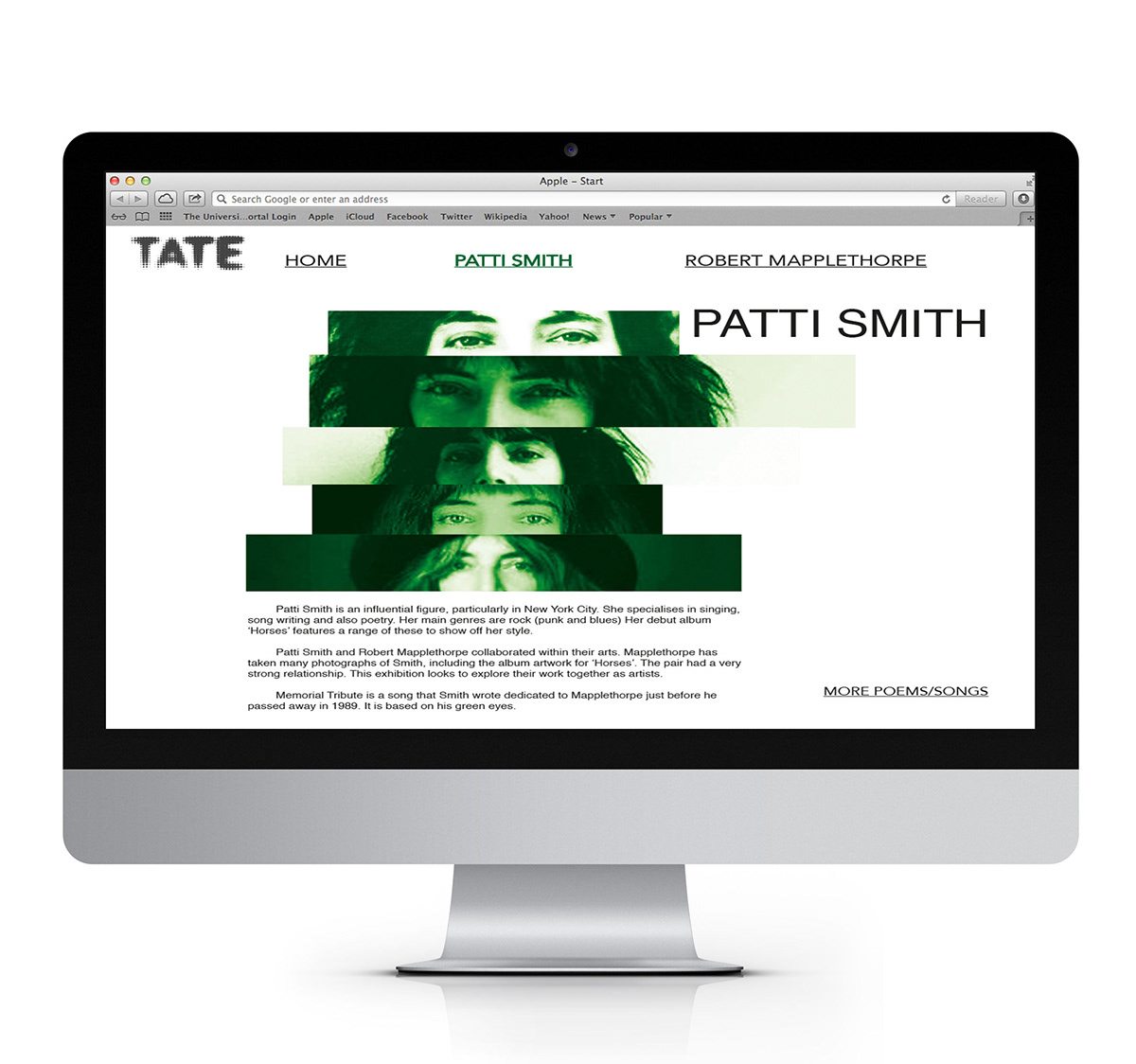
The page for Patti Smith on my microsite
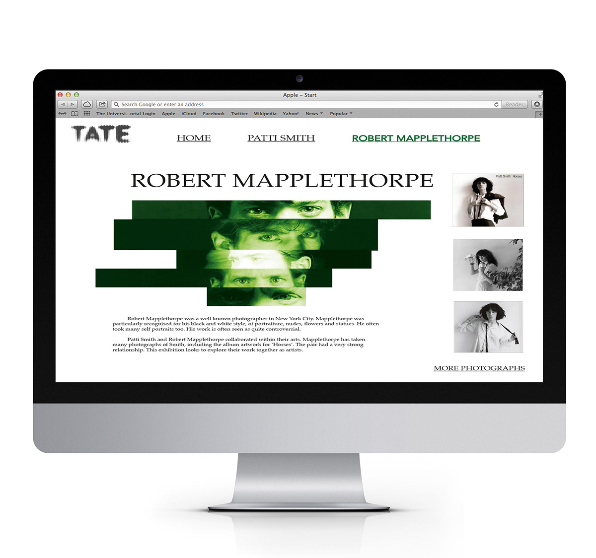
The page for Robert Mapplethorpe on my microsite

Magazine Exhibition item


